They are trying.
And you know what? I give Sailor credit for that. As Pilot has proven with the FriXion, there is an enormous market for erasable gel ink pens. Pilot has been perfecting theirs for 20 years, which is important context to keep in mind as I go through the rest of this review, because the Sailor Que Será is not a good pen. Yet.
The Que Será was launched by Sailor earlier this year, with an ink formulation designed to differentiate itself from the FriXion. Where the FriXion uses thermo-sensitive ink and erases via heat generated by friction, the Que Será designed their ink to essentially sit on top of the page, and allow the eraser to “peel” off the ink, similar to a traditional pencil erasing experience.
Shades of a Sharpie marker, but with Pentel parts on the front end.
That may sound weird, but it works. The eraser marks are mostly clean, although there is some mess left behind, again, like a standard pencil. This time, it’s ink bits, not eraser bits, left on the page that need to be brushed off. This ink formulation does mean your words are actually erased, unlike with the FriXion, where the words can be “restored,” by placing the page in a cool area, like a freezer.
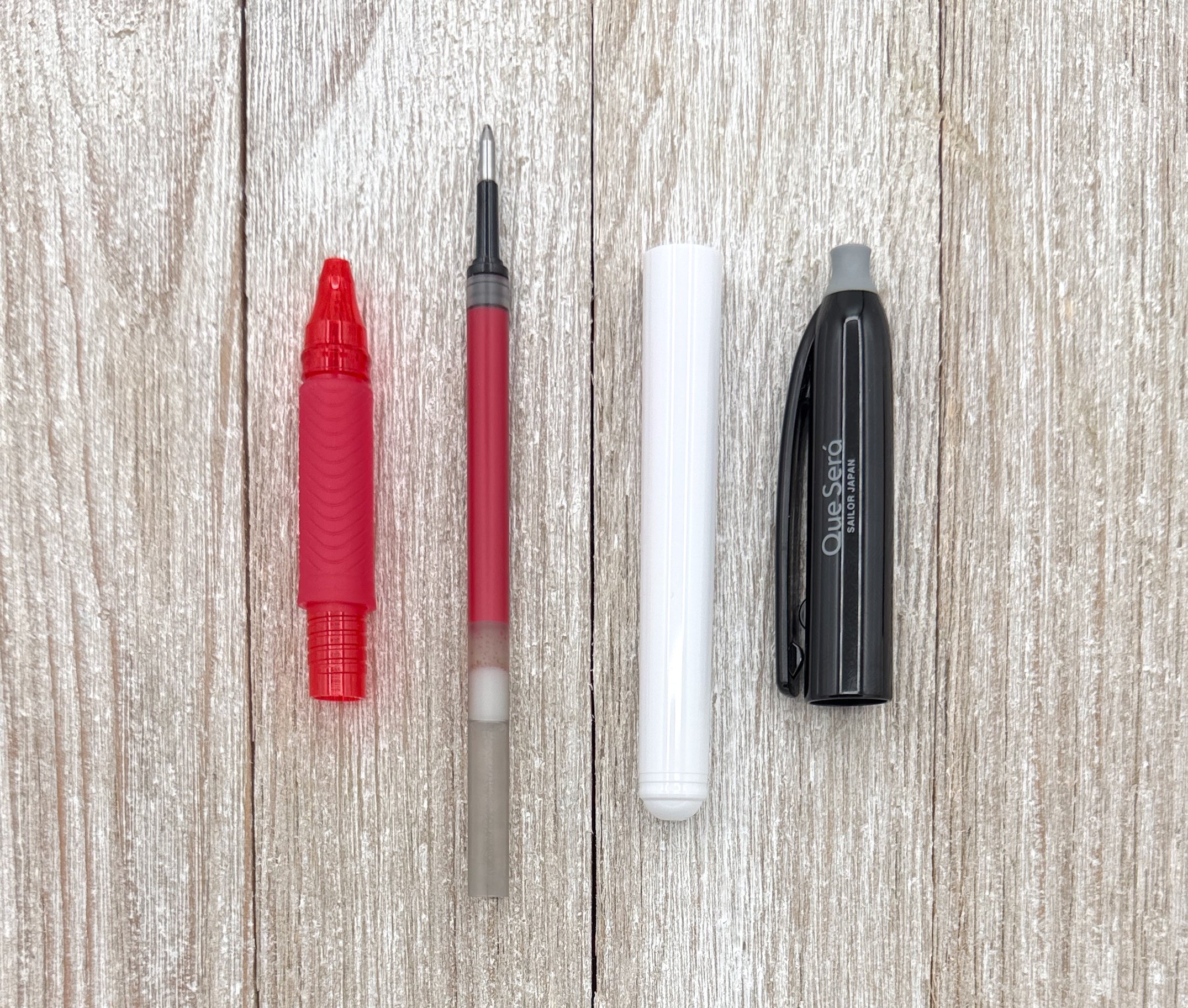
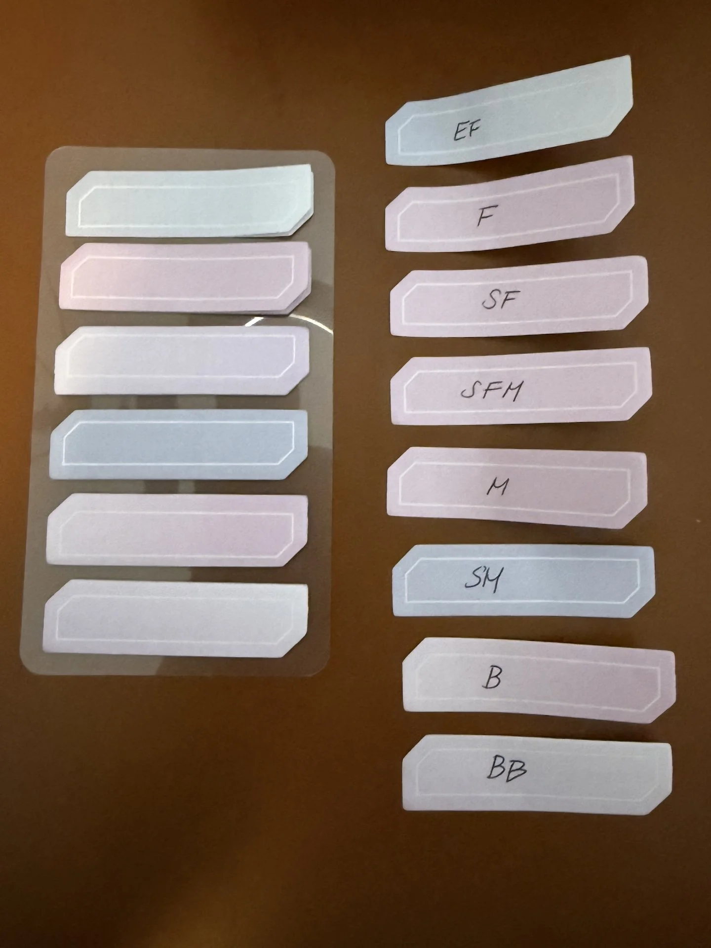
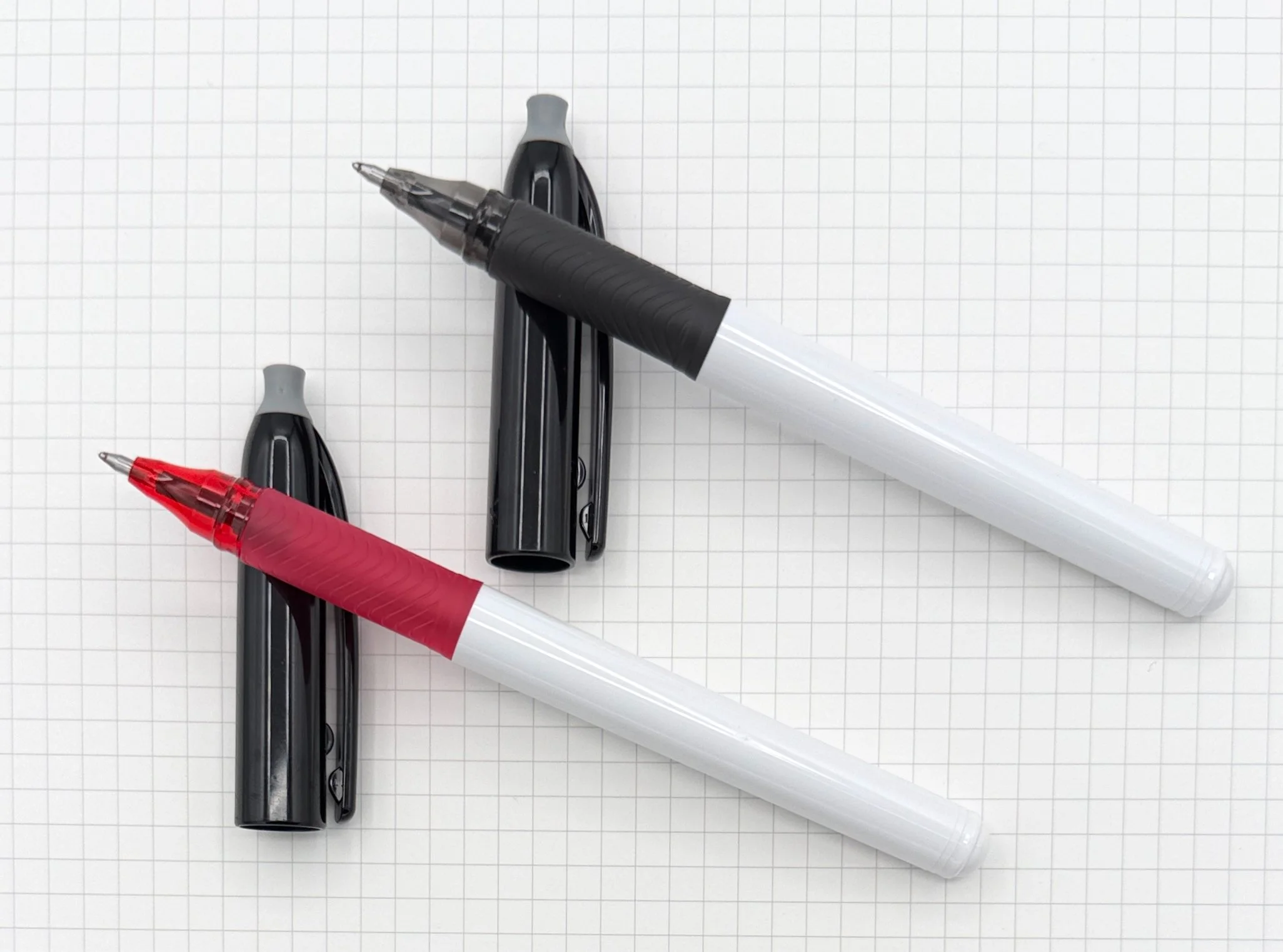
EnerGel refill shape and grip section.
While it’s main feature, gel ink that erases, works well, the general writing experience is one of the worst I’ve had with any standard pen, erasable or not. That’s a problem for the Que Será, because I’ll never get to the main benefit if I don’t enjoy writing with the pen in the first place.
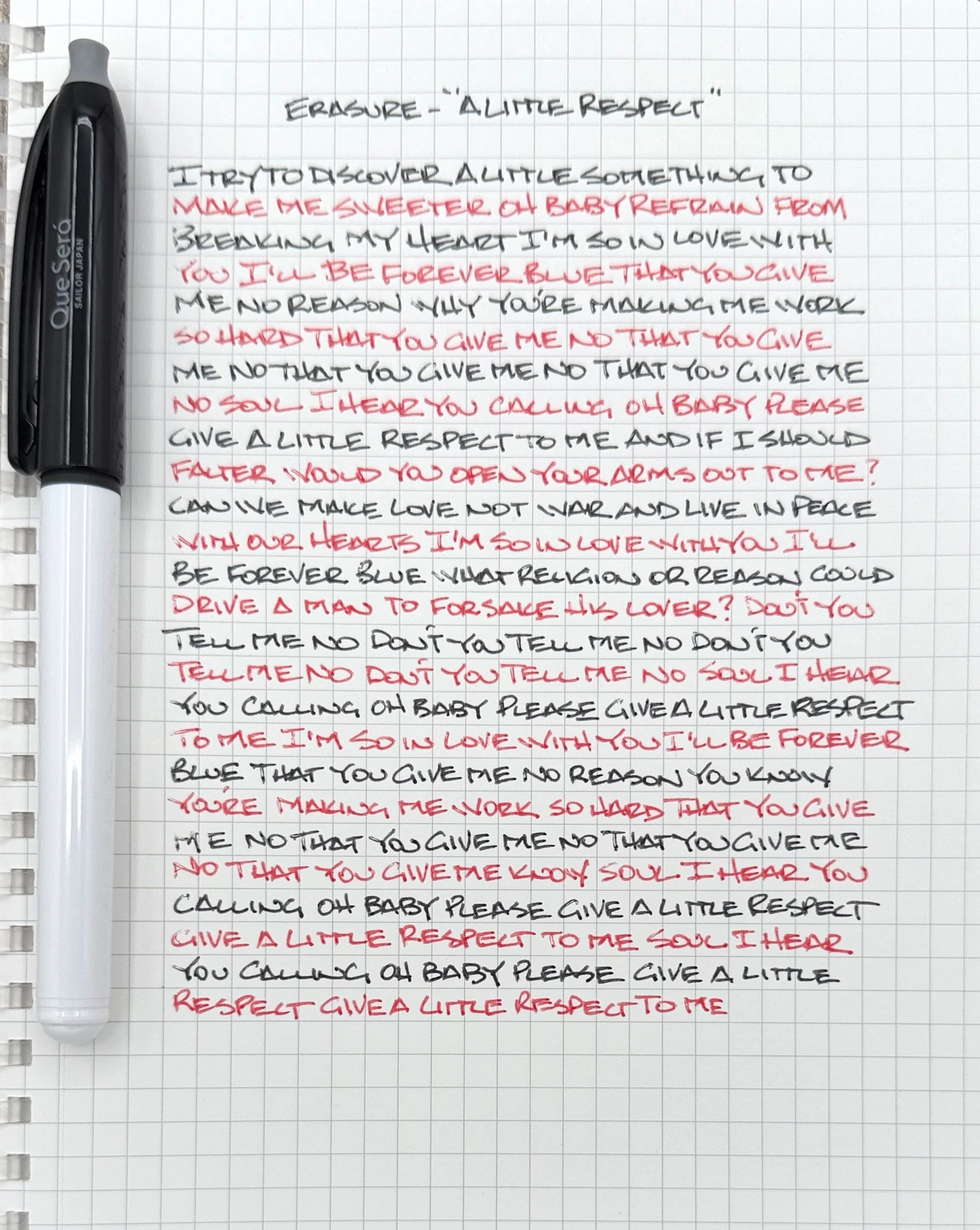
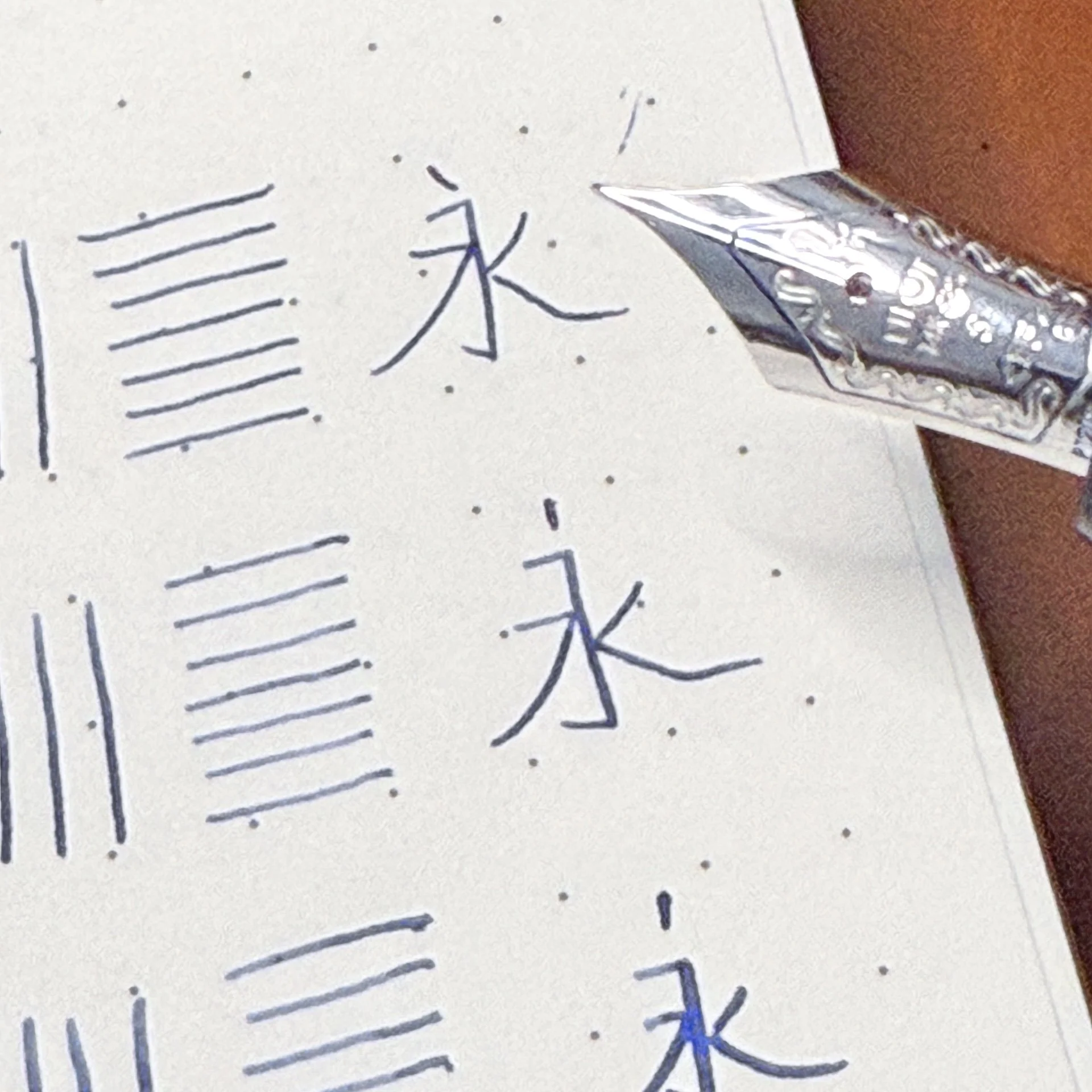
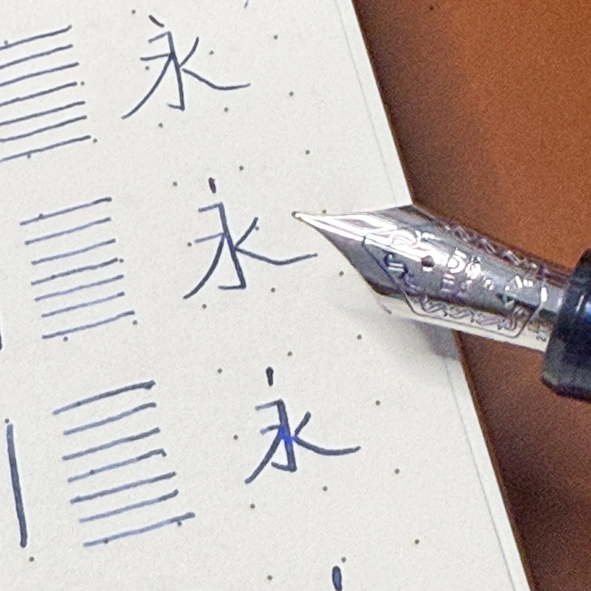
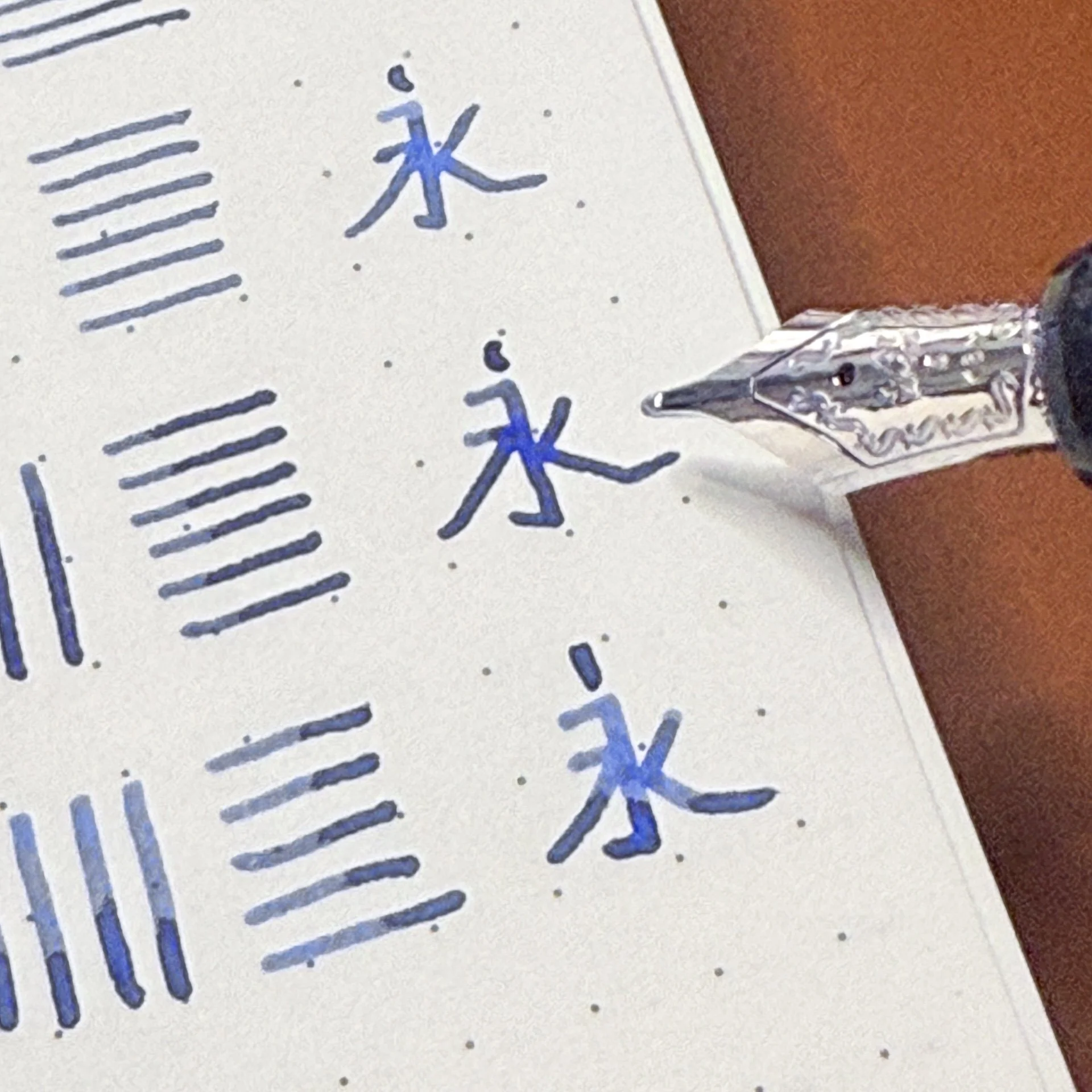
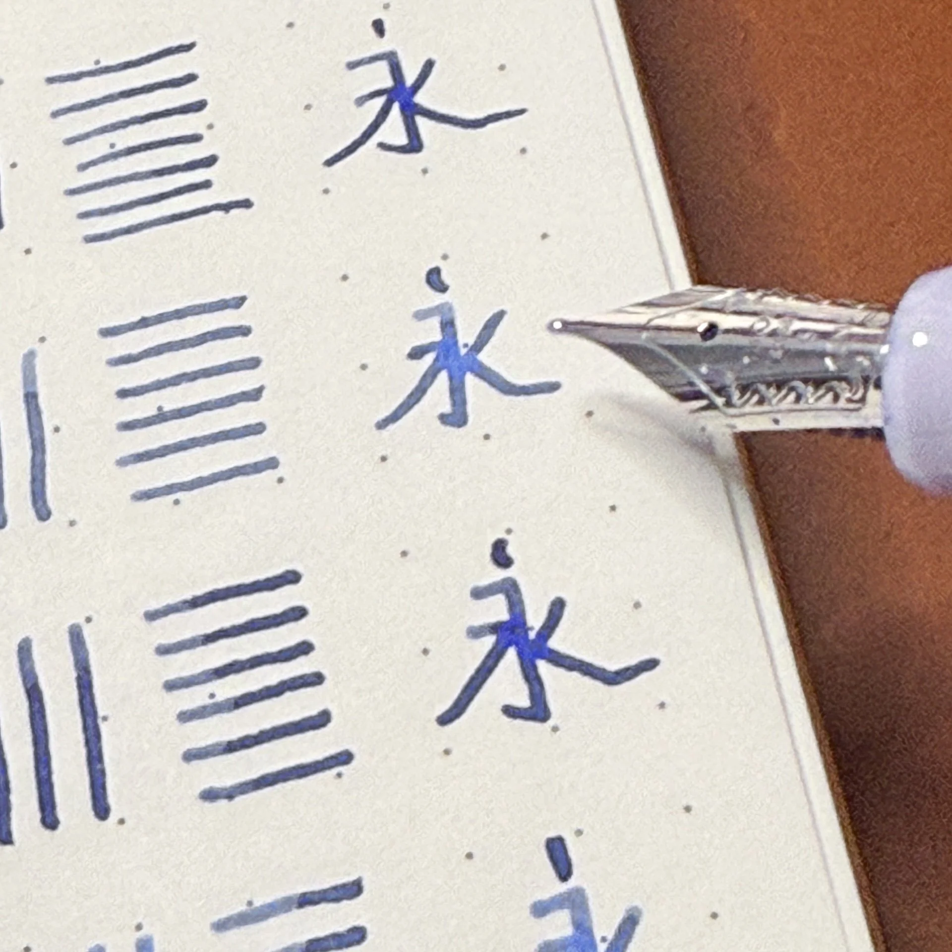
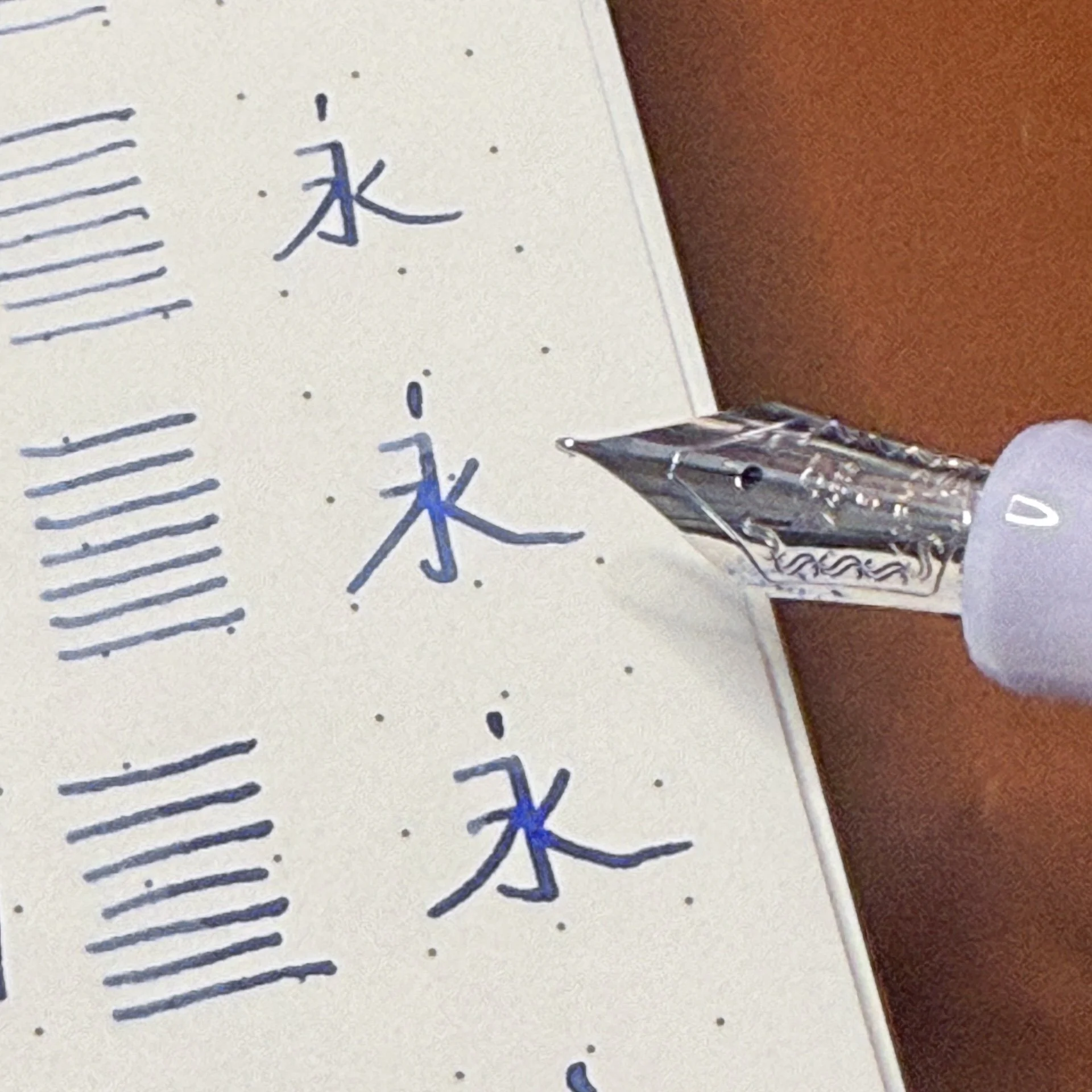
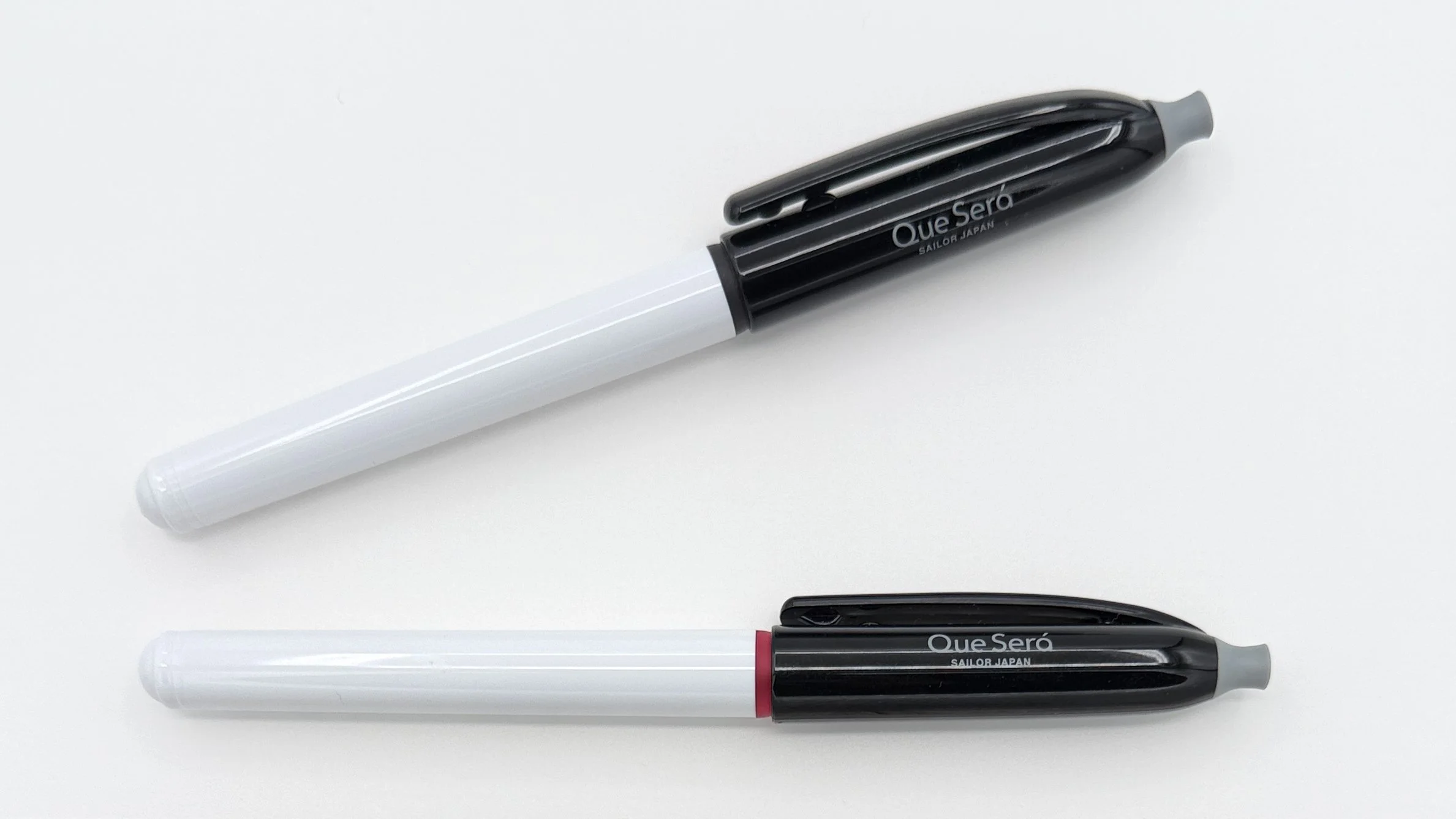
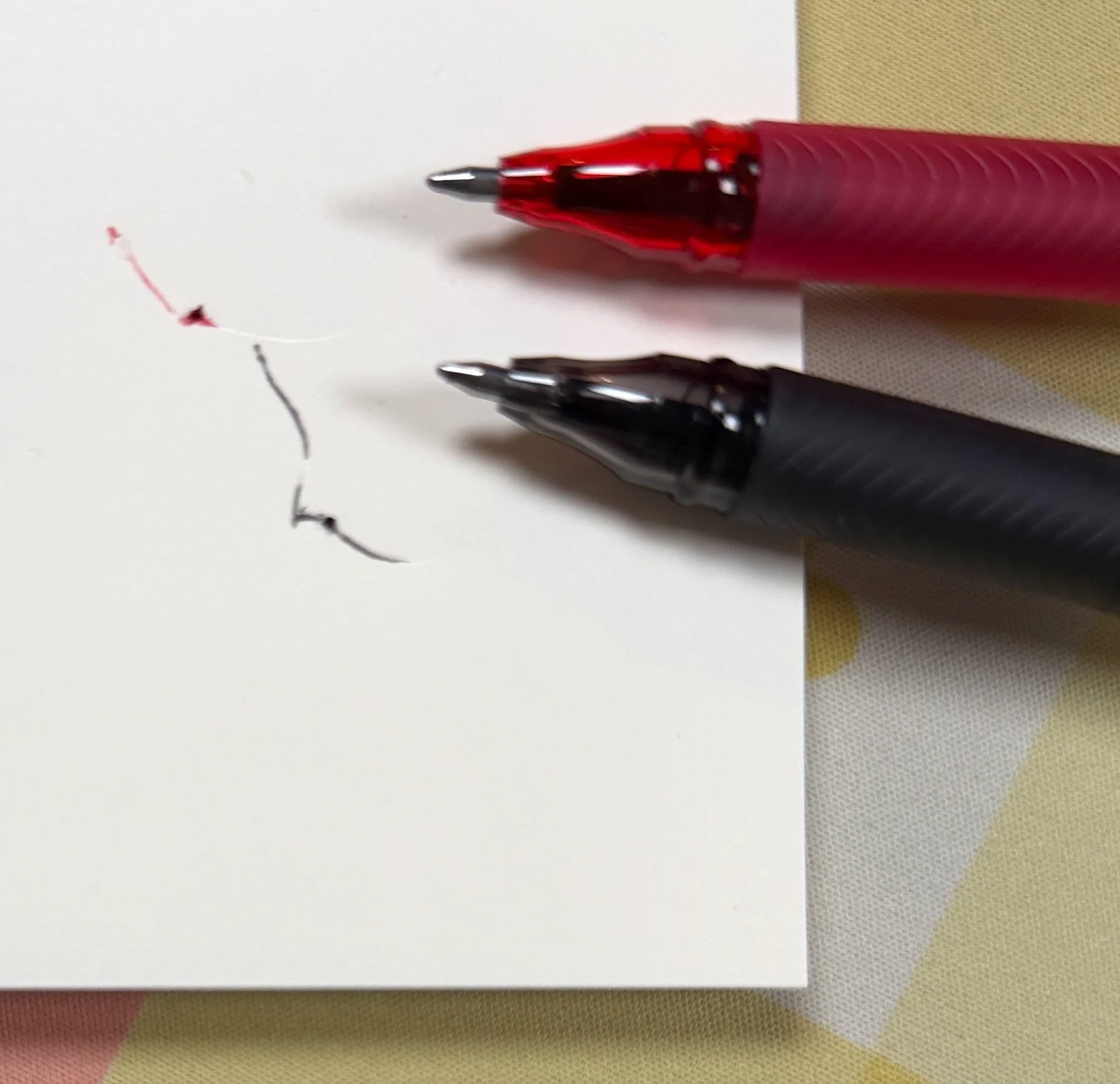
I was sent two Que Será pens by a friend - one Black, one Red - each with an 0.8 mm tip size. From my first lines the writing experience was underwhelming, and with more use it escalated to downright bad. I think the good part of the ink formulation - the erasability - plays directly into the poor writing performance. The ink sometimes builds up on the tip, making my lines messy, but more annoying was the constant railroading of the lines on the page.
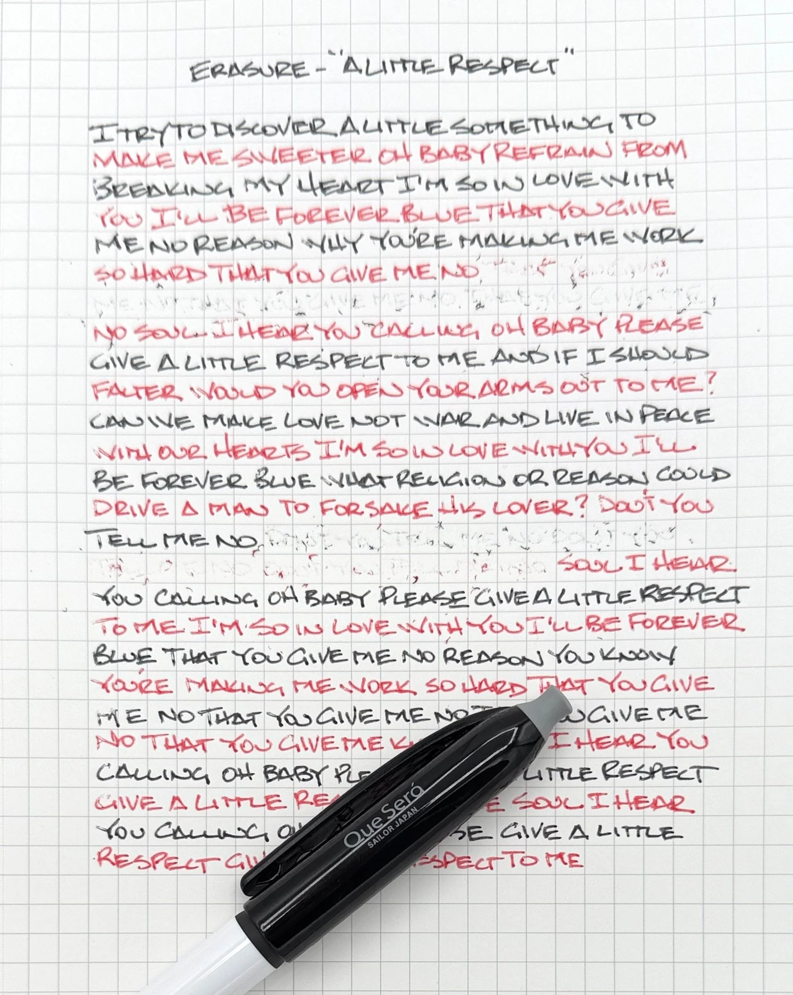
Initial erasing.
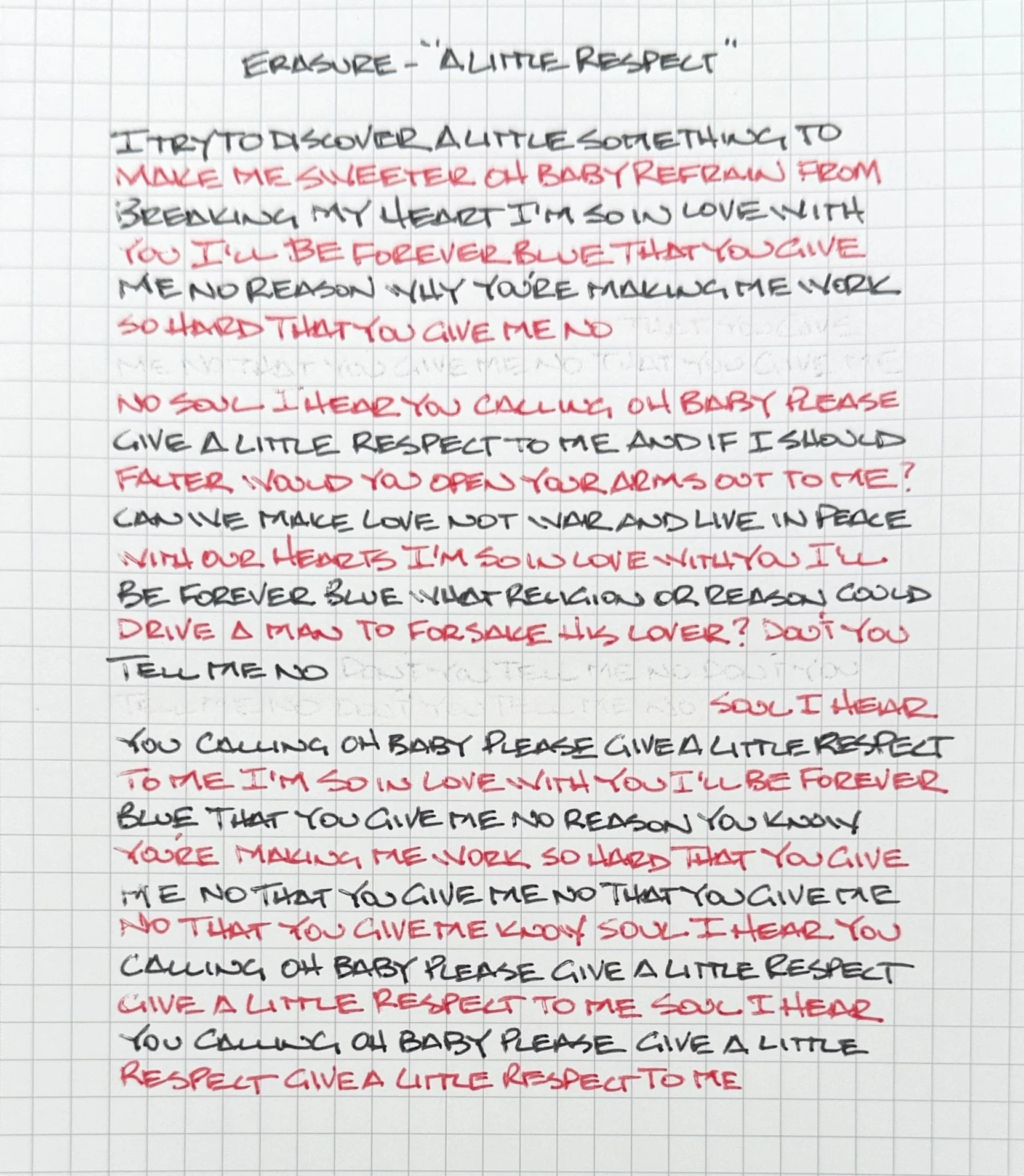
Brushed off. You can still see the underlying writing like with almost any erasable product, and I could take another pass to erase more fully.
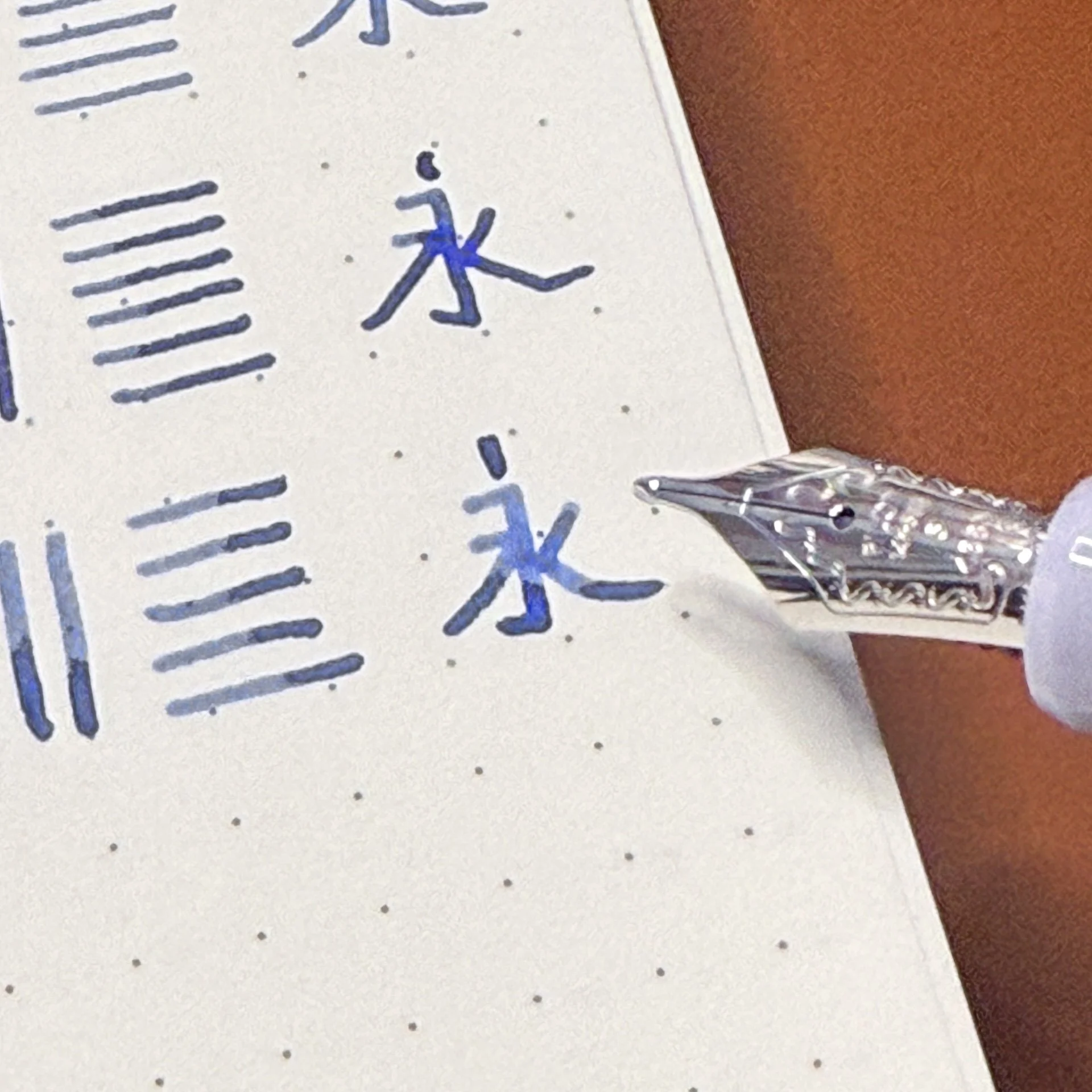
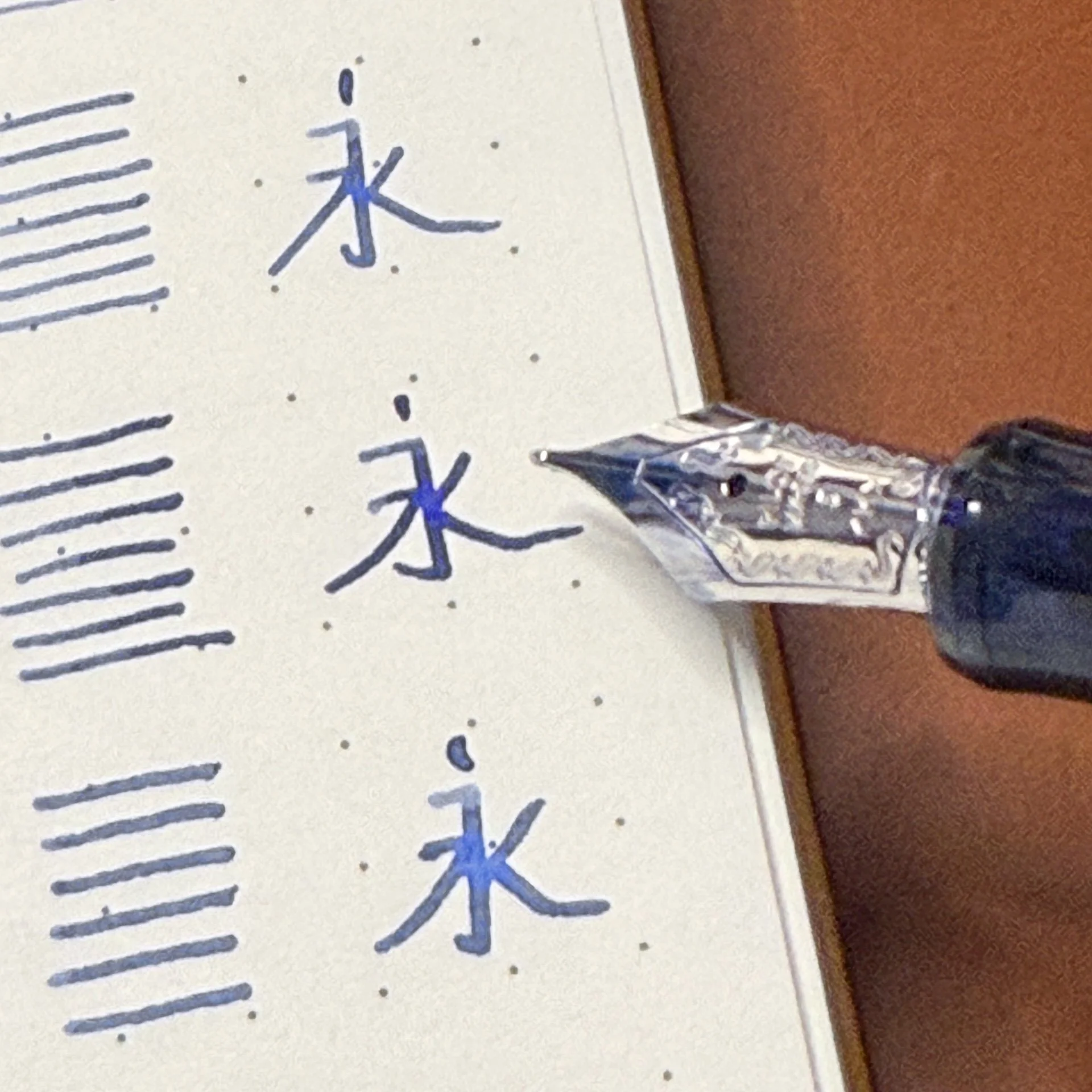
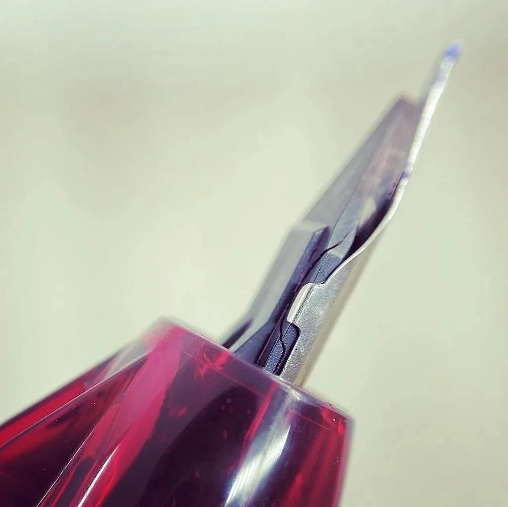
Railroading is an effect where you see white space in the lines on the page, usually in the middle of a mark. It was constant with both Que Será pens, but more noticeable with the Black. I did try to wipe off the tips on occasion, but that was a fool’s errand. They started bad, and stayed that way. On top of that, their pigmentation was light compared to standard gel ink options.
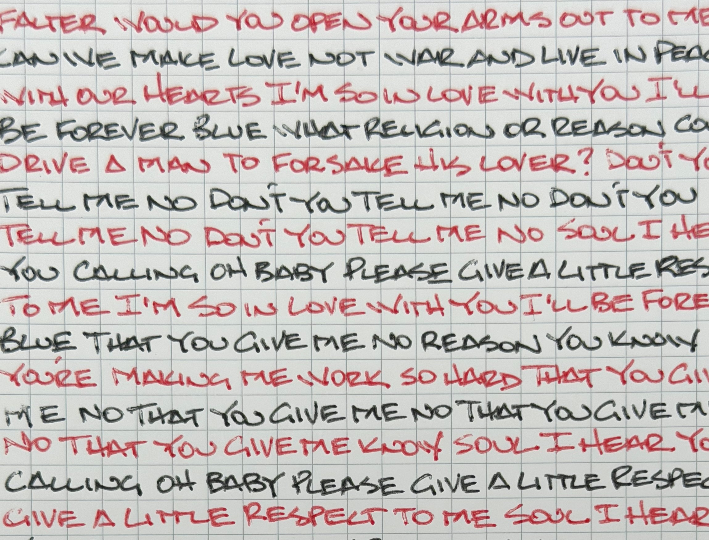
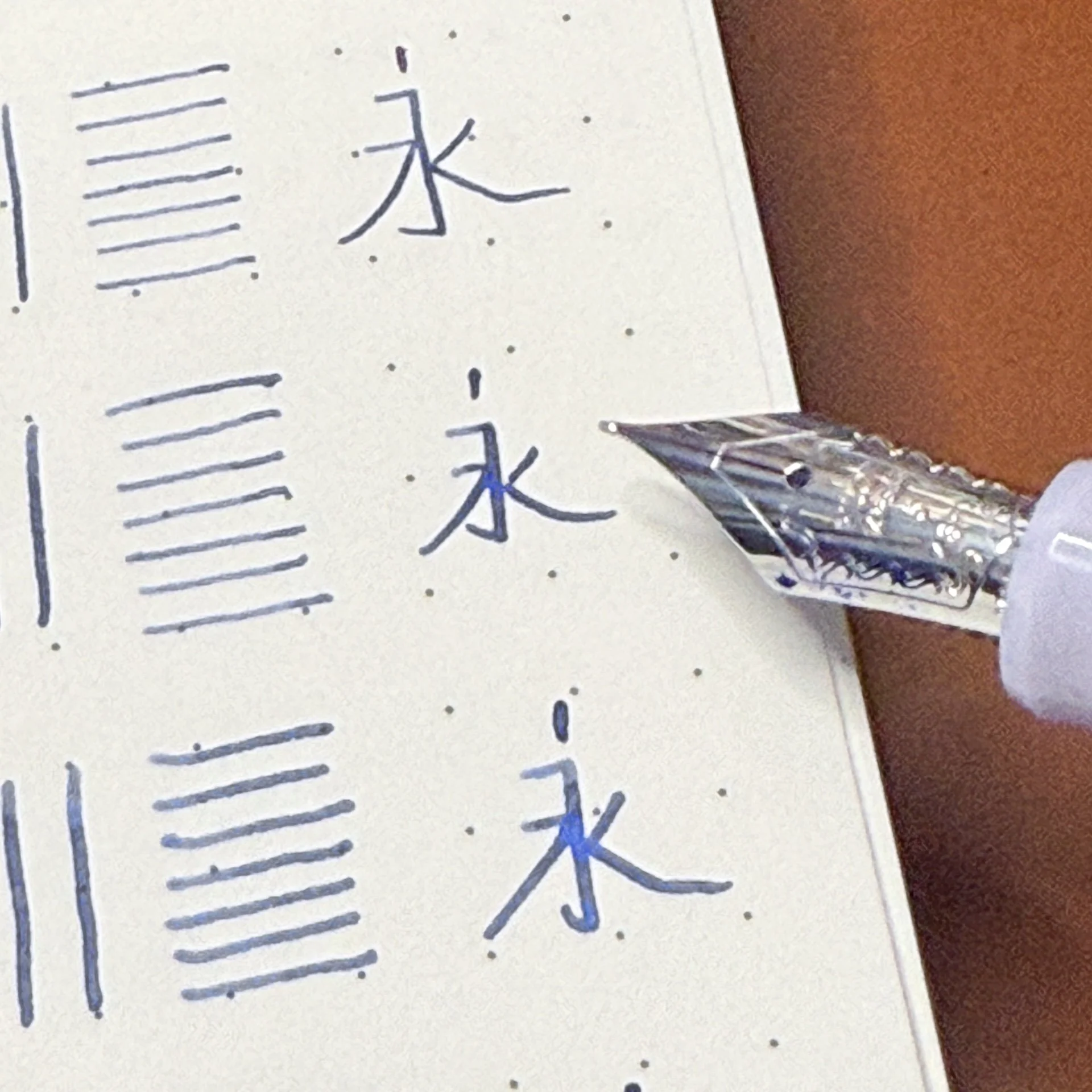
A close-up of the writing. Look at the vertical lines - especially every “T” in both colors - not good.
While all of this is bad for the current iteration of the Que Será, I wonder if they can find their footing like Pilot did with the FriXion? When it launched, the ink was very light - the Black much lighter than the current Que Será - and the erasability was only average. It didn’t work well enough to be an every day pen, but Pilot stuck with it, and turned it into a high-quality gel ink pen that, almost as a bonus, has great erasability if that’s a feature you need.
What path will Sailor take with the Que Será? We can only wait and see. Now that Pentel is also under the same corporate umbrella as Sailor, can they continue to iterate and improve on it together? I hope so, because competition is good, and right now, the FriXion continues to have none.
Enjoy reading The Pen Addict? Then consider becoming a member to receive additional weekly content, giveaways, and discounts in The Pen Addict shop. Plus, you support me and the site directly, for which I am very grateful.
Membership starts at just $5/month, with a discounted annual option available. To find out more about membership click here and join us!
Maybe keep a “nib crud” page handy.