Posts filed under Schon DSGN

Schon DSGN x Custom Nib Studio Sashiko Fountain Pen Review

(Kimberly (she/her) took the express train down the fountain pen/stationery rabbit hole and doesn't want to be rescued. She can be found on Instagram @allthehobbies because there really are many, many hobbies!.)

My purchases at the recent 2025 Pacific Northwest Pen Show were pretty restrained and I hadn’t planned on buying any pens, but when I heard that two of my favorite pen people were doing a collab, I knew I had to take a look.

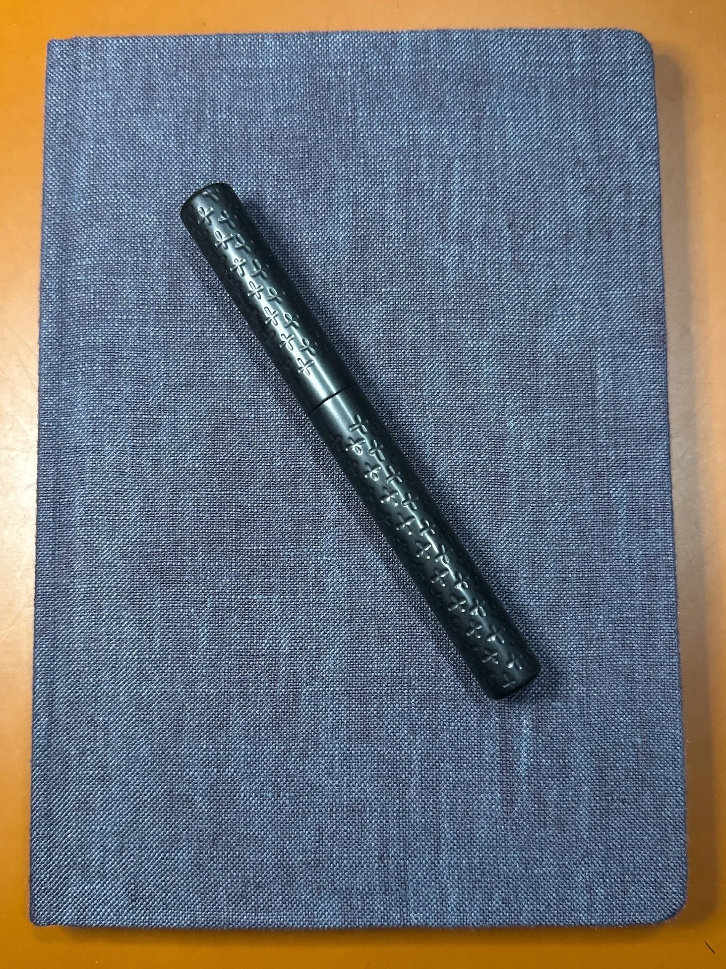
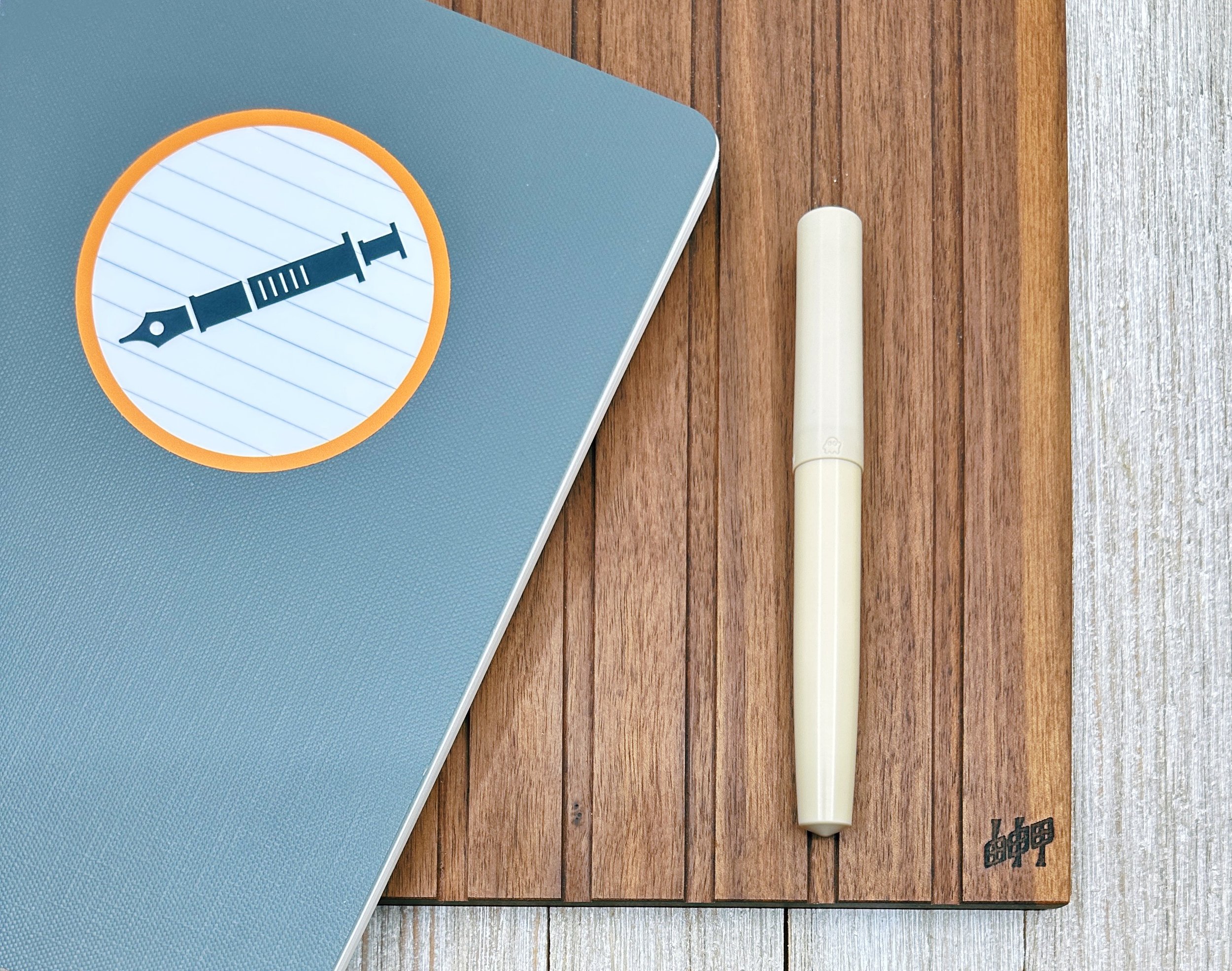
Schon DSGN x Custom Nib Studio Sashiko fountain pen.

Gena Salorino of Custom Nib Studio launched their Sashiko Fountain Pen collab with Ian Schon of Schon DSGN a couple weeks ago at the PNW Pen Show. This Sashiko pen has an engraved design, which is inspired by the Japanese stitching/embroidery technique of the same name. According to Wikipedia, “Sashiko (刺し子, lit. 'little stabs') is a type of traditional Japanese embroidery or stitching used for the decorative and/or functional reinforcement of cloth and clothing.” There are different kinds of patterns for Sashiko embroidery/stitching, like stripes, checks, diamonds, etc. Gena chose the cross stitch pattern because this is the technique they use to repair their own clothing, which I think is extra cool.

When asked how this pen came about, Gena said they had always wanted to work on a pen with Ian and it came about a few months ago when they “daydreamed” their idea of a pen to him, who took the idea and ran with it. And thus, the Sashiko fountain pen was born.

The Sashiko pen is made from Ultem (also known as polyetherimide or PEI), an engineered plastic that is much stronger than acrylic. It can also be machined to be very thin, resulting in a very lightweight pen. The finish is neither a matte nor super polished, giving it a “warm” feeling to it, similar to ebonite.

Rather than creating a single sashiko pattern and then reproducing that pattern on all the pens, Ian, ever the engineer, challenged himself to “create a style of 'macro' programming to create a new unique pattern for each pen that follows the same logic and styling, but is totally one of a kind.” This gives it a random, handmade feel without actually hand-crafting each stitch. As a result, each of these pens are unique. I appreciate the “imperfection” of the cross markings, which echoes real life stitching on fabric.

You can see that each of the stitches are similar but different.

One of the things that impressed me the most about the pen is the cap threading - in addition to it taking a mere half turn to cap/uncap the pen, the last little turn to cap the pen has a gentle resistance that tells you it’s about to be fully sealed. It’s hard to describe but it is such a satisfying sensation.

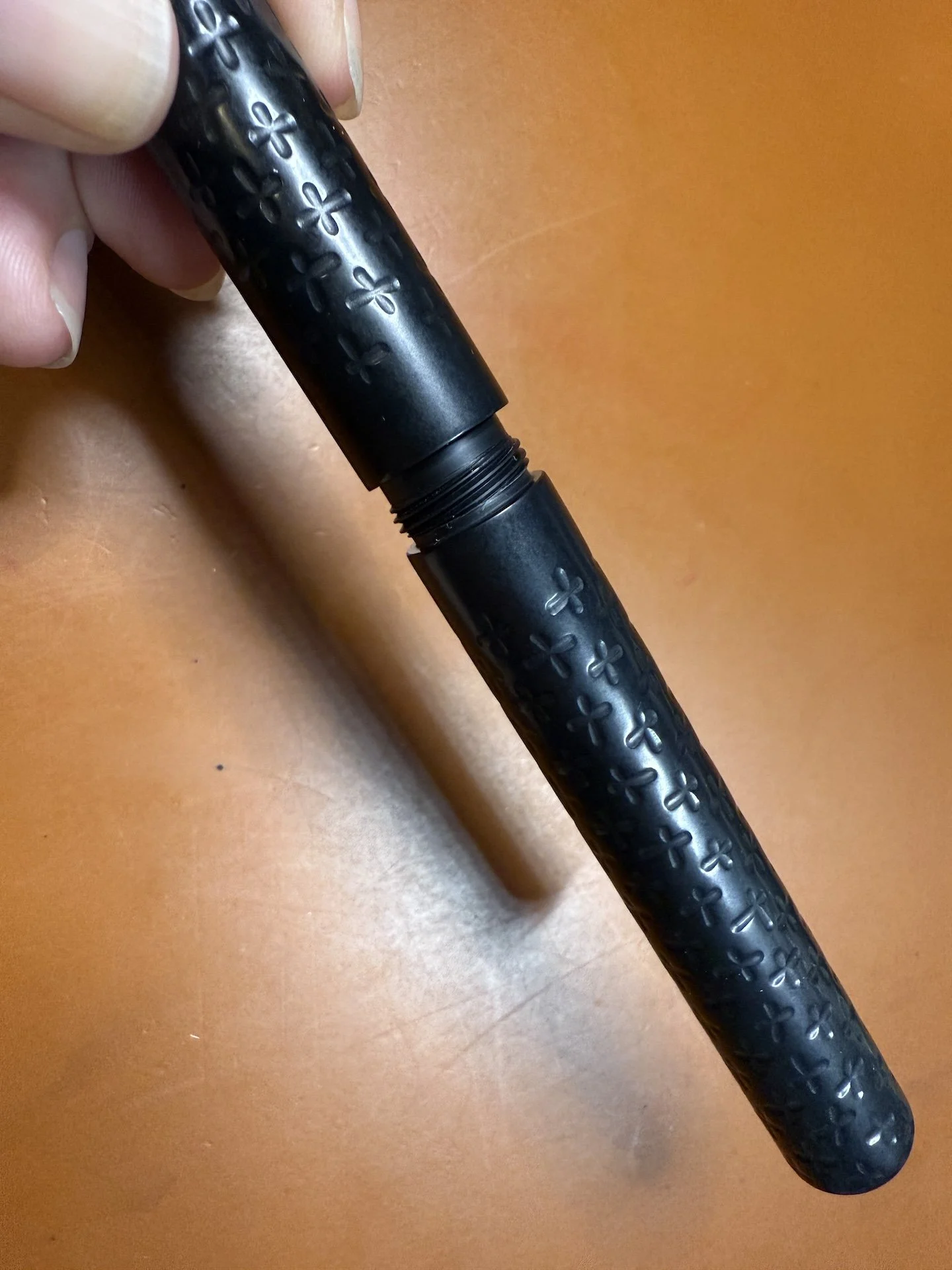
Just a few threads are needed for a half-turn cap/uncap.

Cleaning Ultem pens is easy - usually water (and soap, if necessary) is all you need. Alcohol is also safe if you need a deeper clean. Ian recommends avoiding ammonia-based solutions, including pen flush. If you want to use pen flush to clean the nib/feed, unscrew the nib unit to clean it separately.

The pen measures 5” (127.5 mm) when capped and 4.8” (122.5 mm) when uncapped (note that the pen does not post). It weighs 0.66 oz. or 18.77 g with nib unit & converter. Here are some pens that are similar in size, along with their weights:

Pen

Weight (uncapped with converter)

Weight (capped with converter)

Sashiko

0.546 oz/15.46 g

0.66 oz/18.77 g

Schon Dsgn Full Size Fountain Pen - Aluminum

0.729 oz/20.66 g

0.927 oz/26.28 g

Sailor Pro Gear

0.543 oz/15.43 g

0.835 oz/23.69 g

Platinum 3776

0.475 oz/13.50 g

0.840 oz/23.82 g

Franklin-Christoph 03

0.440 oz/12.48 g

0.657 oz/18.62 g

Pilot CH 912

0.440 oz/12.47 g

0.755 oz/21.41 g (with Con-40)

Pelikan M600

0.397 oz/11.22 g

0.646 oz/18.31 g

Note: I sorted this by descending uncapped weight since the Sashiko can’t be posted.

Pens similar in size and/or weight to the Sashiko pen (L to R): Sashiko, Schon DSGN full-sized fountain pen, Sailor Pro Gear, Platinum 3776, Franklin-Christoph 03, Pilot Custom Heritage 912, Pelikan M600.

Writing sample of the Sashiko pen, with a Broad Journaler. Robert Oster Tokyo Denim Blue seemed like a good choice for the Sashiko. Paper is Ayush Paper dot grid.

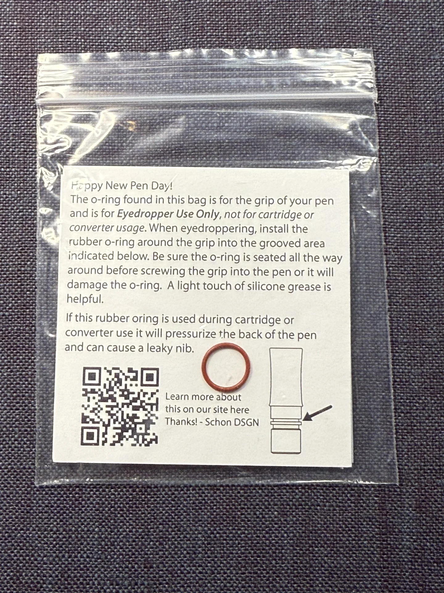
The Sashiko pen includes an o-ring for the grip for eyedropper use only.

The Sashiko pen costs $300 and comes equipped with a converter, an unbranded Jowo 6 nib from Extra Fine to Broad, and an o-ring (only for eyedroppering). If you want a nib grind for the Sashiko, you have to add that to your cart separately. You can also order a Monoc with a grind from Gena via email.

When I first saw the IG post announcing the Sashiko pen, I thought that it was cool, but probably not my thing. Despite being in the tongue-in-cheek Black Pen Society, I prefer more colorful pens. I’ve also felt that Ultem pens were a bit too light (weightwise) for me. But when I got to touch, hold, feel the pen in hand at the PNW Show, I was sold. It isn’t cheap but it wasn’t overly expensive either. I went from “it’s cool, but maybe not for me” to “this is more interesting than I expected it to be and I’m glad I get to buy one and support two wonderful people”.

A batch of 100 pens were made, with no current plans to make more. Gena will have them at their table at the upcoming DC Pen Show and SF Pen Show, as well as on their website.

(Disclaimer: The Sashiko Pen was purchased by me at full price from Gena at the 2025 Pacific Northwest Pen Show. I also paid regular price for the Journaler grind on the Broad nib. Everything else shown is also my own.)

Posted on July 25, 2025 and filed under Custom Nib Studio, Schon DSGN, Fountain Pens, Pen Reviews.

Monoc Monoc Monoc

(Kimberly (she/her) took the express train down the fountain pen/stationery rabbit hole and doesn't want to be rescued. She can be found on Instagram @allthehobbies because there really are many, many hobbies!.)

When Ian Schon first announced his in-house, titanium Monoc nib in late 2022, I rushed to pre-order it, picked it up a few months later at the Philly Pen Show, and ended up going through three converters’ worth of ink to write this Monoc review. Since then, I got a Bock Monoc with a Fine nib last year, and got the Cursive Monoc at the Baltimore Pen Show earlier this year.

Top to bottom: Fine, Medium, Cursive Monoc.

I won’t go into a lot of detail since that’s already been covered in the other article, but I wanted to share some writing samples since they all write differently. There is also a blog post that goes into more detail about the Monoc and has much better nib pictures than I can take.

One of the things that I like about the Monoc is that I can put them in a wide variety of pens that take #6 nib units, including Schon Dsgn Full Size and Pocket 6, Franklin-Christoph, and especially Montegrappa pens.

Left to right: Franklin-Christoph 46 in Italian Ice (Medium), Conid Minimalistica Monarch (Fine Bock), and Montegrappa Mia Everglades (Cursive.)

I will start with the Medium Monoc since that’s the one I’ve had the longest and used the most (in at least 7 different pens, some with multiple inkings). My Medium Monoc is a decently wet writer and produces lines that are a bit closer to a Medium-Broad Jowo, if such a thing existed. Each of these nibs are individually machined and hand-tuned by Ian (he’s the only one who tunes them) so there can be minor variations in wetness and width. I sometimes use drier inks to compensate - this time around I picked Robert Oster Viola, which is a lovely light purple ink but definitely on the dry side, even in this wet nib.

I love that all of the Monoc nibs can also be used to write on the reverse, that is, flipped around/rotated such that the feed is facing up. Some of the Monoc’s lines, as you will see, are more angle dependent. As a reminder, I am a high/steep angle writer (typically ~75 degrees) so my lower angle writing samples are a little messier. Paper and ink will also make a difference so keep that in mind when comparing writing samples.

Writing sample with the Medium Monoc, the reverse will give you a finer line. You can get more of a difference between the regular and reverse with a wetter ink. Writing angle doesn’t affect the line width much on either side.

Here is a writing sample with the Medium Monoc and Medium nibs from other brands: Graf von Faber-Castell Intuition (18kt gold), Lamy Studio (steel), Nahvalur Schuykill, Opus 88 Mini (Jowo 5 Medium), Platinum 3776, Sailor Pro Gear (21kt gold), Radius Settimo (Jowo 6 Medium), Sailor Pro Gear Slim (14kt gold), TWSBI Eco, Taccia Spectrum (Sailor steel), Kaweco Special.

The Bock Monoc has a Fine nib and is inked with a very wet ink, KWZ Monarch, in the Conid Minimalistica, which is also in a fairly wet pen. It has a smooth fine line on the regular, and a broad architect line on the reverse.

Writing sample with the Fine Monoc. Writing angle doesn’t make much of a difference on the regular but definitely does on the reverse.

Here is a writing sample with the Fine Monoc and nibs from other brands: Pilot Vanishing Point, Kaweco Sport, Platinum Plaisir 05, TWSBI Precision. On the reverse: Lamy Studio (steel B), Kaweco Sport (B), Lamy Accent (14kt gold M), Jowo Broad Architect, Lamy BB Architect (ground by Gena Salorino of Custom Nib Studio). The contrast of the Fine Monoc’s reverse down vs cross stroke isn’t as great as with a more traditional architect (the last two.)

Last and definitely not least, the Cursive Monoc isn’t a “regular” Monoc with a Cursive grind added to it. Ian says the Cursive Monoc starts off as its own nib shape (sorry, I can neither explain nor share the technical aspects) and then gets ground and tuned further to a smooth, “cursive italic”. I put that in quotes because Ian says it’s not a traditional cursive italic the way a nib grinder might describe it, but it’s definitely close enough to call it that. This grind makes narrow horizontal strokes and broader vertical strokes, giving noticeable line variation whether you are writing in cursive or print.

It is currently inked with an average wetness ink, Robert Oster x Vanness Pens Hemp, in a Montegrappa Mia. It has a smooth Medium to Medium Broad cursive italic line/variation on the regular, and an even broader line on the reverse than the Fine Monoc’s reverse.

Writing sample with the Cursive Monoc and nibs from other brands: Franklin-Christoph Fine SIG (Stub Italic Gradient), F-C Broad Stub (Masuyama), Jowo 1.1 (14k5 gold), Pelikan Steel Broad CI (Masuyama), F-C Medium SIG, Waterman Carene Stub (or BB, depending on who you ask), TWSBI Eco Broad & Fine “In Between” (Mark Bacas’ grind that’s “in between” a stub and a CI), and for the reverse, Lamy 2000 BB Architect by Gena Salorino, Jowo Broad Architect.

The writing angle doesn’t really impact the writing of any of the Monocs on their regular sides, nor for the Medium Monoc on the reverse. But on both the Fine and Cursive Monocs, the width of the reverse side is more angle dependent, moreso for the Fine than for the Cursive. Of the 3 Monocs, it’s hard to pick a favorite, but if I could only use one, it would be the Fine because I love how differently the regular and reverse sides write.

Here are a few things that Ian wanted folks to know:

  • The Bock-threaded Monocs aren’t listed on the website but they can be requested.
  • Monoc nibs have a 5-10 day fulfillment turnaround because they are made to order. If you need something sooner, please reach out to them in case there are some in stock.
  • If you see one of their nibs at a show or someone’s IG post but you don’t see it online, reach out to them to ask if it can be made. Ian and team will often make special anodized colors that might not be listed on the website.
  • Avoid using shimmer inks because the nib isn’t disassemble-able for thorough cleaning.
  • Schon Dsgn is 3 people and Ian is the only one who does the fine tuning on the Monocs, so be patient, especially around pen show time when some or all of them may be traveling. Definitely send them an email if you have any questions.

The Schon Dsgn Monoc starts at $385 for polished titanium. Anodized options are also available - prices vary depending on complexity of the anodization (nib anodizing is done in-house, while anodization on the aluminum pens are done elsewhere).

As I said in my other article and will say again, yes, it is an expensive purchase, and no, this is not a nib for everyone. I value the innovation that goes behind the research and design of these nibs. I also like the stiff, nail-like writing experience that it provides, and the reversibility of the nibs is twice the fun even though I don’t take advantage of the reverse as much as I should. If you’ve been thinking about getting one and it fits your budget, definitely check them out, especially if you’re reading this during this weekend’s Chicago Pen Show!

Posted on May 2, 2025 and filed under Schon DSGN, Nibs, Fountain Pens, Pen Reviews.

Schon DSGN Peek Fountain Pen Review

Schon DSGN Peek Fountain Pen Review

“I love engineered plastics!”

This is one of those phrases us pen fans wouldn’t say in mixed company. But here, among pen friends? Absolutely. And in my case, it is true. Give me all of the weird barrel materials-such as Ultem and Peek-that make for fun and unique fountain pen barrels.

This review is going to focus on the Schon DSGN Full Sized Peek Fountain Pen. What is Peek? Known as Polyether ether ketone, it is a thermoplastic used in applications that require high chemical and/or temperature resistance. For example, bearings, pistons, pumps, and a wide range of medical implants.

Schon DSGN Peek Fountain Pen

Do fountain pens need the high tolerances that those parts require? Not necessarily. But what Peek offers pen makers is a barrel material that is ultra light and exceedingly strong. This pen checks in at around 15 grams, with thin barrel walls that will be able to withstand much more than typical plastic barrel pens in the same weight class.

Schon DSGN Peek and Ultem

The Peek features the same o-ring setup as the Ultem, which you can see on the left.

Being a specialty material, you might guess that it comes with a cost. Peek is expensive, and poses different machining challenges than traditional acrylics and metals. That cost, $285 with a steel nib, does come with several Schon DSGN added features, such as internal o-rings throughout the grip section, barrel, and cap, making this a perfect pen to eyedropper fill. It’s quite a piece of work.

Schon DSGN Peek Fountain Pen

If there is one knock on Peek, it’s that many consider the color of the material to be-let’s see how I can be nice here-uninspiring. It’s 1980’s computer tower beige, and that’s it. That’s the color Peek comes in. I dig the weirdness, but it is not for everyone. I always make sure to have a fun ink color loaded up, such as magenta, to bring some excitement to the page. For my latest fill, I decided to go with a classic: Rohrer & Klingner Alt-Goldgrun.

Schon DSGN Peek Fountain Pen

The Schon DSGN Peek doesn’t have to be eydroppered. It is designed to fit standard international converters, which is what I use most of the time. I don’t need the mass ink capacity that eyedroppers offer, and I’ll admit that using a converter is safer if you think this pen might be banging around in a pocket or purse. It is tailor made to handle that, but I still lean towards converters the majority of the time.

Schon DSGN does offer a few mix-and-match options with the Peek barrel and the two colors, Amber and Black, of Ultem barrels. You can swap in a different grip section color between the three, and even swap into an Amber Ultem grip section to fit larger #8 size nibs. Mine is full Peek, but I did add a bit of uniqueness with the nib itself.

Mini Naginata Togi Nib Grind

At the San Francisco Pen show this past Summer, I bought one of Schon DSGN’s Full Sized Aluminum Barrel Fountain Pens, and had the option to add a Custom Nib Studio Mini Naginata-togi grind on a Jowo #6 Broad Steel nib. Yes please, I would like that very much! The standard Peek fountain pen is designed around the Jowo #6, so when I bought my pen second-hand I didn’t need a nib, and added this one right in.

This level of mix-and-match and cool materials is why I love stationery so much. Standard pens and paper give me plenty of these options, but fountain pens are the true playground. The Schon DSGN Peek is a perfect example.


Enjoy reading The Pen Addict? Then consider becoming a member to receive additional weekly content, giveaways, and discounts in The Pen Addict shop. Plus, you support me and the site directly, for which I am very grateful.

Membership starts at just $5/month, with a discounted annual option available. To find out more about membership click here and join us!

Schon DSGN Peek Fountain Pen
Posted on January 30, 2023 and filed under Schon DSGN, Fountain Pens, Pen Reviews.