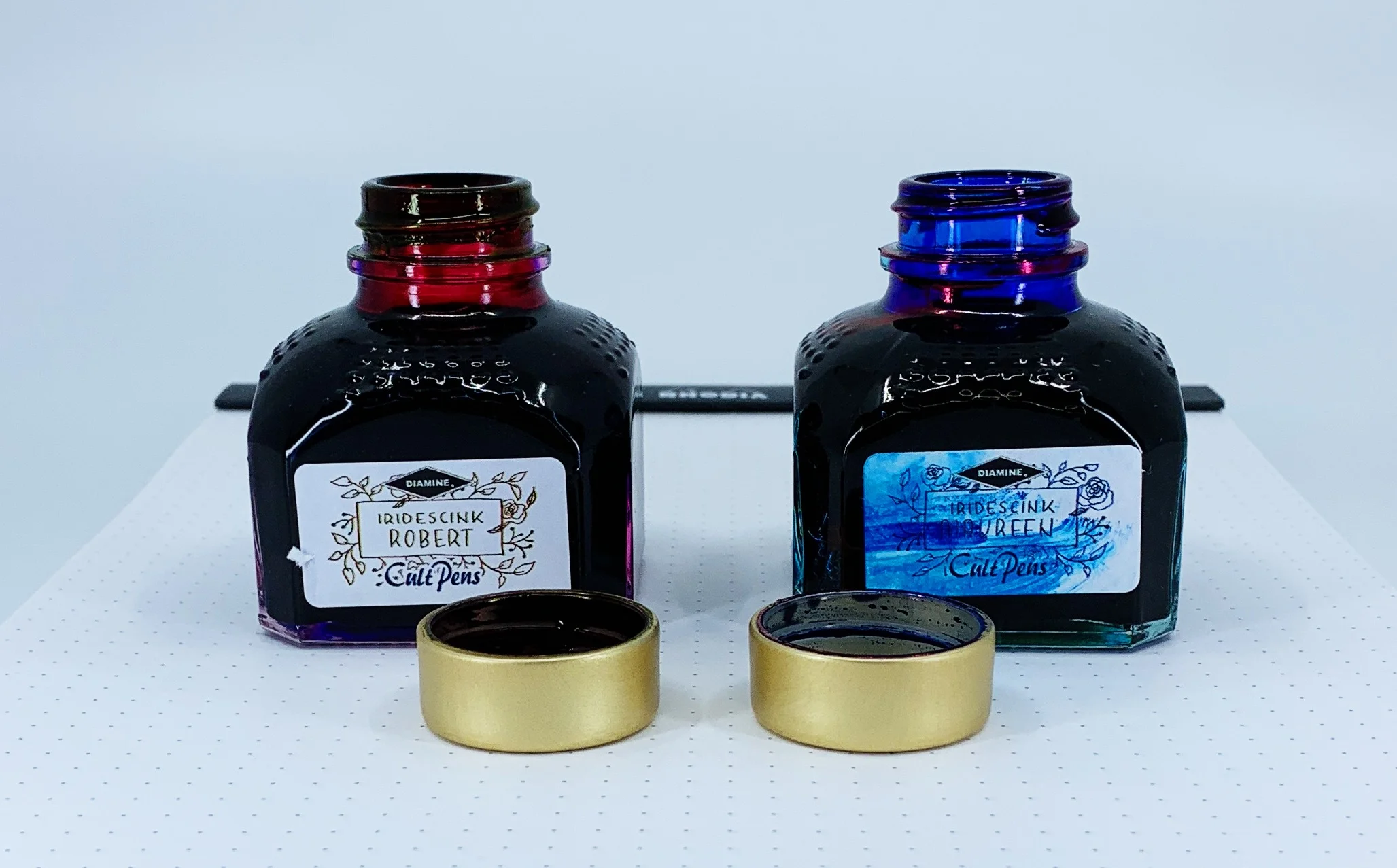
(Note: I'm not sure I've had a harder time accurately capturing two ink colors than these. It was challenging, and I'm still not happy with the results. No matter the lighting setup, I never fet I did them justice. YMMV.)
Over the past year or two I have taken a passive stance on two of the most popular ink trends: Shimmer and sheen. While I have admired them from afar, I haven’t wanted to use them myself. I’m not a big risk taker when it comes to fountain pen inks, although the siren’s call of their results on the page is breaking me down.
If I am going to head down one of these two shiny paths, sheen seems to be more my thing. And when I saw the first pictures of the new collaboration from Cult Pens and Diamine, I knew I was done for. Maureen and Robert are the ones for me.
Just look at the stock pictures and you will see why I am so enamored. The purple ink of Robert has a beautiful greenish-gold sheen, and Maureen’s deep and saturated blue ink pops with red. And these are not passive, slightly on the edge of the line, sheens. They are full-bore, 50-75% coverage sheens, if not more.
The kicker with these inks is do you like this type of effect when writing? Some people live for it. Others can do without. Big sheening inks have never been a priority for me because of my use of primarily extra fine nibs. Finer lines inherently don’t show off the ink properties as well, but Maureen and Robert are here to change my mind.
I inked up Maureen in my Pelikan M805 Ocean Swirl with an EF nib. This nib is essentially a Japanese Broad in line width, so I knew it would show off most of the ink properties, and it did. This is a rich, saturated blue, and I immediately though of Parker Penman Sapphire. Maureen may be a shade darker, but the way this ink behaves is awfully similar.
Robert was put into use in my Pilot Falcon. I purposely chose this soft fine nib to see how the ink would perform, and I have to say, it’s better than I thought. It may be the two nib choices, but I assumed I would prefer Maureen over Robert. I assumed incorrectly, as I’m enjoying the purple and green sheen out of the Falcon nib more.
To get the full effect of the sheen, you need to use a coated paper - like Rhodia - or the magic capabilities of Tomoe River. Basically, a paper where the ink takes longer to dry than is sometimes acceptable. That is the tradeoff to get the beautiful sheen of these inks to pop. Using them on a faster-drying paper like Leuchtturm deprives you of the main feature of these inks.
Swabs on Tomoe in a lightbox
With specialty inks like this, my main concern is: “Will I be able to use these for more than special occasions?” For Maureen and Robert, undoubtedly yes. I’ve enjoyed general every day writing with them, but I do make sure to use Rhodia for the most part. When I’ve used them on my favorite Nock and Studio Neat notebooks I haven’t enjoyed them nearly as much. I think you may even be able to get away with these in an office environment - if you bring your own paper.
Finally, and as I mentioned on the podcast recently, I have a soft spot for fun names, and fun stories about how they came to be. Fountain pen inks named Maureen and Robert? Sign me up!
There are many factors to consider when making a buying decision, and these inks tick all of my boxes. They are fun, functional, innovative, and have a great story behind them. They are also priced well, at £9.50 in the UK, or approximately $10.50 per 80ml bottle, minus the VAT. Big thanks to Cult Pens for send these my way for review.
(Cult Pens provided this product at no charge to The Pen Addict for review purposes.)
Enjoy reading The Pen Addict? Then consider becoming a member to receive additional weekly content, giveaways, and discounts in The Pen Addict shop. Plus, you support me and the site directly, for which I am very grateful.
Membership starts at just $5/month, with a discounted annual option available. To find out more about membership click here and join us!


