Posts filed under Fountain Pens

J. Herbin Eclat de Saphir Ink Review

If Iroshizuku Kon-peki is my favorite blue ink, then J. Herbin Éclat de Saphir is my close second.

Éclat de Saphir is a gorgeous, vibrant blue ink with lots of character and depth. I love how it pops off the page when I’m writing and even after it’s dried. I'm very pleased when inks retain the same level of saturation when they dry as when the ink is wet, and this ink is no exception.

Before I dive into the detailed notes, I do have some general comments about this ink. I love the color and shading qualities of this ink, but you really need to try it in a fine or larger nib (or medium and larger for Japanese nibs) to get the full effect. After playing with this ink for a while, I really want a stub nib. Secondly, many reviews I've seen on this ink praise its fast-drying property, as well as many other J. Herbin inks. This has not been the case for me with this ink. I don't know if I'm doing something wrong or if I'm just using wet nibs on heavy paper, but I would not say it's fast to dry. In my tests, it took about 20 seconds to dry to a point where it would not smudge when I brushed my finger across it. With that being said, it's still an excellent ink that I highly recommend.

J. Herbin Eclat de Saphir 3.jpg

This is one of the most well-behaved and easy to maintain inks I've tried. I currently only have cartridges, but will buy a bottle very soon so as to use it in even more pens. It's extremely easy to clean out of pens and washes off my fingers easily.

My favorite quality of this ink is the color. It's a medium to dark blue, very similar to what I think of as "royal" blue. It's nice and saturated, which is something I long for in inks. It has good lubrication and excellent flow in the handful of pens I've used so far.

On nice paper, this ink does not feather or show through the page. Sure, it does feather on cheap paper, but what ink doesn't?

The shading properties are fantastic. Again, I see a stub nib in my near future just so I can play with this beautiful ink some more.

Overall, this is one of my favorite inks and I can't wait to introduce it to more of my pens. Aside from my quibble with the drying time, it's close to a perfect ink for me. I'd like to hear from you if you have some information about the drying time or have advice on performing ink drying tests. Next time you're looking for a nice blue ink to try, grab some Éclat de Saphir.

J. Herbin Eclat de Saphir 1.jpg

(You can find more from Jeff online at Draft Evolution, Twitter, and App.net.)

Posted on January 31, 2014 and filed under Fountain Pens, J. Herbin, Ink Reviews.

Retro 51 Tornado Black Acrylic Fountain Pen Review

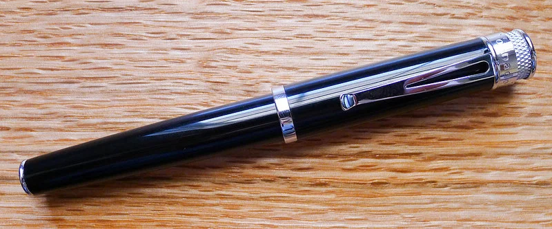
Retro 51 fountain pens have been on the market for a while now and I finally got my hands on one from JetPens. I went with the Black Acrylic - Fine Nib model and while it is beautiful and has a fantastic nib, there are a couple of issues keeping this pen from being a daily writer.

First off, the grip section is exceedingly poor for a pen of this quality. It is a cheap, slick plastic that does not fit in with the overall design of the pen. I'm assuming Retro 51 made this choice for a good reason, but for the life of me I don't know what it could be. Awkward looks aside, it is a bad gripping surface. My fingers slide constantly when writing.

Secondly, the balance is wrong in both posted and unposted writing modes. Unposted, the pen is too short, too light, and uncomfortable to write with. It is very close to an unposted Pilot Prera. I don't like writing with the Prera unposted either, but the difference is the Prera is perfectly weighted and balanced when posted. The Retro 51 is not. The sexy cap bling and knurling make the pen too top heavy.

The Schmidt nib, on the other hand, is good. As in really, really good. I chose a fine nib and it is smooth, consistent, and a true joy to write with. The barrel design outstanding as well, as we all have come to expect from this popular pen maker.

In the end, the problem with this pen is there is no middle ground. The nib and design are 10's, the section and balance are 1's. I expect a more functional pen than this from Retro 51.

(JetPens is an advertiser on The Pen Addict and I received this product at no charge.)

Posted on January 22, 2014 and filed under Fountain Pens, Pen Reviews, Retro 51.

Guest Review: Vintage 1950s Montblanc Meisterstück 146 Fountain Pen

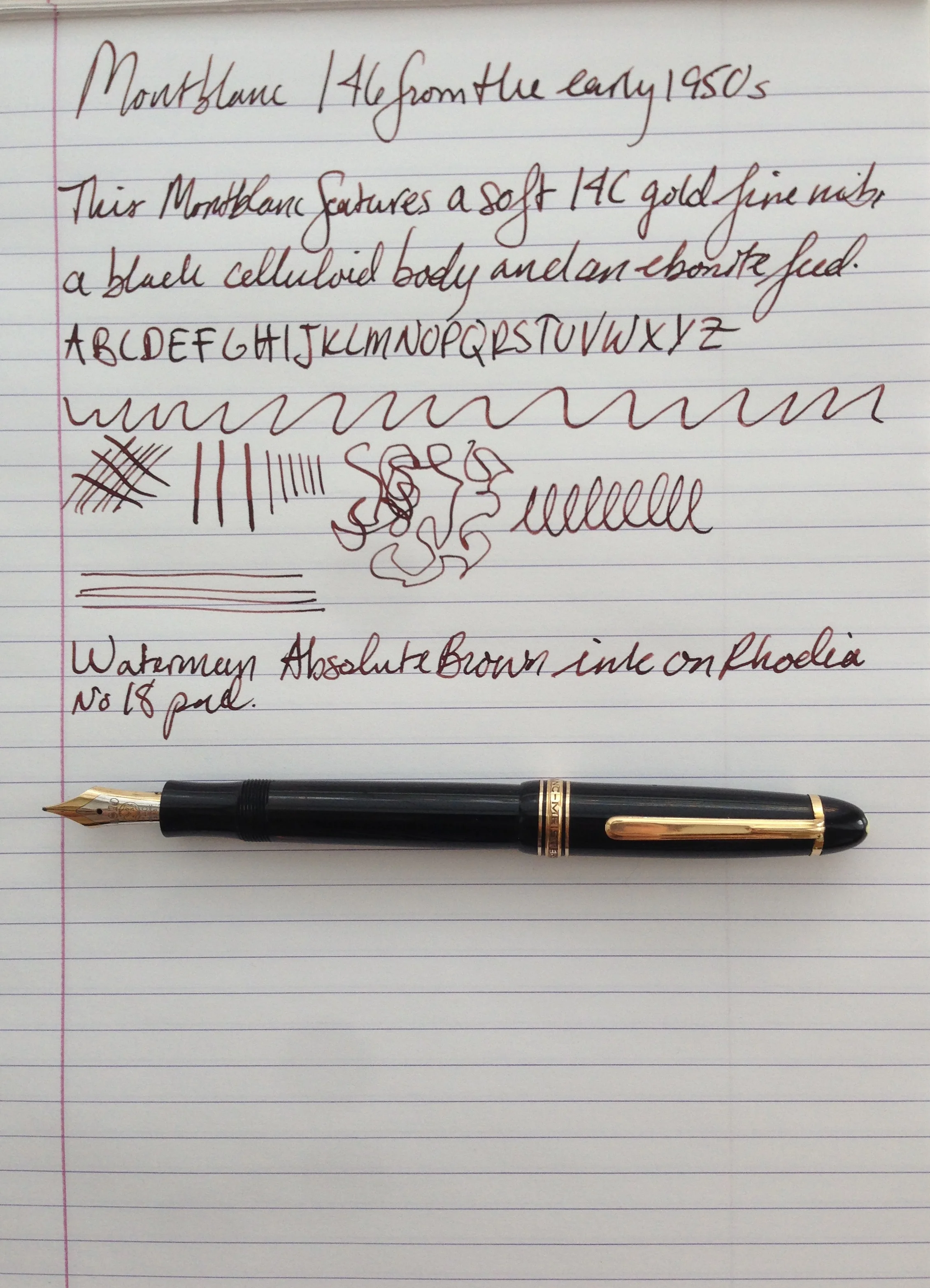
If you are reading this blog you likely have a grail pen, something that you think is beyond or in some way more exciting than what is in your current collection. I have been collecting fountain pens for almost 10 years now and I strive to buy great writers over anything else. With the help of some friends at the Fountain Pen Network I landed on the Montblanc 146, specifically one from the early 1950s as the pens of this era had the most appealing features of the Meisterstück (masterpiece) line: a celluloid body, a softer 14C gold nib, and the flat ebonite “ski slope” style feed.

Montblanc 1

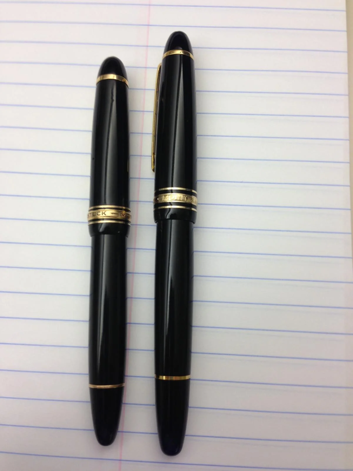
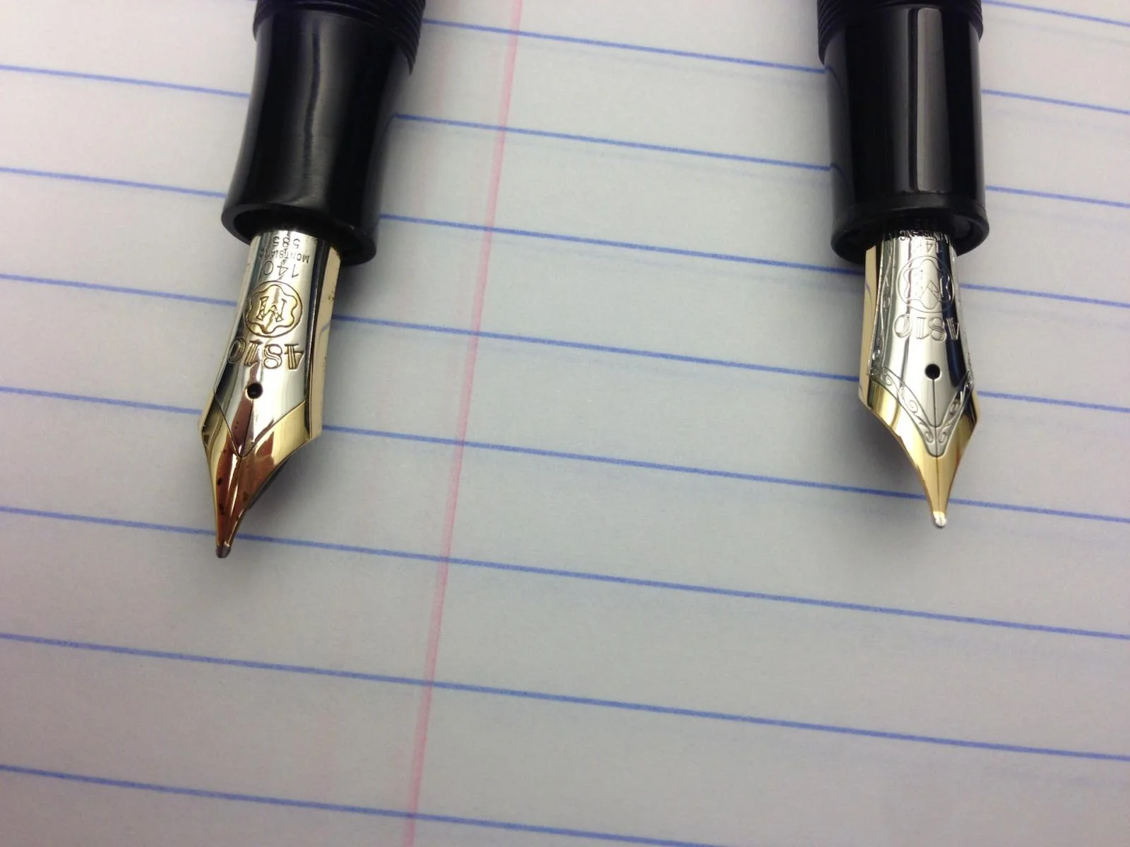
The 146 is a piston fill fountain pen that is larger than the 144 (Classique) and smaller than the 149. Compared with the modern 146 (often referred to as the “LeGrand”) the vintage 146 is slightly shorter with a shapelier barrel and deeper engravings on the gold furniture. The vintage 146 also has a larger more attractive two-tone 14-carat gold nib.

Montblanc 2
Montblanc 3

Vintage 146 Nib on the left, modern 146 nib on the right.

The 146 fits comfortably in my hand and weighs approximately 26 grams full of ink, and 18.5 grams uncapped. This pen does not post well. I have to apply more pressure than I would like to get the cap to sit straight on the body so I usually write with it uncapped. At 4.75” uncapped and just under 5.5” capped (not posted) it’s average sized and will be comfortable for most people to use.

The nib is the softest non-flex nib that I have used and provides some mild line variation. The buttery soft springy writing experience makes the 146 one of my favorite fountain pens. The nib writes wide and wet for a fine. The pen always starts right away and does not skip. I have left the cap off for over a half hour and it started without a hitch.

Montblanc 4

The vintage 146 uses a unique two-stage piston filling system that holds a lot of ink. You unscrew the piston knob, which will come up away from the body, but this does not move the piston. You keep twisting until you feel a transition at this point the knob becomes harder to turn (but still smooth) and no longer moves away from the body; it is at this stage that the piston moves. The mechanism behind this is complicated and likely discontinued due to cost. One weak point is the cork piston head; it is likely less durable than the synthetic ones found in most modern pens.

Being around 60 years old there is some loss of plate on the gold furniture but overall it is in great shape. If you look closely you can see that the nib tines are not in perfect alignment but the pen writes without a hitch so I haven’t been in a huge rush to get it to a nibmeister.

Montblanc 5

The prices of these pens have been going up and can be bought between $500-$700 on auction sites and for around $900 from a reputable dealer of vintage pens (I highly recommend the latter option). I bought mine on an auction site and got lucky as my pen turned out to be in great shape and functioned wonderfully.

To me the price is worth it as it offers a fantastic writing experience with an elegant high quality body but these pens can be tricky to buy and even trickier to fix if you get a bad one. I highly recommend the vintage 146 to experienced fountain pen users.

Posted on January 15, 2014 and filed under Fountain Pens, Pen Reviews, Montblanc.