Posts filed under Fountain Pens

Kaigelu 316 Review

Kaigelu 316.jpg

After seeing a couple of different reviews about affordable pens from China, I decided to take a chance and order a few. The first one I received was a Kaigelu 316. So, is the price difference worth it? In a word, no – not in this case at least.

A quick explanation

Why did I go out on a limb and buy a $33 pen from China? It's something new to try. Granted, most of the pens you can find on eBay that are made by companies like Kaigelu, Hero, or Jinhao aren't even close to $33. Normally, they're less than $10. I really liked the look of the barrel material in the photos, so I decided to take a chance. There's something so enjoyable about landing a really great deal for something that provides a lot of value. I was looking for the rush of getting something that feels and performs like something that costs 5 times more.

Kaigelu 316.jpg

Look and feel

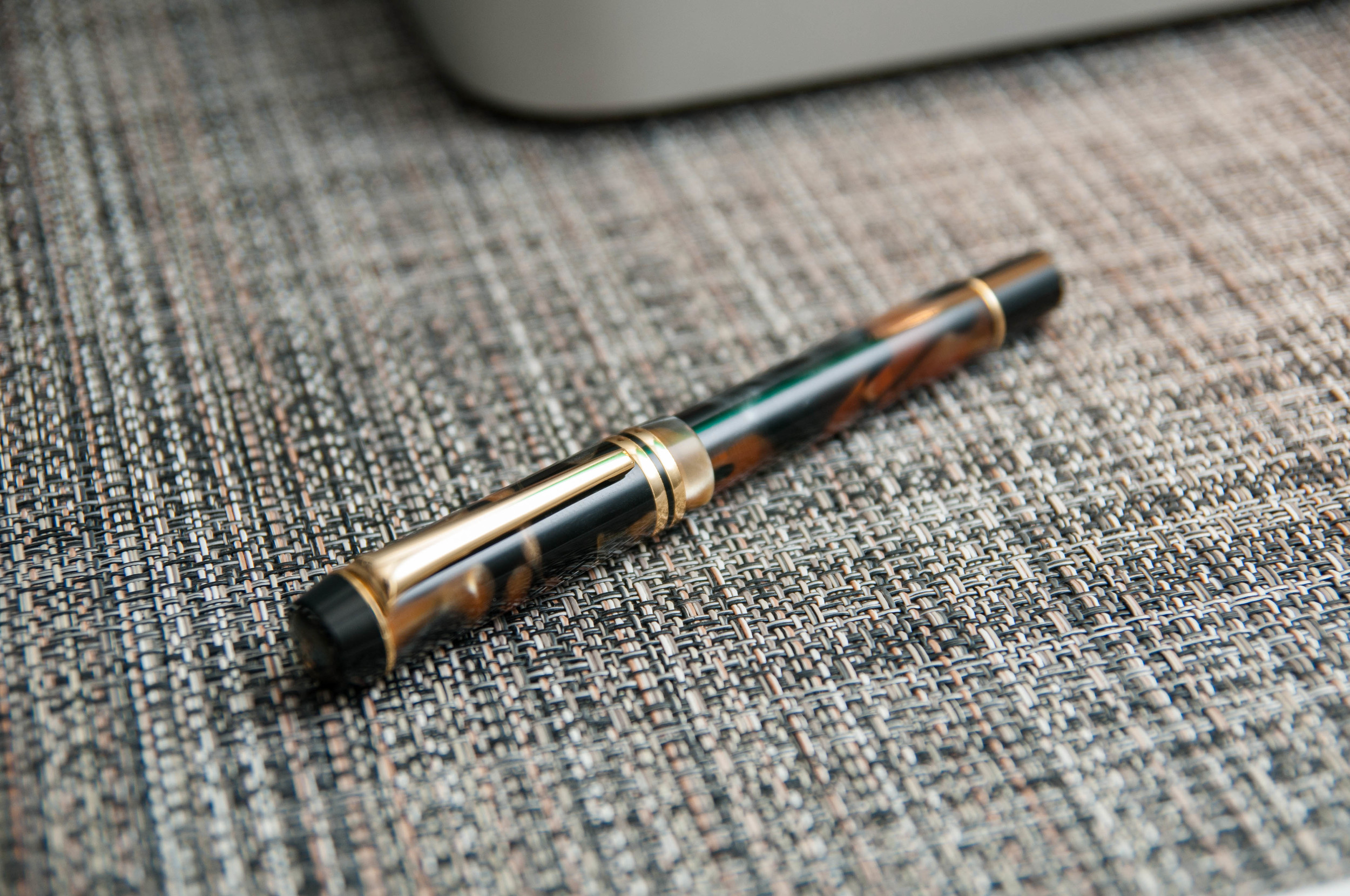
The color of the 316 that I ordered is called "Tiger Eye." It's a blend of warm orange, gray, and black. It looks handsome in soft light, and gives a 3D look because of the different layers of color in the celluloid. The metal accents are a cheap looking gold. There's a large button on the top of the cap with the Kaigelu logo, which is a kangaroo. As far as I can tell, a medium nib is the only option. The pen came with a converter and was packaged in a decorated cardboard box.

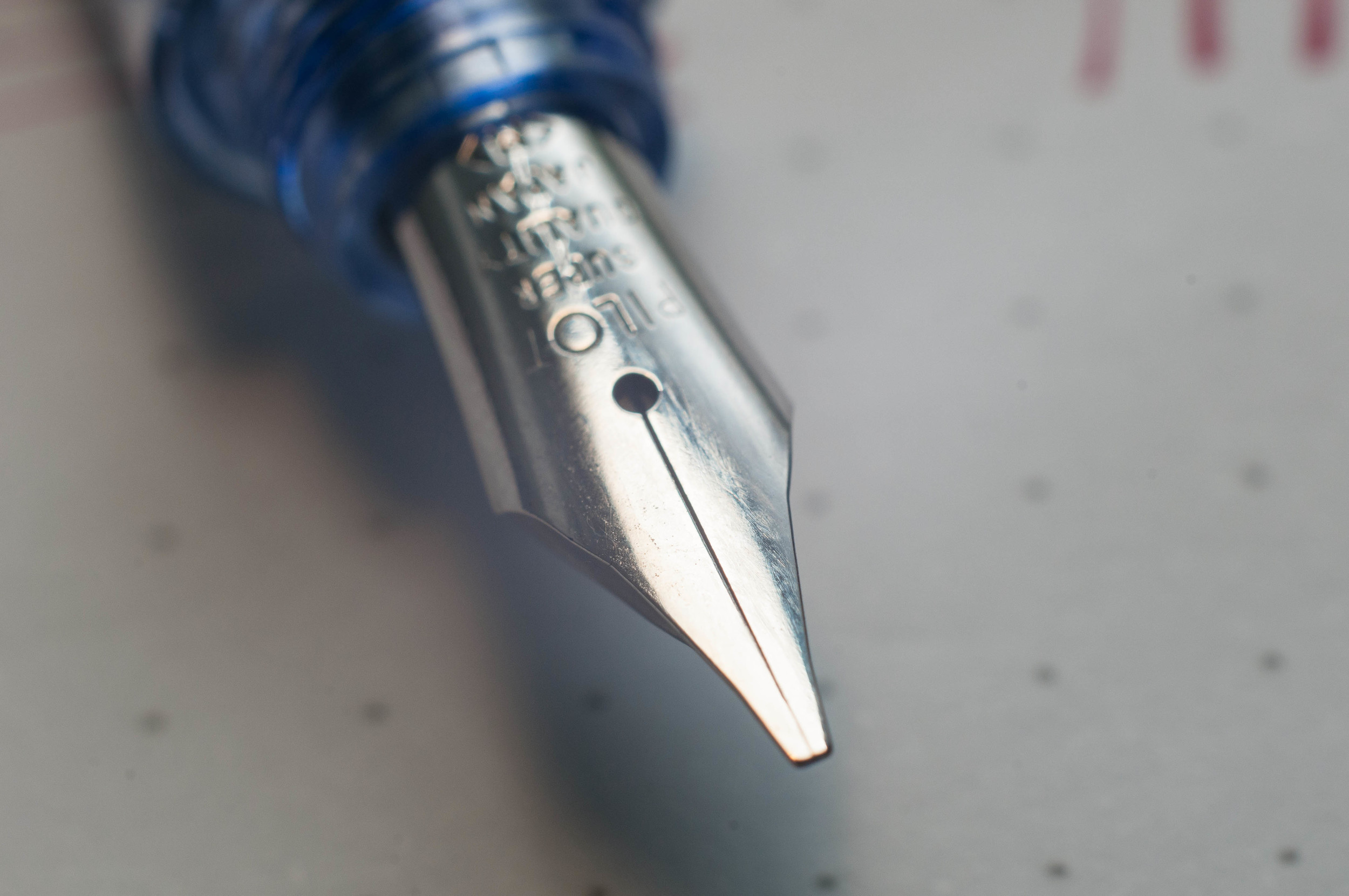
The nib has a nice two-tone look with another kangaroo etched into the nib, along with "KAIGELU" just beneath it. I really like the look of the nib.

The pen has a heft to it that was new to me. I've never felt a pen this heavy. To make sure I wasn't imagining anything, I grabbed our kitchen scale to do a few quick comparisons. Turns out, this pen is actually overweight compared to others.

  • Kaigelu 316 - 46g (capped), 31g (no cap)
  • Lamy Studio - 33g, 24g
  • Lamy Vista - 21g, 10g
  • Kaweco AL Sport (with clip) - 24g, 13g

As you can see, the uncapped Kaigelu is a tad lighter than the uncapped Studio. I tend to normally write without the cap posted, so this is a pretty accurate comparison for me. Oddly enough, the bulk of the weight in the Kaigelu body is toward the rear of the pen, not the nib section. This can make for an awkward writing feel.

The converter worked great, but it does have one deal-breaker for me. There's a small metal ball bearing inside the ink chamber that tends to rattle around. This makes the pen feel and sound cheap. I assume the bearing is there to keep the ink from clotting, but I can't say for sure.

The cap screws onto the body when capped. On the particular copy of the pen I have, the threads don't have a satisfying "end" when screwing the cap on. On every pen that I have with a screw on cap, there's a very definite end point to the threads. You know for certain when the cap is completely secured and you can't possible turn it any further. This isn't the case with my 316 – it feelsl ike I could continue turning the cap onto the body. I haven't been able to find an "end" to the threads, and I'm always concerned that I'm causing some sort of damage to the pen or that I won't be able to uncap it later.

Kaigelu 316 vs Lamy.jpg

Writing performance

Yikes. The nib had a serious case of baby's bottom when I first inked it up. After 5 minutes of nib smoothing, it started writing like a charm. Despite the smooth nib and plentiful flow of ink, I can't write with this pen for more than a few paragraphs because of the weight. It's difficult for me to keep my handwriting neat because of the top-heavy nature of the pen. It wants to topple over, and that causes the nib to take its own direction sometimes when forming letters.

In short, I pick the pen up because I think it looks pretty, but put it back down shortly after because the writing feel is off-putting.

Overall

In retrospect, I wish I spent the $33 on a different pen. The Kaigelu 316 writes and feels similar to a Jinhao that I have, but the Jinhao cost $6. I wish I had more positive things to say, but it ultimately boils down to the fact that the pen isn't pleasing to use.

In my case, the cost of the Kaigelu 316 greatly outweighed the value.

(You can find more from Jeff online at Draft Evolution, Twitter, and App.net.)

Kaigelu 316 Barrel.jpg
Kaigelu 316 Review.jpg
Posted on March 19, 2014 and filed under Fountain Pens, Pen Reviews, Kaigelu.

Pilot Plumix Review

Pilot Plumix.jpg

I've taken my first dip into the world of squared nibs, and I'm afraid I'll have to jump all the way in before long.

The Pilot Plumix with a medium italic nib is my first experience with an italic nib. From what I understand, the italic nib is different than a stub nib, but similar. I did a little research and found this article on Richard Binder's site that explains the difference. Italic nibs are squared off while stub nibs are rounded off a bit. This information will become relevant a little later in this review.

Pilot Plumix Open.jpg

Looks

The Plumix is made almost entirely of plastic, save the nib. Even though it's made of a cheap material, it doesn't feel cheap. The plastic is sturdy and has a gem-like appearance that makes it pleasing to look at in certain light.

The grip section has a triangular grip that resembles what you find on a Lamy Safari. In my use, I prefer the grip of the Safari over the Plumix. If it were up to me, I'd stick with a plain grip section. I'm sure Pilot representatives are listening and will change their entire design to please me. Right?

There's an interesting bulb further down the body of the pen, just past the grip section. The bulb faces down (opposite the top of the nib) and provides some support when writing by snugging up to the space where your thumb meets your hand. I thought the design was a little odd when I first saw the pen, but I have to admit I really like this feature. An added bonus of this bulb is that it keeps the pen from rolling. This is important since the pen has no clip.

The fact that there is no clip on this pen isn't a huge deal for me, but it does mean I don't want to take it out with me. Pilot did integrate some small tabs on the lid of the pen to keep it from rolling.

One of the strangest things about this pen is the cap. It's tiny. It's only long enough to cover the nib and screw onto the section. I've never seen a cap that's so small. Surprisingly, it posts to the end of the pen, but it's not sturdy enough for my taste. A slight bump will send it tottering across the desk.

Overall, the build of this pen is better than I expected for the price. It's actually quite pleasant to hold and use. The quirky design is endearing to me.

Pilot Plumix Nib.jpg

Writing experience

In my mind, this nib would create a large, dramatic line variation that would rival calligraphy nibs. In reality, a Japanese medium is not that wide to begin with. The nib lays down a line that's a bit thicker than a regular medium nib when drawing with the flat side of the nib square to the paper (the thick end). If you turn the nib sideways, it lays down a really fine line.

The nib is smooth and has no starting or skipping issues. It ran a bit on the dry side for me. I'm not sure if this is a common issue, but it did annoy me several times. On the other hand, it also forced me to slow down to get the adequate ink flow that I wanted. This was good practice and actually improved my handwriting.

The pen ships with a standard blue Pilot cartridge. I skipped that entirely and went with one of the bulb converters from one of my Metropolitans. I tried several inks in the pen, and found that they were all a bit dry. My only guess is that the feed might need an adjustment or that the wide nib is spreading the ink further. I'd love to know if anyone else has mentioned or noticed anything similar.

The italic nib caused some trouble for me. The squared off edges don't play nice with thin or cheap paper. This nib is definitely much happier with a nice, smooth paper. It's because of this nib that I'm convinced one of my next fountain pens will be a stub. I imagine a stub is better suited to everyday writing. I'll keep the Plumix around to help me improve my handwriting.

Pilot Plumix Comparison.jpg

Conclusion

Overall, this is an excellent deal for a quirky little pen that will open your eyes to a different world of nibs. And if you're already a member of this other nib world, it's still fun to try the nib and the shape of the pen.

The Plumix is available in purple, light blue, and black. When I purchased the pen, I was under the impression that purple was the only color. Bummer. That light blue looks awesome. But, it's fairly easy to swap the nib to a Metropolitan or a Prera body, so that opens up a lot of style options.

If you're in the mood for an affordable, quirky italic pen, try out the Plumix.

(You can find more from Jeff online at Draft Evolution, Twitter, and App.net.)

Pilot Plumix Sample.jpg
Posted on March 5, 2014 and filed under Fountain Pens, Pen Reviews, Pilot.

Sailor Reglus Fountain Pen Review

Outside of the Sailor Clear Candy there are not many opportunities to own a Sailor fountain pen under $150. Granted, the more expensive models come with 14k gold nibs, but the Sailor Reglus can hold its own with some of the pricier Sailor options on the market.

As with any Sailor I have ever used, the nib is the standout. The Reglus comes stock with a steel fine nib that is smooth, clean and enjoyable to write with. I loaded mine up with Sailor Nano Ultra Black ink cartridges and they are a perfect match. The cartridges desrve a review of their own one day but they are spectacular and have me not even considering using a converter in the Reglus. It's a perfect combination.

The barrel design of the Reglus is excellent as well. The shape is slightly narrower than many fountain pens but it is by no means skinny. Think of it around the size of a larger gel ink pen barrel like the Pentel Energel and narrower than more common fountain pens like the Lamy Safari. The cap snaps on and off both ends of the barrel, and that leads to one minor issue: Unthreaded metal on metal cap connections allow for rotation. I didn't find it to be a nuisance when writing but you will get some spin movement if you are looking for it.

It was a no-brainer for me to go with the orange barrel, but after receiving it I think I would have preferred one of the darker barrels. The shade is a little light and and the pearlescent sheen a little too sparkly. The blue, black, and gray all look like great choices instead. The clip is a big win though. Very tight and the dagger design is spot on.

As I review the Sailor Reglus I cannot help but think of the Pelikan M205. They both hold a similar place in their respective product lines, and both offer a high quality entry into their brands. If you force me to pick one I'll take the M205 for the piston filling mechanism but the Reglus gets heavy use in my rotation.

(JetPens is an advertiser on The Pen Addict and I received this product at no charge.)

Sailor Reglus Review.jpg
Posted on February 24, 2014 and filed under Fountain Pens, Pen Reviews, Sailor.