Posts filed under Fountain Pens

Pelikan M215 Rings Fountain Pen Review

So you broke down and bought a Pelikan M205 and you love it, right? It is an amazing pen that writes wonderfully, looks beautiful, and will last for decades. Your Pelikan fountain pen needs have been met! Or so you think.

Businesses love consumers like me and you. We obsess over the small details, latch on to the things we love, think we have found perfection, and slam our wallets shut.

Squirrel!

What is that bright and shiny thing over there? You made a product I already think is perfection even better? Just take my money now!

Thanks a lot Pelikan.

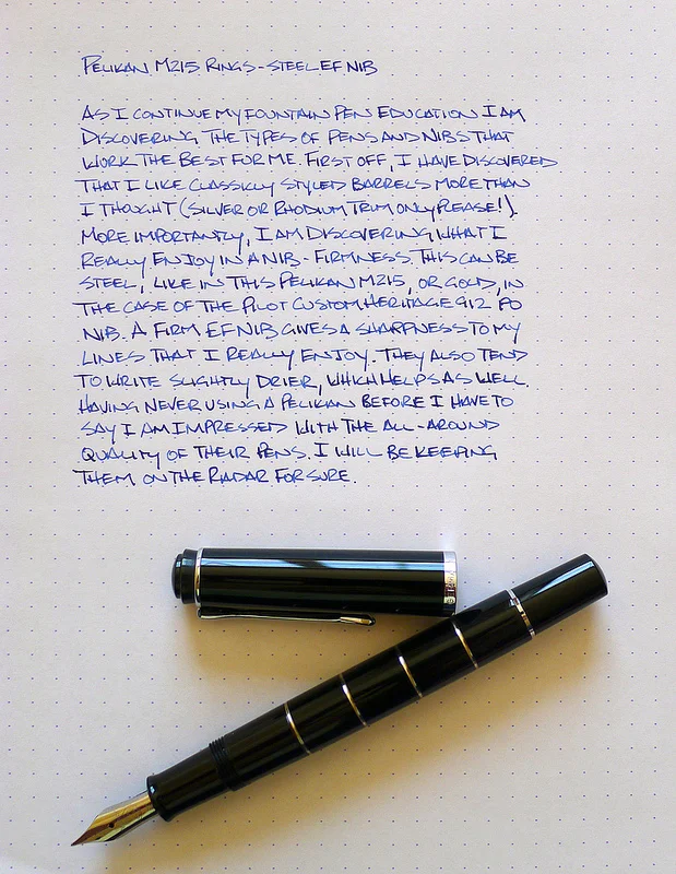
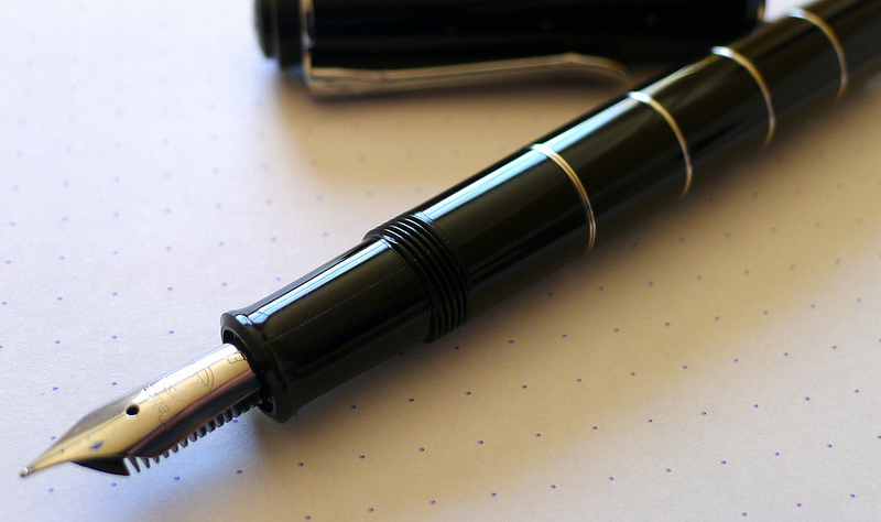
The M205 is a near-flawless pen in my mind. The only teeny tiny thing that could be improved on is the overall weight. The M215 Rings model takes care of that by using the same M205 design and adding five metal rings to the barrel. This gives the pen some added heft that many writers may prefer over the base model M205. It's not a huge amount - 20 grams for the M215, 14 for the M205 - but you absolutely notice it when writing. It feels great.

My buddy Thomas loaned me this pen over a year ago, and the written portion of this review was done around then as well. At that time, I didn't own a Pelikan of my own, but a few short weeks later I bought an M405 at the Atlanta Pen Show. That was followed later in the year by my M205. To say I've been bitten by the Pelikan beak is accurate.

Thomas has since sent me the now discontinued M215 Blue Stripe model, which is a beauty, and the 2014 Atlanta Pen Show is only a few weeks away. I don't really have a shopping list for the show this year but the odds are good that I add another bird to the flock.

For more, check out Brian's review from way back in 2009. I wonder if he still uses his?

Posted on March 21, 2014 and filed under Fountain Pens, Pen Reviews, Pelikan.

Kaigelu 316 Review

Kaigelu 316.jpg

After seeing a couple of different reviews about affordable pens from China, I decided to take a chance and order a few. The first one I received was a Kaigelu 316. So, is the price difference worth it? In a word, no – not in this case at least.

A quick explanation

Why did I go out on a limb and buy a $33 pen from China? It's something new to try. Granted, most of the pens you can find on eBay that are made by companies like Kaigelu, Hero, or Jinhao aren't even close to $33. Normally, they're less than $10. I really liked the look of the barrel material in the photos, so I decided to take a chance. There's something so enjoyable about landing a really great deal for something that provides a lot of value. I was looking for the rush of getting something that feels and performs like something that costs 5 times more.

Kaigelu 316.jpg

Look and feel

The color of the 316 that I ordered is called "Tiger Eye." It's a blend of warm orange, gray, and black. It looks handsome in soft light, and gives a 3D look because of the different layers of color in the celluloid. The metal accents are a cheap looking gold. There's a large button on the top of the cap with the Kaigelu logo, which is a kangaroo. As far as I can tell, a medium nib is the only option. The pen came with a converter and was packaged in a decorated cardboard box.

The nib has a nice two-tone look with another kangaroo etched into the nib, along with "KAIGELU" just beneath it. I really like the look of the nib.

The pen has a heft to it that was new to me. I've never felt a pen this heavy. To make sure I wasn't imagining anything, I grabbed our kitchen scale to do a few quick comparisons. Turns out, this pen is actually overweight compared to others.

  • Kaigelu 316 - 46g (capped), 31g (no cap)
  • Lamy Studio - 33g, 24g
  • Lamy Vista - 21g, 10g
  • Kaweco AL Sport (with clip) - 24g, 13g

As you can see, the uncapped Kaigelu is a tad lighter than the uncapped Studio. I tend to normally write without the cap posted, so this is a pretty accurate comparison for me. Oddly enough, the bulk of the weight in the Kaigelu body is toward the rear of the pen, not the nib section. This can make for an awkward writing feel.

The converter worked great, but it does have one deal-breaker for me. There's a small metal ball bearing inside the ink chamber that tends to rattle around. This makes the pen feel and sound cheap. I assume the bearing is there to keep the ink from clotting, but I can't say for sure.

The cap screws onto the body when capped. On the particular copy of the pen I have, the threads don't have a satisfying "end" when screwing the cap on. On every pen that I have with a screw on cap, there's a very definite end point to the threads. You know for certain when the cap is completely secured and you can't possible turn it any further. This isn't the case with my 316 – it feelsl ike I could continue turning the cap onto the body. I haven't been able to find an "end" to the threads, and I'm always concerned that I'm causing some sort of damage to the pen or that I won't be able to uncap it later.

Kaigelu 316 vs Lamy.jpg

Writing performance

Yikes. The nib had a serious case of baby's bottom when I first inked it up. After 5 minutes of nib smoothing, it started writing like a charm. Despite the smooth nib and plentiful flow of ink, I can't write with this pen for more than a few paragraphs because of the weight. It's difficult for me to keep my handwriting neat because of the top-heavy nature of the pen. It wants to topple over, and that causes the nib to take its own direction sometimes when forming letters.

In short, I pick the pen up because I think it looks pretty, but put it back down shortly after because the writing feel is off-putting.

Overall

In retrospect, I wish I spent the $33 on a different pen. The Kaigelu 316 writes and feels similar to a Jinhao that I have, but the Jinhao cost $6. I wish I had more positive things to say, but it ultimately boils down to the fact that the pen isn't pleasing to use.

In my case, the cost of the Kaigelu 316 greatly outweighed the value.

(You can find more from Jeff online at Draft Evolution, Twitter, and App.net.)

Kaigelu 316 Barrel.jpg
Kaigelu 316 Review.jpg
Posted on March 19, 2014 and filed under Fountain Pens, Pen Reviews, Kaigelu.

Pilot Plumix Review

Pilot Plumix.jpg

I've taken my first dip into the world of squared nibs, and I'm afraid I'll have to jump all the way in before long.

The Pilot Plumix with a medium italic nib is my first experience with an italic nib. From what I understand, the italic nib is different than a stub nib, but similar. I did a little research and found this article on Richard Binder's site that explains the difference. Italic nibs are squared off while stub nibs are rounded off a bit. This information will become relevant a little later in this review.

Pilot Plumix Open.jpg

Looks

The Plumix is made almost entirely of plastic, save the nib. Even though it's made of a cheap material, it doesn't feel cheap. The plastic is sturdy and has a gem-like appearance that makes it pleasing to look at in certain light.

The grip section has a triangular grip that resembles what you find on a Lamy Safari. In my use, I prefer the grip of the Safari over the Plumix. If it were up to me, I'd stick with a plain grip section. I'm sure Pilot representatives are listening and will change their entire design to please me. Right?

There's an interesting bulb further down the body of the pen, just past the grip section. The bulb faces down (opposite the top of the nib) and provides some support when writing by snugging up to the space where your thumb meets your hand. I thought the design was a little odd when I first saw the pen, but I have to admit I really like this feature. An added bonus of this bulb is that it keeps the pen from rolling. This is important since the pen has no clip.

The fact that there is no clip on this pen isn't a huge deal for me, but it does mean I don't want to take it out with me. Pilot did integrate some small tabs on the lid of the pen to keep it from rolling.

One of the strangest things about this pen is the cap. It's tiny. It's only long enough to cover the nib and screw onto the section. I've never seen a cap that's so small. Surprisingly, it posts to the end of the pen, but it's not sturdy enough for my taste. A slight bump will send it tottering across the desk.

Overall, the build of this pen is better than I expected for the price. It's actually quite pleasant to hold and use. The quirky design is endearing to me.

Pilot Plumix Nib.jpg

Writing experience

In my mind, this nib would create a large, dramatic line variation that would rival calligraphy nibs. In reality, a Japanese medium is not that wide to begin with. The nib lays down a line that's a bit thicker than a regular medium nib when drawing with the flat side of the nib square to the paper (the thick end). If you turn the nib sideways, it lays down a really fine line.

The nib is smooth and has no starting or skipping issues. It ran a bit on the dry side for me. I'm not sure if this is a common issue, but it did annoy me several times. On the other hand, it also forced me to slow down to get the adequate ink flow that I wanted. This was good practice and actually improved my handwriting.

The pen ships with a standard blue Pilot cartridge. I skipped that entirely and went with one of the bulb converters from one of my Metropolitans. I tried several inks in the pen, and found that they were all a bit dry. My only guess is that the feed might need an adjustment or that the wide nib is spreading the ink further. I'd love to know if anyone else has mentioned or noticed anything similar.

The italic nib caused some trouble for me. The squared off edges don't play nice with thin or cheap paper. This nib is definitely much happier with a nice, smooth paper. It's because of this nib that I'm convinced one of my next fountain pens will be a stub. I imagine a stub is better suited to everyday writing. I'll keep the Plumix around to help me improve my handwriting.

Pilot Plumix Comparison.jpg

Conclusion

Overall, this is an excellent deal for a quirky little pen that will open your eyes to a different world of nibs. And if you're already a member of this other nib world, it's still fun to try the nib and the shape of the pen.

The Plumix is available in purple, light blue, and black. When I purchased the pen, I was under the impression that purple was the only color. Bummer. That light blue looks awesome. But, it's fairly easy to swap the nib to a Metropolitan or a Prera body, so that opens up a lot of style options.

If you're in the mood for an affordable, quirky italic pen, try out the Plumix.

(You can find more from Jeff online at Draft Evolution, Twitter, and App.net.)

Pilot Plumix Sample.jpg
Posted on March 5, 2014 and filed under Fountain Pens, Pen Reviews, Pilot.