Posts filed under Fountain Pens

Franklin-Christoph Model 65 Stabilis Review

(Susan M. Pigott is a fountain pen collector, pen and paperholic, photographer, and professor. You can find more from Susan on her blog Scribalishess.)

Well, I'm eating crow, that's for sure. In my review of the Franklin-Christoph Model 19, I claimed that I was not interested in the ice models that the company makes. I now own an ice model, and it is one of the coolest pens I own (pun intended).

I sent back the Model 19 after I decided it was too big for my hand. Following many emails back-and-forth with Lori in customer service (she gets new angel's wings every time I email her), I finally decided on the Model 65 Stabilis in ice. What made me change my tune? I saw a video review of a different ice model which the reviewer had eyedroppered. When the ice is filled to the brim with ink, the result is simply magical.

The pen transforms into whatever color the ink is, but, because the acrylic looks like ice, the ink sparkles inside. The effect is unlike any demonstrator pen I've owned.

The Model 65 Stabilis is the smaller version of Franklin-Christoph's desk pens with a #5 nib (the model 65 is longer and takes the larger #6 nib). The name Stabilis comes from the pen's unique design. The barrel is round except for one small portion that is flat. This allows the user to place the pen on a desk without worrying that it will roll off. It's genius, really.

The flat side is etched with the words "Franklin-Christoph Model 65." This branding is unobtrusive but classy, especially when you see it reflected in sunlight.

Another design element that makes this pen stand out is the cap threads. Instead of the threads being on the barrel, they are at the top of the grip section. Not only does that mean your fingers never feel the threads while writing, but the threads act as the barrier between your fingers and the nib. Why didn't someone think of this sooner?

Like most Franklin-Christoph pens, the Model 65 can be used with cartridges or a converter (both are included with the pen). The fact that you can also transform the pen into an eyedropper makes it even better.

The Model 65 is light, weighing only .06 oz/17grams without ink. It measures 5.35 inches in length capped, 5.6 inches uncapped, and 6.2 inches posted. The barrel diameter ranges from .51 inches to .39 inches near the grip. The Stabilis is a full-length pen with a comfortable barrel size. The acrylic makes it extremely light and easy to write with.

I don't normally post my pens, but I tried writing with the Stabilis posted just to see how it felt. I thought posting threw the balance off slightly, but it's a subjective thing. The cap is rather small, and it's completely round (no flat side), so it can roll off the desk pretty easily. I stand it up vertically so it won't roll.

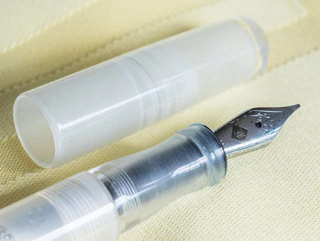
For this pen, I decided to get the Mike Masuyama stainless-steel medium italic nib.

It is fantastic. In all honesty, I cannot tell the difference between this stainless steel nib and the 18k nib I had on the Model 19. In fact, I like this nib's design better–an understated "F" in an etched diamond and scroll work.

I thought the italic might be more finicky than the medium stub I had on the Model 19, but it is smooth and has a wide sweet spot. It produces a nice, crisp line and doesn't catch on the paper.

I emptied the pen after making it into an eyedropper to see how hard it is to get the ink out. I rinsed the barrel with water first, but I noticed ink residue near the bottom. I used some pen wash, shook it up pretty well, and rinsed again. Even using a Q-tip didn't get that little bit of residue out. If it makes me crazy, I'll try soaking it all night.

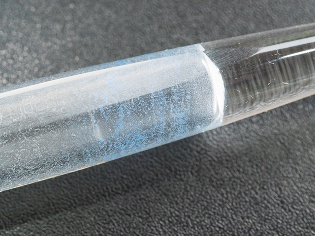
I disassembled the nib unit and all the ink accumulated there cleaned out nicely. Lori warned me that if ink gets in the threads it's more difficult to clean out. She suggested avoiding troublesome, highly saturated inks (which is fountain-pen-community-speak for avoiding a certain blue ink that causes major existential crises whenever it is mentioned in forums). The key is, use your common sense when deciding which inks to use if you transform the pen into an eyedropper.

The Model 65 Stabilis is a terrific pen. It suits me in every way that the Model 19 did not. The pen is currently available in classic black, solid ice, or a stunning blue-violet with numerous nib choices. Prices range from $149.50 to $244.50 depending on the nib.

I love, love, love this pen!

Pros

  • Beautiful pen at a reasonable price.
  • Versatile, since you can use cartridges, a converter, or transform the pen into an eyedropper
  • The Solid Ice model is magical when filled with ink in eyedropper mode.
  • The Masuyama stainless steel nib is fantastic.
  • This pen is absolutely comfortable in the hand.
  • Genius design elements, such as the flat side so the pen doesn't roll, and the placement of the cap threads, make this pen stand out.

Cons

  • People who prefer pens with some heft may find this pen too light.
  • Good luck trying to decide between the Solid Ice and the Violet-Blue. Even better, just get one of each!
  • Because this pen uses the #5 nib, you can't use it with the Franklin-Christoph 1.9 Music Nib which comes only in #6 size. You can get cursive italic calligraphy nibs in either 1.1 or 1.4mm sizes.
Posted on May 29, 2015 and filed under Fountain Pens, Franklin-Christoph, Pen Reviews.

Sailor 1911 Standard Music Nib Review

What is a music nib? That is a question I have wondered for years. I know generally what they are all about: A wider than normal nib suited well for writing musical scores. But how does it work, and most importantly, how will it work for me? Thanks to my friends at Goldspot Pens, I was able to get a Sailor 1911 Standard with Music Nib on loan to see what it is all about.

When you have a non-standard nib like a music nib, it becomes the singular reason you are buying the pen. The barrel feel and design are obviously important in the grand scheme, but they are secondary considerations to how the nib performs. As is the norm with all of Sailor's nibs, the music nib performed wonderfully.

From a design perspective, the majority of music nibs are designed with two slits and three tines. This is to allow for big ink flow, which is a staple of music nibs. Sailors music nib is more traditional in that it has a single slit and two tines, but the tip of the nib is designed in such a way as to keep that same big ink flow. That was clear once I started writing with it using Sailor's Shigure ink. There were no issues putting this beautiful purple ink down on the page.

Top view

Top view

As I learned while researching this nib, music nibs are designed to hit the page more vertically than standard nibs, and at approximately a 90 degree angle. Picture your normal fountain pen writing grip where the nib hits the page at around a 45 degree angle. Rotate the pen in your hand counterclockwise (if you are a righty) until the nib hits the page at a 90 degree angle. Then move the barrel into a more vertical position instead of laid back as you would normally. Now become Mozart!

Side view

Side view

Once I realized this, well after my handwritten review mind you, all I could think of is isn't this what an architect grind is supposed to accomplish, without all of the angle adjustments? Wide horizontal strokes, thinner vertical strokes. Seems like it would do the trick. The thing is, no one uses a music nib for its named use these days anyway.

Bottom view

Bottom view

What the modern age of music nibs brings to the table is a thick, luscious line, perfect for large, sweeping writing. Big block lettering, cursive flourishes, and fancy styling. That's what this music nib is good at. Think of it as a chisel tip marker in a fountain pen nib. Go big or go home.

As I worked my way through this review my early prediction came true. It really is all about the nib. Sailor's 1911 barrel is excellent in its own right, with black, rounded ends set off by strongly colored resin barrels. I'm not a gold furniture guy but it's hard to argue how sharp these pens look.

Your writing style and planned use is the determining factor in purchasing a pen with a music nib. I've seen some amazing work with nibs like the one found in this Sailor. It's not a daily writer for me, but if I want to put some ink down on the page this is the way to go.

My thanks to Goldspot Pens for loaning me this pen for review. It will be heading back to its rightful home later this week, and I wish it safe travels!

Posted on May 18, 2015 and filed under Fountain Pens, Pen Reviews, Sailor, Music Nib.

The TWSBI 580 AL Orange, With A Twist

(Jeff Abbott is a regular contributor at The Pen Addict. You can find more from Jeff online at Draft Evolution and Twitter.)

If you've never had the pleasure of owning a TWSBI pen, I hope that this review can change your mind. For the money, they're nearly impossible to beat. They feel great, write well, and offer one of the most economical ways to try out a true piston filler mechanism. In a word, TWSBI pens are fantastic.

The most recent TWSBI that I've fallen in love with probably won't surprise many of you — the 580 AL. My first TWSBI was a 540 in Amber, so it seemed fitting that I should pick the orange version of the 580 AL. Yep, I'm pretty happy with my choice.

TWSBI madness

If you follow TWSBI very much, you'll probably know that the orange model of the 580 AL was limited, and they're pretty much sold out at this point. I bought my pen from Pendleton's Pens, and it looks like he still has some of the orange in stock. If you were wanting one of these, I'd hop to it. And if you get one of these pens, you get a huge advantage over the stock TWSBI because it's been pre-tuned by Mr. Pendleton to his signature BLS — Butter Line Stub — grind. This is probably half of the reason I love this pen so much (possibly more than half).

Before I get into the delicious nib, let's take a look at the outside of the pen. The 580 is a full-size pen. It's mostly demonstrator, but the grip section and piston mechanism is aluminum. In the case of my pen, the aluminum is anodized orange, which looks fantastic next to the clear plastic. Like all other TWSBIs, the plastic body is fairly high quality with a great feel to it. The clip is a little weak, but I've come to expect that from the brand. It works fine, but don't expect it to perform at a tactical level.

The 580 is a great length for me unposted. You can technically post this pen, but it becomes comically large at that point. Unlike the 540 before it, the 580 has a bit of shiny trim around the grip section and the piston knob. The shiny metal does a great job of offsetting the clear plastic and subdued aluminum. When you throw in the fact that I have some shimmery blue ink in the pen, the 580 is visually stimulating. You can't shake the impulse to pick this thing up when you see it. For me, it's a great design and aesthetic.

Like I mentioned earlier, this is a piston filler fountain pen. All that means is that the back of the pen has a knob that you can twist to operate the piston filler. Basically, the body of the pen acts like a giant cartridge converter and can hold a large amount of ink. I haven't measured it exactly, but I'd guess it holds around 1.5 ml of ink. And, you always have a very clear view of how much ink you have left as this is a demonstrator body.

The "Elegant Butter-line Stub / Cursive Italic" nib

Ah, the nib. This grind is Pendleton Brown's signature style, and I love it. Basically, it's a mix between a stub and cursive italic, or a cursive italic with "soft" edges. For anyone new to nib grind magic, stub and italic grinds give a nib a nice variance of line width when writing. Generally, a stub grind is much smoother on the paper since the corners of the nib tip are "softer," or ground down a bit. The stub is smooth, but doesn't afford you as much line variation, nor is the variation as crisp as the italic. On the other hand, the italic grind creates sharp lines with more dramatic line width variation. On the downside, they usually have a small "sweet spot," and if you stray from that, then the nib feels scratchy and might even hang on the paper in extreme cases.

All that to say, the BLS grind is a perfect marriage of the two styles. It provides an elegant amount of line variation while remaining incredibly smooth and effortless. If you're new to custom nib grinds, I'd highly recommend trying this one first. You can buy one of Pendleton's pre-tuned TWSBIs, or you can send in a pen of your own for him to grind. Definitely check him out for nib work — he's super nice and he got my order out to me extremely fast. He even sent me an email with a picture of the pen and a writing sample before he shipped it.

I chose a medium nib with the BLS grind for my TWSBI 580. In case I forgot to mention it earlier, I love this nib. It's smooth, right between wet and dry, and provides fantastic line variation. It's not crazy like a flex nib, but it's also not as subtle as my fine Franklin Christoph nib. I really like the medium nib range for this type of grind, although I might need to buy a broad nib now. You know, for science.

The TWSBI 580 is a fantastic pen that I highly recommend. It's Brad's #1 pick for the "Top 5 Fountain Pens $50-$100" category, and it performs at a much higher bracket if you ask me. With that in mind, this BLS nib grind takes the 580 to another level of bliss. If you're in the market for a TWSBI, check out Mr. Brown's selection, or send him a pen of your own to try out some of that buttery goodness.

Posted on May 13, 2015 and filed under Fountain Pens, Pen Reviews, TWSBI.