Posts filed under Fountain Pens

Graf von Faber Castell Walden Woods Fountain Pen Review

(Susan M. Pigott is a fountain pen collector, pen and paperholic, photographer, and professor. You can find more from Susan on her blog Scribalishess.)

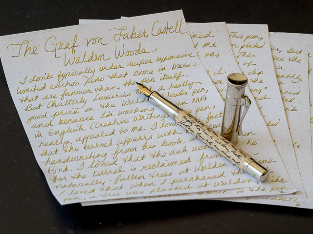
I don't typically order super expensive, limited edition pens that come in boxes that are fancier than the pens they house. But Chatterly Luxuries had a good price on the Walden Woods pen, and because I'm working on an MA in English in Creative Writing (I totally need another "practical" degree), this pen appealed to me. I love the fact that the barrel has Thoreau's handwriting etched on it. I appreciate that the ash wood used for the pen is reclaimed from naturally-fallen trees at Walden Pond. I am pleased that my purchase of this pen means a new tree will be planted at Walden Pond by the American Forests organization. All these factors combined with the great price led me to purchase the pen. I bought it for $395 (retail $750), which is still quite expensive.

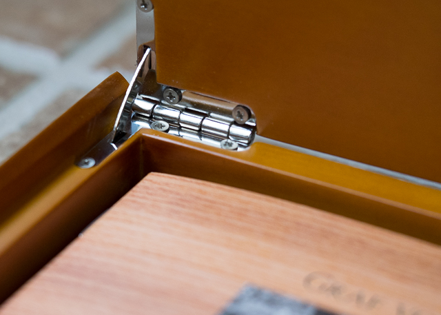
I waited to open this pen until I turned in my grades for Summer II. It was my reward for surviving the term (and it was a doozy). The packaging was impeccable. A thick, outer cardboard box protected the beautiful wooden box within. The lid of the wooden box is unadorned except for a small logo and the Graf von Faber Castell name.

The box opens smoothly and silently–I mean look at that hinge mechanism! And this is just the box!

A cream-colored, molded insert houses the pen and information about it. A well-designed booklet gives a brief history of Henry David Thoreau's two-year experiment at Walden Pond which became the basis for his book, Walden, or A Life in the Woods. The Walden Woods Project, which formed in 1990 to protect Walden Pond from development, is also discussed, as well as the partnership with the American Forests organization. A card with warranty information is enclosed and there's a small cloth for cleaning. The insert that houses the pen and information comes out, so with a pen tray cut to size, the wooden box can be repurposed for pen storage.

The Walden Woods pen is a limited edition of 2006 pens, each individually numbered. Mine is number 1268.

Unlike Graf von Faber Castell's yearly limited edition pens, which can be quite ornate (and cost thousands of dollars), the Walden Pen is understated. It has a beautiful platinum-plated cap with a spring-loaded clip that is easy to operate.

The finial is concave and unadorned other than grooves etched around the edge.

The Faber Castell logo appears just above the top of the clip.

"Graf von Faber Castell Germany" is imprinted around the bottom of the cap, and just above that, in tiny letters, is a credit for the quote used on the pen.

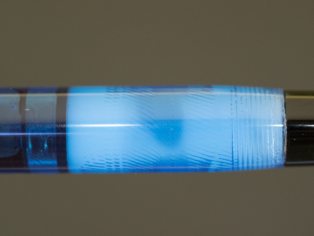
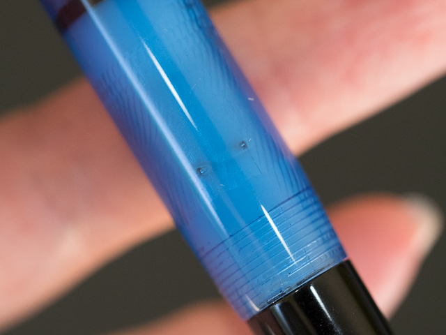
The grip is made of the same platinum-plated metal, and so is the bottom of the barrel which is convex and sports the grooves around its base.

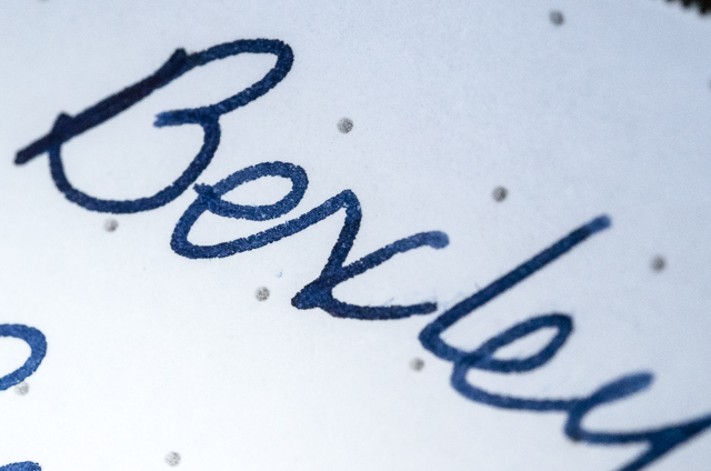
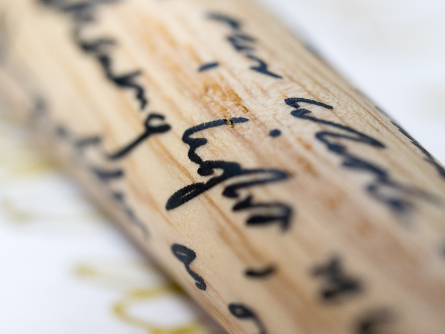
The ash-wood barrel feels smooth to the hand. It's hard to tell whether Thoreau's quote is actually etched into the wood or just painted on (the descriptions I've read use the word "etched," but the words don't look or feel like they are carved into the wood). The quote is written in black and stands out nicely against the light color of the wood.

The quote chosen for the pen is beautiful:

"So we saunter toward the Holy land; till one day the sun shall shine more brightly than ever he has done, shall perhance shine into our minds and hearts, and light up our whole lives with a great awakening light, so warm and serene and golden as on a bank-side in Autumn."

~Henry David Thoreau, Walking

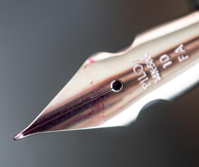
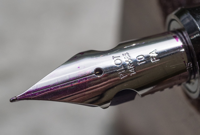
The nib is a two-toned, 18K gold medium. It started up immediately after I inked the pen, and I've had no problems with skipping, hard starts, or scratchiness. I inked it with Iroshizuku Ina-Ho because I thought the golden color of that ink matched the ash wood nicely. The nib is smooth, but firm without any springiness.

Because the grip is metal, it becomes slippery under my sweaty fingers. It is small in diameter (I don't have a caliper, but it's less than 10mm at the thinnest point), and my hand cramps up while writing. I may eventually have the nib ground to an oblique italic so that I can rotate the pen into a more comfortable position. Plus, the medium nib lacks personality in my opinion.

The pen is a cartridge/converter filler, but no cartridges were supplied, an oversight for such an expensive pen. I use the converter anyway, but I think cartridges should have been included for those who don't use the converter. The converter works smoothly and draws up ink without any difficulty.

At 135mm (5.31 inches) capped, 130mm (5.11 inches) uncapped, this is a medium length pen, just a little longer than a Pelikan M600 capped. The pen is fairly heavy due to the metal construction. I could not find a specific weight in any of the literature or online. In spite of this, it feels balanced in the hand unposted. Posted it is 173mm (6.8 inches) in length and is unwieldy. The cap is simply too heavy and throws the balance off.

I am interested to see how the wooden barrel reacts with the natural oils in my hand. I don't know if the ash will darken over time, or if the wood has been coated to prevent that. My main concern about the light ash wood is what will happen if I accidentally get ink on it. Will the ink wipe off or will it stain the barrel? I am unwilling to test this, even for the sake of a Pen Addict review, sorry.

This is my first Graf von Faber Castell pen. I like many things about it, and it is definitely unique. But, it's not the most comfortable pen I've written with. My hand grew fatigued fairly quickly due to the small grip combined with the weight of the pen.

Nevertheless, I can't wait to take this pen to my English classes. I hope Thoreau's spirit channels itself through the pen to make my poetry better. I can always hope, but so far no poems have magically emerged from my Walden pen.

Pros

  • Simple design with understated elegance
  • Fans of Henry David Thoreau would probably love this pen
  • The Walden Pond ash wood and Thoreau's writing on the barrel make this pen unique
  • The nib is beautiful and well-made (though I don't like the medium point and will probably send it to a nibmeister)
  • For every purchase of this pen a tree will be planted at Walden Pond
  • The beautiful wooden box that houses the pen can be used as a pen box with the addition of a tray (but, honestly, I'd rather just have a simple cardboard box and a lower price)

Cons

  • Expensive, even on sale
  • Fairly heavy pen
  • The grip is metal and narrow in diameter which may make it difficult for some people to write comfortably
  • Cartridge/Converter filler, which can be a plus or minus depending on your perspective, but no cartridges are supplied with the pen which seems an odd oversight
  • The pen is no longer being manufactured, and remaining units are limited
Posted on August 21, 2015 and filed under Faber-Castell, Fountain Pens, Pen Reviews.

Pilot Custom Heritage 912 with FA Nib: A Review

(Susan M. Pigott is a fountain pen collector, pen and paperholic, photographer, and professor. You can find more from Susan on her blog Scribalishess.)

The Pilot Custom Heritage 912 is not a particularly remarkable pen on the outside. It is black resin with rhodium-plated rings at the juncture of the grip and barrel, at the bottom of the barrel, and at the top and bottom of the cap. The clip is unadorned, and the only branding is on the cap ring which says "Custom Heritage 912 Pilot Japan."

The 912 comes with a CON-70 push-button converter that holds a good amount of ink (0.6 ml). I much prefer this to Pilot's other converters, but I will say this one is tough to clean thoroughly. You have to flush it repeatedly, and the ink tends to get caught in the nooks and crannies of the converter.

It is a light pen, weighing in at only 25 grams. The length is comfortable posted (6.18 inches) or unposted (just under 5 inches).

What makes the 912 shine is the 14K rhodium-plated FA nib (you can, of course get the pen with other nibs). The FA nib (short for Falcon) has cutouts that look like wings.

This design allows the nib to flex when the writer applies pressure to it.

Unlike a Soft Fine nib, which is simply less firm and offers no flex, the tines of an FA nib actually spread, giving that coveted line variation so many writers love.

You can also write normally with the FA nib, and it has a lovely spring to it.

My 912 worked perfectly out of the box. I inked it with Pilot Iroshizuku Yama-budo, and I spread the tines as far as I dared. The ink flowed perfectly and the nib floated on the paper. However, when my bottle of Montblanc Blue Hour arrived, I tried it with the 912. Boy, was I disappointed. The nib railroaded almost immediately. I tried priming the nib, forcing more ink down, but nothing worked.

Wondering if this was a problem with the ink or the nib, I experimented with several different inks. You can see the railroading with Blue Hour, but none of the other inks caused any problems.

I read on some other blogs that the FA nib works best with Pilot inks, but I tried several different brands and they all worked fine. In fact, I tried Blue Hour again after all my tests and suddenly it worked perfectly. I can't explain this. Maybe by the time I tried Blue Hour again, the nib and feed had been flushed so many times they were able to handle a drier ink.

Still, Yama-budo is my go-to ink for this pen. It is such a happy color (it forces me out of my blue ink rut), and the FA nib almost makes my writing look Spencerian . . . almost.

Aside from the initial railroading problem, the only other negative is nib creep. I noticed this from day one. For whatever reason, ink creeps between the tines and pools on the nib's surface. From what I've read, this is caused either by the wetness of the ink or possible hairline fissures in the nib. It doesn't affect the writing, but I get a little OCD-irritated that the nib surface isn't pristine. If I try to wipe it clean, more ink just smears over it. It's a Sisyphian battle. I lost.

No modern pen has yet managed to duplicate the super-flex pens of old. But, if you want the convenience of a modern filling system (no dried up sacs, no broken lever boxes, no rotten cork seals) and a smooth, flexy nib, the 912 FA is a great choice. I honestly did not expect to like this pen as much as I do. I planned to review it and then sell it. But that's not going to happen. This is a keeper.

I purchased my Pilot Custom Heritage 912 with the FA nib through Amazon for $155.37. The seller was in Japan, so it took almost a month for the pen to arrive. That seller does not currently offer this pen anymore, but you can check Amazon periodically to see if it becomes available. Classic Fountain Pens has the pen back in stock ($256), so you can order from them or from your favorite Japanese eBay dealer.

Pros

  • Lightweight pen for comfortable writing
  • Good ink supply with the CON-70 converter
  • The FA nib is a wonderful option for people who desire flex but don't want to use vintage pens
  • Simple, elegant design

Cons

  • The pen only comes in black; I wish they offered a variety of colors
  • The CON-70 converter is difficult to clean completely
  • The pen can be difficult to obtain in America
  • Fairly expensive for a plastic pen (though the nib is 14K)
Posted on July 24, 2015 and filed under Falcon, Fountain Pens, Pilot, Pen Reviews.

Bexley Phoenix Fountain Pen Review

(Susan M. Pigott is a fountain pen collector, pen and paperholic, photographer, and professor. You can find more from Susan on her blog Scribalishess.)

The Bexley Phoenix collection includes four colors: black with a clear barrel, red with a clear barrel, blue velvet with a blue translucent barrel, and cappuccino with a bronze translucent barrel. The caps on these pens are marbled acrylic, and the piston knobs are black, except for the cappuccino's which is caramel.

Goldspot Pens kindly loaned the Bexley Phoenix in Velvet Blue for review. The retail price for this pen is $219.00, but it is currently on sale at Goldspot for $164.95. The pen is 5.3 inches capped, 5.125 inches uncapped, and 6.45 inches posted.

The nib is a two-tone, custom-engraved, stainless steel nib that comes in fine, medium or broad. The nib on the loaner pen from Goldspot is a fine.

And the nib is the best part of this pen. It is large and writes smoothly. It's a very firm nib (no flex or bounce). But it isn't scratchy nor does it exhibit hard starts.

The marbled blue cap with a black top section is elegant, and the steel accents complement the silver swirls in the marbled acrylic.

The clip is unadorned except for a small "B" stamped at the top and the ring is plain. The clip is flexible enough to attach to a pad of paper or a shirt pocket.

Unfortunately, the pen's design begins to fall apart once you remove the cap. The grip portion of the barrel and the piston are black. The mid-section of the barrel is translucent blue, allowing you to keep track of your ink level. This unusual combination of a marbled acrylic cap with a demonstrator barrel doesn't work well. When I look at the pen, I think "someone put the wrong cap on this pen."

Then there's a section I can't quite describe. It's opaque, and it looks like a wad of wet Kleenex was stuffed into the barrel.

I have no idea why the pen was designed with this element which, frankly, I think is ugly. Had the designers simply used the marbled acrylic or translucent blue, the pen would be more attractive. Maybe they were trying to hide the piston mechanism. But this strange opaque white section ruins the appearance of the pen, especially since it isn't uniform but mottled.

In the photographs, it looks like this section is textured on the inside, but you can't see that with the naked eye. It may be a trick of the light or an aberration the camera picked up.

In addition, two holes, which I assume are necessary, mar the appearance of the barrel.

Appearance isn't the only problem with this pen. The piston does not turn smoothly at all. You can feel the piston bump along as you turn it–gallumpf, gallumpf. It's quite disconcerting. I don't know if the barrel is misshaped or if the piston is not perfectly round. I've owned Pelikans with hard-turning pistons (something easily fixed with a little silicone grease), but I've never felt a piston "gallumpf." Maybe this is simply how Bexley pistons turn. If so, I don't like their pistons.

Whatever causes the Bexley piston to stutter doesn't seem to affect the seal. However, I discovered that the pen won't fill unless you have the entire nib submerged plus a little of the grip. Since the nib is so large, you'll need to have deep, full ink bottles or figure out a way to angle bottle so the nib is completely submerged. That's what I did to fill the Bexley with Diamine Denim.

My son demonstrates the tip fill

My son demonstrates the tip fill

I am not impressed with the Bexley Phoenix fountain pen. Although it is a smooth writer, the design of the pen is disappointing, and the piston mechanism, at least on the loaner pen, is bumpy. I've not tried other Bexley models, but I would not recommend this one.

Pros

  • Smooth writing, large steel nib
  • Piston filler

Cons

  • Unattractive design, especially the opaque white section
  • Rough piston movement
  • A bit difficult to get a good fill
Posted on July 17, 2015 and filed under Bexley, Fountain Pens, Pen Reviews.