Posts filed under Fountain Pens

Bung Box Pilot Penmanship EF Fountain Pen Review

(Jeff Abbott is a regular contributor at The Pen Addict. You can find more from Jeff online at Draft Evolution and Twitter.)

Pretty much everyone you meet has something negative to say about their own handwriting, no matter how pretty it might be. It's an extension of our personality, and some people take pride in their penmanship. Others may view it as a tool or trade, but it's one of those things that can always be improved. We never "arrive" when it comes to penmanship.

There are several ways to improve your own penmanship, and the most elemental method is simple practice. Write things over and over while slowing down and focusing on the small details of every letter. Turns out, some pens are better for this exercise than others.

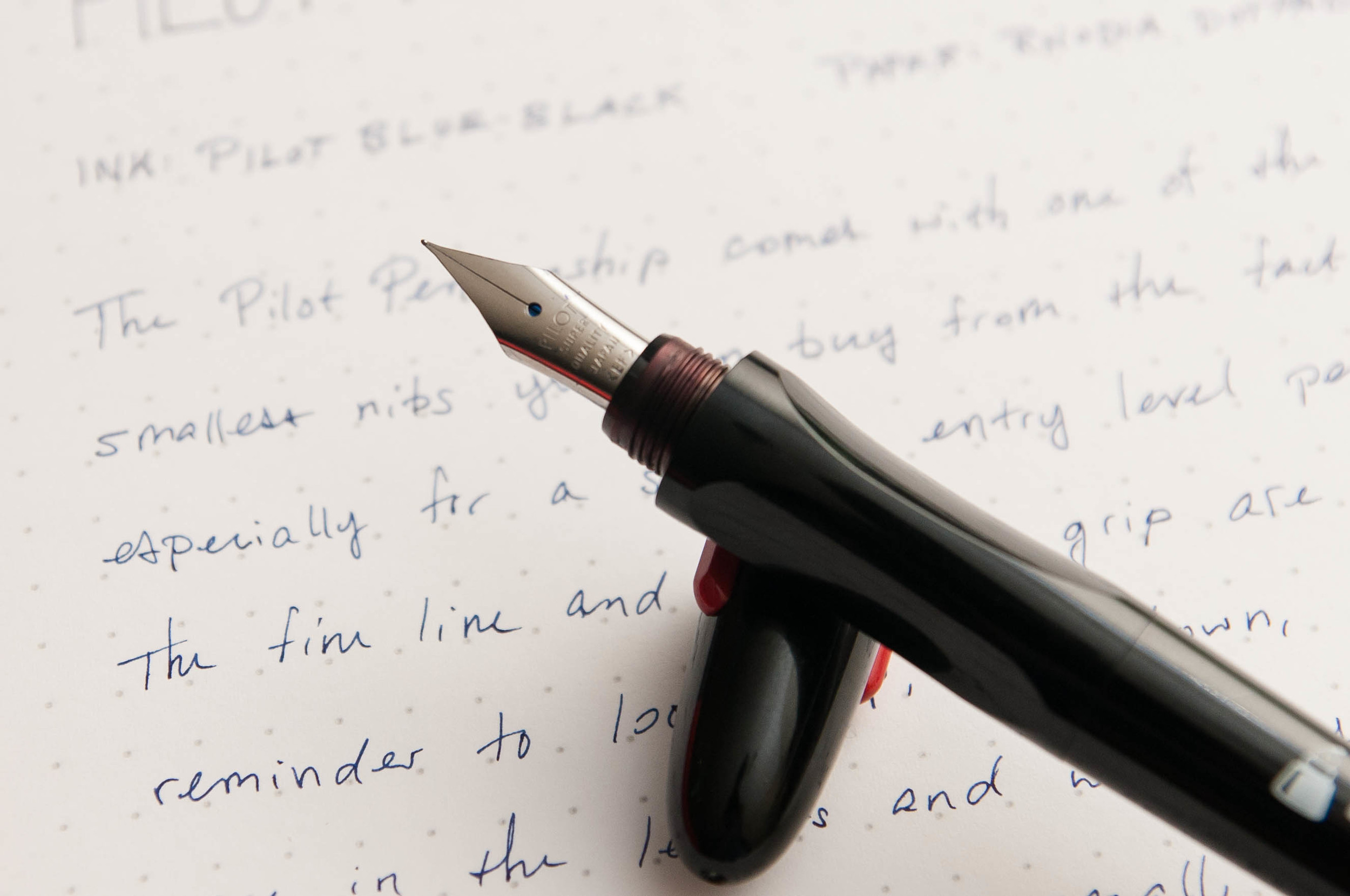
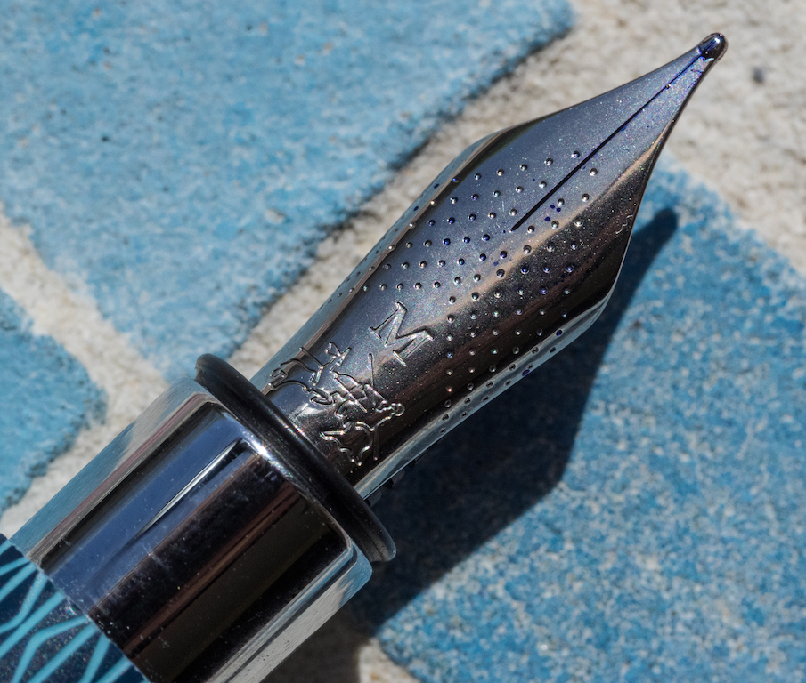
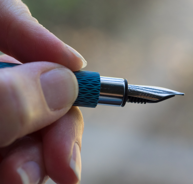
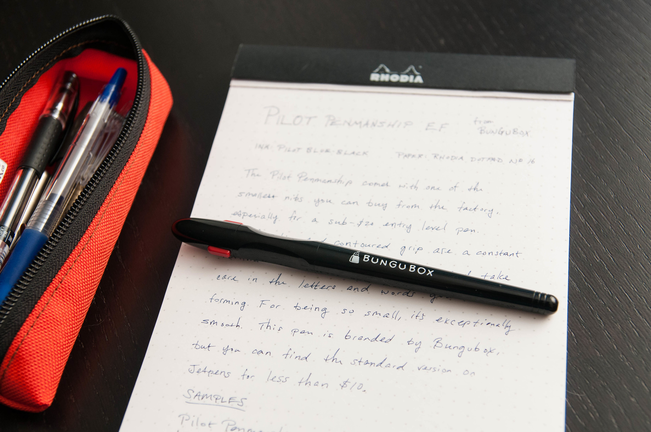
That's where the Pilot Penmanship comes into play. This cheap fountain pen features an EF nib from Pilot, which is something you don't see in a lot of fountain pens from the factory. The idea behind a tiny nib is that you have no choice but to slow down and stay relaxed. If you try to press down too hard or go too fast with this pen, it will scratch the page and be uncomfortable.

While using this pen, I enter a different mindset that focuses on each letter. For one, I tend to press down more than I need to when using pens. It's an old habit from my grade school days where we learned to write with giant, ridiculous pencils. With the EF nib, you can't bear down on the nib without it sticking and scratching. What's more, since the line is so small, you have to work harder to keep the nib controlled when writing. Any mistakes are magnified when using this small nib, unlike larger nibs that cover up a lot of small mistakes.

The nib is excellent and a great value considering the sub-$10 price point. Even though the line width from this nib is a touch smaller than my 0.38mm gel pens, it's exceptionally smooth when used correctly. That, my friends, is impressive.

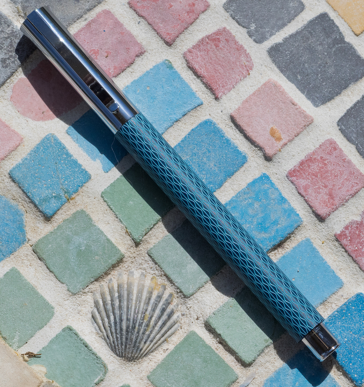
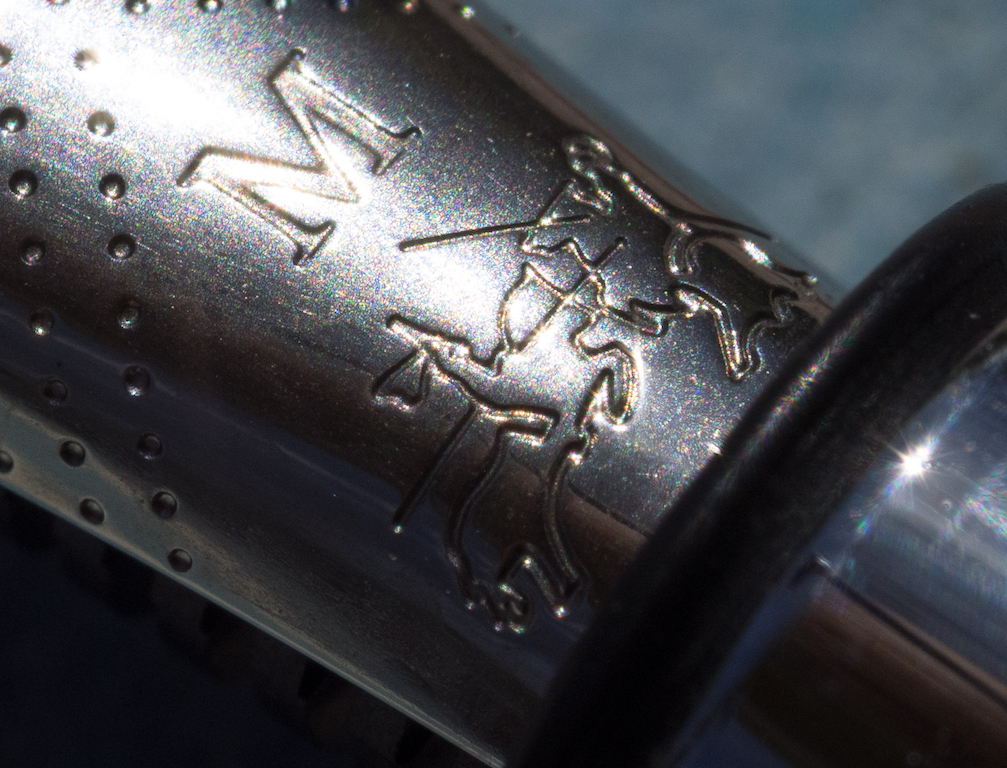
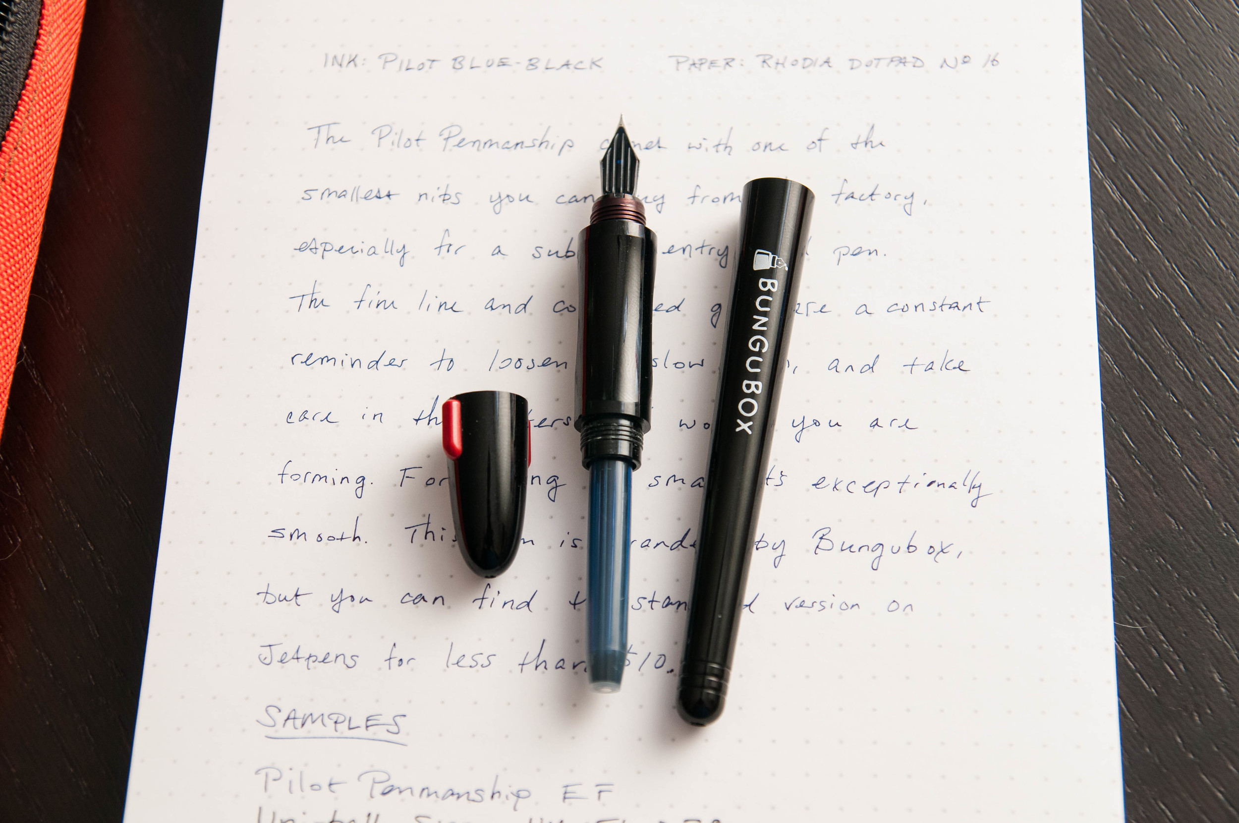
You can also swap this nib into both the Pilot Metropolitan and Prera. I like this grip section quite a bit. The grip is contoured to provide the "correct" finger positions. It's very similar to the Lamy grip section, but a little smaller. Like I've mentioned with Safaris and Al-Stars, if you don't use the "correct" grip, this pen might not be good for you. Besides the frustration of a pen manufacturer trying to impose a particular finger position for a pen, it's a great design that looks and feels good for me. The version I have has a nice "BunguBox" logo on the side, but that's not standard. The barrel is normally completely devoid of all branding.

The cap is comically small, but posts securely to the back of the pen. It has a couple of small red bits that stick out of the sides of the cap to prevent it from rolling around. It looks good when the cap is secured on the closed pen, but the cap looks silly on its own. Fortunately, I don't think this pen was made to win any aesthetic awards.

That being said, this is a great pen if you're looking for something that delivers an exceptionally thin line. You'd be hard pressed to find something this good that comes straight from the factory. Most of the time, you need a nib specialist to do a custom grind on a larger nib to achieve these results.

The Penmanship accepts Pilot cartridges and the CON-20 and CON-50 converters. It also comes in black and clear, so you have that choice as well. Both are a mere $8.25 on JetPens, which is hard to argue with.

Posted on April 19, 2016 and filed under Pilot, Pen Reviews, Fountain Pens.

Containing the Chaos of Pen Addiction: Pen Cases and Boxes

(Susan M. Pigott is a fountain pen collector, pen and paperholic, photographer, and professor. You can find more from Susan on her blog Scribalishess.)

Like many people, my pen addiction began with a Lamy Safari and quickly escalated. I'm not quite sure how many pens I own right now, but everyone in my family will say, "Too many." One of the many symptoms of pen addiction is pen clutter. This is my usual method of organizing pens:

Obviously, this is not an ideal method, since it is not a method at all. Rather, the pens that I'm currently using are strewn across the living room side table. They are easily within reach, and I can choose from a variety of pen styles and colors without having to move an inch. Unfortunately, the pens are exposed to the vagaries of living room life, which includes cats skittering across the table on their way to capture a moth. Thus far, I haven't lost any pens to the cats, but the danger always looms.

Danger!

Danger!

My first attempt at pen organization was when I had fewer than ten pens. I ordered a faux crocodile, six-pen Penvelope from Franklin-Christoph.

This wonderful case managed my pens for a month or two, but I quickly outgrew it. Now the Penvelope serves as my carrying case for the favored pens I take with me to work each week.

Next, I ordered a wonderful cigar pen case from BamaPens. I love the glass top so I can see my pens while they are protected in the box. The box holds ten pens and has a lovely felt interior and a padded bottom so it doesn't scratch any surface. Just in case anyone wonders, the case has absolutely no residual cigar smell.

But, my collection kept growing because of my insatiable love for pens. I ordered another BamaPen case, hoping that this would take care of the overflow. I planned to keep my Urushi pens in this simpler, glass-free box to protect them from the sun.

The inner fabric is gorgeous, and I love the lion design on the outside. This pen box holds twelve pens horizontally.

Unfortunately, right after I bought my second BamaPen box, I went on what can only be described as a manic spending spree. I bought a ton of pens. Even with my Penvelope and my two Bama pen boxes, I didn't have a place for all of my pens. The living room side table looked like the aftermath of a tornado.

This time, I was determined to find something that could hold lots of pens. I thought about going really cheap and buying a tackle box or an art supply box. I even thought about trying to reengineer a jewelry cabinet. But I'm not crafty. I eventually found a gorgeous wooden, three drawer, thirty-six pen, display case with a glass lid, but, man, it was expensive ($240 at nibs.com). After some extensive searching I found it at Penn State Industries for $99.95.

This case is absolutely beautiful and well made. It is crafted from solid rosewood. The lid sports brass hardware and glass, allowing you to view the top drawer of pens. Another drawer sits below this one. Both slide out for viewing and can be completely removed, if you wish. A bottom drawer is independent of the other two and it also can be removed. All the pens are nestled in contoured foam.

I'd like to say that this pen case solved all my storage problems, but no. I've managed to fill it, the two BamaPen boxes, and my Penvelope. A few unlucky, stray pens sit adrift on table surfaces.

The only hope for completely containing the chaos is to sell some pens . . . or buy another pen case.

Posted on April 15, 2016 and filed under Fountain Pens, Storage.

Faber-Castell Ambition Blue Ocean OpArt Fountain Pen: A Review

(Susan M. Pigott is a fountain pen collector, pen and paperholic, photographer, and professor. You can find more from Susan on her blog Scribalishess.)

I really wanted to buy a French fountain pen on my trip to France. I tried several Waterman pens, but the nibs were scratchy and the pens were (in my opinion) over-priced. So, at La Paperterie in Rouen, France, I purchased the new Faber-Castell Ambition Blue Ocean OpArt. I'm calling it my French pen, even though it's a German brand–but I bought it in France, okay?

The city of Rouen

The city of Rouen

What drew me to this pen is its beautiful dusty-blue body with an engraved, intricate guilloche pattern. Plus, I've found Faber-Castell pens to be high-quality, and this pen does not disappoint.

The pen comes in a solid cardboard presentation box. The inner box, which contains the pen, slides out like a drawer. Faber-Castell offers a two-year guarantee on the pen.

One blue cartridge is supplied, but if you want a converter, you have to purchase it separately (which I did). The converter works well, though it is made of a rubbery sort of plastic, not the hard clear plastic I'm accustomed to with most converters.

The Blue Ocean has a resin barrel with a chrome cap, grip, and posting knob.

The pen is neither lengthy (120 mm/4.75 inches unposted) nor heavy (13 grams, unposted). Posted (159 mm/6.25 inches), the pen feels off-balance because the cap is the heaviest piece. When you put it on the posting knob the balance shifts backwards making the pen uncomfortable to use. I do not recommend posting it.

The cap exhibits the usual clean, crisp lines of Faber-Castell pens. It has a simple clip, an engraved circle on the finial, and Faber-Castell branding engraved on the side. It is subtle, and unless you look closely, it's difficult to distinguish the two knights on horses, the emblem of the company. I like subtle branding, and Faber-Castell pens always look classy in my opinion.

The nib sports the Faber-Castell emblem, decorative dots, and the nib size. It's not the most beautiful nib design I've seen, but it suits the Ambition style.

The nib itself is silky smooth and firm though it has no spring or flex. It wrote perfectly right out of the box, and I've had no problems with it at all. This is an excellent steel nib.

I love the style of this pen, and the guilloche pattern is striking. One of my students noticed the pen in class the other day and said, "Wow! That's a cool-looking pen!" You know a pen is something special when an undergraduate notices it.

That said, the Ambition design does not make for the most comfortable writing experience. The step-down from the barrel to the grip is significant, and the grip is too short to grasp comfortably.

I almost did not purchase the pen because of this. The French saleslady showed me I should hold the pen further back on the barrel, which works, but it feels a bit awkward to me. I generally hold my pens fairly close to the nib. I think, in this case, Faber-Castell chose symmetry and design over comfort in writing.

I paid 78 Euros for the pen which converts to about $88. You can purchase this pen at American retailers like Goulet for $100. That seems a bit pricey for what you're getting: a plastic barrel and a steel nib (though other parts are chrome). I wish the barrel were metal overlaid with the guilloche pattern. It would make the pen feel more substantial in the hand.

Nevertheless, the pen is beautiful and well constructed. The Blue Ocean color is pleasing to the eye and the chrome parts accent it perfectly. I now own three Faber-Castell pens, and all of them write beautifully and look fantastic.

L-R: Intuition Terra, Special Edition Walden, and Ambition Blue Ocean.

L-R: Intuition Terra, Special Edition Walden, and Ambition Blue Ocean.

Pros

  • The Blue Ocean OpArt is a beautiful pen with classy styling.
  • It is less expensive than some other Faber-Castell models.
  • The medium nib is smooth and works perfectly straight out of the box.
  • This is a light and thin pen, so people with small hands will probably find it comfortable (but see below).

Cons

  • The pen does not feel as substantial as the other Faber-Castell pens I own due to the plastic barrel. People who prefer pens with some heft will probably want to avoid this model.
  • Because of the design, the grip section is too short and uncomfortable to hold (the barrel digs into your fingers). So, you have to hold this pen further back from the nib. I have adapted to this, but it might be a deal-breaker for some users.
  • The pen does not come with a converter. You have to purchase it separately (but it is only $5 to $7, depending on where you make your purchase).
Posted on April 8, 2016 and filed under Faber-Castell, Fountain Pens, Pen Reviews.