Posts filed under Fountain Pens

First Look: PIUMA Fountain Pen

I had Mike Dudek on the podcast last week, and it was inevitable we were going to talk Kickstarter pens. He is one of the few people that is as crazy as me, and possibly crazier seeing some of the projects he has backed.

When the PIUMA Fountain Pen came up in the conversation, Mike mentioned it “looked nice, but…” then struggled to come up with more. I chimed in with "…but this was done four years ago.” He agreed, and we both elaborated on the point we were trying to make. The PIUMA pen does not break any new ground in design, functionality, or materials, but that doesn’t keep it from being a damn fine pen.

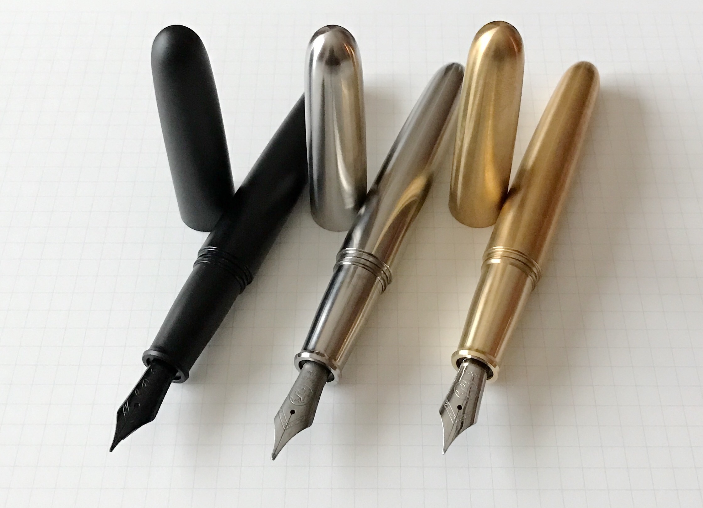
I backed the brass model early on, and Ensso, the maker of the PIUMA, sent me a prototype of each pen for a quick peek. That has made me happy with my initial decision, and now I’m wondering if that is the only one I’ll end up with.

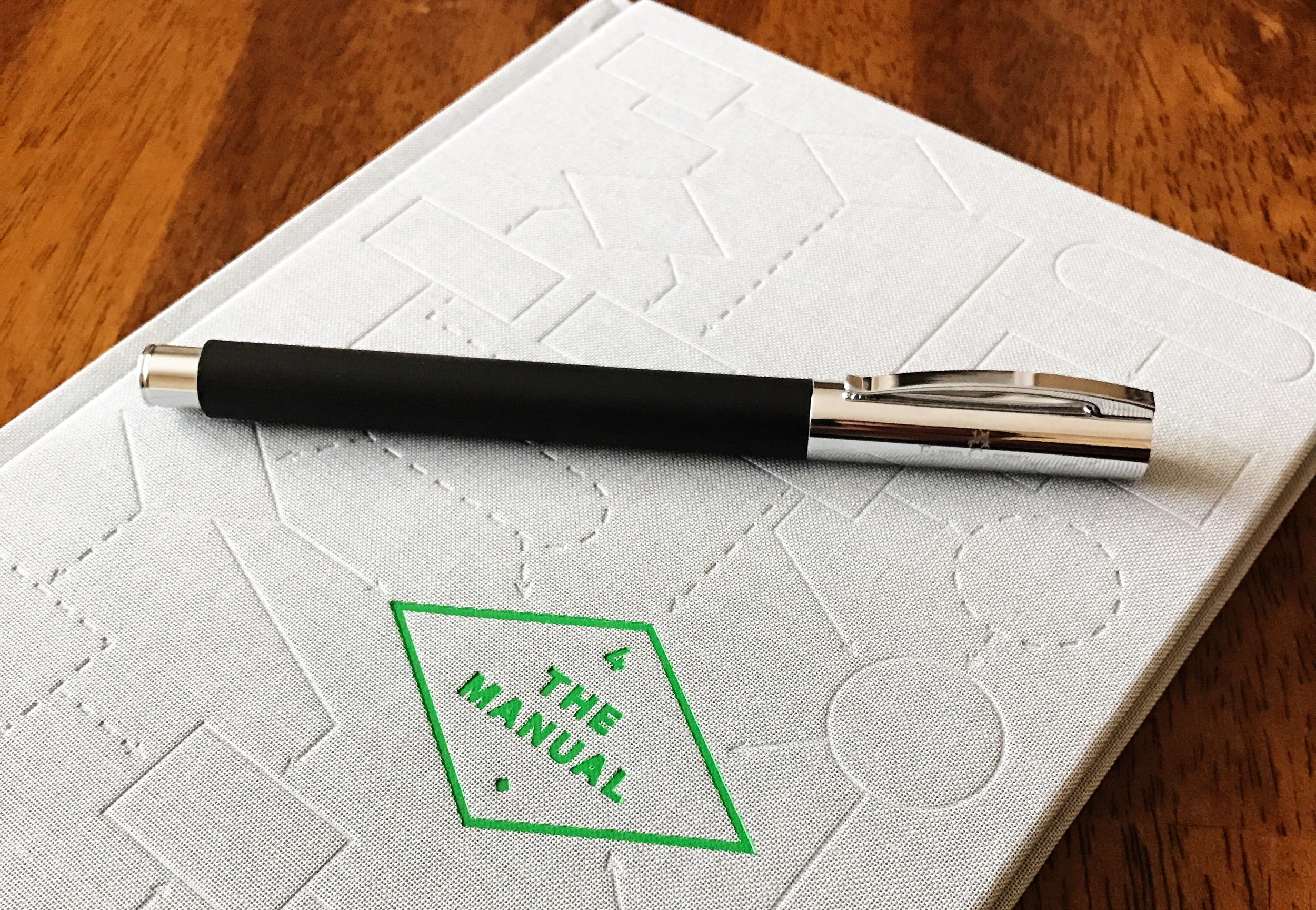
Let’s start with the Black Matte model. It is killer - full stop. The finish is smooth, the branding is minimal, and the addition of the black nib turns this into possibly the darkest pen I’ve handled. It looks fantastic, and the lighter weight of the aluminum makes it great for every day carry.

When backing new pens and I have the opportunity to choose titanium, I usually do. Not this time though - I have too many. The titanium PIUMA is fantastic, and I feel you should go ahead and add on the titanium nib to get the full effect. At least that’s what I would do. This one feels great, and is weighted just right.

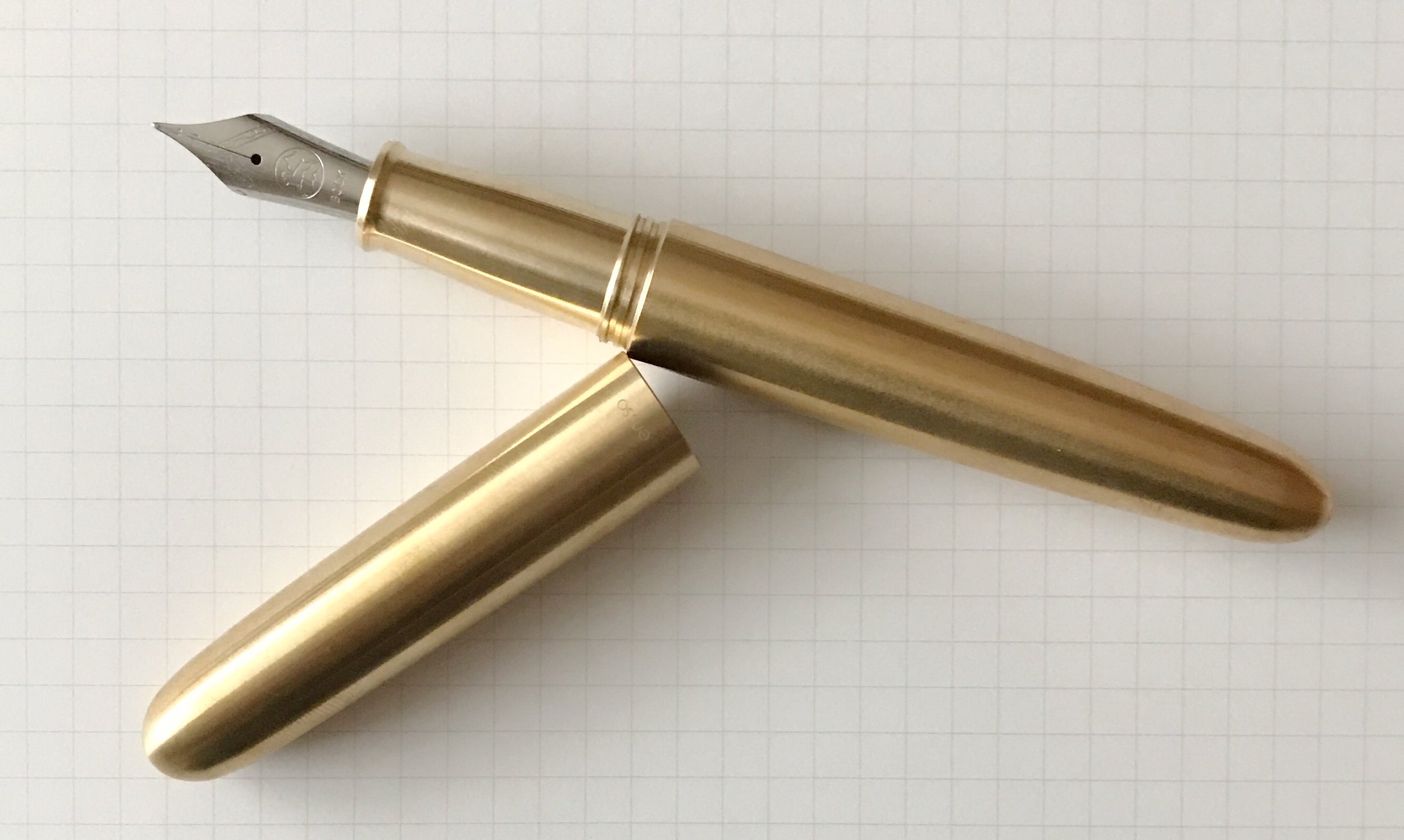
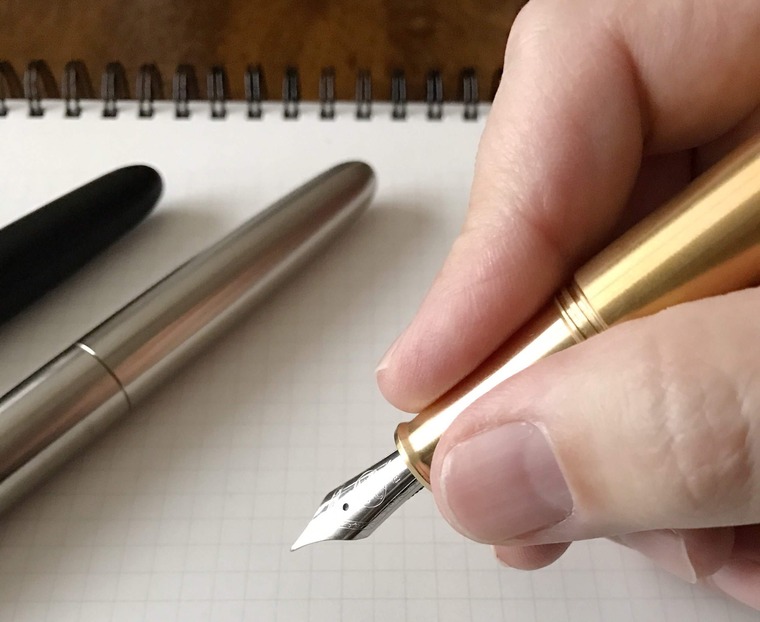
The brass PIUMA is the big daddy of the bunch, weighing in capped at over three ounces. That is a heavy pen! I’m giving this one a shot because I wanted to try something different. After using all three I thought I might change my mind and go with the black aluminum model, but something about this pen makes me smile. Plus, the patina looks very cool already after just a short time handling it.

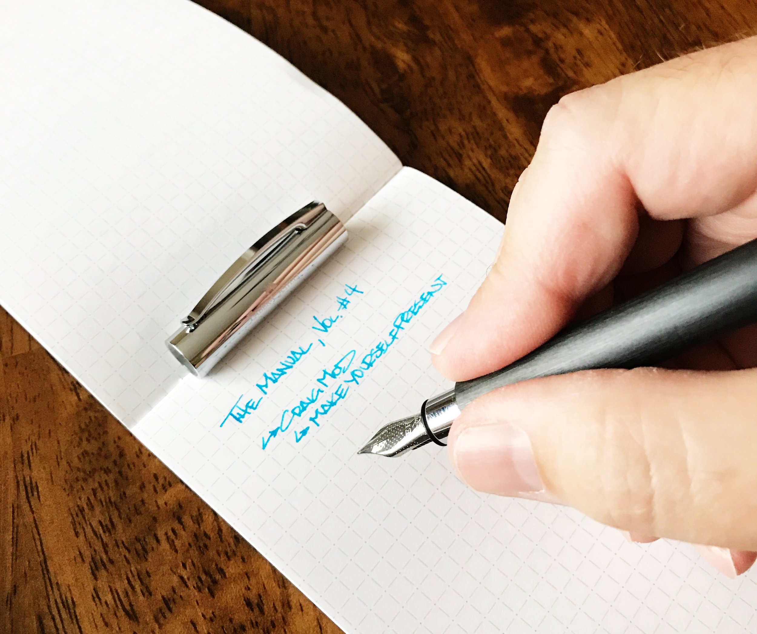
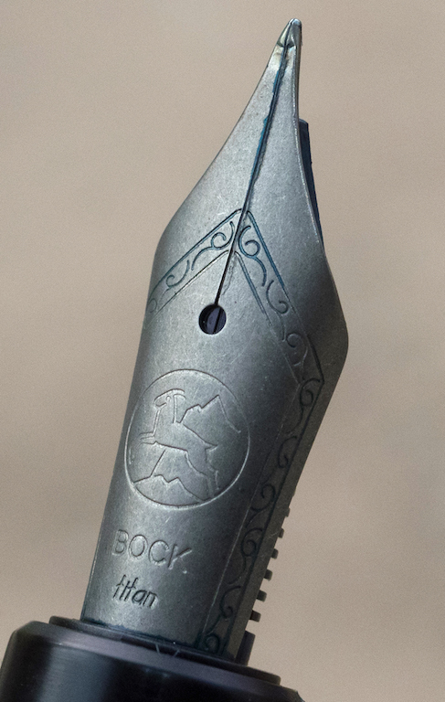
All of the pens are outfitted with Bock nibs, which are available in various sizes, and materials including steel, titanium, and gold. I’ve used all three varieties and have had a great experience with all.

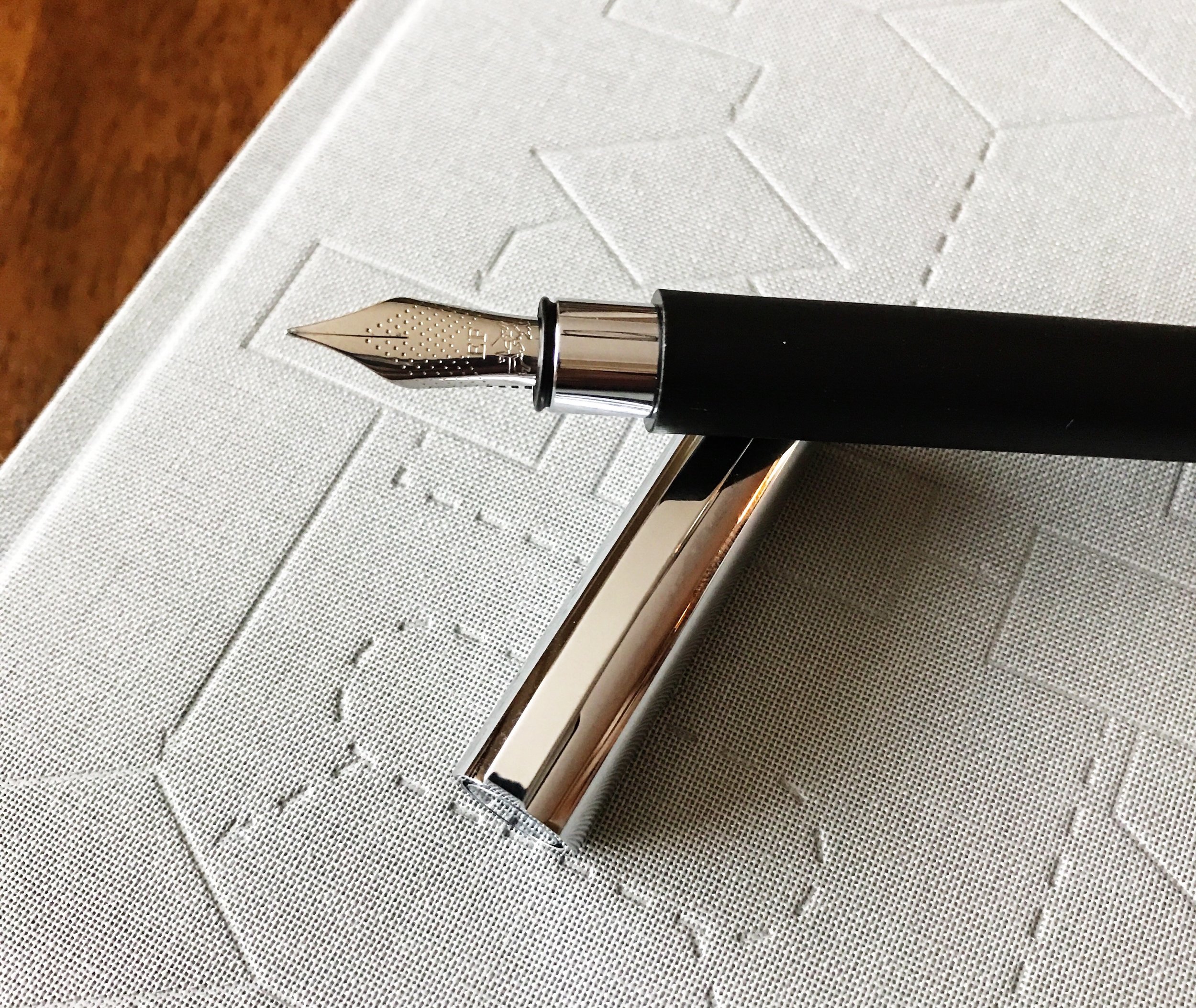
If I can pinpoint any downside, it’s one thing that Ensso considers a feature of the PIUMA - the cap and barrel threads. From the Kickstarter campaign:

“The cap threads are wider and allow a fast opening and closing of the pen.”

I want more threads on a metal on metal connection rather than less. That may put me in the minority on this minor issue, but bumps and vibrations can loosen caps. I want the cap to have to travel more so it stays secure rather than travel less and get loose. This matters less on acrylic and ebonite pens than it does metal. I haven’t noticed any issues yet, but haven’t had the pen long enough to run it fully through the paces.

PIUMA borrows its name from the Italian word for feather, which is what the first, and simplest, pens were made from. Ensso has succeeded in making a simple fountain pen, while retaining beauty and functionality. Getting a first look at these pens only confirmed my original thoughts when backing the project, and I look forward to getting to use it in the new year.

My thanks to Ensso for loaning me these pens for the purposes of this review. Ensso is also a current and future sponsor of The Pen Addict.


Enjoy reading The Pen Addict? Then consider becoming a member to receive additional weekly content, giveaways, and discounts in The Pen Addict shop. Plus, you support me and the site directly, which I am very grateful for.

Membership starts at just $5/month, with a discounted annual option available. To find out more about membership click here and join us!

Posted on December 21, 2016 and filed under Ensso, Fountain Pens.

Faber-Castell Ambition Fountain Pen Review

When I read Susan's review of the Faber-Castell Ambition she bought in Paris, the first thought I had was why don't people talk more about this pen? It is priced well, looks great, comes from a historic company - what am I missing? Not much it seems, especially for a $70 pen.

The model I am reviewing - the Ambition in Black with an Extra Fine nib - has been fantastic to use. The brushed resin barrel feels great, and the chrome accents, especially in the cap and the clip, give the Ambition a classic, dignified look. The dot pattern on the nib can be seen across Faber-Castell's steel nib lineup, which is a nice touch.

If there is one thing about the Ambition that people question it is the grip section, or lack thereof. The barrel terminates into a small chrome piece that is used for access to the ink cartridge or converter. There is a small step down where they connect, which begs the question of grip interference.

As a low-gripper, my traditional three point grip lands right above the edge, so I personally have no issue with the barrel digging into my fingers. Your mileage may vary, especially if you have a non-traditional grip. Otherwise, my fingers land on the barrel right where I would hold any other pen. I think it is designed this way. This is an instance where the pen section is designed for utility (barrel access), not for grip. Attempts to hold it there will be met with disappointment and discomfort.

I haven't had the opportunity to use many Faber-Castell steel nibs, but if this one is any indication, they are firm and a bit on the dry side. That is how I like my nibs, but if you are looking for more ink flow I would consider the Medium or Broad. This EF suits my style very well.

The Faber-Castell Ambition is going to find a place on my Top 5 Pens list for fountain pens in the $50-$100 range, likely knocking out the Kaweco Liliput in the 5-spot. I'm glad to discover more options in that bracket to be honest, and this one deserves it.

(Goldspot provided this product on loan to The Pen Addict for review purposes.)


Enjoy reading The Pen Addict? Then consider becoming a member to receive additional weekly content, giveaways, and discounts in The Pen Addict shop. Plus, you support me and the site directly, which I am very grateful for.

Membership starts at just $5/month, with a discounted annual option available. To find out more about membership click here and join us!

Posted on December 19, 2016 and filed under Faber-Castell, Fountain Pens, Pen Reviews.

Namisu Nova Studio Ebonite Fountain Pen: A Review

(Susan M. Pigott is a fountain pen collector, pen and paperholic, photographer, and professor. You can find more from Susan on her blog Scribalishess.)

I’ve wanted a Namisu Nova ever since I first saw the pen on Kickstarter, but I wasn’t quick enough to get the aluminum or titanium versions. So, when I saw the new ebonite version, I was thrilled. I knew this material would be light and not slippery, like metal pens can be.

The pen comes in minimalistic packaging suited to the pen’s classic style: a black cardboard drawer box. The pen sits in a v-shaped recess in the drawer, but is not held there by elastic or anything else. I was a little concerned that it wasn’t at least wrapped in plastic or something else to protect it, but it seems undamaged.

This is a classy looking fountain pen. It’s all matte black ebonite with solid titanium finials and threading and comes without a clip. The ebonite warms to your hand while you write and it feels like satin. Although the pen is matte black, it does show fingerprints, but they are easily wiped away with a soft cloth.

I’m reminded of the Nakaya Piccolo when I look at the Namisu Nova. It has similar conical finials, with a gradual widening of the barrel near the middle. There’s a noticable step down from the barrel to the grip, but I’ve not found this to be uncomfortable when writing.

The pen is very light due to the ebonite materials, weighing 21 grams capped and 14 grams uncapped. It is 140mm long capped and 128mm uncapped. Namisu did not design the cap to be posted.

The top finial is engraved with “Namisu Studio.” Otherwise there’s no obvious branding on the pen itself.

The pen also has a titanium threads where the cap screws onto the barrel.

I purchased my Studio with a titanium EF nib, mainly because, at the time of my purchase, the only choices were a steel medium or the titanium EF. More options are available now. The nib has some basic scrollwork like other Bock titanium nibs.

I’ve found the EF nib to be pretty scratchy and loud on paper. The tines seem to be aligned, but there’s a divot on the top of the tines near the nib. I’m not sure if this affects its performance or not, but it does make the nib tip look a bit mangled.

Other than scratchiness, the nib writes well. I’ve not experienced any hard starts or flow issues.

And, the titanium provides a little bit of flex and line variation.

The pen is a cartridge/converter. It comes with a Schmidt converter, but no cartridges.

I am very pleased with my Namisu Nova Studio. I love minimalistic pens, and this one has a wonderful zen simplicity with unique titanium accents. You can purchase the Namisu Nova Studio in ebonite from Namisu with a steel nib for £105 (=$132 at today’s exchange rate) or with a titanium nib for £140 (=$178 at today’s exchange rate), plus shipping. This is currently Namisu’s most expensive pen.

Pros

  • The Namisu Nova Studio is an affordable ebonite pen with a beautiful form factor: simple, elegant, and well designed.
  • The pen is light and well-balanced, and the ebonite warms to your hand as you write.
  • The nib writes without any hard starts or flow problems (but see below).
  • The titanium nib offers a little bit of flex and line variation.

Cons

  • This is Namisu’s most expensive pen. It’s affordability depends on the exchange rate.
  • The titanium EF nib is a bit scratchy and may have some flaws (the divot I mentioned above). But since Namisu doesn’t design the nibs, that is really the fault of Bock. However, Namisu should examine nibs for flaws before shipping.
  • For people who like heavy pens, I would recommend the Namisu Nova in titanium rather than the ebonite.
Posted on December 16, 2016 and filed under Namisu, Fountain Pens, Pen Reviews.