Posts filed under Fountain Pens

Sailor 1911 Large Azure Exclusive Fountain Pen Hospital Edition: A Review

(Susan M. Pigott is a fountain pen collector, pen and paperholic, photographer, and professor. You can find more from Susan on her blog Scribalishess.)

Anyone who knows me knows that I am absolutely obsessive about blue fountain pens. If a fountain pen is blue, I probably own it. I do not know the origin of this obsession, but blue is my favorite color for both fountain pens and inks.

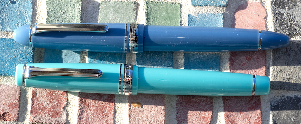
Lately, the Sailor Fresca has been featured by most fountain pen dealers. It’s a North American exclusive color, and I almost bought one. But, I own a Sailor Pro Gear in robin’s egg blue (an exclusive from the Morita Pen Shop in Osaka, Japan), and it’s almost the same color as the Fresca.

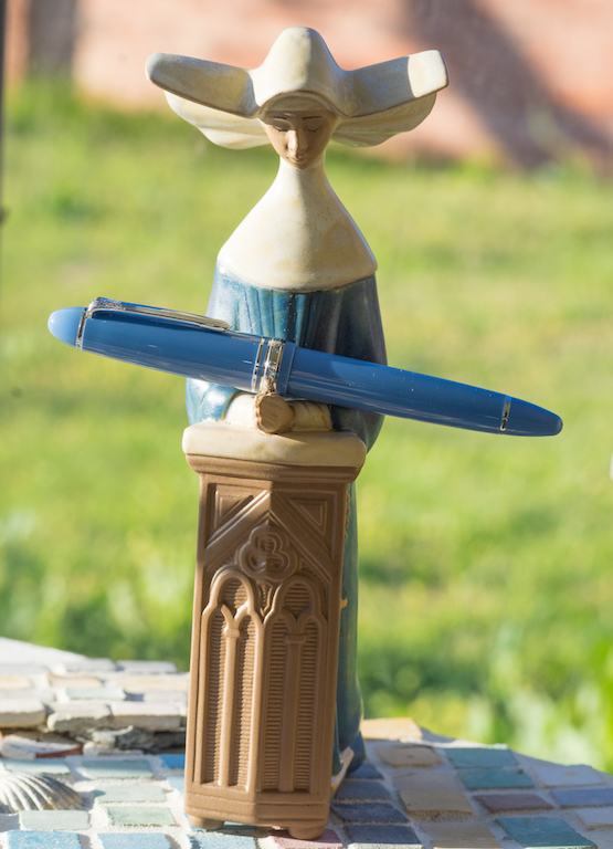
So, I decided to purchase the Sailor 1911 Azure which is an exclusive Fountain Pen Hospital edition with only 100 pieces worldwide.

Packaging for this exclusive edition is indistinguishable from other Sailor editions: a clamshell box inside a cardboard sleeve. Inside, the pen is presented on faux velvet. Underneath you’ll find the converter, two cartridges, and a small pamphlet.

The 1911 Azure is the large-sized Sailor. It measures 5.5625 inches capped, 4.875 inches uncapped, and 6.125 inches posted. I would call this a medium-sized pen, and it weighs only .9 ounces. It’s certainly larger than a Pro Gear, but not as big (or weighty) as a Montblanc 149.

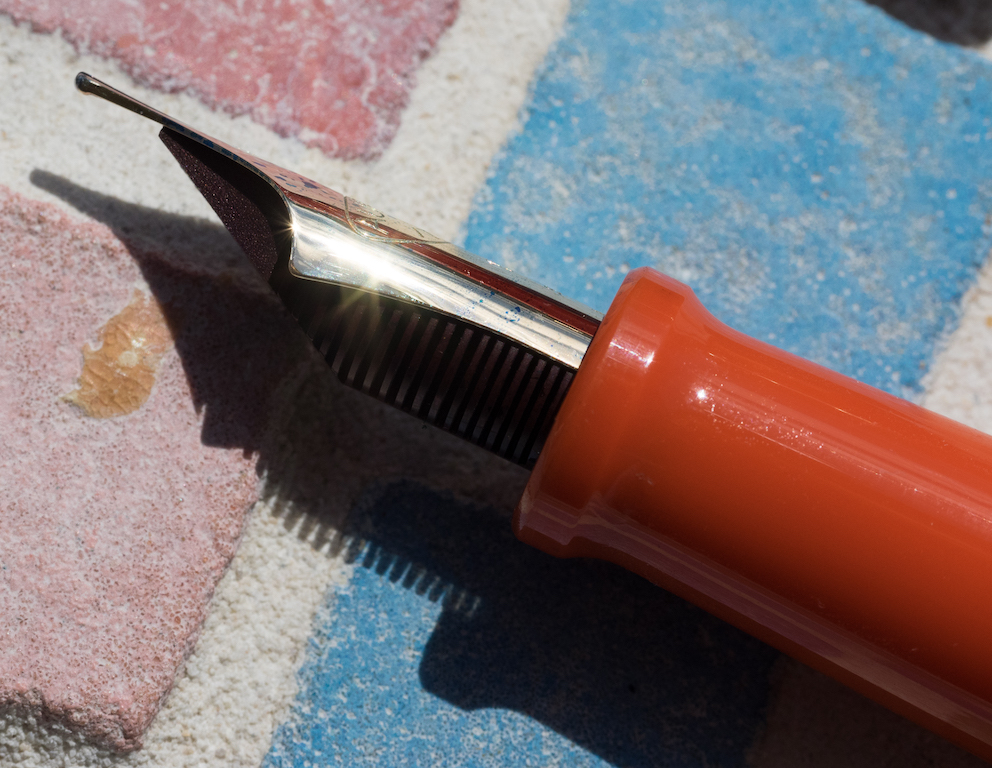
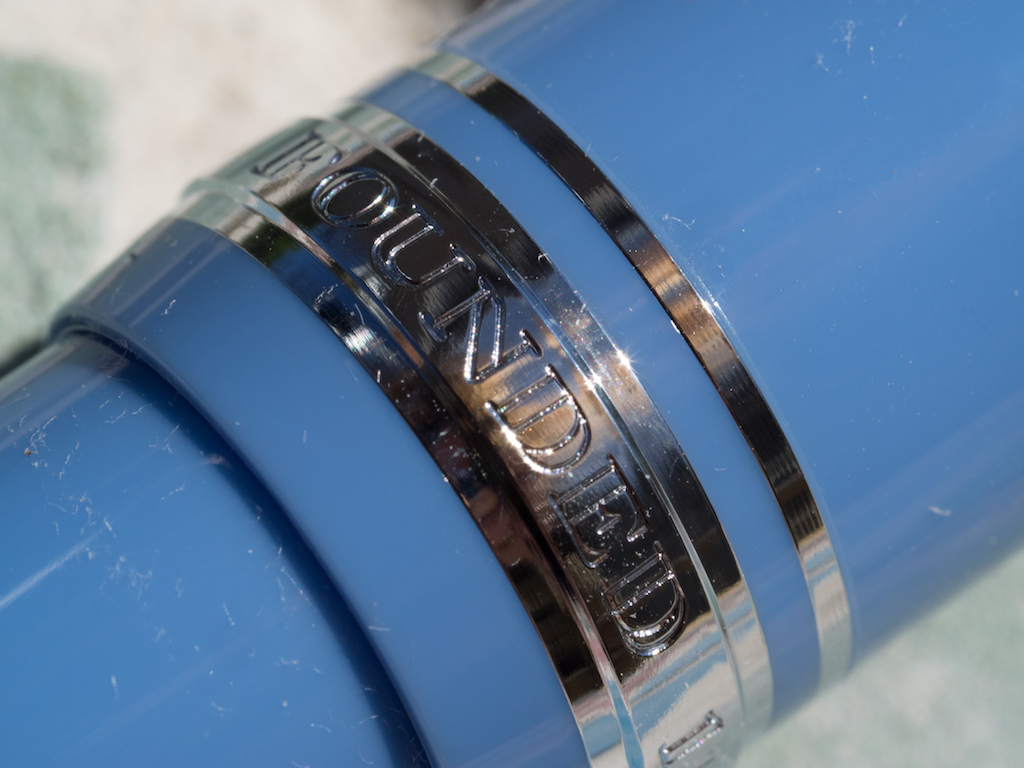
The pen is made of resin and has chrome-plated accents and clip.

The cap band is engraved with “Sailor Japan Founded 1911.”

This is a cartridge/converter pen. The converter is rather disappointing, holding only .5ml of ink, and I can never seem to get a complete fill with this converter.

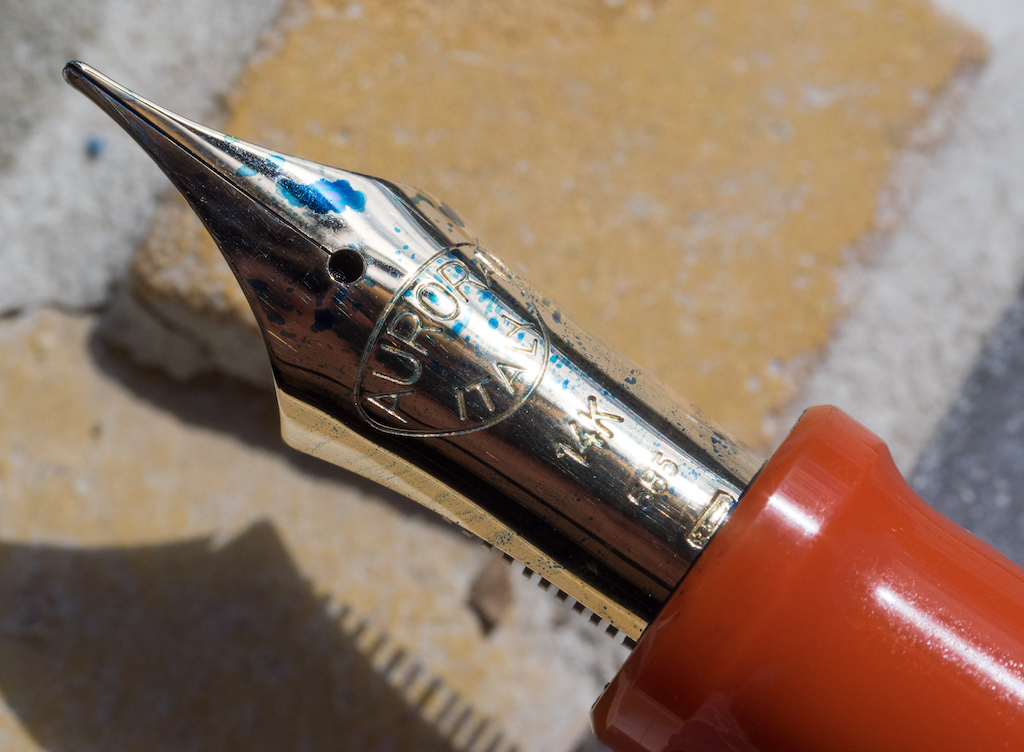
The best part of the pen is, of course, the nib. The Sailor 1911 large comes with a 21k rhodium-plated nib. The medium writes like a western fine and is nice and wet.

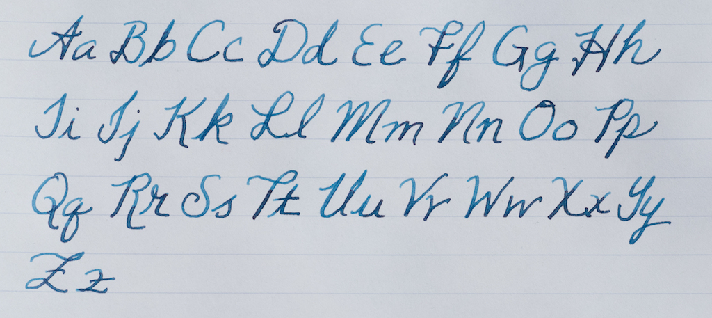
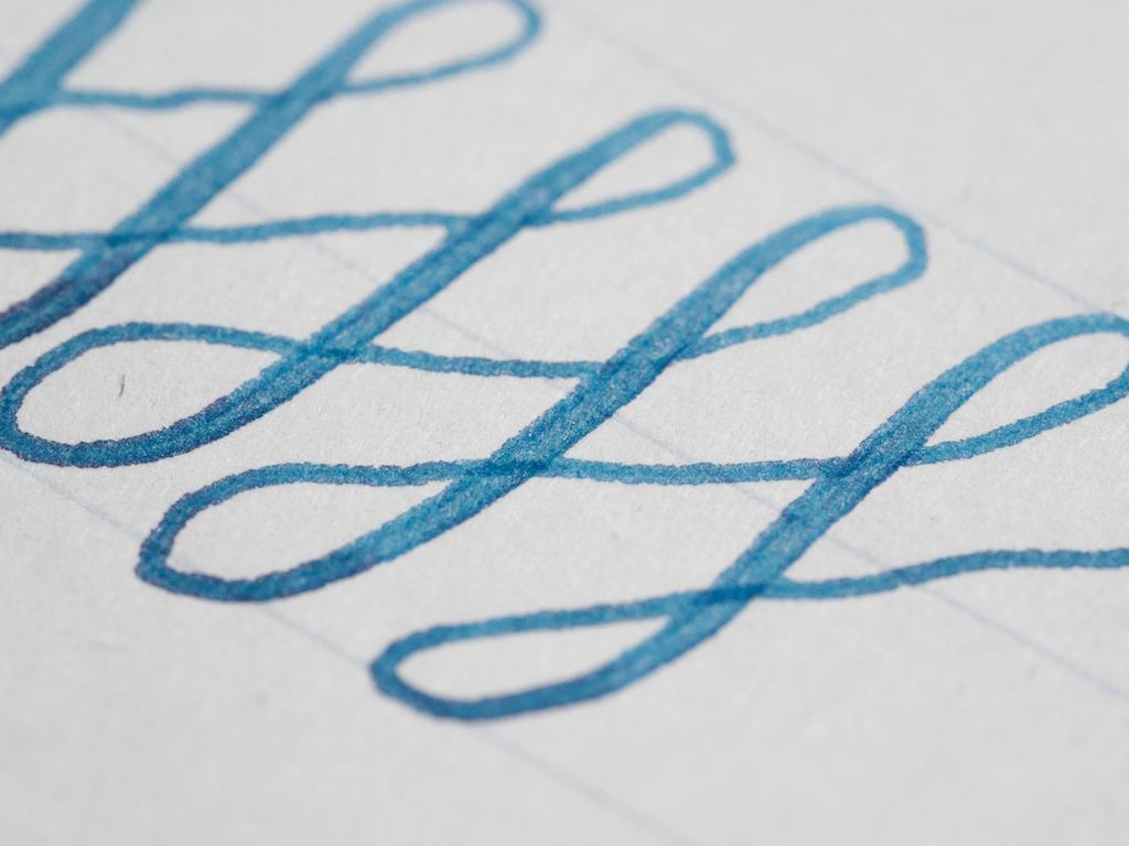
Sailor nibs are stiff and exhibit distinctive feedback. I wouldn’t call this a scratchy nib, but it’s not butter smooth either. There’s definitely no bounce or flex with this nib, but it is a terrific writer. I inked the pen with KWZ Azure 3 which is a good match for the pen.

I absolutely love the color of this Sailor 1911 from Fountain Pen Hospital. There’s just not another blue quite like it. However, you do pay a premium for this exclusive color. It costs $350 as opposed to the new Sailor Fresca 1911 (large) which most retailers are offering for $288.

Pros

  • The Sailor 1911 large is a pen most users will find comfortable. It is light because of the resin but well balanced. It is excellent for lengthy writing sessions.
  • The azure color is exclusive to Fountain Pen Hospital, and it’s very unique. It reminds me of china blue.
  • The 21k nib is an excellent writer with distinctive Sailor feedback. It’s not scratchy but it’s not butter smooth either. These nibs are definitely Japanese sizes, so if you like western fine nibs, you’ll want to order at least a medium nib.

Cons

  • You will pay a premium price for this exclusive edition. $350 really is a bit much considering that this pen is unnumbered, plastic, and comes in regular packaging. But, if you’re crazy about distinctive shades of blue like me, it might be worth it.
  • The converter on this pen holds only .5ml and I’m not sure it’s really even that much since you can’t get a complete fill. You’ll get better mileage out of cartridges, but I’m too lazy to refill cartridges.
Posted on April 7, 2017 and filed under Sailor, Fountain Pens, Pen Reviews.

The Aurora 88 70th Anniversary LE Fountain Pen with Flexible Nib: A Review

(Susan M. Pigott is a fountain pen collector, pen and paperholic, photographer, and professor. You can find more from Susan on her blog Scribalishess.)

I was beyond excited when I first heard that Aurora was coming out with a flexible nib. I pre-ordered the blue 88 with flex nib as soon as I could. But then I started hearing some ambivalent feedback from pen shows, and my excitement waned. Fortunately, Kenro sent Pen Addict a test pen so I could try out the flex nib for myself.

First, a disclaimer: I am not an experienced flex nib user. I own two Omas pens with extra flessibile nibs and a few vintage pens with semi-flex nibs. I was not willing to push the Aurora test pen too hard (I have to return it, after all). So, keep this in mind as you read my review and look at the photos. It’s possible that users with more experience might get more flex out of the Aurora than I did.

This Aurora 88 70th Anniversary fountain pen is a gorgeous bright orange (a color that will be released later this year). It’s a typical Aurora 88 style, cigar-shaped, with the signature Aurora clip. The pen has a small ink window and is a piston filler.

Of course, what everyone wants to know is, “How is the flex nib?” Well . . .

The nib is solid 14k gold with super long tines. The test nib doesn’t have the usual Aurora scrollwork, but the photos I’ve seen of actual pens for sale show scrollwork on the nibs. The nib tip looks like a fine, though the size isn’t indicated anywhere on the nib itself.

I’ll be perfectly honest. When I inked up the test unit and started writing, I was immediately disappointed. The nib felt pretty stiff like a regular Aurora nib. And while I could get some line variation when I flexed the nib, it was slight.

I worked with the pen for several days, switched out the ink, practiced swirls hoping maybe the nib would loosen up a little, but the flex was still minimal.

I inked my Omas Ogiva Extra Flessibile fine with the same ink, Iroshizuku Tsuki-yo, to compare with the Aurora. What a difference. The Omas nib is springy and exhibits a great deal of flex without much effort. While neither pen flexes as much as a super-flex vintage nib, the Omas beat the Aurora hands down.

The examples below show how the two nibs compare:

Alphabet

Aurora

Omas

Swirls

Aurora

Omas

Sentence

Aurora top, Omas bottom

I canceled my preorder after working with the Aurora. I really wanted to love the pen and the nib, I just wasn’t impressed. While it has some flex, it offers nowhere near the flex that the Omas extra flessibile does. At first I thought maybe I was being unfair comparing the Aurora to the Omas extra flessibile. But then I saw some websites advertising the Aurora as a “super flexible” nib. I think that, if people claim that the nib is super flexible, it should at least be as flexible as the Omas. Unfortunately, it’s not.

Does the nib flex? Yes. Does it flex as much as an Omas Extra flessibile nib? No. Does it flex as much as a vintage superflex nib? Definitely not.

And yet . . . after writing with the nib daily for a week, I have to say that, in spite of the fact that the nib does not flex as much as I’d hoped, it’s a wonderful writer. The long tines offer a different feel from a standard nib, and you can write without flex quite easily.

But here’s the deal. The Aurora 88 70th Anniversary LE fountain pen with a flex nib costs $650. These pens are made of resin. Yes, they are limited, numbered editions (only 188 of each color). Yes, they have special, long-tined, semi-flex nibs. Yes, they write beautifully. But $650 is a pretty steep price for a resin pen with a semi-flex nib. If these were auroloide pens with flex nibs, I wouldn’t hesitate to get one.

Vanness Pens will be stocking the Aurora 88 70th Anniversary Flex Nib Fountain Pen but you have to act fast. The first release in Blue is already sold out. Send them a message to inquire about future releases.

Pros

  • The Aurora 88 fountain pen is a terrific cigar-style pen. It’s a good size and weight for most users.
  • The flex nib is beautiful and has gorgeous long tines reminiscent of some vintage Aurora fountain pens.
  • The nib offers some flex and line variation, and when you write with it normally, it is smooth and the long tines provide a unique writing experience.
  • The anniversary pens will be released over the year in a variety of colors to suit many tastes.

Cons

  • The flex nib is certainly not a “superflex” nib. It isn’t even as flexible as an Omas extra flessibile. I would call it a semi-flex nib at best.
  • The anniversary pens are made of resin not auroloide, and, in my view, they are overpriced. If they were in the $350-$400 range I’d feel better about purchasing one.

(Kenro Industries provided this product at no charge to The Pen Addict for review purposes.)


Enjoy reading The Pen Addict? Then consider becoming a member to receive additional weekly content, giveaways, and discounts in The Pen Addict shop. Plus, you support me and the site directly, which I am very grateful for.

Membership starts at just $5/month, with a discounted annual option available. To find out more about membership click here and join us!

Posted on March 20, 2017 and filed under Aurora, Pen Reviews, Fountain Pens.

Lamy Pacific Blue Al-Star Pen And Ink Review

(Jeff Abbott is a regular contributor at The Pen Addict. You can find more from Jeff online at Draft Evolution and Twitter.)

Every year, Lamy release a limited edition color of their popular Al-Star line, along with a companion ink of the same color. This year, I'm especially excited for the limited edition color: Pacific Blue. I'm admittedly a huge fan of turquoise and teal, and this pen is a delicious, shiny color that fits my bill perfectly. Pair that with an equally gorgeous turquoise ink, and we're all set for a killer combo.

The Pacific Blue Al-Star

You might love the new color, or it might make you cringe. Either way, it's impossible to miss. This is a loud, shocking, electric blue with subtle green undertones that set it off. Obviously, the color is inspired from the Pacific Ocean, and it does a great job of factoring in all the factors of the sea. When looking at this pen, it somehow looks as if it might be partially liquid while it sits on the desk. For me, it's a color that makes me extremely happy, and I love the pen for that.

Since the only difference with this Al-Star is the color, I won't spend a lot of time on the details. Check out my review of the Charged Green Al-Star from 2016. Everything holds true for this copy as well!

The Lamy Al-Star is a solid fountain pen. It's not as affordable as the Safari line, and some people enjoy the Safari line more for many great reasons, but the Al-Star hits a nice balance of design, weight, feel, and awesome colors that set it apart from the Safari. If you haven't tried out an Al-Star (or a Safari...), then I highly recommend picking up this limited edition color.

The Lamy Al-Star in Pacific Blue is $36.00 and available with an EF, F, or M nib. Remember that Lamy nibs are easy to swap out with another size as well. Each Al-Star ships with a single blue cartridge, or you can purchase a cartridge-converter separately.

Lamy Pacific Blue ink

The other half of this year's Lamy special edition combo is the Pacific Blue ink. You might have heard, but it's no secret that Pacific Blue is, in fact, the same ink as Lamy Turquoise. I don't understand why Lamy released Turquoise under a limited edition moniker instead of formulating a unique ink, but that's not the point of this review. As such, keep that in mind if you already own Lamy Turquoise! You can safely skip this ink knowing that you already have it.

Lamy Pacific Blue is a beautiful turquoise ink that leans toward the lighter and blue spectrum. For example, I found that Kaweco Turquoise was a bit darker than the Lamy version. Iroshizuku ama-iro is actually very similar to Pacific Blue, but I think it has better shading qualities. Regardless, it's a gorgeous blue-green that radiates on the page! I love using this ink because of the color, and it's been difficult for me to switch back to Ama-iro over the past week. It's a great color.

Shading is great with this ink, which is something I haven't been very excited about with other Lamy inks. There isn't a massive range of variation, but it's tasteful. Again, it's intended to remind you of the Pacific ocean, so a degree of shading is expected. Lamy delivers this with high marks. The shading behavior is easy to notice in this medium nib, but it shows off a bit more in larger nibs. There's a minimal degree of shading in small nibs, but that shouldn't be a surprise.

The ink performs really well. I've not had any issues with skipping, starting, or clogging. Cleaning is a breeze, and lubrication is very balanced.

I haven't been able to detect any bleeding or feathering so far on my normal papers. There's a degree of feathering on cheap copy paper, but that is expected. Being on the light side, show-through isn't a problem in most cases. Using Rhodia paper, the opposite side of the page is completely usable after the top side is used.

Dry time is average compared to other fountain pen inks I use. It dries consistently by 15 seconds, while pooled areas take about 20 seconds to dry completely. Not bad, but not exceptional.

One unique feature with any Lamy bottled ink is the ink blotter included at the base of the bottle. This is convenient for cleaning the grip section and nib after you fill it with ink. These blotting strips do a great job and prevent you from using a tissue or paper towel to do the same job. Much less waste.

You can purchase Lamy Pacific blue in a 50ml bottle, or as a 5-pack of cartridges. Personally, I think the bottle is a better bargain. And remember — if you already own Lamy Turquoise, you don't need this!

(JetPens provided this product at no charge to The Pen Addict for review purposes.)


Enjoy reading The Pen Addict? Then consider becoming a member to receive additional weekly content, giveaways, and discounts in The Pen Addict shop. Plus, you support me and the site directly, which I am very grateful for.

Membership starts at just $5/month, with a discounted annual option available. To find out more about membership click here and join us!

Posted on March 1, 2017 and filed under Lamy, Fountain Pens, Ink Reviews, Pen Reviews.