Posts filed under Fountain Pens

Franklin-Christoph S.I.G. Flex Nib Review

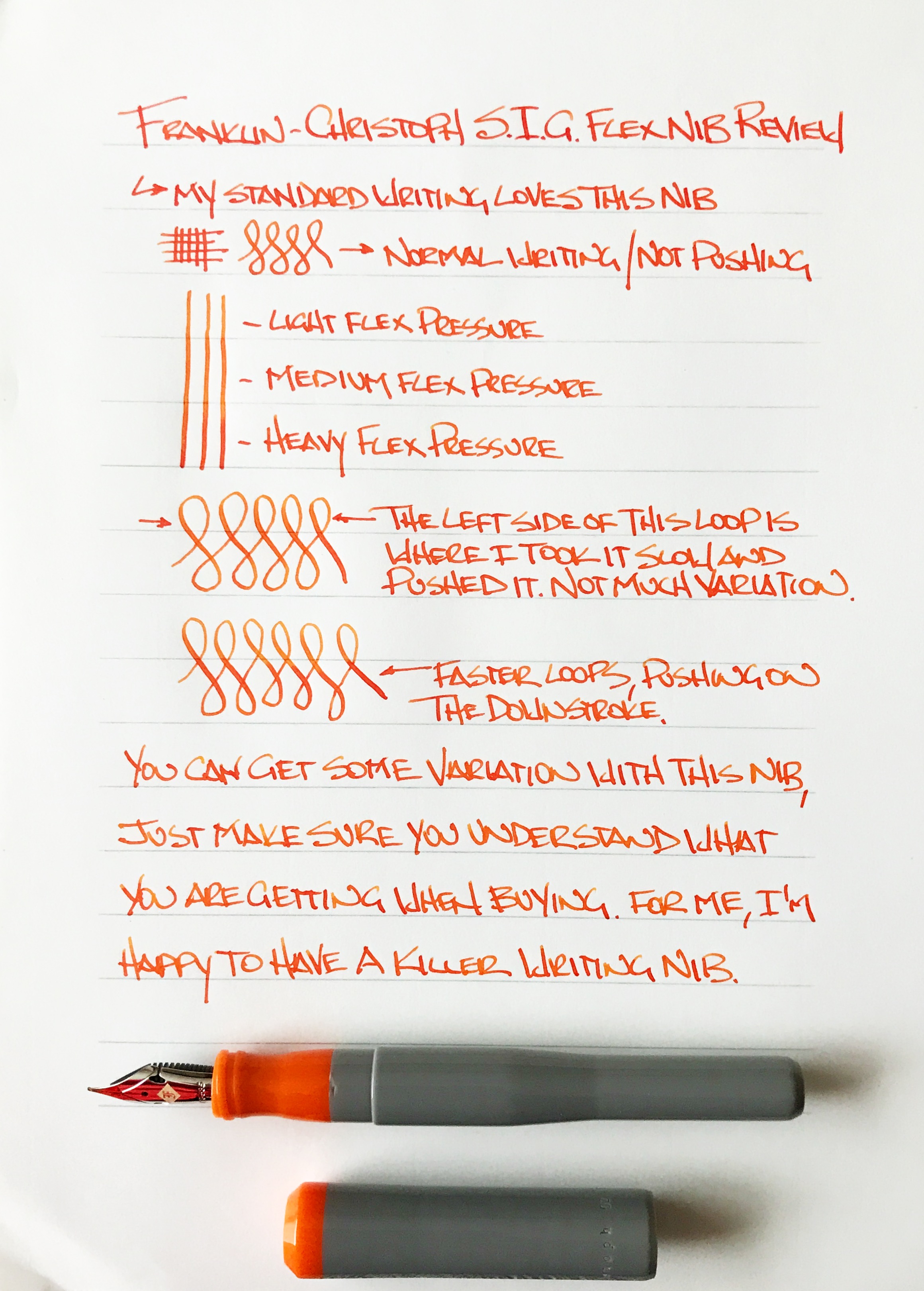
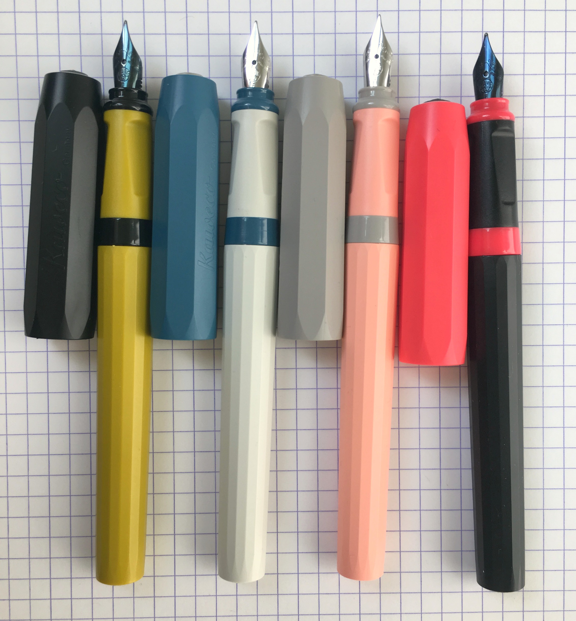
I’ve had my Franklin-Christoph S.I.G. Flex Nib in regular use for a couple of months now, and I find two statements to be true about it’s performance:

  • It is an awesome feeling nib.
  • There is little line variation.

When I have talked about this nib in other places I keep saying it is not a flex nib. That’s not exactly true. It does flex in the literal sense, as in the tines spread and the nib bends, but it does not provide what I consider to be flex nib output, meaning noticeable line variation when pushed. Not with light pressure, not with heavy pressure. But that doesn’t keep this nib from being great in my book.

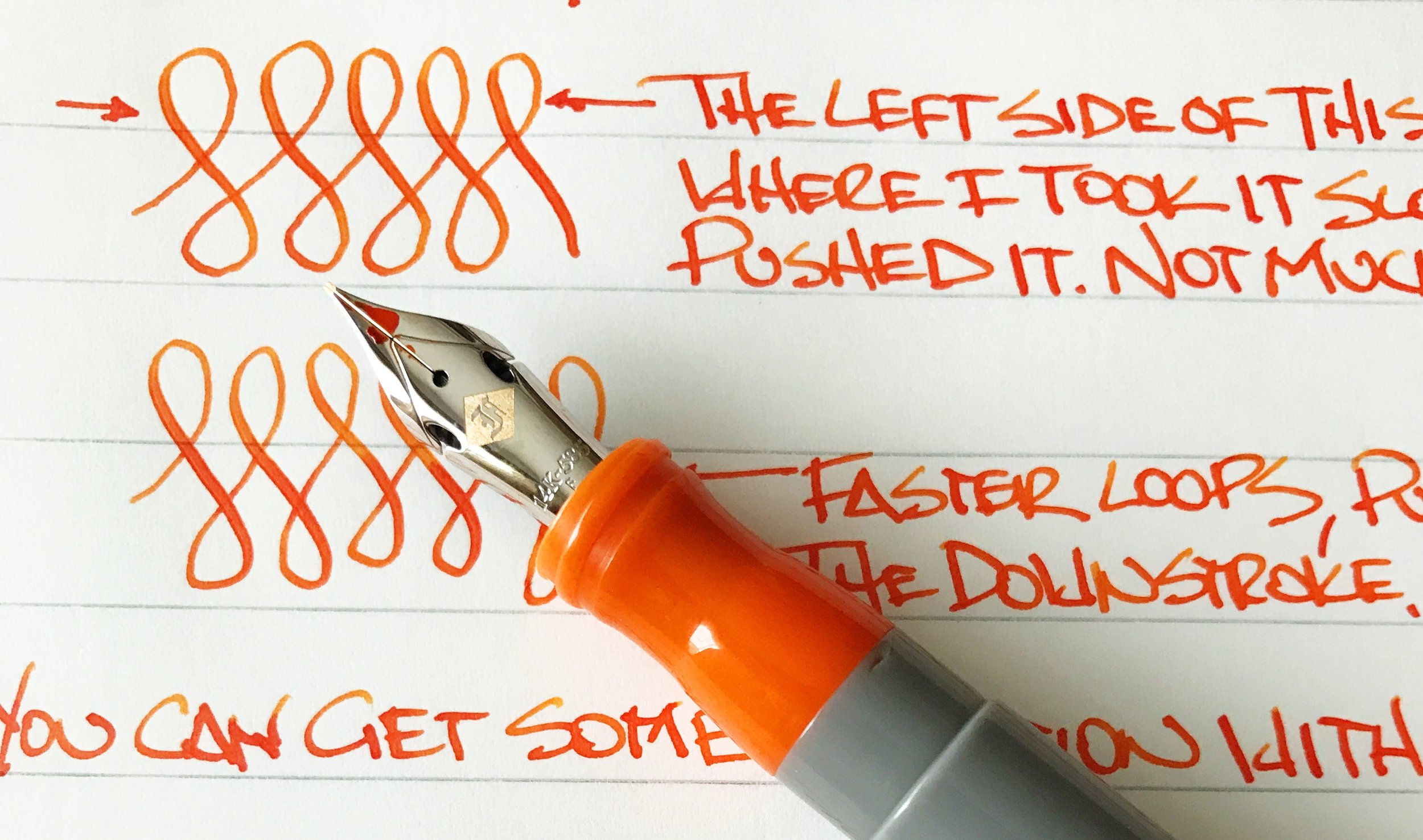
What this nib provides is bounce, not flex. You can push the nib and watch the tines spread. It is a fantastic feel, and a great writing experience. Just don’t expect much line variation. My fine S.I.G. grind goes from a medium width line to a mediumer line. And I’m ok with that because my line looks great and the nib feels great.

S.I.G. stands for Stub Italic Gradient, which is a nib grind done by F-C’s in house nib meister Jim Rouse. It is perfect for someone like me who enjoys a cursive italic grind but without the sharp edges is often comes with. This grind smooths those edges out while keeping the horizontal and vertical line variation that I enjoy so much.

To achieve flex in this nib, Jowo (the nib manufacturer) added cutouts above the shoulders of the nib. In theory, this allows the tip to be pushed when writing for added flex. The output just isn’t as impressive as the look. Nib meisters have added cutouts and slits to nibs for years to provide added flex. Jowo, and other nib manufacturers, are now adding this feature as a stock offering, which is a good sign that they are listening to us consumers. Just don’t be confused about what you are actually purchasing.

If you are looking for line variation as found with a traditional flex nib, this is not the nib for you. If you are looking for a wonderful writing nib with a ton of character and fun, then check out the S.I.G. flex nib. I’m completely enamored with mine and enjoy using it. I may even add a second one to the lineup one day.

(This nib was purchased at full price with my own funds.)


Enjoy reading The Pen Addict? Then consider becoming a member to receive additional weekly content, giveaways, and discounts in The Pen Addict shop. Plus, you support me and the site directly, which I am very grateful for.

Membership starts at just $5/month, with a discounted annual option available. To find out more about membership click here and join us!

Posted on September 11, 2017 and filed under Franklin-Christoph, Fountain Pens, Nibs, Pen Reviews.

Visconti Rembrandt Silver Shadow Fountain Pen: A Review

(Susan M. Pigott is a fountain pen collector, pen and paperholic, photographer, and professor. You can find more from Susan on her blog Scribalishess.)

The Visconti Rembrandt Silver Shadow is a variegated resin pen in a silver/grey color. The resin is meant to evoke Rembrandt’s use of chiaroscuro (tonal contrasts that create a 3-D effect) in his paintings. You can see that effect in the photo of the resin below:

The pen comes in a large Visconti clamshell box in brown with a soft cream interior. A Visconti booklet is enclosed. My loaner pen came with two different converters, but I’m sure it normally arrives with just one.

The Rembrandt is one of the smaller Visconti pens. It is 140mm capped, 160mm posted, and 125mm unposted. It weighs 33 grams.

The cap is adorned with the Visconti finial (and you can replace this with Visconti’s “My Pen” system), the arched Visconti spring clip, and a beautiful cap ring engraved with Rembrandt’s name and etchings that are based on the artist’s work. The cap snaps on using a magnetic system that is rather unique.

Unfortunately, my Rembrandt came with a faulty finial. It fell off the moment I removed the pen from its cellophane wrapper. It looks as though the glue that holds the magnetic base for the finial came loose. This is one of those things that could be a fluke, or it could be an indication of quality control issues that seem to be common with Visconti pens

In addition to that issue, I noticed what might be a flaw in the resin. It’s tiny, but noticeable and looks like a crack in the resin. It feels smooth to the touch, however, so it may simply be a place where darker resin pooled.

One beautiful detail that I almost didn’t notice is a ruthenium (I think) bottom finial. It is barely noticeable from the side, but from the bottom, it shines like a mirror. It provides a nice balance to the cap finial.

The nib is a fine stainless steel coated in black with Visconti’s lovely scroll work. It is really quite beautiful and goes well with the grey color of the pen.

The grip is ruthenium-coated. As with most metal grips, it can become slippery if you have sweaty fingers. But, because this pen is light, I found it easy to write with in spite of the fact that I normally don’t like metal grips.

The pen fills with either short international cartridges or the enclosed converter.

I found the Rembrandt to be quite comfortable for writing. The pen is a little small, but not so much that I found my hand cramping. The stainless steel nib was smooth and exhibited no problems like hard starting or skipping. It is, however, a very stiff nib and offers absolutely no flex or give. Although the nib is labeled a fine, it wrote more like a medium with Iroshizuku Take-Sumi ink.

Midori MD Notebook

I wrote a portion of the first chapter of The Hobbit in my Clairefontaine French-ruled notebook to put the pen through its paces. It wrote flawlessly, and by the end of the page my hand was not fatigued.

You can purchase the Visconti Rembrandt fountain pen in Silver Shadow from Goldspot Pens for $175. I found the Rembrandt to be a sweet smaller pen that wrote well and looks quite classy, but I think $175 is rather expensive for this pen, considering that it is plastic, has a steel nib, and is not a piston filler. The Rembrandt comes in other colors as well: red, purple, blue, and black. Not all have the black nib, however.

Pros

  • I was pleasantly surprised at how much I liked this little Visconti. I love the grey/silver color and the black nib.
  • The nib on this pen is unyielding but smooth. The fine wrote more like a medium, so if you like a finer line, you might see if you can get the nib in extra fine.
  • The pen is comfortable in the hand, and, despite the metal finial, I didn’t have trouble holding the pen even when my fingers got sweaty.

Cons

  • My pen arrived with two flaws: a faulty finial that fell off the pen upon removal from the cellophane and a possible small flaw in the resin (which could just be where a darker portion of resin pooled).
  • This is not a pen for people who have large hands or who like large, hefty pens.
  • Visconti pens can be hit or miss in terms of nib quality out of the box. I was pleased that this steel nib wrote smoothly. But if you can, have your retailer test the nib and tune it before shipping.
  • For a plastic pen with a steel nib and converter system, $175 seems too high pricewise.

(Goldspot loaned this product to The Pen Addict for review purposes.)


Enjoy reading The Pen Addict? Then consider becoming a member to receive additional weekly content, giveaways, and discounts in The Pen Addict shop. Plus, you support me and the site directly, which I am very grateful for.

Membership starts at just $5/month, with a discounted annual option available. To find out more about membership click here and join us!

Posted on September 8, 2017 and filed under Visconti, Fountain Pens, Pen Reviews.

Kaweco Perkeo Fountain Pen Review

(Sarah Read is an author, editor, yarn artist, and pen/paper/ink addict. You can find more about her at her website and on Twitter.)

Kaweco has updated their old 1900s dip pen design into a new entry-level, full-size fountain pen--and I'm quite smitten with it. The Kaweco Perkeo is a cartridge/converter pen. It takes standard international sizes, so there's no need to fuss with the dreadful Kaweco mini converters. Each pen comes with a short blue cartridge. It's a bit of a shame that they don't come with converters--be sure to toss one in your cart if you're buying one of these pens.

The Perkeo is available in four colors: "Bad Taste" in cherry and black; "Cotton Candy" in pink and grey; "Indian Summer" in black and slime-green; and "Old Chambray" in a pale off-white and blue. They're all fun and attractive color combos, and it's incredibly fun to mix-and-match the bodies, sections, and caps. I won't even confess to how much time I've spent swapping them around.

The caps show the familiar Kaweco faceted silhouette. They are octagon shaped and a bit wider than the Sport caps--so the Kaweco clips will not fit on these pens. I hope they plan to release a clip for this model soon. At the top of the cap is a Kaweco brand medallion. The body has many narrow facets and looks quite sleek and elegant, I think. The section has two color bands that match the cap color. The section is slightly molded for a triangular grip. It isn't as intense as the Lamy Safari grip, but it's a similar idea. If you don't have a triangular pen hold, it could potentially be intrusive for you. I don't quite understand why any pen manufacturer would fit their product in such a way to limit their audience, but there you go. They do feel perfectly comfortable for me, but you may want to try holding one before you commit to the purchase if molded grips cause you grief.

The lightweight plastic has a matte finish, but is very smooth to the touch. The snap cap is quick and handy but gives a good seal. After leaving the pens idle for nearly a week, only one needed any priming to get started again. The cap posts very nicely and securely. The bodies are long enough to carry a spare cartridge, if you're using the short size. If you partially unscrew the barrel, you can peek at your ink level through a clear thread piece. It's not terribly easy to see through the threads, but it does give some idea of ink level. There are holes at the bottom of the barrel--so no eyedropper filling for this pen unless you seal the bottom very securely first. I think that's a missed opportunity for these pens.

The nibs are friction fit, but very difficult to get out. I'd recommend not trying unless there is a pressing need--and be careful to not damage the nib as you pull. They also seem to be slightly different in shape than the Kaweco Sport nibs. They're number five nibs, but they're longer and a bit narrower in wingspan. This shape may contribute to the surprising springiness of these nibs. I got a lovely bit of line variation when putting a pressure on the nibs. If you're careful not to spring the steel, you can get some great character in your writing.

The nibs are all quite smooth and seem to get a good ink supply. I've tried them with Kaweco, Diamine, and Monteverde ink cartridges, and all have been delightful. The pink and blue pens come with silvery steel nibs, and the black and slime pens come with an almost iridescent blue-black nib. My overall impression of the nibs is that they are good quality but bad consistency. All write pleasantly and well--but they all write a bit differently, despite all being a fine point. The lines vary a bit in width, and some nibs seem firmer or offer more feedback than others. Even the coating on the darker nibs seems different between the two pens. While I don't mind this inconsistency so long as they all write well, it does point to some concerns about quality control of the nibs overall (which isn't a new issue for Kaweco nibs).

Despite my few small complaints, I'm enjoying these pens a lot. They're light, durable, inexpensive, and fun. I'm hoping for more great color combos in the future (so I can continue to play LEGO pens) but I think Kaweco has a great, competitive entry-level pen, here. If you have these already, I'd love to see your color combos!

(JetPens provided this product at no charge to The Pen Addict for review purposes.)


Enjoy reading The Pen Addict? Then consider becoming a member to receive additional weekly content, giveaways, and discounts in The Pen Addict shop. Plus, you support me and the site directly, which I am very grateful for.

Membership starts at just $5/month, with a discounted annual option available. To find out more about membership click here and join us!

Posted on September 7, 2017 and filed under Kaweco, Fountain Pens, Pen Reviews.