Posts filed under Fountain Pens

Lamy Aion Fountain Pen Review

(This is a guest post by Y. Amit. He is a freelance writer, living and working in Tel Aviv, Israel.)

There is something strange about Lamy. In fact, it seems like there are two different Lamys: One is the groundbreaking-design-firm, that designs pens that are both minimalist and sophisticated (Lamy 2000), That is not afraid of bold and crazy colors (The Safari and Al Star lineup); The other Lamy is a company that seems a bit, how should I put it… non-evolving: sure, one can definitely recognize a Lamy pen when one sees it, but is that a good thing? Do pen lovers really not want to be surprised by pen companies?

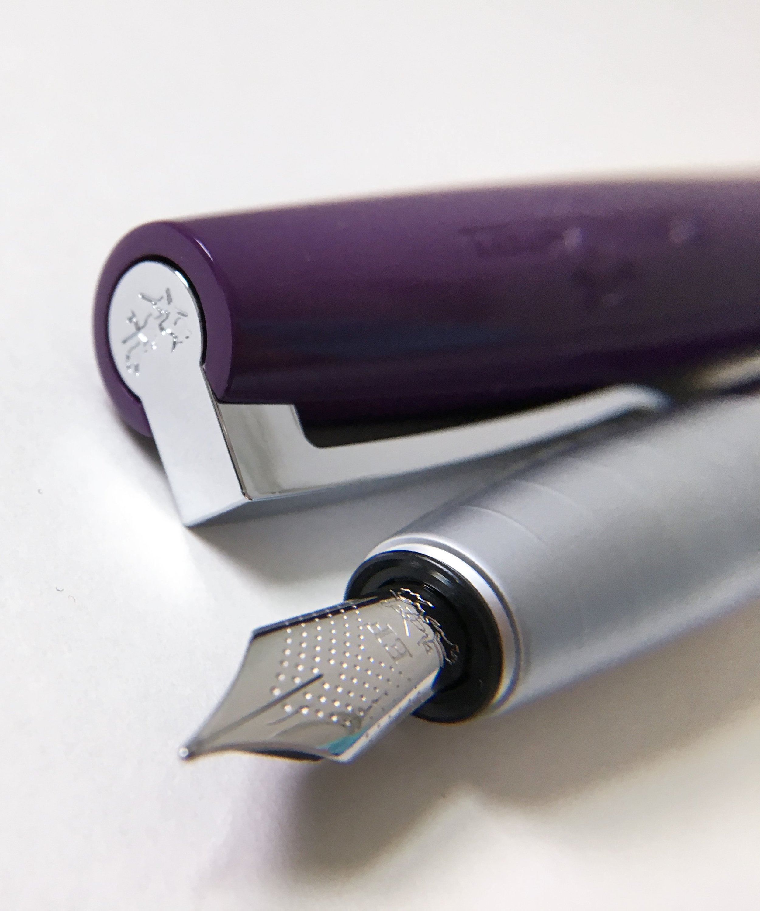
Case in Point: the new Lamy Aion, the latest addition to the Lamy lineup. The pen is made of Aluminum, and comes in either Olivesilver or Black, and with a stainless steel nib, that while interchangeable with regular Lamy nibs (such as the Safari ones), is different in design. As always with Lamy pens, the designer was named, so let's give him the credit: Jasper Morrison, a renowned industrial designer, is the person behind the design. Lamy marked it "Simply Modern", and they claim it to be in direct linkage to the famous Lamy 2000, maybe that's why over 50% of their marketing material regarding the Aion refer to the 2000 instead.

I bought my Aion from Cult Pens, which charges about GBP 40 (USD 54) without the tax, and GBP 47.50 including tax. On American websites the Aion sells for about USD 70, give or take. The first drawback for me was the fact that the pen did not ship with a converter. Now, I use cartridges sometimes, mostly with my Kaweco Sports; I don't like to use cartridges on pens I use for work, as I find the ink flow to be much better with a converter. I think that a pen at this price, should come with a converter. Now, I understand that in the US market, a converter is included, which is fine.

The pen itself is well built: there is nothing new or exciting in the design, and if you're looking for a gimmiky-type pen, that's not it. However, it is a good, solid pen, suited for the office and for the boardroom alike. Compared to the Studio, which is approximately in the same price range, the Aion is a heftier pen: its diameter is slightly larger, and it is a bit higher, so for people with larger hands, this may be better and more comfortable to write with.

The pen is not very heavy, but does have some gravitas to it, and it is well balanced. The cap posts comfortably, without throwing off the balance.

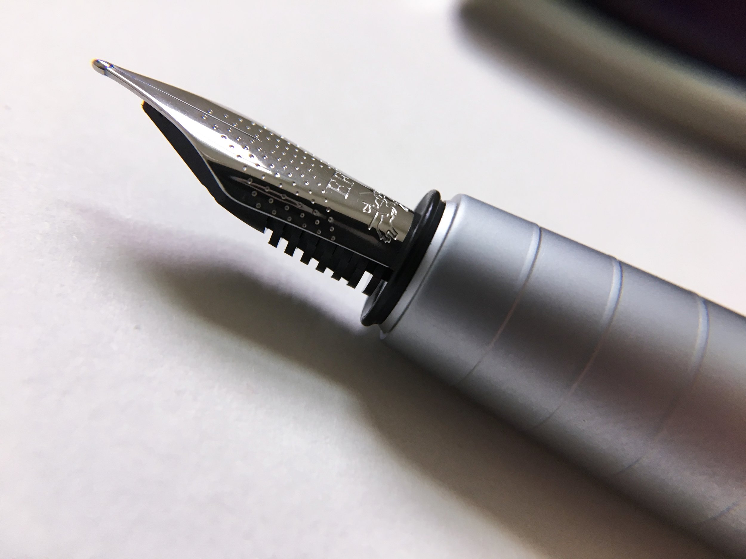
The main novelty of this pen is the nib. Lamy are famous for their uniform nibs, using for most of their pens (except for the 2000 line). The nib on the Aion is somewhat different: it is more round on the tines, and while you can replace it with any other standard Lamy nib (if you want to upgrade to gold nibs, or if you prefer calligraphy nibs), the use of this new design is a statement. Is it a good statement? I have to admit, I'm not sure. One of Lamy's strong suits has always been in my mind the fantastic stainless steel nibs they make. The nibs on the Al Star or the Safari are, generally, so good, they give you a smooth, silent writing experience. In fact, trying the Lamy gold nibs have proven almost no different to me than use of the stainless steel ones.

The new, rounded nib is different. While not scratchy per-se, it does make a distinctive sound on the paper. Some may like it: the tactile sense of a nib running on paper is one of the positive effects of writing with a fountain pen, so for some of you, this may not be an issue, but this is by no means a smooth writing experience. I have tried the pen on many types of paper: from Rhodia pads to the horrible laser-printer pages, and while the sound was more distinctive on some papers than on others, it was present on all papers, smooth or toothy.

The ink flow, as expected from Lamy, is very good: the nib is neither too wet nor too dry, and using a Visconti Blue ink on it gave great results. So, is the Lamy Aion a good buy? I've been writing with it for about a week now as my main writing instrument. It is, like most Lamy pens, a workhorse. Lamy was right to place it in the medium price range. At this range, it is a decent pen, worth having in your pen case.

(DISCLAIMER: The writer purchased the pen with his hard-earned money.)

Posted on December 26, 2017 and filed under Aion, Lamy, Fountain Pens, Pen Reviews.

Parker Premier Monochrome Titanium PVD Fountain Pen: A Review

(Susan M. Pigott is a fountain pen collector, pen and paperholic, photographer, and professor. You can find more from Susan on her blog Scribalishess.)

I have never owned or even tested a modern Parker fountain pen. I once owned a Parker 51 in Cedar, but I could never get that pen flushed out, and I eventually sold it.

My old Parker 51

So, I wasn’t at all sure what to expect from a modern Parker, like this Parker Premier Monochrome Titanium model. This pen arrived in a black clamshell box with black velveteen lining. The black velvet really shows off the silver finish on this pen. Included with the pen are a box of blue Parker cartridges, a converter, a polishing cloth, and a booklet.

I must say that this pen is absolutely gorgeous. The titanium PVD finish is etched and that gives the pen a semi-matte look.

The barrel is adorned with triple sets of engraved rings—two sets on the grip and one at the base of the barrel. The rings make the design interesting without overwhelming the classic lines of the pen. Plus, the grooves on the grip provide some texture so your fingers don’t slip as much.

The snap cap has matching rings on the finial and cap ring. Plus, the Parker logo, name, and the word “France” are engraved on the cap ring. This is pretty low-key branding, and it suits the pen. The clip is a classic Parker arrow design. It flexes well and will clip easily to a shirt pocket or pad of paper.

The pen is postable, but as usual, I find posting throws off the balance too much to make it practical, especially since this pen is fairly weighty. The Premier is a medium-sized pen. It is 5 inches uncapped, 6.2 inches posted, and 5.5 inches capped. It weighs a total of 45 grams.

You can fill the pen with the supplied Parker cartridges or with the converter. The converter is an especially nice model with metal fittings. It holds .5ml of ink.

The nib is a Ruthenium-plated 18k gold medium, and it writes beautifully. It is engraved with Parker’s arrow design.

It has a little give to it, so it doesn’t write like a nail. It offers a tiny bit of line variation.

I used this pen to take notes during my Honors Old Testament oral final. While the students responded to my questions, I wrote their responses as quickly as I could. The nib kept up with me, and never missed a stroke. I was very impressed as I wrote constantly for an hour and a half with no problems whatsoever.

One thing I don’t like about this pen is the metal grip. Even with the engraved rings, my fingers slipped when they got warm and sweaty. This is simply unavoidable with a metal grip. Still, I found the Parker’s grip to be much better than smooth metal grips. I never had to wipe my fingers off in order to keep writing.

The only other minor quibble I have is that ink gets caught in the engraved rings when you fill the pen. This isn’t a major problem, but you do have to clean out the rings if you fill the converter via the nib. You can avoid this by simply filling the converter and inserting it into the pen.

I fell in love with this Parker Premier. It convinced me that I need a modern Parker in my life. I’m looking for one with a non-metal grip so my fingers won’t slip as much.

If you are looking for a classic modern pen that writes beautifully and exudes professionalism, the Parker Premier in titanium is an excellent choice. You can purchase this pen from Goldspot Pens for $419.95 (current sale price).

Pros

  • The Parker Premier in titanium is an elegant, professional looking fountain pen. I particularly like the etched/matte exterior.
  • Although I normally prefer screw-on caps, the snap cap on the Premier attaches firmly to the barrel, and it does not rattle or rotate loosely.
  • The pen is hefty, but I found it completely comfortable while writing constantly for an hour and a half.
  • The nib is fantastic. It is smooth and has a bit of bounce to it.

Cons

  • Because the grip is metal, it can get slippery if your fingers sweat like mine do.
  • Ink can get caught in the engraved rings on the grip when you fill the pen.
  • This pen is expensive, retailing for $525.00. Goldspot is currently offering it at a sale price, but it is out of stock. I read elsewhere that this pen is no longer being produced. So it may be difficult to get your hands on this exact model.

(Goldspot provided this product at no charge to The Pen Addict for review purposes.)


Enjoy reading The Pen Addict? Then consider becoming a member to receive additional weekly content, giveaways, and discounts in The Pen Addict shop. Plus, you support me and the site directly, for which I am very grateful.

Membership starts at just $5/month, with a discounted annual option available. To find out more about membership click here and join us!

Posted on December 22, 2017 and filed under Parker, Fountain Pens, Pen Reviews.

Faber-Castell Loom Fountain Pen Review

(Sarah Read is an author, editor, yarn artist, and pen/paper/ink addict. You can find more about her at her website and on Twitter.)

Faber-Castell has been in the fine writing instrument business since 1761--an incredible legacy. Many of their pens are very high-end, elegant, and unique--but even their more affordable pens show the design and craftsmanship you'd expect from a company that clearly knows what it's doing. I would consider the Faber-Castell Loom to be slightly above entry-level on the pen enthusiast scale. At $40, it's an expensive jumping-in point. But if your first impression of fountain pens is the Loom, there's a good chance you'll soon be referring to yourself as a pen addict.

This model is the plum color in piano finish. There are a lot of other fun colors to choose from. It took me a little sleuthing to figure out that piano finish are the shiny chrome bodies, and metallic are the matte bodies. It's glossy and looks quite fancy on the desk or when writing, but it collects dust and fingerprints very easily. The body is made from aluminum, so it's also quite heavy, while the plastic cap is very light compared to the rest of the pen. The body is a straight tube that tapers to the grip section, which has a matte texture and five raised ridges meant to aid in grip. As much as I think it looks snazzy, this grip section doesn't work well for me. It's a very wide pen and the tapering is a bit too severe--so my fingers just keep slipping down to the nib. I have to focus on maintaining my grip, and it makes my handwriting look terrible. This may not be a problem for someone with larger hands--but a larger hand may find that the pen feels a bit short to them. The proportions are just a bit unusual. Posting the pen solves this, but there is a risk of scratching that glossy finish.

The pen takes a standard international cartridge or converter, and comes with a short cartridge and a dummy cartridge meant to hold the short cartridge in place. It does not come with a converter, which is a shame.

The cap is wider than the body, tapered at each end. The clip is sturdy and spring-loaded, and my favorite clip ever. It's flexible but sturdy, and feels reliable. It's attached at the finial, which is stamped with the Faber-Castell insignia, the jousting knights. The name and logo are also stamped into the plastic of the cap. The stamping isn't terribly clear--I had to squint a bit to see what it was, but it's a complex image to shrink down to the size of a pen cap. It's a snap cap, and the snap is very aggressive. It takes more force to remove than it feels like it should. It's nice to know it's so secure, but I hope it relaxes a bit over time.

The nib, of course, is where this pen reels you in. It's smooth and perfectly tuned, so it's not too wet, but not at all dry. It has no breather hole, but is dimpled all over. It also attempts to squeeze the jousting knights logo into an even smaller space, with limited success--but it still looks fancy. The EF is definitely a western EF--comparable to a Kaweco, but close to a Japanese M. It's a pleasure to write with. There is just enough feedback to give you control of the pen, but it feels butter smooth. I can see why it's said that Faber-Castell has the best steel nibs on the market.

Overall, it's an excellent pen. That wide, tapering grip makes it not work for me, unfortunately. I wish it did, because I can tell I'm missing out on something special. It's definitely a good buy for its cost, and I think it would make an excellent gift--it's in that perfect price range to be something fancy without being extravagant.

I think I'll be trying out more Faber-Castell pens in the near future, looking for one that fits my hand well, and that nib is going to haunt me until I succeed.

(Vanness Pens provided this product at no charge to The Pen Addict for review purposes.)


Enjoy reading The Pen Addict? Then consider becoming a member to receive additional weekly content, giveaways, and discounts in The Pen Addict shop. Plus, you support me and the site directly, for which I am very grateful.

Membership starts at just $5/month, with a discounted annual option available. To find out more about membership click here and join us!

Posted on December 14, 2017 and filed under Faber-Castell, Fountain Pens, Pen Reviews.