Posts filed under Fountain Pens

ystudio Brassing Desk Fountain Pen Review

I admit I’m a bit of a ystudio fanboy. I fell instantly in love with their design when I first saw them (from Patrick Ng on Instagram I’m certain) and found a shop called Kohezi in Amsterdam in 2016 to get the Brassing Ballpoint from. To use the great stationery cliché, it was love at first write.

As great as it was, the release of the fountain pen in late 2016 really set me off. It was an instant hit - for me anyway - and became one of my most used pens of 2017. I still get complete enjoyment every time I ink it up and use it.

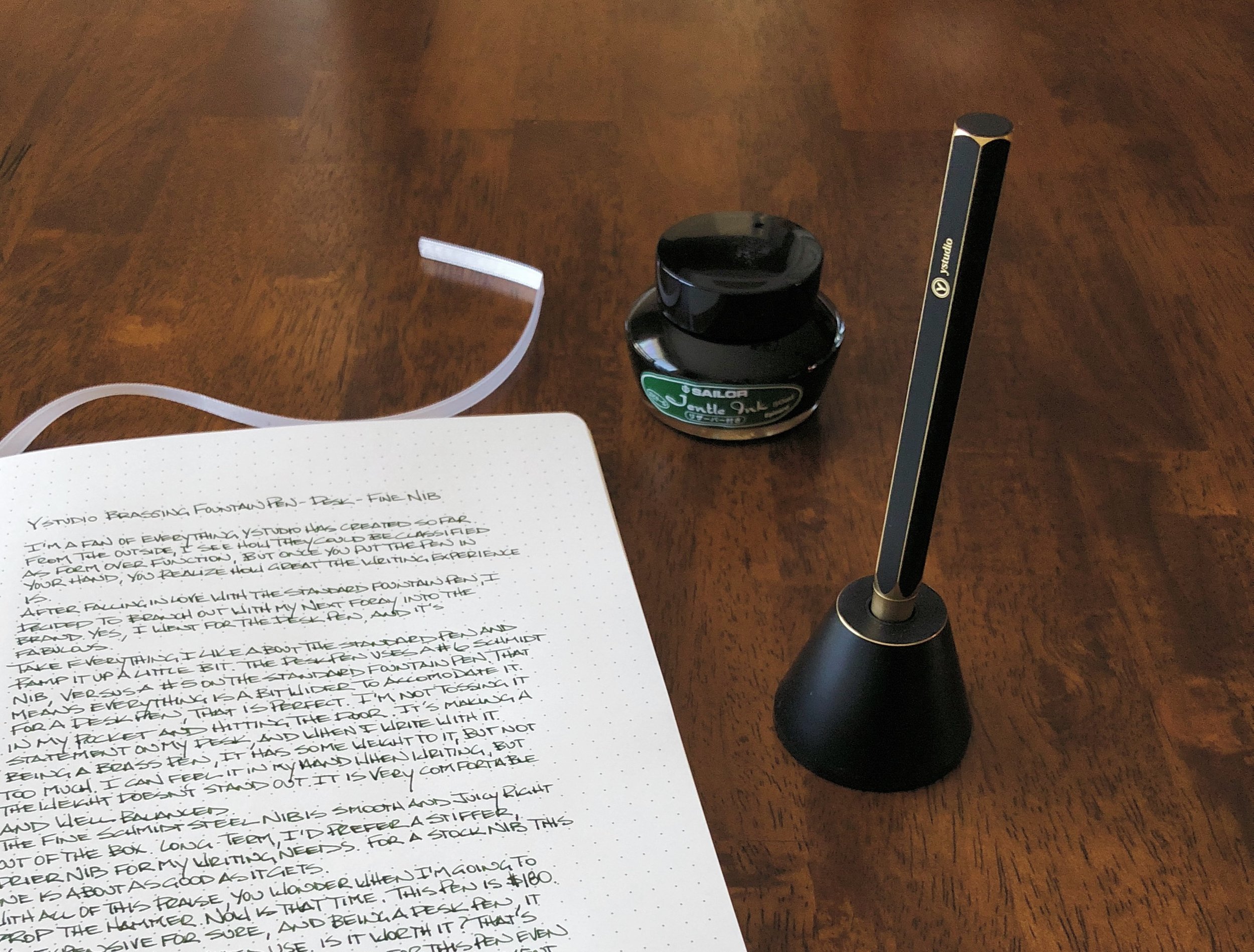
Since I’m committed to that ystudio life now, you know I was going to get the Brassing Desk Fountain Pen from JetPens the minute I could. And - spoiler alert - it’s everything I hoped it would be.

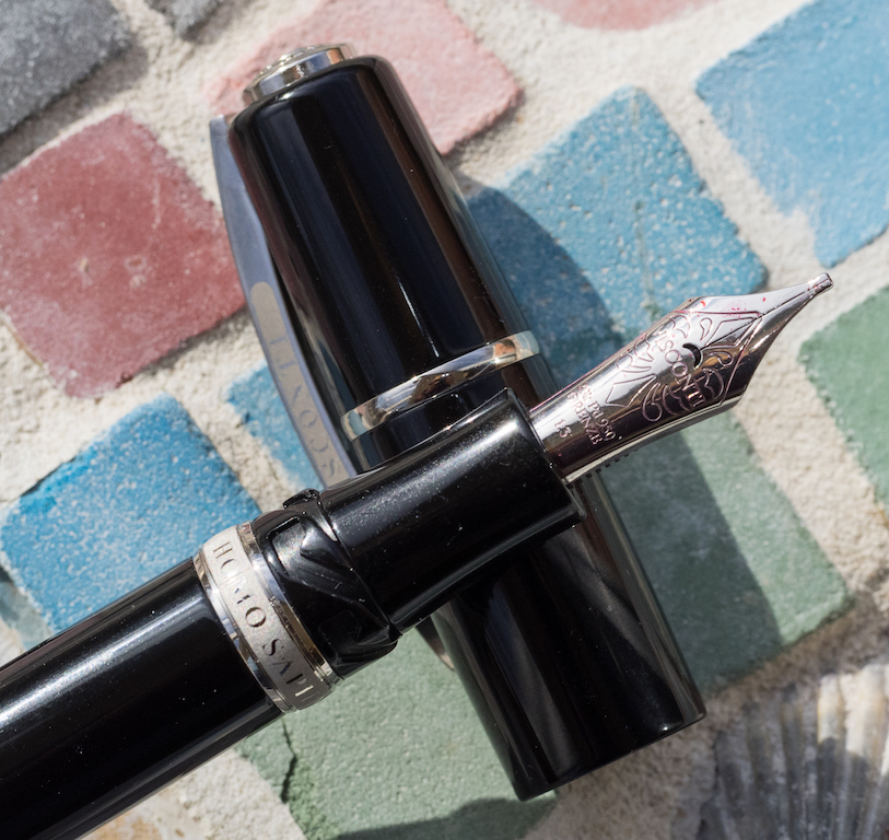
For starters, it is a big pen, as a desk pen should be. The base is heavy, and the brass barrel with #6 nib fits in perfectly and securely. If there was any question I had about using a desk pen, it was if the nib would dry out being left in the base for weeks or months at a time. I haven’t hit the months mark yet, but weeks have been no issue. The nib writes the second it hits the page, with no priming or startup scribbling required. It is instantly good when I am ready to write.

The size and brass construction also had me wondering if it was going to be too heavy to write for any length of time. It’s not. In fact, the barrel weight is only slightly more than the much smaller standard ystudio fountain pen, 1.25 oz vs. 1.00 oz. The concave section fits my grip perfectly, and it is well balanced in the hand, so I don’t even notice the weight that much. Sure, it’s more than an acrylic or ebonite barrel, but still within a reasonable range.

As I mentioned earlier, the desk pen comes with a larger #6 Schmidt nib. It was smooth and wet right out of the box, although for my specific needs, I’ll be looking to swap in something finer than the stock Fine nib for every day use. Any Jowo nib or nib unit will swap in easily.

While my love for the brand knows no bounds, there is one issue with the lineup overall: The price. These are expensive pens. The standard fountain pen is $160 at JetPens, and the Desk Pen is $180. They are beautifully made, highly functional, and fit my personal aesthetic to a tee, but I understand they will not fall into the great value category. The steel nib alone is enough to make buyers balk at this price point, and rightfully so.

It comes down to style and use case, especially when considering the desk pen. If I could only choose one ystudio product it would be the standard fountain pen without question. The desk pen is a much more particular category. It looks amazing and functions perfectly, but will you use it enough to justify the high price? Right now, it is a great fit on my desk, but I’ll see if it stays there long term. I’m guessing it will.

(JetPens provided this product at no charge to The Pen Addict for review purposes.)


Enjoy reading The Pen Addict? Then consider becoming a member to receive additional weekly content, giveaways, and discounts in The Pen Addict shop. Plus, you support me and the site directly, for which I am very grateful.

Membership starts at just $5/month, with a discounted annual option available. To find out more about membership click here and join us!

Epinard, not Grenade. Dummy.

Posted on January 8, 2018 and filed under ystudio, Fountain Pens, Pen Reviews.

Visconti Homo Sapiens Elegance: A Review

(Susan M. Pigott is a fountain pen collector, pen and paperholic, photographer, and professor. You can find more from Susan on her blog Scribalishess.)

The Visconti Homo Sapiens Elegance is an over-sized pen made of black resin with silver trim. It is meant as a less-expensive option for those who like the Visconti Homo Sapiens style. Thus, the pen is made of resin instead of lava or special acriloid and it utilizes a screw-in converter rather than Visconti’s high-capacity power filler.

The Homo Sapiens Elegance comes in a standard Visconti clamshell box with cream interior.

The pen is trimmed with shiny silver rings on the cap and barrel, a silver Visconti finial, and Visconti’s signature arched clip.

However, the large ring on the barrel sports a matte look with “Homo Sapiens” engraved in shiny silver.

The cap uses Visconti’s hook safe lock system which makes it easy to get on and off and makes the cap secure.

Over-sized means that this is an extra large pen, measuring 145mm capped, 170mm posted, and 132mm unposted. At 43 grams, the Elegance is just as heavy as the Homo Sapiens Bronze Age which surprised me considering that one pen is made of lava and the other of resin.

The converter is a nice screw-in model with metal trim. It holds 1.03 ml of ink and is much easier to clean than the power filler pens.

My loaner pen came with the 1.3mm 23k Palladium stub nib. It’s a beautiful nib with Visconti’s classic scroll work.

Unfortunately, this nib is not a smooth writer. There’s a small sweet spot, but even when you’ve got the pen positioned correctly, you can hear it scratch the paper as you write (and not in a pleasant way). I found myself having to hold the pen at an awkward angle in order to maintain some semblance of consistent writing.

My experience with Visconti nibs is not positive. Out of all the Viscontis I’ve owned (and I’ve owned at least eight), only two wrote well out of the box. My Homo Sapiens Bronze Age with a 1.3mm stub had to go to two different nibmeisters before it started writing reasonably well.

The nib on this pen is inconsistent and skips often. As I wrote with it over the past three weeks, I had hard starts that required pushing ink into the nib using the converter. For my handwritten review, I refilled the converter and started fresh. Even with that, I experienced lots of skipping and rough writing.

Although I like the resin version of the Visconti Homo Sapiens Elegance, I think it is still priced too high at $595.00 retail. And, at this price you should get a perfect nib right out of the box. Honestly, if you want a Visconti, I’d suggest saving up for a Bronze Age (which is $200 more) or one of the more colorful versions. And I would make sure that your retailer tests the nib before shipping it to you.

Left to right: Visconti London Fog, Homo Sapiens Bronze Age, Homo Sapiens Elegance, and Divina Elegance

You can purchase the Visconti Homo Sapiens Elegance from Goldspot Pens. Their retail price is $595, but if you log in and add the pen to your cart you’ll see a significantly reduced price.

Pros

  • The Visconti Homo Sapiens Elegance is a nice alternative for anyone who finds the Homo Sapiens Bronze Age to be too expensive at $795 retail.
  • The Elegance uses a cartridge/converter filling system that is much easier to use and clean than the power filler system used by more expensive Visconti models. Even though the power-fillers hold more ink, I like the convenience of a converter filling system.
  • Visconti offers their premium 23k Palladium nib with this pen.

Cons

  • Although the Homo Sapiens Elegance is $200 less than the Bronze Age, it is still an expensive pen.
  • The nib on my loaner pen was finicky and an unpleasant, scratchy writer. Unfortunately, this is typical of my experiences with Visconti nibs, and I always think very hard before purchasing this brand because of it. I recommend asking your retailer to check your nib before shipping.

(Goldspot provided this product at no charge to The Pen Addict for review purposes.)


Enjoy reading The Pen Addict? Then consider becoming a member to receive additional weekly content, giveaways, and discounts in The Pen Addict shop. Plus, you support me and the site directly, for which I am very grateful.

Membership starts at just $5/month, with a discounted annual option available. To find out more about membership click here and join us!

Posted on January 5, 2018 and filed under Visconti, Fountain Pens, Pen Reviews.

Karas Kustoms Decograph Fountain Pen Review

(Sarah Read is an author, editor, yarn artist, and pen/paper/ink addict. You can find more about her at her website and on Twitter.)

Karas Kustoms, renowned machinist of metal pens that can withstand nearly apocalyptic conditions, has decided to explore their softer side with a line of thermoplastic and acrylic pens called the Decograph. The design fuses the ultramodern aesthetic of Karas with the sleek Art Deco look of vintage pens. It's a perfect blend, a very attractive pen, and the super light thermoplastic makes it a tool I can write with for hours.

Right now, the pen comes in two standard colors: black and almost-black-but-actually-wait-it's-green. The green pen is shown here. In low light and at first glance, it appears to be shiny black, but once the light hits it, it's a dazzling beetle green. The effect is downright magical. If Voldemort had need of a pen, he couldn't choose better than this one. There are also regular special editions of this model, so keep your eyes peeled for a color that speaks to you.

The pen arrives in a swanky aluminum tube. It feels like a time capsule from outer space. There is no doubt, from the first moment, that there's something special inside. The pen is cushioned securely in the tube with a foam insert, and the whole setup makes for an attractive pen stand.

The pen is equipped with a standard #6 Bock nib and a Schmidt K5 piston converter. Gold, black, and Titanium nibs are available at additional cost. The nib performed well--standard and as expected for a Bock nib, though with a little more feedback than I personally prefer. It writes with a good flow and starts right up even after sitting for a day. The nib unit screws out and can be switched and swapped as you fancy.

The pen body is beautifully designed, with an elegant taper and well-fitted machined aluminum finials. The top finial is slightly pointed at the center and the bottom shows the Karas logo--all very understated and elegant. The clip is a machined aluminum piece with classic Art Deco chiseled shaping, secured with a piece of spring steel under the top finial. It feels sturdy but flexes enough to perform well.

The cap screws on with all plastic threads that are tucked high enough inside the cap that they should prevent the thin lip of plastic at the cap edge from cracking. The threads are smooth and secure and don't interfere with the pen's grip. The grip section is hourglass shaped and tapers quite narrowly. It fits perfectly in my hand, which means some may find it to be too narrow.

It's one of the more comfortable pens I've held. The shaped grip, light weight and balance, and the way the plastic warms in my hand all make for a really pleasant writing experience. It's a pen that makes me want to pick it up and write for hours.

At a start price of $165, it's considerably more expensive than Karas's other models, but is priced in line with similar pens from other companies and seems more than fair. I'll be watching the limited edition releases and hoping for more color choices from this line in the future.

(Karas Kustoms provided this product at no charge to The Pen Addict for review purposes.)


Enjoy reading The Pen Addict? Then consider becoming a member to receive additional weekly content, giveaways, and discounts in The Pen Addict shop. Plus, you support me and the site directly, for which I am very grateful.

Membership starts at just $5/month, with a discounted annual option available. To find out more about membership click here and join us!

Posted on December 28, 2017 and filed under Karas Kustoms, Fountain Pens, Pen Reviews.