Posts filed under Fountain Pens

Sailor 1911 Standard Royal Tangerine Fountain Pen Review

I fully understand how good Sailor fountain pens are. I own a baker’s dozen, and always have my eyes on the next one. Since I own, use, and love so many already, I was convinced I didn’t need another one when the 1911 Royal Tangerine launched. Yes, it’s practically the perfect pen for me and my tastes, but I was ok holding off until the next one, or the one after that. I have enough Sailors!

Apparently I don’t, as it turns out. My friends at Goldspot sent me one to review, and as soon as I inked it up I wondered what I had been waiting for. This is a fantastic example of everything that Sailor does right.

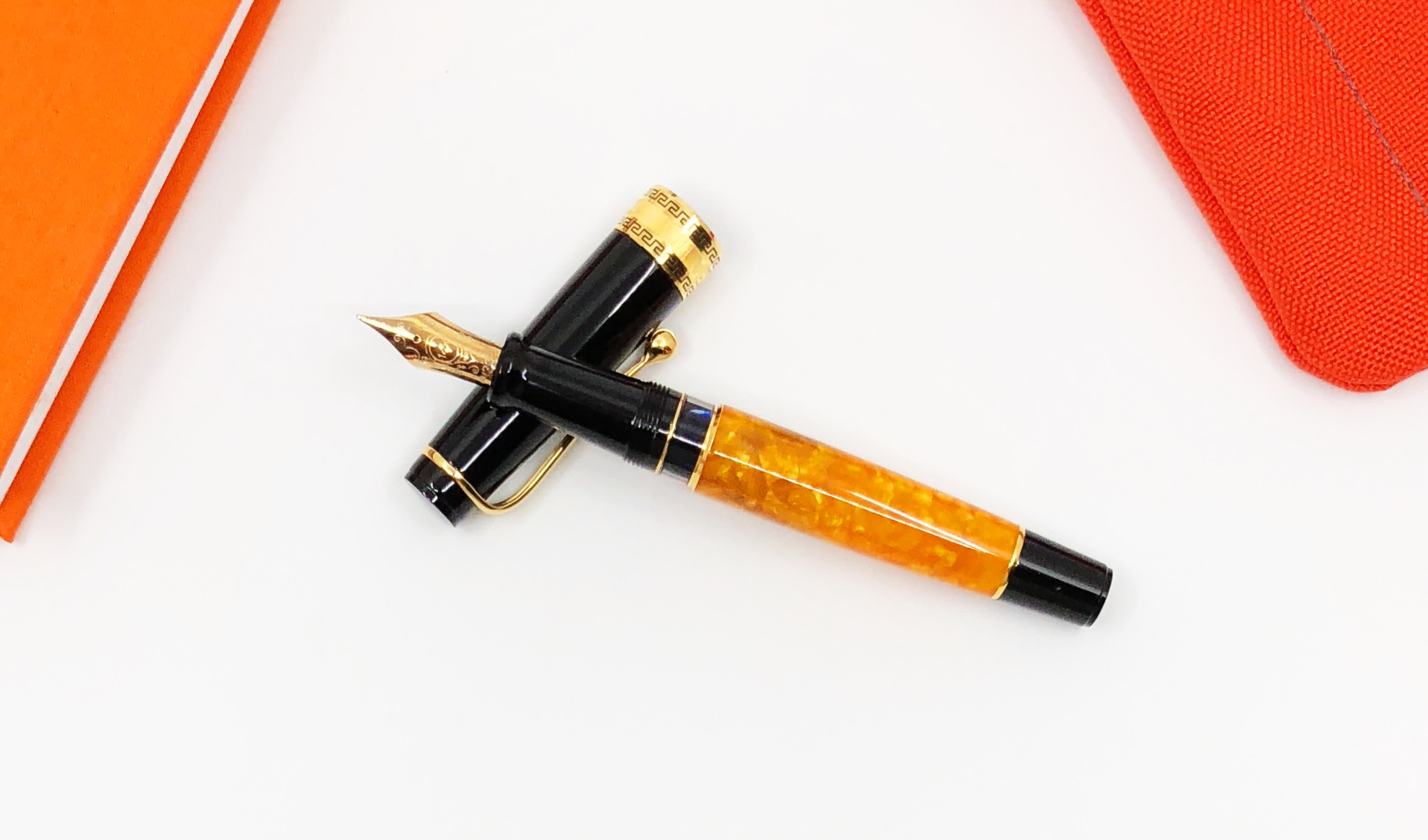
Pro Gear Orange (top) vs 1911 Standard Royal Tangerine

If you’ve read or listened to me for any length of time, you already know what those things are. Sailor pens are stylish, yet refined. The colors are bright, and the hardware fancies up the joint without being ostentatious. This tangerine orange barrel with rhodium trim POPS, but in a way only a few companies can pull off.

And the nibs. I feel a tinge of guilt if I ever say they aren’t the best in the business. Platinum has an argument here, but any Sailor second place talk is squashed quickly by the sheer amount of variety. I even tried something new this time while remaining in my writing wheelhouse. This medium fine nib is a wonderful every day writer.

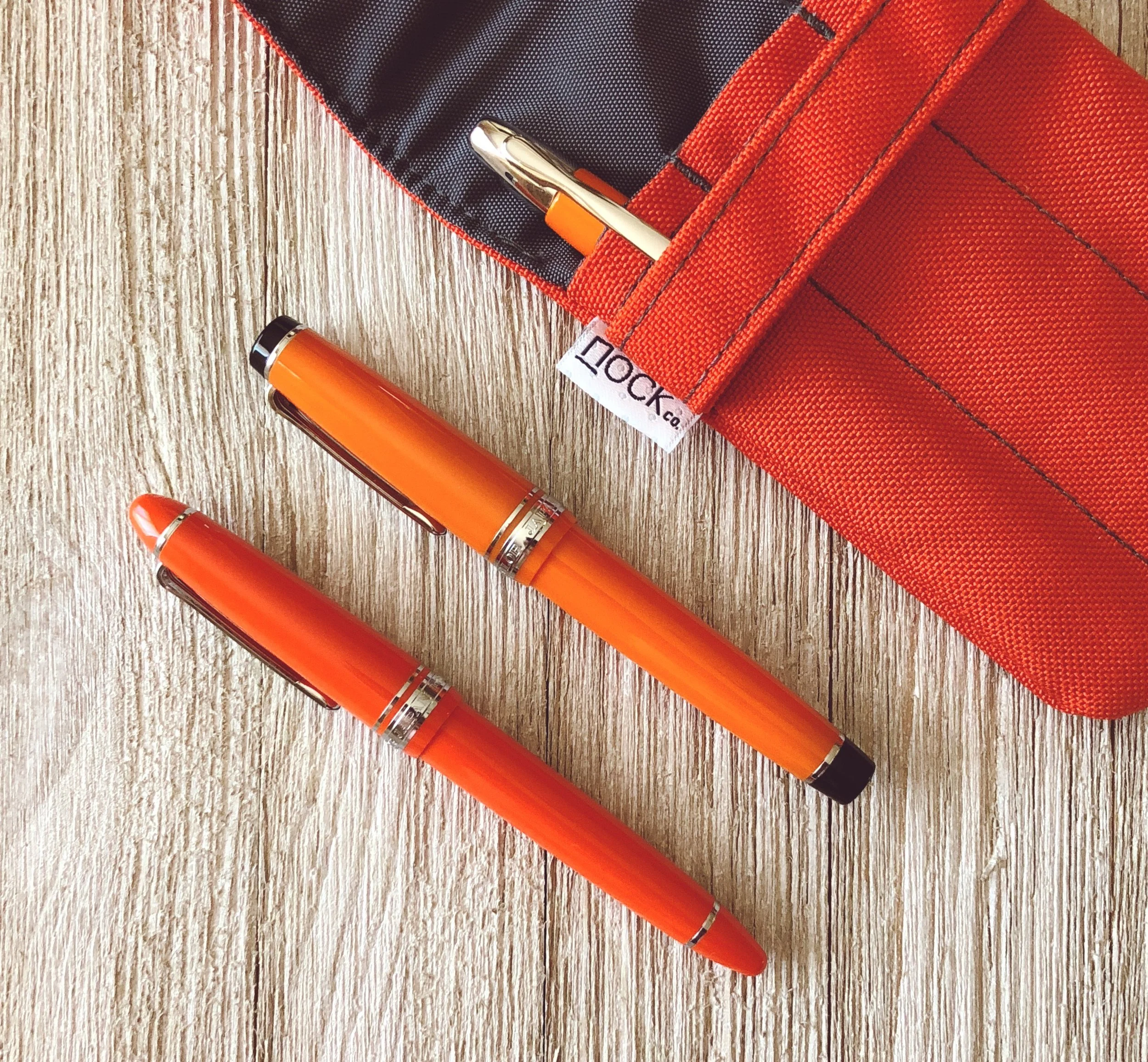
That’s where this pen fits for me. It’s almost the perfect every day carry fountain pen. From the moment I inked it up, with Bungubox Tangerine of course, I’ve wanted to carry this pen with me. Clipped to my shirt, in a front pants pocket, attached to a notebook, in a case - anywhere.

The feeling I get with the 1911 Standard (my first one, btw) is that it wants to be an EDC pen, unlike all of my other Sailors. They are mostly Professional Gear models with flat end caps. The 1911 has rounded end caps. The Standard model is also smaller than the Large. Those things combined mean it stealthily fits into more places than its larger, edgier counterparts.

It’s durable too. The barrel construction, including the clip, are rock solid. Another reason I want to carry it anywhere and everywhere is that I know it can take a beating. It gives me the confidence to carry it to the shop at Nock and leave it on the counter while I work around it. I don’t have to pretend it’s a fragile little flower. That feels great, and makes me want to have it with me at all times.

I’m still not sure exactly why this particular Sailor made me change my mentality around carrying it, but I’m glad it did.

If you are waiting for the kicker, there is one: It’s expensive, especially for a pen I’m recommending as an EDC option. It’s currently $196 at Goldspot, which is above the comfort zone for many. If you are a Sailor fan and user, you get it and understand the cost. If you haven’t reached this threshold in your pen buying, then it can be a tough pill to swallow. There are tons of great pens that are cheaper. There are many worse pens that are more expensive. It’s about finding a pen that fits your needs, and this one fits mine more than I even considered.

(Goldspot provided this product at no charge to The Pen Addict for review purposes.)


Enjoy reading The Pen Addict? Then consider becoming a member to receive additional weekly content, giveaways, and discounts in The Pen Addict shop. Plus, you support me and the site directly, for which I am very grateful.

Membership starts at just $5/month, with a discounted annual option available. To find out more about membership click here and join us!

Posted on April 30, 2018 and filed under Sailor, Fountain Pens, Pen Reviews.

Aurora Optima O’ Sole Mio Fountain Pen Review

How do you review a product you have already reviewed, and already love? How do you keep it fresh? How do you say something new? I’m not sure I have all of the answers to those questions, but let’s find out. One thing I do know: I love the Aurora Optima.

I knew I loved it from the first time I picked one up, which ended up in the purchase of my first, the Optima Red Demonstrator. And yes, I still think just as highly of it now, even though I had to send it to the shoptima. It’s a pen that fits me perfectly.

Until this week, I wasn’t sure why it was so perfect for me. Then I read a review of the Aurora Optima 365 on Hand Over That Pen. Pam, Queen of Tiny Handwriting, First of Her Name, said this about the Optima:

“ I really love the Optima’s shape and size. Why you ask? Because, to me, the Aurora Optima 365 is a gaudier Sailor Progear with the use of a wider, more ostentatious cap band.”

That explains a lot about me and my likes, doesn’t it?

Aurora Optima (Top), Sailor Pro Gear Bungubox 5th Anniversary Edition

Looking at pictures of the Optima and Pro Gear side-by-side the comparison is inevitable. Why didn’t I think of this before! I guess that makes the Aurora 88 and the Sailor 1911 cousins as well.

One area where they do not compare is in price. The Aurora is twice as much as the Pro Gear, but I feel it is priced correctly for what it brings to the table. You can feel the difference in your hand before even getting into the technical aspects.

First off, the Optima is a piston filler, while the Pro Gear uses a cartridge/converter filling system. And this is no normal piston either. It’s easily the most substantial I have felt in a pen, and even has a small, stealth, ink reservoir to get those last drops out until you can get it filled up again.

The Optima has a large ebonite feed, too. Does it make the ink flow better than a standard plastic feed? I’d be lying if I told you I could tell the difference. But the sheer size of it, which is mostly hidden in the section, is impressive.

The materials of this pen - in the case of the O’ Sole Mio black acrylic and marbled orange auroloide - are substantial, and beautiful. The Pro Gear acrylic barrel is lightweight in comparison. The walls of the Optima barrel are thick, and you can feel it in your hand.

Aurora has some of the best gold nibs on the market. So does Sailor. And they are completely different. Aurora’s nibs are thick, and on the firmer side for a gold nib. The medium nib in this Optima is smooth with a little give when writing, but with no bounce or variation when you push it. Sailor’s nibs are obviously finer in comparison, and do have a different feel when writing. Both offer some of the best nibs in the business.

And finally, as Pam says above, the Optima has a gaudier cap band. And it’s a good-looking gaudy! While the Pro Gear offers sleek, refined hardware, Aurora steps up the hardware game in comparison, both in size and style. I think it looks great.

So, if you like the Sailor Pro Gear, will you like the Aurora Optima? I say undoubtedly yes. It does come at a cost though, and in the case of these two pens, it is worth it to me.

(Kenro Inc. provided this product at no charge to The Pen Addict for review purposes.)


Enjoy reading The Pen Addict? Then consider becoming a member to receive additional weekly content, giveaways, and discounts in The Pen Addict shop. Plus, you support me and the site directly, for which I am very grateful.

Membership starts at just $5/month, with a discounted annual option available. To find out more about membership click here and join us!

Posted on April 2, 2018 and filed under Aurora, Fountain Pens, Pen Reviews.

KACO SKY II Fountain Pen Review

(This is a guest post by Frank Dong. You can read more from Frank at his blog Frank Underwater)

What is KACO SKY II?

KACO is a stationery company in Shanghai, China. Established 8 years ago, the company has been delivering stationeries with award-winning industrial designs. While the gel-ink pens are their primary focus, they do keep offering fountain pens over the years. Recently the company has been partnering with the Pen World Magazine to promote its fountain pens lines.

The SKY fountain pens started in early 2016, priced at 39RMB ($6) on launch. Though KACO’s premium offerings have been largely neglected by Chinese pen lovers, the SKY did gain some traction within the community. Last May, the SKY II was launched, which shares the same design as the SKY but deployed some upgrades. Currently, you can have a SKY II from the Pen World magazine’s booth for free during a pen show if you get a subscription on-site.

Makrolon and black Schmidt nib, that’s the key differentiators marketed by the company, and they make this pen the first KACO pen that I want to own. After two weeks with the pen, I am in love. Forget the cliché designs from legacy brands, this is the best entry level fountain pens that have ever been made in China. But the SKY II is also imperfect or even annoying if you want to pull it out from a student’s pen cup and make it part of your EDC since the company clearly neglects the need of having a functional clip.

Let’s start with the bright side. For 69RMB ($11) you will get a metallic-looking pen instead of one in banal solid color, along with a stainless-steel nib with extra black coating, and both of these two upgrades worth the money.

The metallic red barrel makes this review unit pops up easily in my pen collection and resonates with certain electronic gadgets. According to the KACO, the barrels of the SKY II models are made from Makrolon polycarbonate, a name that deeply rooted in the success of LAMY 2000. For the 2000, LAMY put glass fibers into the material and brushed the surface, resulting in a pen that feels like a piece of warm wood (I learned this expression from Myke). While in the case of this SKY II, KACO finished it by applying a metallic paint to the red Makrolon base, creating a texture feels like a piece of warm aluminum. The metallic coating is thick and scratch-resistant, and I only managed to see the red base material from the outside by scraping it off with a knife. I don’t know too much about the properties of the specific grade of Makrolon used in the SKY II, but the material did survive several chest-height drops along with the rubbing with keys in my pocket. Most importantly, it just feels smooth, light and warm in hand.

With SKY II’s black Schmidt nib, the KACO joins the bandwagon of high-quality stainless-steel nibs moving beyond the basic looks of being in either silver or gold. That delivers a striking look which transforms the feeling of this pen—no lights could hit the black nib and bounce back to your face during your writing, and when the pen is rest on the desk, the black nib gives it an understated existence. Another reason for me to love a black German nib is that I can enjoy any ink without caring too much about cleaning the nib, making the whole experience more focused on the writing part rather than the pen I am writing with.

Even the physical performance of the nib could change a little bit. The company reminds its buyer that the extra black coating around the tipping material would result in more friction in certain writing angle, which is true in my experience. Thankfully (or not?) this extra friction from the tip disappeared after days of use.

Regarding other basics, the pen is a cartridge/converter filler, and its black nib is of size 5, made by Schmidt and branded in KACO’s logo. Unlike the black nibs from Kaweco Perkeo, it is a firm writer. It is noteworthy that although the nib and feed look the same as every other pen with a #5 Schmidt nib, they can’t be easily screwed out, due to a unique design at the end of the nib housing. I am fine with this move since in reality, this is not a pen built for pen addict who has a dozen of spare nibs.

Besides the nib and the barrel, the remaining of the pen is basically the same as the first generation of SKY, which is still an acceptable design two years later. The cylinder shape is simple and minimalistic, if not as nuanced as design from LAMY Aion or Pilot Kakuno. The clip still features a KG stamp, representing the KacoGreen branding the company uses for its writing instrument, and at the end of the barrel you may still be perplexed by an F (it's an EF-nib pen!), which means Fountain pen in the company’s explanation. All of these legacy designs are not ideal, but I can live with them. Nonetheless, I am rather glad to see the original design of SKY’s ergonomic nib section stays. That’s a really nice-looking grip, making the inside of the pen visible but not too distracting. The section also feels clear and crispy in hand, thanks to the unique surface pattern and large triangular construct.

(Photo Credit: KACO)

But by this point, I must look on the dark side of the SKY’s design, which I really hate—the clip is more of a decoration than a real clip. The clip on this SKY II is still an injection-molded one, integrated seamlessly into the top finial, and it is just bad. Since the clip is of the same material as the plastic part, itself is loose and lifeless. To render it even more useless, the clutch of the clip was moved from the clip to the body of the cap. That’s a confusing design, and I can barely clip the pen to my shirt, my pen loop, or sometimes even a hardcover notebook. There is no way to deny this clip is more functional when acting as a rotating stopper. If you happen to be a pen user who loves to clip your pen, this is a deal-breaker

However, I still remember comments from Paul G, one of the Pen Addict readers, under the Kaweco Perkeo review—be alert about the target audience of the pen when we are reviewing it from a power user’s perspective. At a price around $11, the SKY II is super affordable and looks totally different from other entry level Chinese pens, and that’s enough to get it noticed. Comparing with clipless student pens like Perkeo and Kakuno, the KACO SKY II is fine to have a sofe clip, since students usually don't clip pens and keep a big pencil case for their pens. Oh, did I mention the matte finish plastic package of this pen? It is a high-quality MUJI style pen case in nature!

To sum it up, the mark II version of the pen feels warmer, flashier, and way more confident in hand than its predecessor. Maturity and refinement are the keywords I always think about for this pen. Despite some lacks, it is still a legitimate upgrade and may lead a new direction for the KACO pens.

Posted on March 30, 2018 and filed under Kaco, Fountain Pens, Pen Reviews.