Posts filed under Fountain Pens

Karas Kustoms Vertex (Acrylic): A Review

(Susan M. Pigott is a fountain pen collector, pen and paperholic, photographer, and professor. You can find more from Susan on her blog Scribalishess.)

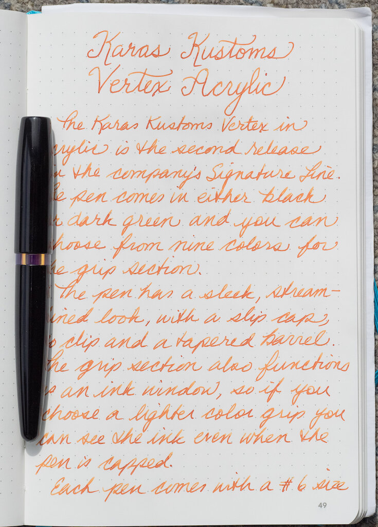
The Karas Kustoms Vertex in acrylic is the second release in the company’s Signature Line. The pen comes in either black or dark green acrylic, and you can choose from nine colors for the grip section.

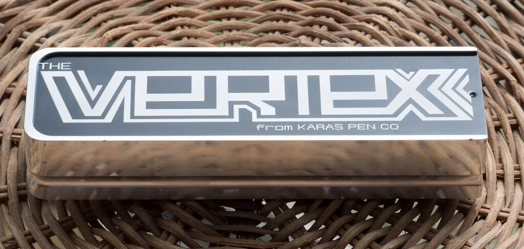
The pen comes in a rectangular machined box with a black, slip-in lid. The box itself is a work of art.

Although my pen didn’t come with a soft pipette or a cartridge, apparently these accessories are normally included with purchase.

The pen has a sleek, streamlined look, with a slip on cap, no clip, and a tapered barrel. It’s a small to medium-sized pen, measuring 5.24 inches/133mm capped, 5.11 inches/130mm uncapped, and 5.9 inches/150mm posted.

The cap posts deeply and securely on the barrel. Because the cap doesn’t have a clip and rolls easily, either post it or set it down vertically. The pen is light, weighing 18.73 grams posted and 12.5 grams unposted (filled with ink).

Although the cap top looks flat from side, it is actually concave, and this adds a little touch of flair to the design.

You have a huge selection when it comes to the grip color. It comes in nine colors: transparent amber, transparent blue, transparent orange, transparent red, transparent smoke, sea glass, Coke bottle, green apple, and UV clear “Italian Ice.” I fitted my pen with the Italian Ice grip. The grip is a nice size, measuring 10.74mm, and it screws onto the barrel seamlessly--no threads, no huge drop from barrel to grip. Another cool thing about the grip is that it acts as an ink window when the pen is capped.

The Vertex is intended to be used as an eyedropper, though you can use a standard international converter if you wish. Three o-rings are in the pen: in the barrel, in the grip, and in the cap, which means you don’t have to use silicone grease to prevent ink leakage. It’s a little hard to see the ink in the black barrel when you’re filling it, so go slowly.

The pen comes standard with a #6 size steel Bock nib. My nib is a medium, and it writes smoothly. The nib sports an etched design with the Karas Kustoms logo and the nib size engraved.

I’ve experienced no burping, hard starts, or dryness when writing with the Vertex. The pen feels wonderful in the hand because of its seamless construction.

The only negative about the design is the slip cap combined with the eyedropper system. You have to be careful when you pop the cap off to avoid spurts of ink on your hands or clothes. So far, I’ve managed to remember to hold the pen with the nib pointed up, but I suspect one of these days I’ll forget and have a mess. The pen comes with a warning about this issue, but I wonder if a screw cap would have been a wiser decision.

The Vertex in acrylic is available from Karas Kustoms at the base price of $130. Steel nibs come in sizes EF, F, M, B, Stub 1.1, and Stub 1.5. You can upgrade to a two-tone steel nib (F, M, or B) for $3.00, a titanium nib (EF, F, M, or B) for $35, and a gold nib (B) for $80. You can also purchase the Vertex in Delrin models (black and white) for the same base price of $130.

(Karas Kustoms provided this product at no charge to The Pen Addict for review purposes.)


Enjoy reading The Pen Addict? Then consider becoming a member to receive additional weekly content, giveaways, and discounts in The Pen Addict shop. Plus, you support me and the site directly, for which I am very grateful.

Membership starts at just $5/month, with a discounted annual option available. To find out more about membership click here and join us!

Posted on October 11, 2019 and filed under Karas Kustoms, Fountain Pens, Pen Reviews.

Sailor Pro Gear Classic Graphite Lighthouse with Zoom Architect Nib: A Review

(Susan M. Pigott is a fountain pen collector, pen and paperholic, photographer, and professor. You can find more from Susan on her blog Scribalishess.)

Long ago I owned a Pelikan M200 with a fine Architect nib (also known as a Hebrew/Arabic Nib). It was a lovely, delicate thing, ground by the great Richard Binder. But, when I originally ordered it I was young and naïve, new to fountain pens, and I didn’t realize that the fine nib would not give me the line variation I craved for Hebrew characters. I eventually sold the pen.

I’ve been itching to try a Sailor Zoom nib with an Architect grind, and I knew exactly which nibmeister I wanted to do it: John Mottishaw at nibs.com. Deciding on a Sailor pen for the nib was extremely hard (so many choices), but I eventually settled on the Sailor Pro Gear Classic Graphite Lighthouse. This surprised me a bit, because why would I want a “boring” gray pen when Sailor has so many bright, cheery colors? I don’t know. I liked the subtle color and the clear finials on both ends, and a more “sober” pen seemed somehow fitting for writing Hebrew.

Even though the Sailor Graphite Lighthouse is a North American exclusive, it comes in a basic Sailor box. The only thing differentiating it from a regular Sailor is a bookmark--woot?

The pen itself is a dark gray color with rhodium trim, which complements the color perfectly.

As stated earlier, the cap and barrel finials are clear, offering a special detail that makes the pen look unique. I just wish it lit up like a real lighthouse!

The Pro Gear Classic is a small to medium-sized pen--small if you don’t post it and medium if you do. It measures 5.1 inches/130mm capped, 4.5 inches/115mm uncapped, and 5.9 inches/150mm posted. It’s a light pen, weighing only 25 grams capped and 16 grams uncapped with the converter filled with ink. I usually like much larger pens, but for some reason I’ve gravitated towards Pro Gear Classics. I own several of them.

The real story with this pen is the nib. All Sailor nibs are gorgeous, with beautiful scroll work and the Sailor anchor inscribed above the gold content.

The Zoom nib is like an extra broad but with a triangular shape and lots of tipping. It’s the perfect choice for an Architect grind.

I asked John to make my Architect “forgiving,” so he smoothed it out more than a traditional Architect grind so I could use it to write cursive.

It’s absolutely perfect--smooth and juicy, but I can also get clean vertical and horizontal strokes for Hebrew and block letters.

Upside down the nib writes extra, extra fine. I’m unlikely to use the nib this way, but it’s a nice option if you want to write marginalia.

I inked the Graphite Lighthouse with Sailor Ink Studio 123, and the two pair together beautifully. I can write in my usual cursive style with this nib, and the pen simply floats over the paper.

I am absolutely thrilled with this pen and the Zoom/Architect nib. Even though the Pro Gear Classic Graphic Lighthouse is mostly sold out, you can, of course, order almost any Sailor with a Zoom nib from nibs.com and request an Architect grind. If you do block printing more than cursive, you’ll definitely want a classic Architect grind. But, if you’re like me and want an Architect that allows you to do cursive as well, just ask John for a more forgiving nib, and he will send you the perfect grind.

(I purchased the Sailor Pro Gear Graphite Lighthouse with my own funds.)


Enjoy reading The Pen Addict? Then consider becoming a member to receive additional weekly content, giveaways, and discounts in The Pen Addict shop. Plus, you support me and the site directly, for which I am very grateful.

Membership starts at just $5/month, with a discounted annual option available. To find out more about membership click here and join us!

Posted on October 4, 2019 and filed under Sailor, Fountain Pens, Architect Nib, Pen Reviews.

Montegrappa Tulip for Team Fox Fountain Pen Review

One of the guiding principles of my adult life is to give back. I am very fortunate to do what I do for a living, and I make it a point to shine the light on others and give back as much as possible. Whether that is as simple as doing a giveaway for readers, linking to a blog post within the community, or supporting a charity - I'm all for it. So, when Ron from Pen Chalet asked me to share the Montegrappa Tulip for Team Fox and the message behind it, I couldn't say yes fast enough.

The Michael J. Fox Foundation for Parkinson’s Research is has funded over $800 million in research since 2000. As many of you know, Fox was diagnosed with Parkinson's decades ago, and has been at the forefront of the work to find a cure. In collaboration with Montegrappa, Team Fox helped design a pen whose proceeds support the ongoing research of this debilitating disease.

There are two featured design elements of the Montegrappa Tulip that help tell its story: The color, and the clip. The red and orange barrel are the foundation colors of Team Fox, and paired together in this pen, well, let's just say it is right up my alley. The red is deep, almost brick-like, and the orange is bright, but not overwhelming, making for a wonderful combination.

The star of the show is the Tulip clip. Designed by artist Timothy Johns, a Parkinson's fighter himself, the Red Tulip has long been associated with Parkinson’s awareness. It looks amazing on the red cap and I can’t help but have my eyes drawn to it every time I use this pen.

While this pen has a story to tell, it is also a fantastic writing instrument. I've become a big fan of Montegrappa’s steel nibs since their switch to JoWo, and this extra fine is no exception. It is exactly what I look for: Firm and fine, with clean, crisp lines. The Montegrappa etching on the nib looks great too.

The acrylic barrel has a small added feature that makes a big difference in my mind. The interior of the barrel is fitted with a metal sleeve in the inside back half, giving this pen a more substantial feel in the hand than many other similarly designed pens. In addition, the grip section also has a metal sleeve that the converter screws into. These additions make for a wonderful writing feel.

At $395, this is by no means an inexpensive pen. But what it can provide you in writing experience - along with helping support the fight to end Parkinson’s - is worth it in my mind.

My thanks to Ron at Pen Chalet, Kenro Industries, and Montegrappa for sending this pen to me for review.

(Pen Chalet provided this product at no charge to The Pen Addict for review purposes.)


Enjoy reading The Pen Addict? Then consider becoming a member to receive additional weekly content, giveaways, and discounts in The Pen Addict shop. Plus, you support me and the site directly, for which I am very grateful.

Membership starts at just $5/month, with a discounted annual option available. To find out more about membership click here and join us!

Posted on September 30, 2019 and filed under Montegrappa, Fountain Pens, Pen Reviews.