Posts filed under Fountain Pens

ystudio Resin Fountain Pen Review

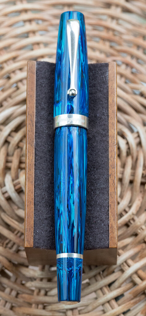
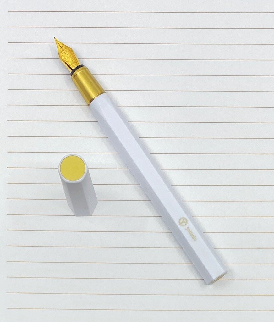
As a ystudio fanboy, I was a little concerned about the Resin Fountain Pen when I first saw pictures of it. How would it stack up to my favorite Brassing models? Would the plastic barrel take a way some of the magic of the brand? My fears have proven to be unfounded, as this is a pen I want to use all of the time.

I will admit that it took me a couple of days to warm up to it. While it shares some of its design DNA with the Brassing Fountain Pen, it really is a different beast altogether. It sat on my desk. I stared at it. It stared back at me. I picked it up. I uncapped it, posted it, and capped it back again. And then I decided ok, time to ink it up. That’s where I ran into trouble.

As much as I am going to rave about this pen in a moment, there is a flaw in its design that must be mentioned: For a cartridge/converter pen, it doesn’t fit standard international converters. Or I should say, it doesn’t fit most of them.

I should have known something was up when it didn’t ship with one, but that’s neither the first - nor last - time a c/c pen won’t ship with one. I thought well fine, the ystudio Resin Fountain Pen uses Schmidt hardware for the nib unit, so I’ll just grab one of the dozens of Schmidt converters I have laying around. I attached it to the feed post, dipped it in the ink bottle, and drew up the ink just fine. Then I tried to screw the barrel back on.

If it doesn’t fit …

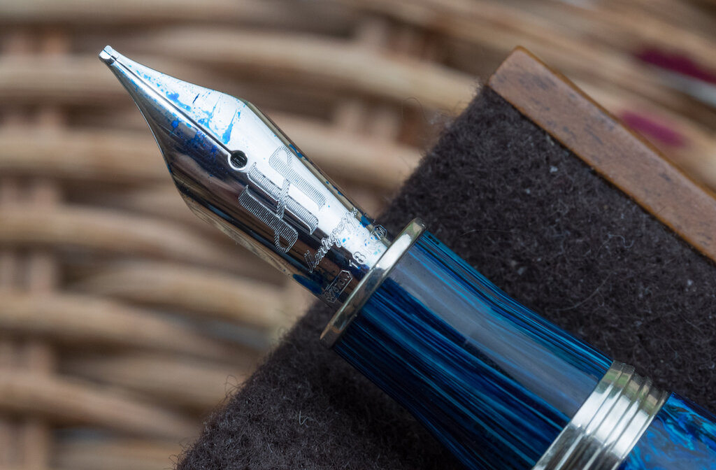
When standard international converters fail to fit into barrels it is usually a length problem. Not here, as the barrel is more than long enough. With this pen, it is a diameter problem. The metal ring around the barrel is too wide to fit inside the barrel.

My first thought was oh, there is something wrong with my converter - let me try another. And another. Until I realized it wasn’t the converter that was the problem. How could this be, seeing that other ystudio pens use the same Schmidt hardware and Schmidt converters fit those pens just fine? I’m guessing that the microscopic measurement that the barrel needed to be expanded by would have altered the entire design? I don’t see how, but I find it hard to believe that this was an oversight. Manufacturing tolerance maybe?

The workaround I found is either to use cartridges - short or long international sized - or a narrower converter, like the one in the picture. Mine is from Kaweco, which looks like this one from Monteverde. Is there a name for this style of converter that we can pass on to ystudio so they can package them with future pens to avoid this unnecessary angst?

Ok, I’ve prattled on long enough about an issue that in the end is a minor annoyance on a pen that gets everything else right. Here is what you really need to know: I cannot put this pen down. I’m not sure if it is the shape, the feel, the weight, the nib, or the tactile-ness of it, but I love using it. I have to set it out of reach sometimes just so other pens get a fair shake.

To try and describe it I’d say it feels close to a large marker in the hand, but it allows for the fine control of a technical pen. These aren’t words I normally use to describe a fountain pen, but they work for this one. It’s different, in a good way.

The way the resin hexagonal barrel smoothly transitions into the the brass grip section is a joy. Brass discs also adorn the top of the cap and end of the pen as an added touch of flair. The cap posts, although not with the same snap as when capping the pen. It could come loose if you set the pen down, for example, or fidget with it.

I’ve said it before - earlier in this review even - that the best compliment that I can give any product is that I want to use it, and that I miss it when I’m not. The ystudio Resin Fountain Pen is a perfect example of that. And at $72, I feel very comfortable recommending it, converter weirdness and all.

(Kenro Industries provided this product at no charge to The Pen Addict for review purposes.)


Enjoy reading The Pen Addict? Then consider becoming a member to receive additional weekly content, giveaways, and discounts in The Pen Addict shop. Plus, you support me and the site directly, for which I am very grateful.

Membership starts at just $5/month, with a discounted annual option available. To find out more about membership click here and join us!

Posted on April 20, 2020 and filed under ystudio, Fountain Pens, Pen Reviews.

Montegrappa Mia Limited Edition Sea at Dusk Fountain Pen with 1.1mm Stub: A Review

(Susan M. Pigott is a fountain pen collector, pen and paperholic, photographer, and professor. You can find more from Susan on her blog Scribalishess.)

Montegrappa is one fountain pen brand I’ve never tried. I was poking around on the Casa della Stilografica website one day and came across a striking blue pen. It was a deep blue with turquoise swirls. I was entranced.

Anyone who knows me understands that I have a crazy thing for blue pens. So, despite the rather steep price (€ 569) and the fact that I had no prior experience with Montegrappa, the Mia Sea at Dusk fountain pen stole my heart.

The pen arrived from Italy in a sage green outer box and an engraved wooden inner box with a hinged lid. I must say, Montegrappa did a great job packaging this limited edition pen.

In person, the pen is, simply put, spectacular. The resin looks like brush strokes in rich oil paint.

With solid silver furnishings, this pen has substance and class. The top finial is engraved with the Montegrappa logo. The clip tapers to a roller-ball tip for easy attachment to pockets or papers.

The cap band is engraved with “Montegrappa” on the front and “2020 Italy” on the back.

The barrel threads are also made of silver, which is a special touch, and there are silver rings at the end of the grip and around the piston knob.

You’ll find the limited edition number engraved on the bottom finial.

The Mia is a large pen (but not over-sized). It measures 137mm capped, 125mm uncapped, and 157mm posted. It is heavy, however, because of all the metal furnishings. It weighs 31.6g uncapped and 43g posted. The grip tapers. At its narrowest, it is 10.1mm and at its widest it is 12mm.

The 18k rhodium-plated nib is engraved with the Montegrappa logo, the name Montegrappa, and the gold content. There’s no scroll work to complicate the simplicity of the nib design.

I purchased my Mia with a 1.1mm stub nib. When it arrived, I noticed that the pen was writing poorly--hard starts, scratchy, skipping. I took macro photos of the nib and discovered the tines were misaligned.

But Casa della Stilografica and Montegrappa took care of the problem gracefully. I had to ship the pen back to Italy, but the nib was repaired and returned speedily. Now those tines are perfect.

The 1.1mm stub writes beautifully. It offers a thick line with enough sharpness that it could be called a semi-italic nib. The ebonite feed provides plenty of ink for a smooth, wet writing experience.

I will say this pen blows through ink very quickly, but it’s easy to refill with the piston system. This is one aspect of Montegrappa that is different from my experience with other piston fillers. The Mia piston makes a ratcheting sound the entire time you turn it. That freaked me out a tiny bit the first time I rinsed out the pen. But now it just sounds kind of cool. One thing to note: the piston knob is a little loose and jiggles if you shake the pen (don’t shake the pen!). That said, I haven’t noticed any sound coming from the knob during normal use.

I am quite impressed with my first Montegrappa. This is one solidly built pen. I love its heft, the feel of the pen in my hand, the silver accoutrements, and the (now) fantastic stub nib. I find myself gazing at the beautiful resin and enjoying its depth and painterly qualities.

The Montegrappa Mia Limited Edition comes in two colors: Sea at Dusk and Chrysocolla (turquoise). 120 pieces were made in each color. I bought mine from Casa della Stilografica, but I’m not sure if they have any more in stock.

(I purchased the Montegrappa Mia Sea at Dusk from Casa della Stilografica with my own funds.)


Enjoy reading The Pen Addict? Then consider becoming a member to receive additional weekly content, giveaways, and discounts in The Pen Addict shop. Plus, you support me and the site directly, for which I am very grateful.

Membership starts at just $5/month, with a discounted annual option available. To find out more about membership click here and join us!

Posted on April 10, 2020 and filed under Montegrappa, Fountain Pens, Pen Reviews.

Esterbrook Estie Lilac Fountain Pen Review

There is a style of pen that I have been enjoying immensely over the past year or two. I don’t know if this particular grouping has a name, but they share the same style of design, and fall in the same general price point. Leonardo Officiana and Montegrappa make pens that meet whatever this artificial criteria is, as does Esterbrook, which I am finally getting around to reviewing.

I know, I’m a little late to the new Esterbrook party, but I’m here now. And the Esterbrook Estie in Lilac has been proven to be worth the wait.

The story of Esterbrook is a long one, primarily as one of the great American writing brands for a period of over 100 years. It saw a small, yet ultimately failed, reappearance in 2014, prior to being bought out by US luxury goods distributor Kenro Industries in 2018. And from what I’ve seen so far, Kenro has Esterbrook on the right track as a new representation of the brand, not a direct throwback to history.

Any expectation that Kenro would mimic the past was thrown out quickly with the release of the flagship pen in the lineup, the appropriately named Estie. It is a traditional cigar-shaped pen, made in various acrylics from basic Black, to Tortoise Shell, to the Lilac I am currently using, and many more in between - including some limited editions.

The barrel sizes offer range as well, with a Slim model, a Standard, such as this one, and a few Oversized models mixed in for good measure.

While they may not look like your grandparents Esterbrook pens, Kenro did make sure that you could use your vintage Esterbrook nibs with these new pens by creating the MV Nib Adapter. It’s an add-on, but well-worth it if you have a hoard of vintage Esterbrook nibs laying around (I know who you are!) It’s a great way for the brand to be able to discuss the wonderful history of the product while bringing in a group of new users, like myself.

So let’s get into why I like it, and why I think this range of pens in the overall market is as strong as its been in years. First off, the Lilac acrylic is stunning. That’s what caught my eye originally, but there were plenty that came before it, such as Honeycomb and Blueberry, and hopefully many more to come after.

Secondly, the build quality is excellent. This is not an inexpensive pen at $156, nor is it a budget-breaker in the grand scheme of fountain pens. It uses Esterbrook-stamped Jowo Steel nibs, fills by standard international cartridge or converter, and has a cushion cap to keep the nib from drying out when closed.

Finally, the Esterbrook Estie feels wonderful to write with. It’s a large pen which you won’t want to post, but not too large or weighted poorly to make it uncomfortable to use. The acrylic has some density to it, and even my preferred Extra Fine nib glides across the page. I’ve thoroughly enjoyed using it since Kenro provided it to me at the Philadelphia Pen Show in January, and I can see more Esterbrooks in my future.

The one thing I can’t figure out about the Esterbrook Estie - and Leonardo Momento Zero and Montegrappa Elmo that I mentioned above - is why this section of the market is popping off, at least in my eyes. You can buy gold-nibbed pens for cheaper, and you can buy small-batch custom poured and machined acrylic pens for around the same price. And many of the existing designs in the $150-$200 range are considered all-time classics.

Is it that we like the new shiny materials of the pens? I know I do. The louder the material the better as far as I am concerned. And we already have the inks to match. I talk about fountain pens as being the most customizable writing instruments on the market, and these are prime examples. Are manufacturers now willing to break the black and gold mold of yesteryear into more modern styles? And have them perform as well, if not better? Is the modern fountain pen market separating itself from a sometimes stodgy history?

I don’t know what it is, but as a fountain pen fan, I like it. And I want more of it. Show us what you got in 2020, Esterbrook. I’m here for it.

(Kenro Industries provided this product at no charge to The Pen Addict for review purposes.)


Enjoy reading The Pen Addict? Then consider becoming a member to receive additional weekly content, giveaways, and discounts in The Pen Addict shop. Plus, you support me and the site directly, for which I am very grateful.

Membership starts at just $5/month, with a discounted annual option available. To find out more about membership click here and join us!

Posted on April 6, 2020 and filed under Esterbrook, Fountain Pens, Pen Reviews.