Posts filed under Fountain Pens

Sailor Compass 1911 Fountain Pen Review

Sailor Compass 1911 Fountain Pen Review

(Sarah Read is an author, editor, yarn artist, and pen/paper/ink addict. You can find more about her at her website and on Twitter. And check out her latest book, Out of Water, now available where books are sold!)

The Sailor Compass 1911 is an entry-level fountain pen modeled after the extremely popular 1911 line that has recently priced itself out of a lot of our budgets. They did the same thing with the Lecoule, which was the same size and shape as the Pro Gear Slim. I've used both, and while neither are as nice as their pricey doppelgängers, they're still good pens. I think it's wise of Sailor to have these more affordable models available.

Sailor Compass 1911 Fountain Pen

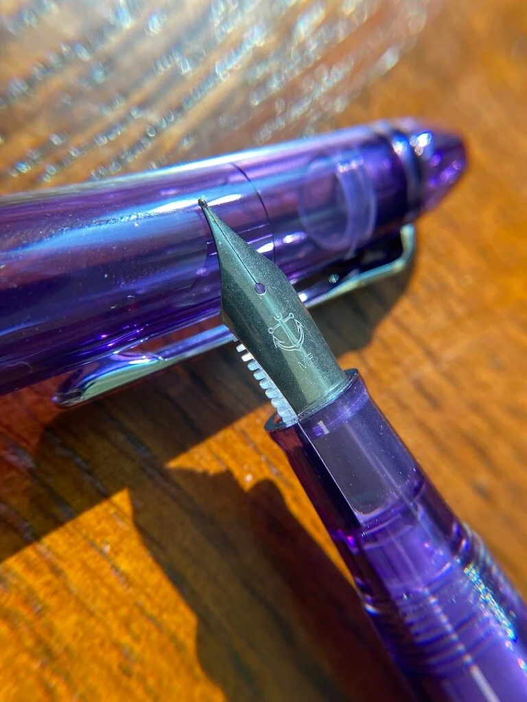
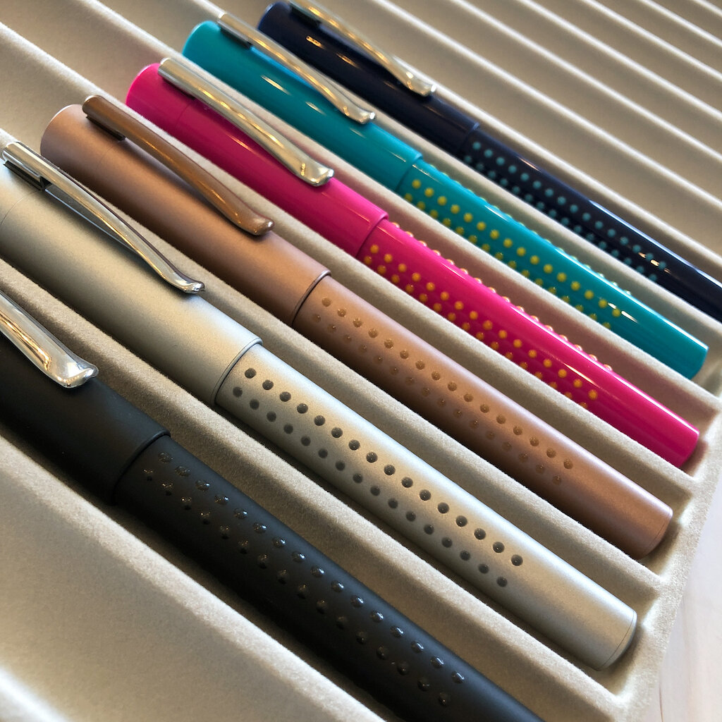
The Compass is made of transparent plastic in a handful of fun colors, all with chrome trim and a steel medium-fine nib. The pens come with a converter that matches the color of the pen, which is a nice bonus, and two cartridges. The cartridges and converter are proprietary, so it's nice that those are included for folks getting this pen as their first Sailor.

This isn't the first 1911 clone I've tried. I've also used the Nagasawa Pro Color and the steel-nibbed Shikiori models. Both of those were slightly more expensive, between $70-$90. The Compass clocks in at around $40, about the same as the Lecoule. If all this sounds a bit confusing, it's because it is. I can't make sense of Sailor's pricing philosophy, but I can tell you that the Compass is a good place to dive into the brand.

Sailor Compass 1911

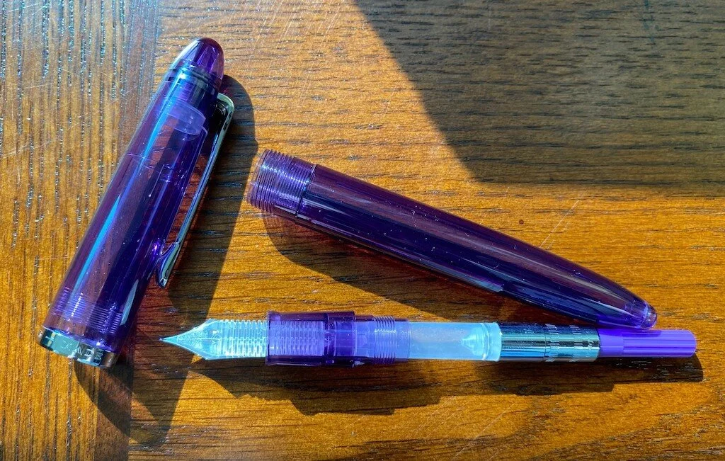
While lightweight, the pen materials do not feel insubstantial or cheap. The nib, while very plain compared to the highly decorated fancy-pants Sailor nibs, writes very well. There's also the added visual interest of the clear plastic feed, which shows the color of the ink moving through. It more than makes up for the plain nib.

Sailor Compass 1911 Feed

The 1911 has always been one of my favorite pens in terms of size and shape. I own one that my husband bought for me as a special gift because they were quite expensive even before the recent price increase. Now they're even out of gift range--so I'm grateful for the existence of models like the Compass, which checks in under $40. I'd definitely recommend this pen for both folks new to the hobby and experienced pen addicts who don't want to overspend. Personally, I like it better than TWSBIs or Pilot Metros for an intro level pen, but that's down to preference.

Sailor Compass 1911 Writing

I hope there will be more fun colors and patterns in the future for the Compass. Some wild themes and color runs could make these just as collectible as other Sailor models, only far more irresistible at this price.

(JetPens provided this product at no charge to The Pen Addict for review purposes.)


Enjoy reading The Pen Addict? Then consider becoming a member to receive additional weekly content, giveaways, and discounts in The Pen Addict shop. Plus, you support me and the site directly, for which I am very grateful.

Membership starts at just $5/month, with a discounted annual option available. To find out more about membership click here and join us!

Posted on September 9, 2021 and filed under Sailor, Fountain Pens, Pen Reviews.

Laban Antique II Fountain Pen Review

Laban Antique II Fountain Pen Review

(Jeff Abbott is a regular contributor at The Pen Addict. You can find more from Jeff online at Draft Evolution and Twitter.)

In a long line of "new to me" pens after the past few months, the Laban Antique II in red with gold lines is the latest to cross my desk. This classy vintage model has just the right amount of distressed character to grab your eye without being over the top or feeling out of place.

Having never used a Laban before, it's interesting to see how the brand defines itself through this individual product. It's easy to see that they appreciate good design, but they also want to bring back some sense of nostalgia by including vintage-looking accents and color schemes. It's not a complicated design, but it's just enough to hold the entire aesthetic together. The thin gold lines against the red body and cap are striking without being too bold. And don't let the "gold" adjective fool you; these colors are more akin to aged brass than shiny gold. Paired with the red, the dusty brass color is perfect.

Laban Antique II Fountain Pen

The grip section features the same material as the cap band, clip, finial, and end of the pen. It all ties together perfectly and supports the simple concept. The nib is the only new and shiny part of this pen, but they've even chosen to use a two-tone gold and silver steel nib to compliment the red/brass color scheme. In all, Laban have done a great job with the aesthetics of this pen.

Moving on to the build quality and materials, this pen has a good amount of weight. It's not specified in the marketing materials, but I'd guess that the pen is made of brass underneath the surface. At 43 grams, it's a comfortable weight that you notice without being too much to cause fatigue after a few lines. For me, the weight of the pen without the cap is perfect for writing, but you can also post the cap for some additional balance.

Laban Antique II Grip Section

I'm not sure what kind of material is used for the exterior of the pen (the red material), but it's definitely tough and not prone to scratching. I'd guess it's some sort of enamel coating, which will do well when packed in bags, pockets, purses, and even stowed next to other pens. Based on how this pen feels, it should last for quite a while assuming normal use.

The clip, finial, band, grip section, and butt of the pen all use the same brass-like metal with the same finish. It's a weathered brass look that matches perfectly with the red and gold color scheme.

The grip section has a nice shape that is comfortable to hold. Even though it's smooth, it has a microscopic texture that provides plenty of gripping power for your fingers.

The clip is strong, but still easy to use. It has no problem holding on to whatever you clip it to. I haven't been able to shake it loose with normal bag use.

Laban Antique II Clip

Overall, this pen has the perfect weight and materials to make it feel like a luxury item.

Now, moving on to the real question at hand: How does it write? Since I'm new to Laban, I had zero expectations for how the nib would perform. I'm not sure who made the nib, as it's stamped with "Laban Iridium Germany." My assumption is that this is a Schmidt or Bock nib branded under Laban, but I have no clue if that's accurate. The nib is steel and features a smooth iridium point. The medium model that I have produces a bold, smooth line and didn't require any adjustments out of the box.

Laban Antique II Converter

In terms of flow, it is a bit on the wet side, but not so much as to cause any issues with most papers. The extra flow definitely adds to the buttery smooth feel of the nib while writing. It really is a pleasant experience, and I hope the smaller nibs perform similarly.

You receive a standard international cartridge converter with the pen, which is a nice touch. They also include a small bookmark in the packaging. They don't include any ink cartridges, though.

Laban Antique II Comparison

Goldspot sells this pen for $88. This price point is notoriously difficult and uncomfortable because there is so much to offer both below and above the price of this pen. Can I recommend it at this price? Not really; it doesn't offer anything that other pens excel at in the sub-$50 range, and if you can spend a little more, your options explode at the $100-120 range.

That being said, this is a solid pen. It might be a tad over-priced for value received when compared to other brands, but not by much. It performs well, looks fantastic, and feels great. If the aesthetic reaches out to you, or if you think this would make a good gift for someone in your life, the Laban Antique II won't let you down. It just doesn't provide the best bang-to-buck ratio.

(Goldspot provided this product at no charge to The Pen Addict for review purposes.)


Enjoy reading The Pen Addict? Then consider becoming a member to receive additional weekly content, giveaways, and discounts in The Pen Addict shop. Plus, you support me and the site directly, for which I am very grateful.

Membership starts at just $5/month, with a discounted annual option available. To find out more about membership click here and join us!

Laban Antique II Writing
Posted on September 8, 2021 and filed under Laban, Fountain Pens, Pen Reviews.

Faber-Castell Grip Fountain Pen - A Quick Look

Faber-Castell Grip Fountain Pen

(Kimberly (she/her) took the express train down the fountain pen/stationery rabbit hole and doesn't want to be rescued. She can be found on Instagram @allthehobbies because there really are many, many hobbies!.)

Faber-Castell’s Grip fountain pens are one of my favorite entry-level, budget-friendly fountain pens. There is already an excellent writeup of the Calligraphy set which contains the Grip fountain pen with calligraphy nibs, so this post is going to take a quick look at the non-calligraphy version.

The Grip Fountain Pen is part of Faber-Castell’s Grip line of pencils, erasers, and pens which all have subtle dots or bumps on the barrel for easy gripping (hence the name). Two versions of the Grip fountain pens are available, the 2010 and 2011, with the former sporting a glossy finish while the latter are matte. The snap cap is very secure, but also easy to open/close with one hand. The barrel is very subtly triangular, making it less likely to roll off one’s desk when uncapped.

Grip up close.jpg
From left to right, 3 - 2011s and 3 - 2010s. Can you tell the difference between pens’ finishes?

From left to right, 3 - 2011s and 3 - 2010s. Can you tell the difference between pens’ finishes?

The fountain pen has a slightly triangular grip section as well. The pens come in EF, F, M, and B sizes and include a standard international Faber-Castell blue cartridge. The nib and feed are friction-fit into the barrel (there is no housing or nib unit) and can be swapped with the Faber-Castell Loom (and probably other models too), though you would need to pull the nib/feed out of the Loom housing to fit the Grip. I would equate the writing experience to be similar to a Jowo steel nib in its stiffness and line width. I like the Medium and Broad nibs for smoothness and flow, the Fine is nice too. The EF felt a bit too nail-like and borderline scratchy for someone with a high writing angle like me and is more sensitive to pressure. If your writing angle is closer to 45 degrees (versus 70-80 degrees like me), it will feel smoother.Prices range from $20-30 USD, depending on color and finish, which makes it a good value.

Left to right: Kaweco Sport, Pilot Metropolitan, Faber-Castell Grip, TWSBI Eco, Lamy Al-Star.

Left to right: Kaweco Sport, Pilot Metropolitan, Faber-Castell Grip, TWSBI Eco, Lamy Al-Star.

Grip comparison - capped.jpg
TWSBI Eco T, Faber-Castell Grip and Lamy Al-Star - The washi tape shows the Grip’s shape to be less angular/sharp compared to the other two.

TWSBI Eco T, Faber-Castell Grip and Lamy Al-Star - The washi tape shows the Grip’s shape to be less angular/sharp compared to the other two.

Pros

  • Pen takes readily available standard international cartridges or converter.
  • Slight triangular grip is more forgiving than other triangular gripped pens.
  • Secure snap cap makes quick note jotting a breeze.
  • Two finishes and a variety of colors are available.
  • Reliable steel nibs that are also swappable with other Faber-Castell models including the Loom.
  • Solid writer at a decent price.

Cons

  • The Grip is a very light pen. If you prefer heavier pens, this might not be the right pen for you.
  • Slight triangular grip still might not be comfortable for all users.
  • The glossy 2010 cap/barrel can feel a bit “cheap” compared to the matte 2011, but this is personal preference.
  • Converter not included (but also not expected at this price point).
EF-B nibs with Sailor Ink Studio 252 on Clairefontaine 90gsm Triomphe paper.

EF-B nibs with Sailor Ink Studio 252 on Clairefontaine 90gsm Triomphe paper.

So why is it one of my favorite pens? Because the snap cap makes it quick and easy to use but doesn’t feel flimsy, despite being a very light pen. The gentle triangular grip feels more like a suggestion rather than a mandate, making it more approachable than other triangular gripped pens like the Lamy Safari/Al-Star. The nibs are pleasant to write with, right out of the box. And the dots on the barrel make it look and feel interesting (in a good way), and the variety of colors and textures makes it easy to find one to match your style. All this in a budget-friendly price range, what’s not to love?

(All pens in this review were purchased with my own funds and I received no compensation from Faber-Castell for this review.)


Enjoy reading The Pen Addict? Then consider becoming a member to receive additional weekly content, giveaways, and discounts in The Pen Addict shop. Plus, you support me and the site directly, for which I am very grateful.

Membership starts at just $5/month, with a discounted annual option available. To find out more about membership click here and join us!

Grip - capped.jpg
Posted on August 27, 2021 and filed under Faber-Castell, Fountain Pens, Pen Reviews.