Posts filed under Fountain Pens

Leonardo Momento Zero Grande 2.0 Guilloche Fountain Pen Review

Leonardo Momento Zero Grande 2.0 Guilloche Fountain Pen Review

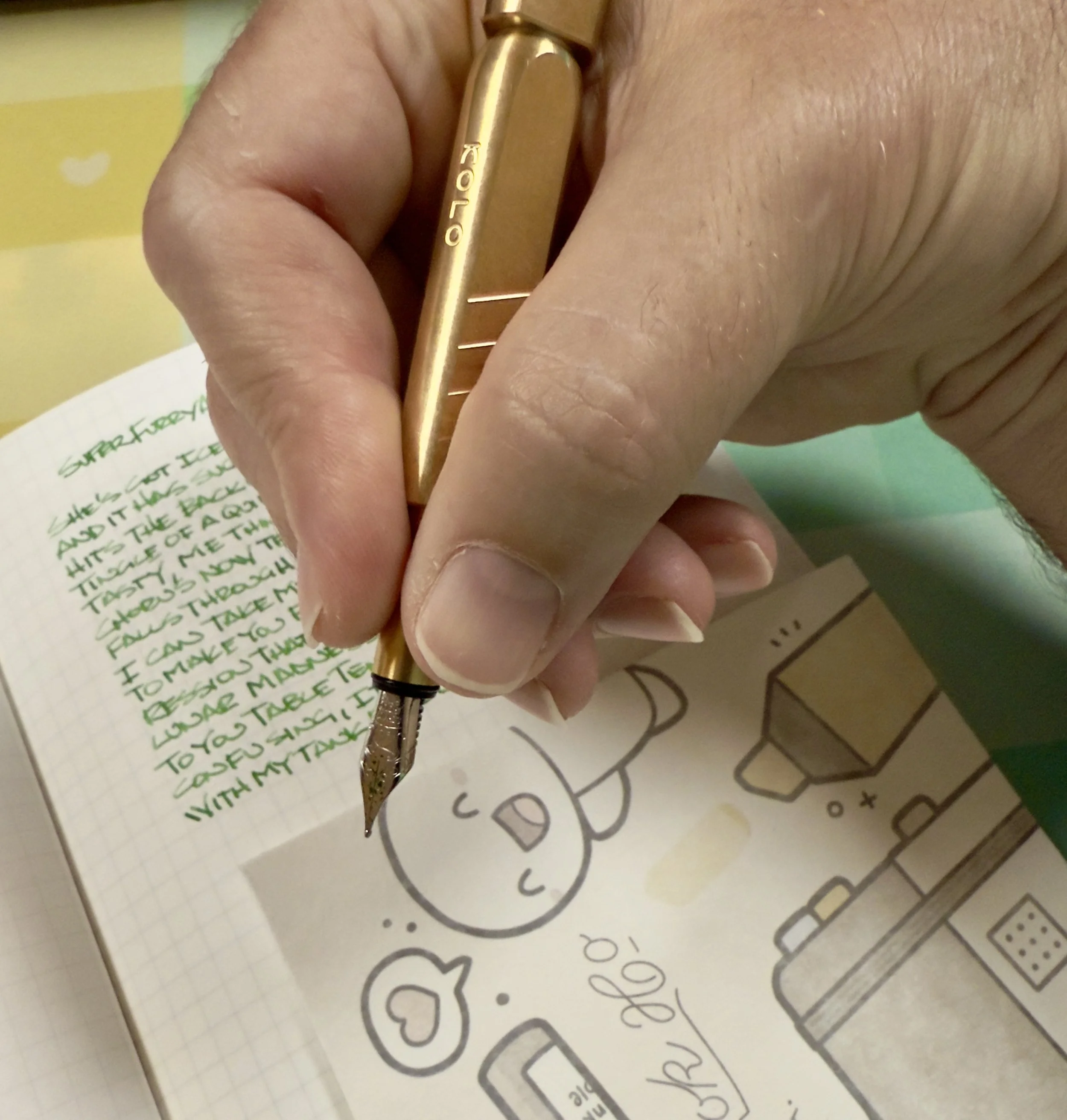
(Sarah Read is an author, editor, yarn artist, and pen/paper/ink addict. You can find more about her at her website and on Bluesky. And her latest book, The Atropine Tree, is now available!)

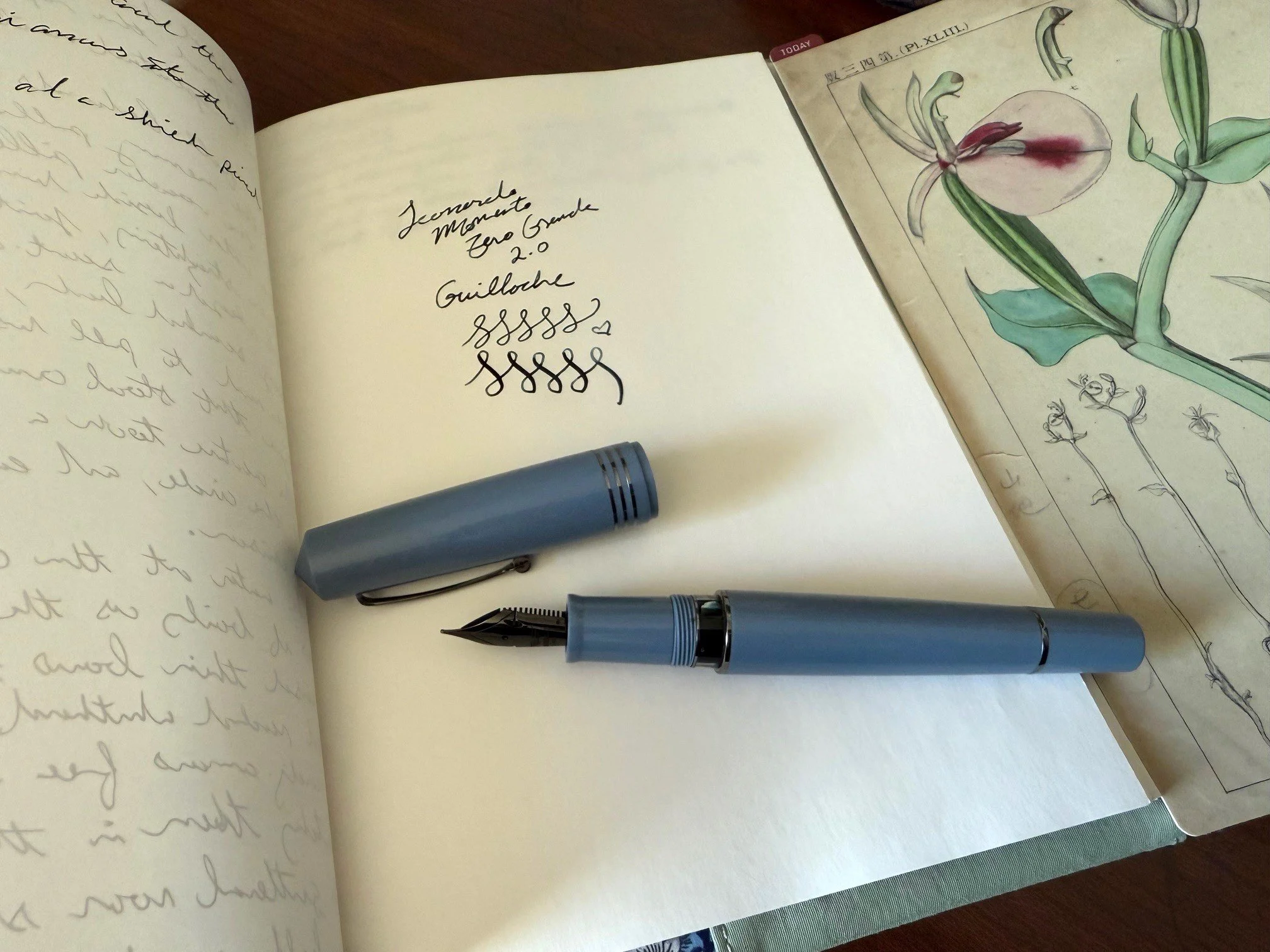
Every now and then I open a new pen and it's a favorite at first sight. The Leonardo Momento Zero Grande 2.0 Guilloche gave me instant heart-eyes when I opened the box. It looks amazing. The texture, the finish, the colors--all perfect. I liked the look of it so much that I actually got nervous, because what if the writing experience didn't live up to the looks? There was no need to worry. This is a fantastic pen.

Leonardo Momento Zero Grande 2.0 Guilloche Fountain Pen
Leonardo Momento Zero Grande 2.0 Guilloche Fountain Pen Open Box

The body of the pen is a cool-toned blue resin that is subtly etched with a geometric guilloche pattern that resembles ears of grain. Each of the different colors has its own etching pattern. This color is called "indigo," though it looks to me to be more of a slate grey-blue. There is also “Iris” which is dark blue and “Verdigris” which is a sage green. They're all gorgeous. The Indigo is the only one that comes with the ruthenium trim, and the gunmetal grey looks perfect with the moody blue tones. The clip is slim and fairly flexible, with a tiny wheel at the bottom to make the clipping process smoother. The cap and piston knob have metal bands that add a decorative reinforcement to these stress points. Speaking of points, both the top and bottom finials are gently pointed. The overall look is very Art Deco vintage elegance.

Leonardo Momento Zero Grande 2.0 Guilloche Fountain Pen Pattern
Leonardo Momento Zero Grande 2.0 Guilloche Fountain Pen Nib

Under the twist cap, the grip section is engraved with "Leonardo Italy" and you're greeted with a clear resin ink window, so you can keep track of your ink supply. This is a piston filler pen, so the back end unscrews to move a plunger inside the pen that draws ink in through the nib from a bottle. It is my personal favorite ink filling mechanism, as they tend to hold quite a lot of ink, as this one does, but they can be more difficult to clean. There is no way to disassemble the pen for cleaning, so rinsing ink out is a matter of repeatedly filling the pen with water and releasing it till it runs clear. It takes longer and is less effective than a filling system you can take apart, but it's worth it to me for the higher ink capacity, and I don't like reassembling tiny pen pieces after cleaning. I'm always afraid I'll drop one. So, I prefer this. There's no fear of a precious nib falling down the drain.

Leonardo Momento Zero Grande 2.0 Guilloche Fountain Pen Writing

They all come with either a Fine nib or a Flex Fine nib. Mine has the Flex Fine, because I like a bouncy writing experience. The nib has its sides cut out to create a narrow neck that flexes when pressure is applied. The flex nib also has "Leonardo elastic" engraved on it. This is very much a modern flex nib, which is to say that it's not super flexy. It can take some light pressure and provide some slight line variation, but it isn't bendy like a vintage flex pen would be. What I love about it is that I can get fine lines when writing, but it still has a softer writing experience, and often flex nibs have better ink flow. This combination is perfect for me when I want a longer writing session. Writing a whole short story in one sitting, but don't want to run out of ink or get hand fatigue? This is your pen. Well, no. This is my pen. But you can have one, too.

Leonardo Momento Zero Grande 2.0 Guilloche Fountain Pen Notebook

The Leonardo Momento Zero Grande 2.0 is available on JetPens for $289, which is perfectly fair. It's a fancy pen and it has a fancy pen price. It is, however, much nicer and more solidly built than some pens that are considerably more expensive. When it comes to measuring cost against quality, I think Leonardo is at the top of the game when it comes to mass-produced pens. All of their pens that I've used have been winners, and this is my favorite one, yet.


Enjoy reading The Pen Addict? Then consider becoming a member to receive additional weekly content, giveaways, and discounts in The Pen Addict shop. Plus, you support me and the site directly, for which I am very grateful.

Membership starts at just $5/month, with a discounted annual option available. To find out more about membership click here and join us!

Leonardo Momento Zero Grande 2.0 Guilloche Fountain Pen Lake
Posted on May 29, 2025 and filed under Leonardo, Fountain Pens, Pen Reviews.

Kolo Tino Brass Fountain Pen Review

Kolo Tino Brass Fountain Pen Review

The Kolo Tino has been making the rounds on the Stationery Internet™, and yes, I received one too. I’ve had mine in use for the past week, and I’ll say this: it makes for a perfect review product because I have a lot to say about it. Let’s dig in!

Kolo Tino Brass Fountain Pen

The Kolo Tino is designed by Tino Valentinitsch, an industrial designer from Vienna, Austria, in collaboration with Peter Dunn, founder of Kolo. As a brand, Kolo began in 1998, and was acquired by Topdrawer in 2016. Topdrawer is a subsidiary of Itoya, Japan, and has several brick and mortar retail locations around the world. For our purposes, Topdrawer is the distributor of the Kolo lineup, which is why you see the brand being carried by several retailers in our space.

Kolo Tino Brass Fountain Pen Barrel

That patina doing work.

The Kolo Tino Brass Fountain Pen is a stunner to look at. This model is small and sleek, featuring a triangular shaped barrel with rounded ridges. The barrel tapers into a torpedo shape on the front, and has aluminum extension on the back for posting the cap. Aesthetically, it looks spectacular, although I do wonder about the left-handed orientation of the stamped Kolo wordmark. If the designer is left-handed and just went for it that would be awesome!

Kolo Tino Grip

I stopped mid-writing to take a few pics of my grip, and where it hits on the barrel step.

Once uncapped, the Kolo Tino runs into some challenges. The triangular barrel design gives way to a cylindrical, tapered grip section. This leaves quite a drop from the barrel to the section - more on the ridges, less on the flat sides. A traditional writing grip will find its way up the flat sides, but not without some challenge finding comfort in the step down to the grip. The barrel edge in that area is chamfered so it’s not cutting into your hands, but it is still Brass, and noticeable. Non-traditional grips could have more of a challenge in this area.

For me, the only way to grip the pen is to have some part of my fingers over that step down. I could grip lower, but that puts me too close to the nib. I could go higher, above the step, but that puts me too far away.

I could have some #DealWithIt grace in this area of the pen if it was usable unposted. For me, and my very average sized hands, it’s not. The Kolo Tino is too short to clear the cusp of my hand between my thumb and forefinger, making it awkward to write with for more than a short note.

Kolo Tino Unposted

Too short to use uncapped.

When posted, the Brass cap attached to the Brass barrel makes the pen too heavy, and too unbalanced. I also don’t care for the aesthetic of the posting connection, but that’s just a me thing. I’d prefer a more seamless posting.

Kolo Tino Posted

Better posted, but now unbalanced.

Given the weight of the Brass pen - which checks in at 69 grams - this was always a possibility. That’s why I’m interested in how both the Acrylic and full Aluminum barrels feel in hand. The lighter weight of those models (21g and 27g, respectively,) could make the grip section more passable, and less of an interference.

Kolo Tino Comparison

Comparison (L to R): Kaweco Steel Sport, Kolo Tino Brass, Sailor Pro Gear Mini.

Kolo Tino Comparison Unposted
Kolo Tino Comparison Posted
Kolo Tino Section Comparison

The Kolo Tino is fitted with a Schmidt #5 Steel nib, and uses Short International cartridges, and compatible converters. My Medium nib was perfect out of the box, and nice to use, especially with my selection of Graf von Faber-Castell Viper Green. I nailed the color, I must say.

Kolo Tino Writing

Priced at $150 for Brass, Aluminum, and Standard Acrylic barrels ($195 for Specialty Acrylic,) the Kolo Tino provides nice value for what it offers. The material and construction are top notch, but that said, will you be able to use it given its extreme grip section? For me, the Brass model is too much of an ask to use over comparable pens. At a minimum, I’d be looking to try before buying to see how it will works for you.

I’ll be doing the same once I can test out an Acrylic barrel, which I hope to in the next couple of months. I think that would be worth a bit of a follow-up to this post and see how it compares. The design of the Kolo Tino interesting enough to see if they iterate on it and make it more of a universal user, instead of a specific fit.

(Topdrawer sent me this pen at no charge for purposes of this review.)


Enjoy reading The Pen Addict? Then consider becoming a member to receive additional weekly content, giveaways, and discounts in The Pen Addict shop. Plus, you support me and the site directly, for which I am very grateful.

Membership starts at just $5/month, with a discounted annual option available. To find out more about membership click here and join us!

Kolo Tino Packaging
Posted on May 26, 2025 and filed under Kolo, Fountain Pens, Pen Reviews.

Monoc Monoc Monoc

(Kimberly (she/her) took the express train down the fountain pen/stationery rabbit hole and doesn't want to be rescued. She can be found on Instagram @allthehobbies because there really are many, many hobbies!.)

When Ian Schon first announced his in-house, titanium Monoc nib in late 2022, I rushed to pre-order it, picked it up a few months later at the Philly Pen Show, and ended up going through three converters’ worth of ink to write this Monoc review. Since then, I got a Bock Monoc with a Fine nib last year, and got the Cursive Monoc at the Baltimore Pen Show earlier this year.

Top to bottom: Fine, Medium, Cursive Monoc.

I won’t go into a lot of detail since that’s already been covered in the other article, but I wanted to share some writing samples since they all write differently. There is also a blog post that goes into more detail about the Monoc and has much better nib pictures than I can take.

One of the things that I like about the Monoc is that I can put them in a wide variety of pens that take #6 nib units, including Schon Dsgn Full Size and Pocket 6, Franklin-Christoph, and especially Montegrappa pens.

Left to right: Franklin-Christoph 46 in Italian Ice (Medium), Conid Minimalistica Monarch (Fine Bock), and Montegrappa Mia Everglades (Cursive.)

I will start with the Medium Monoc since that’s the one I’ve had the longest and used the most (in at least 7 different pens, some with multiple inkings). My Medium Monoc is a decently wet writer and produces lines that are a bit closer to a Medium-Broad Jowo, if such a thing existed. Each of these nibs are individually machined and hand-tuned by Ian (he’s the only one who tunes them) so there can be minor variations in wetness and width. I sometimes use drier inks to compensate - this time around I picked Robert Oster Viola, which is a lovely light purple ink but definitely on the dry side, even in this wet nib.

I love that all of the Monoc nibs can also be used to write on the reverse, that is, flipped around/rotated such that the feed is facing up. Some of the Monoc’s lines, as you will see, are more angle dependent. As a reminder, I am a high/steep angle writer (typically ~75 degrees) so my lower angle writing samples are a little messier. Paper and ink will also make a difference so keep that in mind when comparing writing samples.

Writing sample with the Medium Monoc, the reverse will give you a finer line. You can get more of a difference between the regular and reverse with a wetter ink. Writing angle doesn’t affect the line width much on either side.

Here is a writing sample with the Medium Monoc and Medium nibs from other brands: Graf von Faber-Castell Intuition (18kt gold), Lamy Studio (steel), Nahvalur Schuykill, Opus 88 Mini (Jowo 5 Medium), Platinum 3776, Sailor Pro Gear (21kt gold), Radius Settimo (Jowo 6 Medium), Sailor Pro Gear Slim (14kt gold), TWSBI Eco, Taccia Spectrum (Sailor steel), Kaweco Special.

The Bock Monoc has a Fine nib and is inked with a very wet ink, KWZ Monarch, in the Conid Minimalistica, which is also in a fairly wet pen. It has a smooth fine line on the regular, and a broad architect line on the reverse.

Writing sample with the Fine Monoc. Writing angle doesn’t make much of a difference on the regular but definitely does on the reverse.

Here is a writing sample with the Fine Monoc and nibs from other brands: Pilot Vanishing Point, Kaweco Sport, Platinum Plaisir 05, TWSBI Precision. On the reverse: Lamy Studio (steel B), Kaweco Sport (B), Lamy Accent (14kt gold M), Jowo Broad Architect, Lamy BB Architect (ground by Gena Salorino of Custom Nib Studio). The contrast of the Fine Monoc’s reverse down vs cross stroke isn’t as great as with a more traditional architect (the last two.)

Last and definitely not least, the Cursive Monoc isn’t a “regular” Monoc with a Cursive grind added to it. Ian says the Cursive Monoc starts off as its own nib shape (sorry, I can neither explain nor share the technical aspects) and then gets ground and tuned further to a smooth, “cursive italic”. I put that in quotes because Ian says it’s not a traditional cursive italic the way a nib grinder might describe it, but it’s definitely close enough to call it that. This grind makes narrow horizontal strokes and broader vertical strokes, giving noticeable line variation whether you are writing in cursive or print.

It is currently inked with an average wetness ink, Robert Oster x Vanness Pens Hemp, in a Montegrappa Mia. It has a smooth Medium to Medium Broad cursive italic line/variation on the regular, and an even broader line on the reverse than the Fine Monoc’s reverse.

Writing sample with the Cursive Monoc and nibs from other brands: Franklin-Christoph Fine SIG (Stub Italic Gradient), F-C Broad Stub (Masuyama), Jowo 1.1 (14k5 gold), Pelikan Steel Broad CI (Masuyama), F-C Medium SIG, Waterman Carene Stub (or BB, depending on who you ask), TWSBI Eco Broad & Fine “In Between” (Mark Bacas’ grind that’s “in between” a stub and a CI), and for the reverse, Lamy 2000 BB Architect by Gena Salorino, Jowo Broad Architect.

The writing angle doesn’t really impact the writing of any of the Monocs on their regular sides, nor for the Medium Monoc on the reverse. But on both the Fine and Cursive Monocs, the width of the reverse side is more angle dependent, moreso for the Fine than for the Cursive. Of the 3 Monocs, it’s hard to pick a favorite, but if I could only use one, it would be the Fine because I love how differently the regular and reverse sides write.

Here are a few things that Ian wanted folks to know:

  • The Bock-threaded Monocs aren’t listed on the website but they can be requested.
  • Monoc nibs have a 5-10 day fulfillment turnaround because they are made to order. If you need something sooner, please reach out to them in case there are some in stock.
  • If you see one of their nibs at a show or someone’s IG post but you don’t see it online, reach out to them to ask if it can be made. Ian and team will often make special anodized colors that might not be listed on the website.
  • Avoid using shimmer inks because the nib isn’t disassemble-able for thorough cleaning.
  • Schon Dsgn is 3 people and Ian is the only one who does the fine tuning on the Monocs, so be patient, especially around pen show time when some or all of them may be traveling. Definitely send them an email if you have any questions.

The Schon Dsgn Monoc starts at $385 for polished titanium. Anodized options are also available - prices vary depending on complexity of the anodization (nib anodizing is done in-house, while anodization on the aluminum pens are done elsewhere).

As I said in my other article and will say again, yes, it is an expensive purchase, and no, this is not a nib for everyone. I value the innovation that goes behind the research and design of these nibs. I also like the stiff, nail-like writing experience that it provides, and the reversibility of the nibs is twice the fun even though I don’t take advantage of the reverse as much as I should. If you’ve been thinking about getting one and it fits your budget, definitely check them out, especially if you’re reading this during this weekend’s Chicago Pen Show!

Posted on May 2, 2025 and filed under Schon DSGN, Nibs, Fountain Pens, Pen Reviews.