Posts filed under Fountain Pens

Inked Up for the 2025 Pelikan Hub

(Kimberly (she/her) took the express train down the fountain pen/stationery rabbit hole and doesn't want to be rescued. She can be found on Instagram @allthehobbies because there really are many, many hobbies!.)

This article is coming out on the day when folks around the world are/will be gathering as part of the 2025 Pelikan Hub! This is my fourth time as the Hubmaster for the Palo Alto Pelikan Hub and even though it’s not a requirement to own a Pelikan in order to attend a hub, what kind of Hubmaster would I be if I didn’t ink up some birds for folks to try, right?

I try to pick out at least one from each of the main models in a variety of colors and nib sizes, when possible. I don’t own any vintage Pelikans, so the ones I have are modern (1980s onward). I also don’t have any M100x because I can’t write with the nibs because they are too long (not big hands + steep writing angle = can’t use long-nibbed pens). And here’s a not-so-short primer on Pelikan fountain pens if you’re not familiar with the models and numbering.

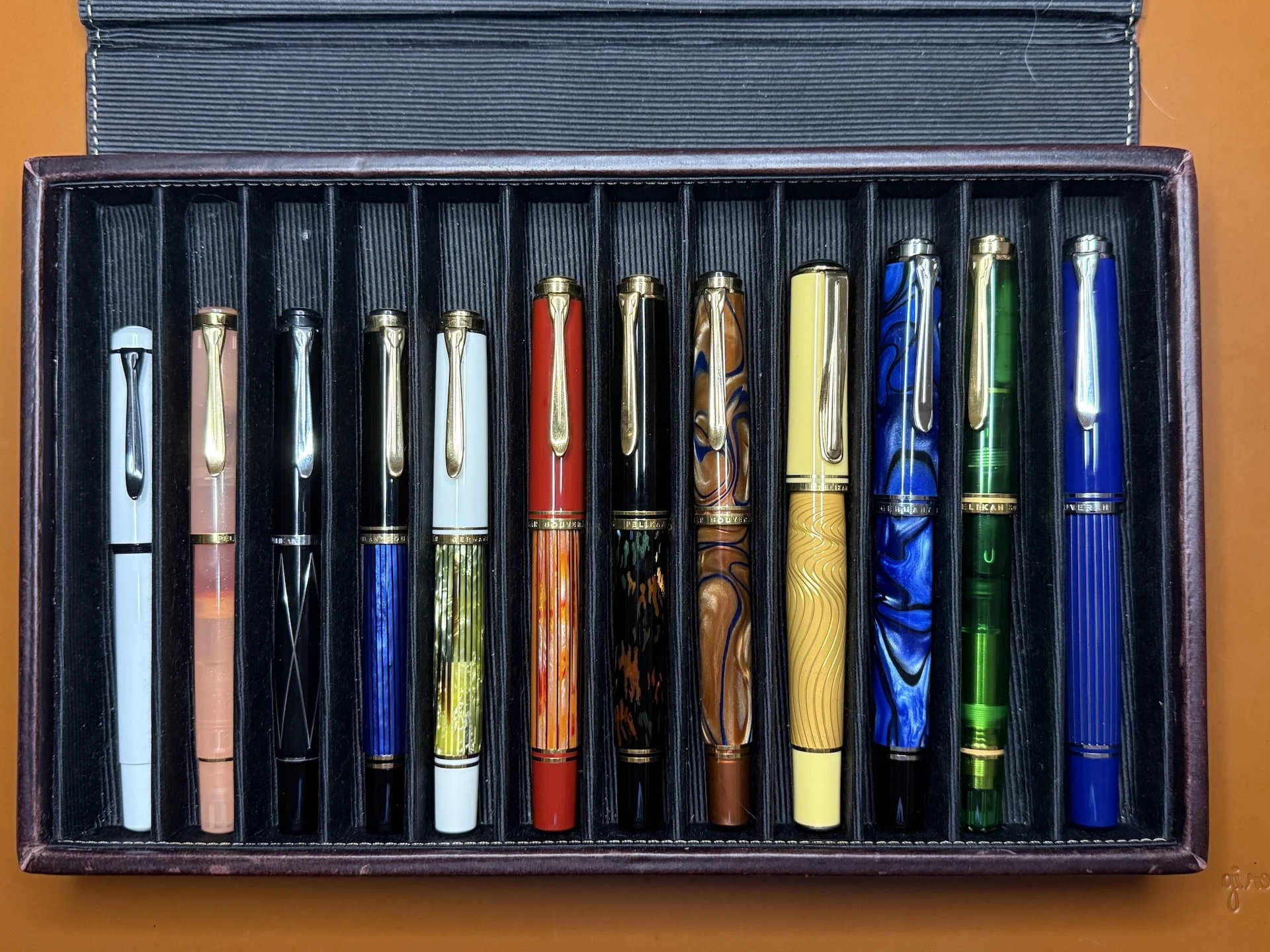
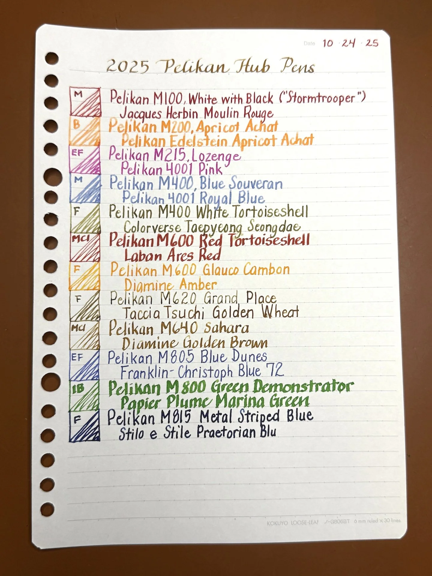
This year’s flock in a Franklin-Chrisoph 12-pen Covered Pen Tray (left to right):

  • M100 White with Black, aka Stormtrooper
  • M200 2025 Pen of the Year, Apricot Achat
  • M215 Lozenge
  • M400 Blue Souveran
  • M400 White Tortoiseshell
  • M600 Red Tortoiseshell
  • M600 Glauco Cambon
  • M620 Grand Place
  • M640 Sahara
  • M805 Blue Dunes
  • M800 Green Demonstrator
  • M815 Metal Striped Blue

Let’s go through the picks:

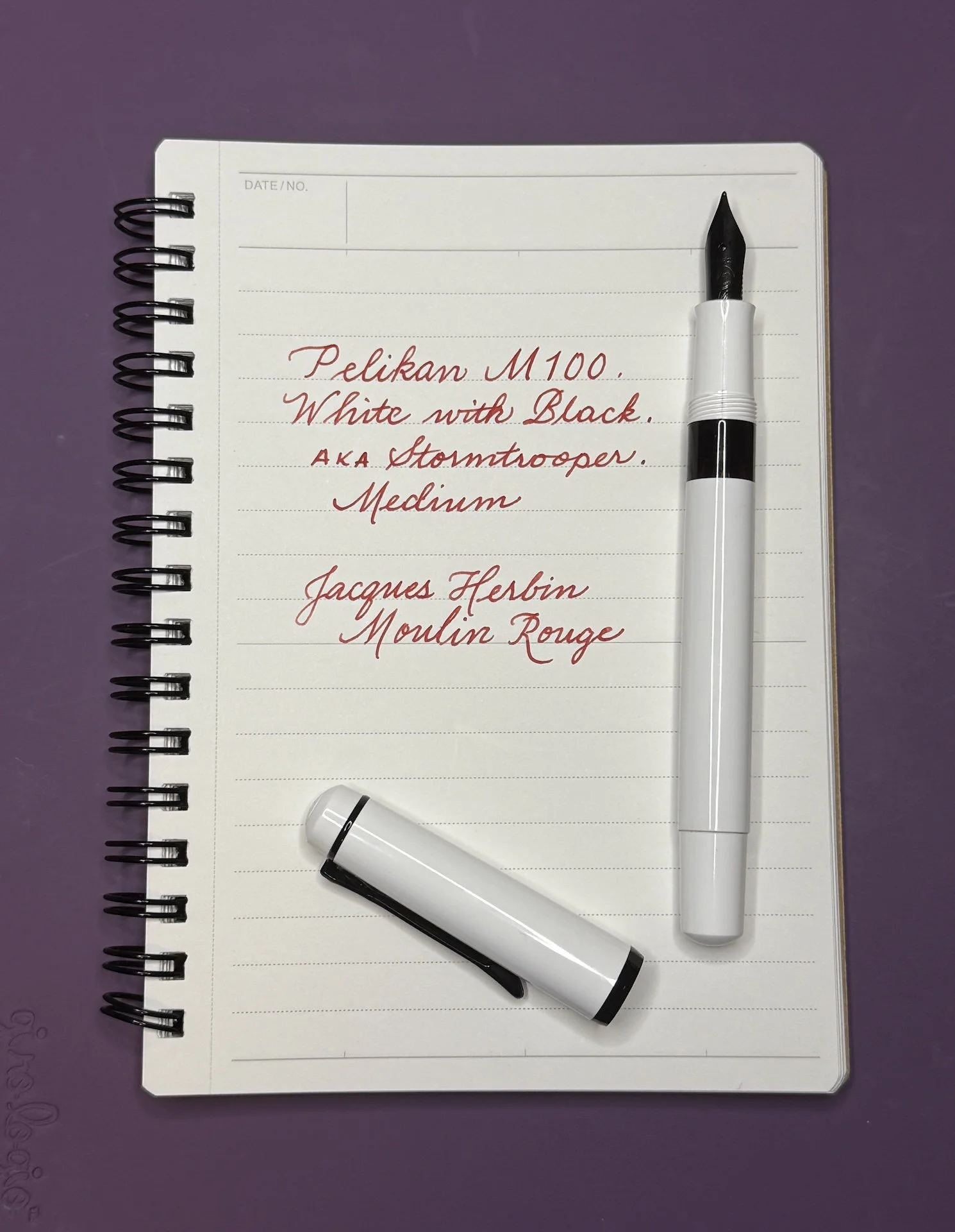
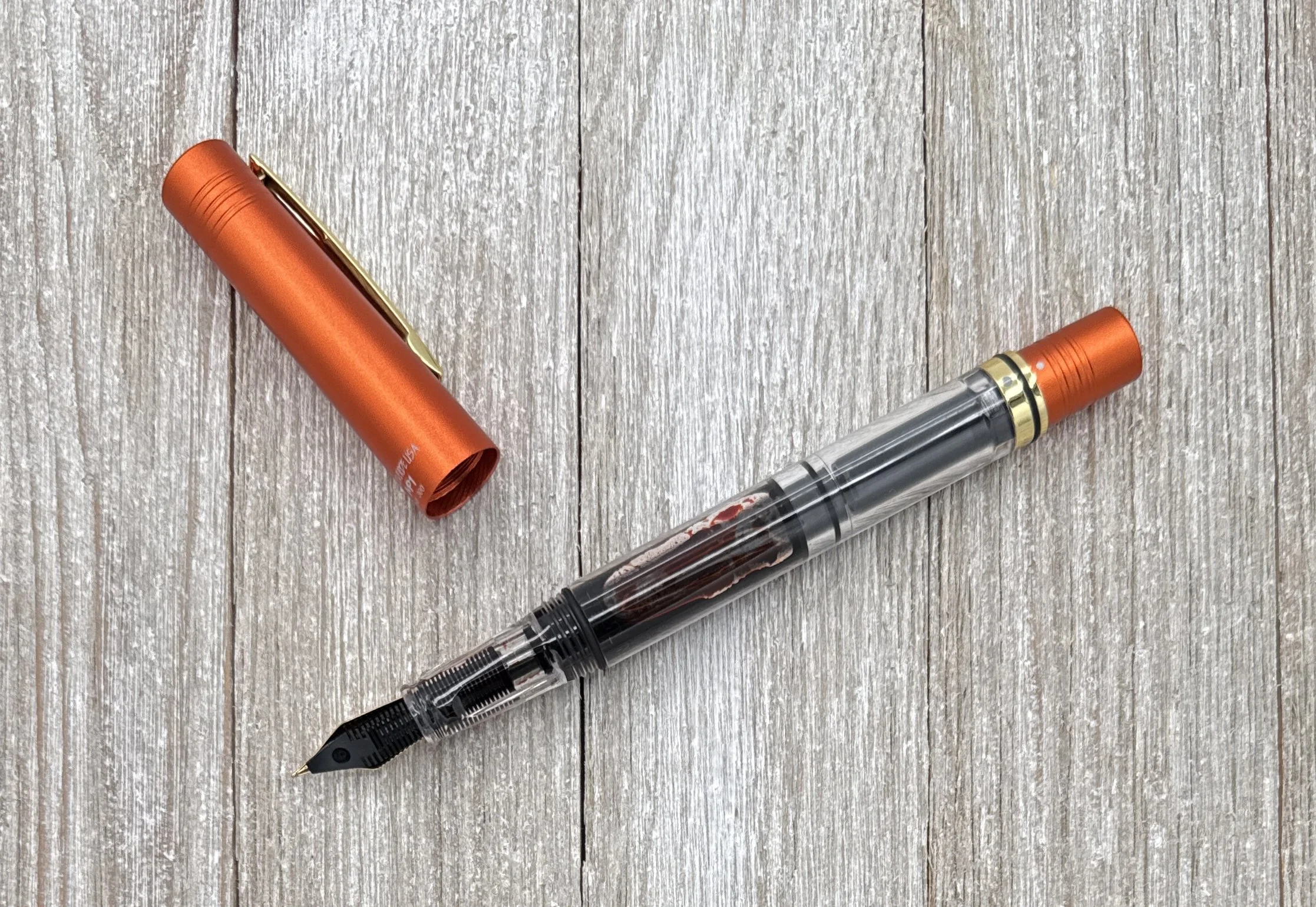
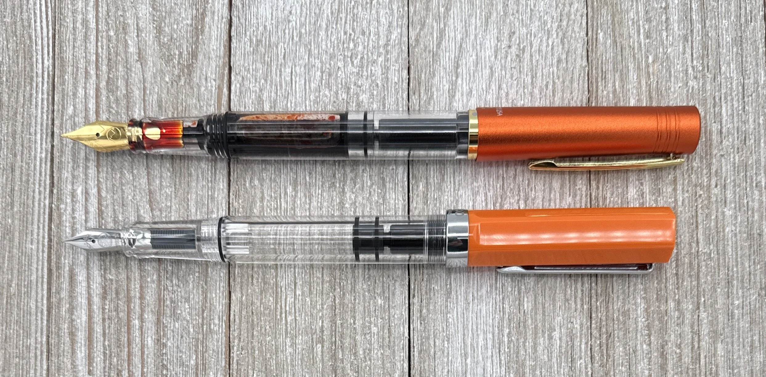
M100 Stormtrooper - I hadn’t inked this up ever since I bought it second hand a couple years ago and honestly, it kinda disappeared amongst all the other birds. Time to remedy that! I’m glad it had an EF nib, even though that’s not my usual jam, because it’s nice to have some diversity for myself and for folks wanting to try the different nibs sizes. And a Stormtrooper pen demands red ink (pew pew!) and Jacques Herbin Moulin Rouge fits the bill perfectly!

M200 Apricot Achat - Assuming the pen of the year shows up in time for the hub (it doesn’t always), the current year’s pen will always be in rotation for the hub. I picked a broad nib to show off the Apricot Achat ink, which is on the lighter side.

M215 Lozenge - The “1”in the model number signifies that there’s metal on the barrel - and this one is in the form of diamonds. This also has an Extra Fine nib, and I picked a fun pink ink (Pelikan 4001 Pink) to counteract the “seriousness” of this classy black pen.

M400 Blue Souveran - Not the flashiest of Pelikans but I will always have a soft spot for this pen because it was my very first Pelikan which I bought from Peyton Street Pens at the SF Pen Show in 2017 (my first show!). I stuck with a classic for this pairing - Pelikan 4001 Royal Blue.

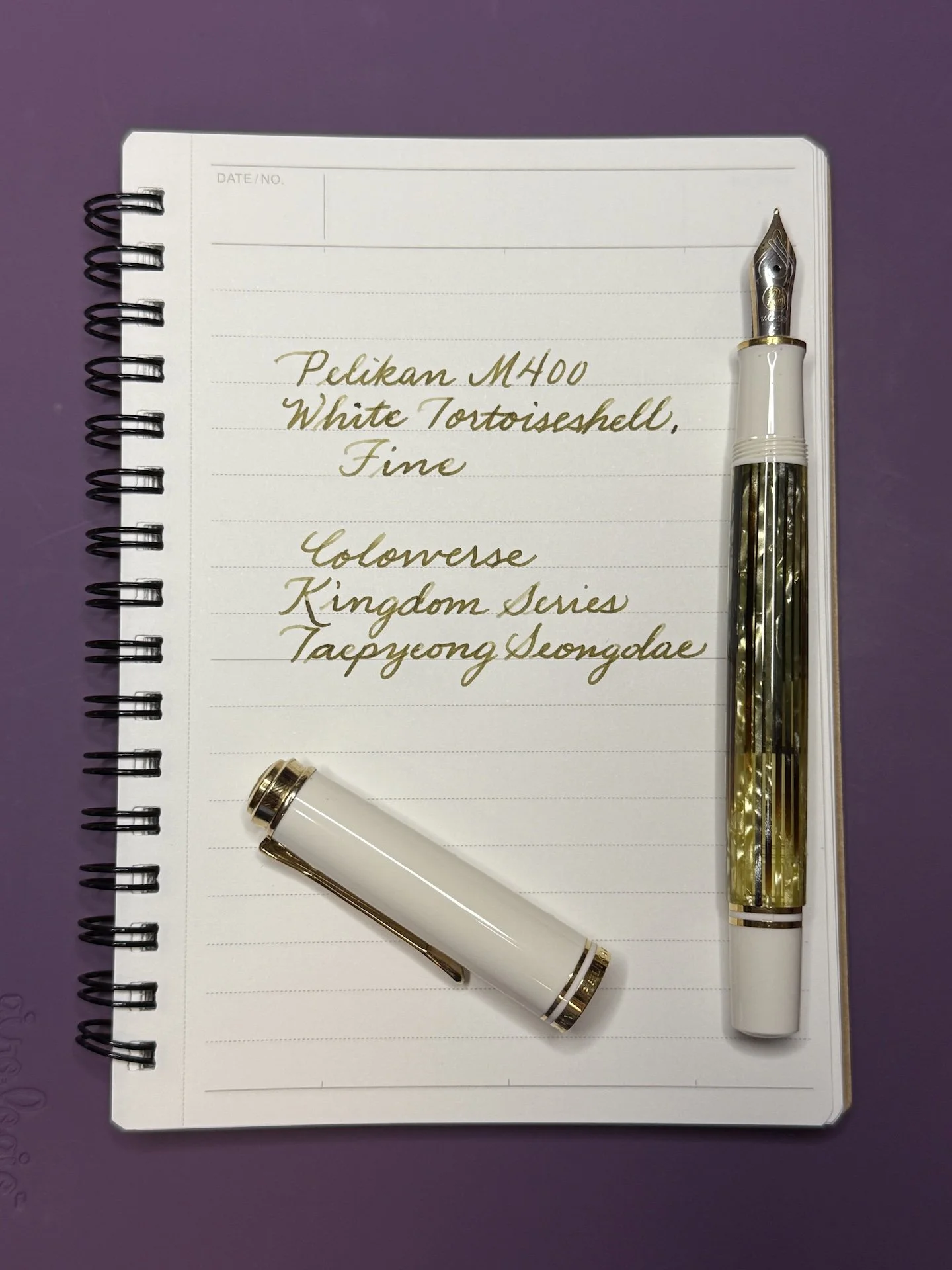
M400 White Tortoiseshell - There’s something about the olive greens and browns in the barrel of this pen that just gets me, so I ink up this one quite often. I decided not to use a shimmer this time (though Pelikans have handled shimmer pretty well in my experience), and went for a slightly dry ink like Colorverse Taepyeong Seongdae. The pen/ink combo works well because the drier ink tames the Pelikan’s wetter nib.

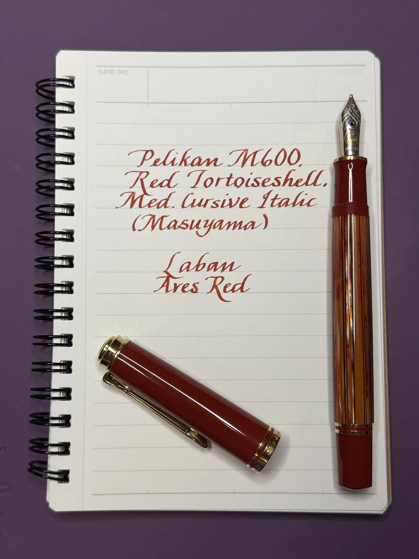
M600 Red Tortoiseshell - As someone who is generally not into red, I notice when a red pen catches my eye. I love the shades of orange, red, and black in the barrel. Picking an ink for this pen is easy and hard for the same reason - lots of colors to try and match. I picked a fairly true red, Laban Ares Red, instead of one that leans a bit more orange. The Masuyama Medium Cursive Italic makes any ink look good.

M600 Glauco Cambon - After seeing the M600 Art Collection Rudi Rother in person at the Dallas Pen Show last month, I knew I had to ink up the Glauco Cambon, which was the first release of the Art Collection series. Despite the M600 name, it is actually heavier than the usual M600 because of the brass barrel which is engraved/guilloched and lacquered. The varying shades of yellow, orange, and green really pop in good lighting. Photos just don’t do it justice. I opted to match the orange parts of the barrel, and chose Diamine Amber.

M620 Grand Place - One of my more recent acquisitions, this is a pen that I have drooled over for many years. I finally managed to get this one (pen friends are the best), so inking it up for the Hub was a no-brainer. So many shades of brown (and blue) in this pen to choose from, but I ended up picking Taccia Tsuchi which pairs quite nicely.

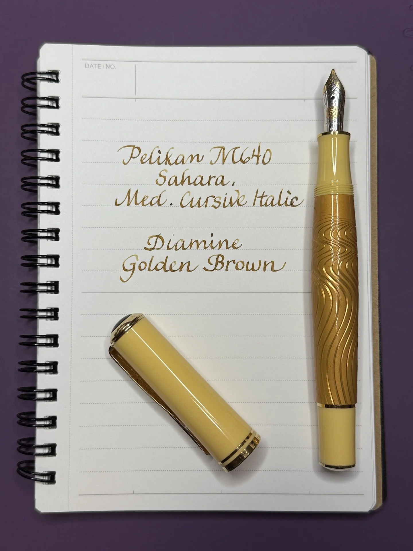
M640 Sahara - I picked the 640 because it is a different shape from the other pens in that it has a slightly bulbous/curvy shape to the barrel which tapes down to the grip. I got this one second hand with a CI grind on it so I’m not sure who did the grind. I used up the last of my Diamine Golden Brown sample to ink it up, so guess it’s time to get a bottle, right?

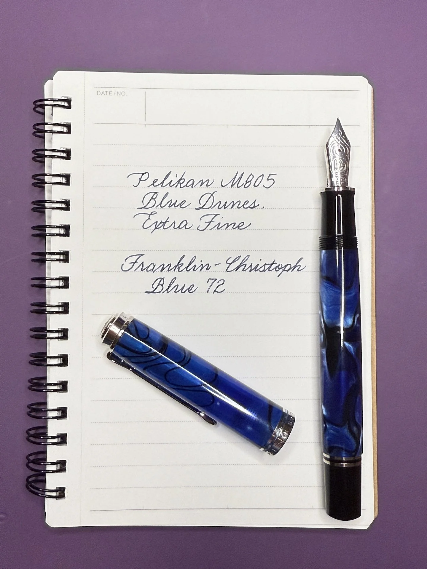
M805 Blue Dunes - I have the hardest time refusing blue pens, especially when it has something interesting going on, like these blue and black swirls. This is my only M8xx pen that has an Extra Fine nib on it, too. Thought I’d pair it with a blue that I get to see at a lot of pen shows - Franklin-Christoph Blue 72.

M800 Green Demonstrator - This is the re-release of the Green Demonstrator, and I swapped in a factory Italic Broad (nib says “IB”) to show off the bright green ink that I picked - Papier Plume Marina Green (from the 2019 SF Pen Show).

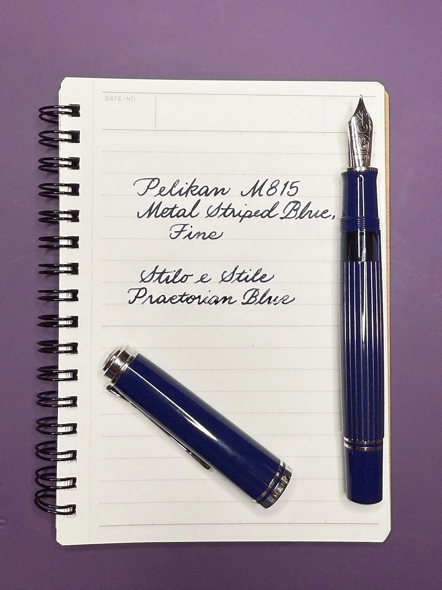
M815 Metal Striped Blue - This was probably my most anticipated pen for me. I already have this in Black, but in Blue, it was a must-have. I don’t know why I picked Fine, because I seem to only have Fine or Broads (and the lone EF in the Dunes) in this size. I picked a rich, darker blue for this pen - Stilo e Stile’s Praetorian Blu.

After inking up these Pelikans, I found a few lesser known Pelikans in the “to-be-inked” pile and thought, what the heck, let’s ink them up too!

Lesser known Pelikans:
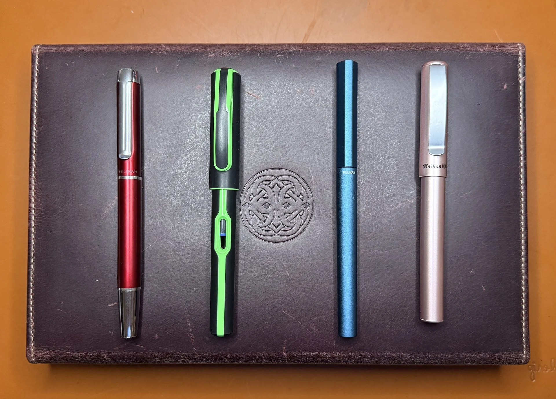
  • P40 Pura , Bordeaux
  • Style, Neon Green
  • Ineo, Ocean Blue
  • Piña Colada, Rosé

P40 Pura, Bordeaux - I usually pick Medium nibs when I get a pen/model that I’m not familiar with, but I decided to get a Broad for a change. It is a smooth writer that lays down a nice amount of ink. I picked Diamine Red Dragon because it matches and also because I hadn’t used this classic ink in a long time. Such a great reminder that we often have great stuff in our possession already (not that it’ll stop me from getting more inks, lol).

Style - Neon Green - I liked to call this my TRON pen, even though I’ve never watched the movies. The black portions of the pen have a slightly rubbery feeling to them (I wonder if it will eventually end up feeling sticky/tacky), and the green is a slick plastic, similar to Lamy Safaris or LEGO. I unironically picked Visconti Wheatfield Under Thunderclouds because (1) it’s the closest match I have and (2) now they both have the same distributor (Coles of London).

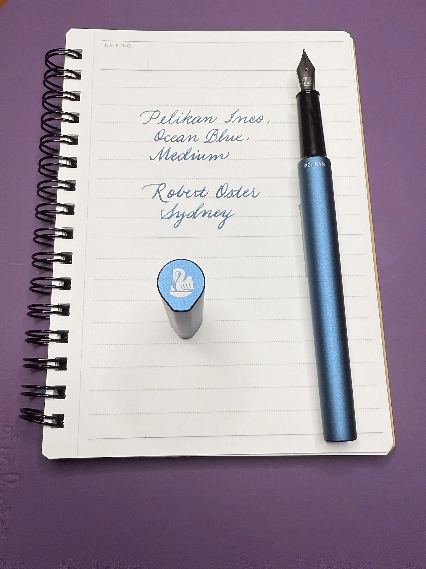
Ineo, Ocean Blue - I was shocked at the price when I saw it earlier this year. $30-35 for a metal fountain pen is pretty good, especially when it has the Pelikan name on it! This slim, snap cap pen also fits in my PLOTTER pen sleeve (though I don’t store it in there since there is no clip - I’m a little paranoid). The slightly teardrop shape of the cap reminds me of the Lamy Ideos. Robert Oster Sydney flows well in the Ineo’s Medium nib.

Piña Colada, Rosé - This metallic pen reminds me a bit of the Lamy Al-Star (both have “interesting” clips, both have metal barrels, both have triangular grips), but this one is available for ~$15 which is quite the bargain. The Piña Colada’s grip is rubbery as opposed to plastic like the Lamy, so again, I wonder about whether that will become tacky/gummy over time. Hopefully it’ll be a long time before that happens (if ever). I picked Oblation Papers’ Rose City Rose for this Rosé’s Medium nib. ==nib size== Writing samples with similar nib sizes across different models.

I’ve got 16 Pelikans inked up - 12 piston fillers and 4 cartridge/converter pens - so I can’t wait to get to the Hub so folks can try out the pens, and so I can start writing them dry! Gonna take me a while, so wish me luck!

Happy Hub! And happy writing!


Enjoy reading The Pen Addict? Then consider becoming a member to receive additional weekly content, giveaways, and discounts in The Pen Addict shop. Plus, you support me and the site directly, for which I am very grateful.

Membership starts at just $5/month, with a discounted annual option available. To find out more about membership click here and join us!

Posted on October 24, 2025 and filed under Pelikan, Fountain Pens.

Monteverde MP1 Mercury Orange Fountain Pen Review

Monteverde MP1 Mercury Orange Fountain Pen Review

When Monteverde launched their MP1 Fountain Pen earlier this year, I was intrigued. I like the style, and it lands in a price bracket that could make it an option for users looking for their second fountain pen. You know, the one when you decide that “Yes, I like this stuff!” and you want more from your next choice.

The Monteverde MP1 Mercury Orange Fountain Pen is a Goldspot exclusive release, and a perfect fit for the season. They sent it over to me pre-launch, and I’ve had some time to spend with it recently. So far, it has been a fantastic writer, although there is a minor change I’d like to see updated if there is a version two.

Monteverde MP1 Mercury Orange Fountain Pen Ink

Packaged with a 15ml bottle of matching Mercury Orange ink. These sets are a limited edition of 300.

For starters, the MP1 is my aesthetic: Clear barrel, color anodized cap and piston knob, complimentary gold-plated hardware. This is a common barrel layout and design, and one I find myself using in other models frequently. The Mercury Orange aluminum that Goldspot chose for their pen pops off the desk, and in my hand.

Monteverde MP1 Mercury Orange Fountain Pen Piston

The locking piston, pulled out. The two white dots line up for closure.

The piston mechanism has an interesting lock that keeps the knob in place when not actively using it. I’ve never used a pen with this feature before, and it is a simple pull to release and use the piston, and a snap back to lock it in place. Ok, maybe more than a simple pull and push - it is a two-handed operation to release - but it’s not going anywhere when locked. For those worried about carrying a piston-filling mechanism and having it twist in transit - like in a backpack, pen case, pocket, or purse - this gives you some extra peace of mind while on the go.

Monteverde MP1 Mercury Orange Fountain Pen Nib

When you arrive, the nib is ready to write, and never stop. This Fine Steel Jowo #6 nib has been perfect from the jump, with no adjustment needed. The feed is not the normal matching Jowo #6 feed, and it flows as good or better than what I would expect from a stock setup. The product description calls the feed “Plasma-treated,” but I have no idea what that means from a technical perspective. All I know is that it works well.

Monteverde MP1 Mercury Orange Fountain Pen Plasma treated feed

With all of that good, I won’t say that there is no bad, but more of a personal nit to pick with the usage of o-rings on this pen. O-rings can be used well, but I don’t believe either of the exterior barrel o-rings add anything to the pen. In fact, they take away. The end of barrel ring, just below the piston, is assumedly there for posting. The problem is that it forces the cap to stop right there, making for an extra long pen when posted. I don’t post, so I don’t use that area, but I’m not sure it is good if you do want to post it.

Monteverde MP1 Mercury Orange Fountain Pen Posted

Longbois.

The MP1 is just shy of 7 inches posted.

The front end o-ring, just above the barrel threads is useful in concept, but doesn’t provide a great user experience. This o-ring is there to seal off the interior of the cap from exterior air entering and drying out the nib when not in use. That’s a good, valid issue with many pens. Monteverde chose this option, and it works well - I’ve had no drying out at all - but capping the pen feels off. It’s almost like the o-ring gets in the way, and the cap is wobbly as you begin to screw it on until you force your way past it. After that, you are sealed and good to go, but capping it was noticeably odd every single time I did it.

To be fair, the TWSBI ECO is designed with o-rings in the same places. Like with the MP1, the end of barrel o-ring isn’t useful unless you want to write with a baton. The front o-ring isn’t noticeable on the ECO until the final turn of the cap, which is exactly where you want it to be. In fact, I had to go grab one of my ECO’s to verify it was even there. The MP1 doesn’t engage in the same way.

Looks awesome, but it may be difficult to see that it is a molded, triangular-ish, grip section.

One not so nitpicky consideration if you like the looks of this pen is that it has a triangular/molded grip section, so if you have a non-standard grip you might want to pass. If the MP1 continues to do well, maybe they mix in a standard grip section, like TWSBI does with the ECO and ECO-T?

The Goldspot exclusive Monteverde MP1 Mercury Orange Fountain Pen runs $63 and includes a 15ml bottle of matching Mercury Orange ink, which is only available with this pen. A wide range of other colors of the MP1 range from $52 to $60, so they are all in the same ballpark. As I mentioned up top, this pen looks and feels great to write with, and the nib/feed combo keeps the ink flowing. The main consideration is if you can work with the molded grip section, or not. I can, so I’m going to keep on writing!

(Goldspot provided this product at no charge to The Pen Addict for review purposes.)


Enjoy reading The Pen Addict? Then consider becoming a member to receive additional weekly content, giveaways, and discounts in The Pen Addict shop. Plus, you support me and the site directly, for which I am very grateful.

Membership starts at just $5/month, with a discounted annual option available. To find out more about membership click here and join us!

Monteverde MP1
Posted on October 13, 2025 and filed under Monteverde, Fountain Pens, Pen Reviews.

Kaweco Perkeo Calligraphy Set Review

(Kimberly (she/her) took the express train down the fountain pen/stationery rabbit hole and doesn't want to be rescued. She can be found on Instagram @allthehobbies because there really are many, many hobbies!.)

The Kaweco Perkeo Calligraphy Set includes the Perkeo pen barrel and cap and three different grip sections, each housing 1.1, 1.5, or 1.9 millimeter nibs. 3 Kaweco Pearl Black cartridges are also included but I decided to use my Kaweco Midnight Blue cartridges instead. The set comes in a plastic box.

The pen, grip sections, and cartridges in a clear “tray”.

Since I have already done a review (of the Perkeo), I will focus on the Calligraphy Set. Not only does the set include 3 separate grip sections with the nib and feed, they are different shades of blue, so you can easily tell which nib you’re using. The light blue section holds the 1.1, the royal blue holds the 1.5, and the dark blue 1.9.

The light blue 1.1 section (left) is installed in the pen, 1.5 royal blue in the middle, and 1.9 dark blue on the right.

I knew that the Perkeo would work right out of the box (which it did), but I was really surprised at how nicely it wrote! It wasn’t scratchy but it also wasn’t uncontrollably smooth either. In addition to this Ayush paper, I also tried the smoother Meringue paper and this pen behaved like a champ.

I felt that I had spent a fair amount of time with the 1.1; after all, it’s been inked up since August 1, and used five times before this article, so it was time for the 1.5 nib. This one isn’t quite as smooth as the 1.1, but I think it is a bit more sensitive to angle than the 1.1. Most companies use 1.1 for their stubs so I find it fun to use a 1.5 for variety, and it’s a faster way to go through ink.

1.1 on the first paragraph, and 1.5 for the rest of the page.

Of course, after the 1.1 and 1.5, I have to try the 1.9 and it, too, wrote well out of the box. (The 1.1 and 1.5 nibs have been sitting out on my desk for a few hours so the ink is more saturated. The top of this page is a bit lighter because I put a drop of water on the breather hole to get the ink started.)

Love all the ink that gets laid down by a 1.9!

I liked all three nibs pretty equally, but the 1.9 forces me to slow down a bit more so my letters aren’t as messy.

Writing sample of the 1.1, 1.5, and 1.9 nibs.

The Kaweco Perkeo Calligraphy set retails for $40, which is a good deal for a pen with 3 nibs/grip sections.

(Disclaimer: I bought this set from Vanness Pens. I already had the Kaweco Midnight Blue cartridges and Ayush Paper.)

PS - A 10 ml vial is a great to store the grip sections (Clearly, I cannot grammar when writing! You know what I meant, lol!)


Enjoy reading The Pen Addict? Then consider becoming a member to receive additional weekly content, giveaways, and discounts in The Pen Addict shop. Plus, you support me and the site directly, for which I am very grateful.

Membership starts at just $5/month, with a discounted annual option available. To find out more about membership click here and join us!

Posted on September 26, 2025 and filed under Kaweco, Fountain Pens, Pen Reviews.