(This is a guest post by Brian Draghi. You can find more of Brian’s work on Instagram @Sketchscape)
I wanted to describe my process for my March of Robots and the current Name-Your-Own-tober for this post. I am not a professional artist, but this process works for me and what I use for my hobby. I like to use many references to what I draw, whether it's online research or my book collection the I've collected over many years. Some people may have an issue with artists using reference photos, but it's suitable for a couple of reasons. Most artists aren't good at using memory sources, especially if you are doing any photo-realistic illustration. Two- it's always ideal to use source material from actual environments or as real sources as possible. The more practice you have from real life, the faster your work becomes, and the experience helps with future sketches.
Tools of the Trade
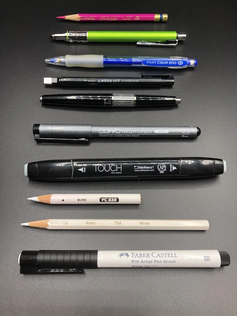
Prismacolor Col-erase pencils, blue or red
Kuru Toga Advance mechanical pencil
Pilot Color Eno mechanical pencil
Electric sharpener
Pentel Kerry mechanical pencil
ShinHan Touch markers
White Faber Castell Pitt Artist Pen brush
Prismacolor Toned Tan paper squares
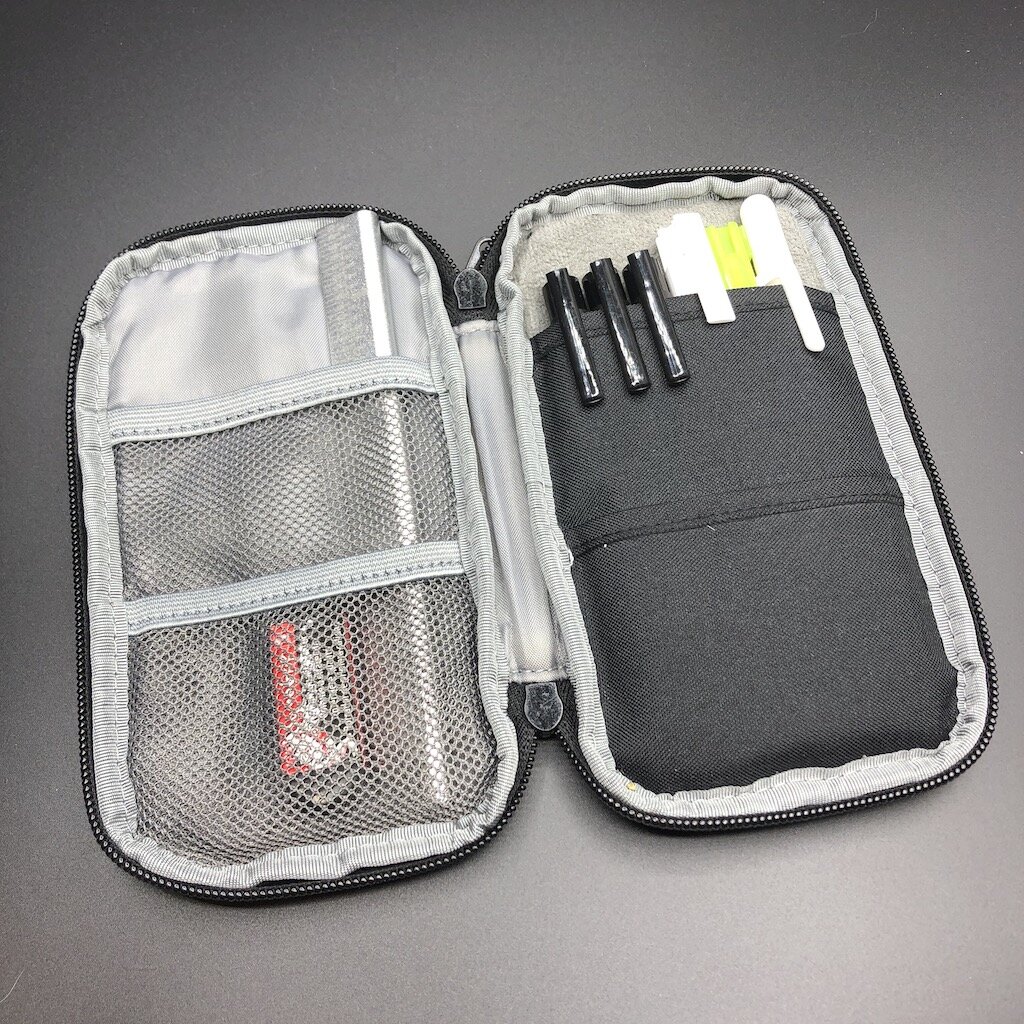
Nock Co. Brasstown case
Nock Co Chimneytop case
Lihit Labs Smart fit case
The Prismacolor Col-erase pencils are my go-to pencil of choice for laying down the beginning sketch before ink. I like these pencils for two reasons. They don't smear as regular graphite lead does, and they erase quite well without much effort. I tend to have a heavy hand, so these leads are more forgiving than traditional graphite.
My favorite mechanical pencil in my Uni Kuru Toga advance for two reasons. The lead rotation mechanism continually rotates the lead while sketching, allowing the same consistent line without variation. The Kuru Toga also features the ability to retract the guide pipe for the lead to protect it from getting bent or poking a hole in my case.

I'm particular about the pencils I use for the highlights, and some provide a brighter look for the more intensive highlights. I favor the Prismacolor white pencils using both the Verithin version, a more rigid type of lead, and the colored pencil version with a softer lead. The Verithin creates cleaner edge lines and outlines, and the white-colored pencil has a more soft waxy core used for more blending. I tend to favor the Faber Castell brand and the German Edding brand of white markers. These tend to be more of a pigmented water-based ink, with some brands being more opaque than others.

The markers of choice are the cool greys of the ShinHan Touch marker. These are cheaper markers than the popular yet more expensive Copic markers that professionals use, but they work well and blend well on the page. Many marker brands available react differently to certain paper types and having different shades for each color. As the digital format has become more accessible to more artists, these traditional mediums can be overlooked. I still prefer the tactile feel of using conventional tools on actual paper rather than a digital screen.

The paper choice is the Prismacolor Toned Tan squares, which provides a nice manageable size to create sketches promptly. The toned paper works well with white pencils and allows you to create highlights that you wouldn't achieve with regular sketch paper.

Most of my sketching supplies are stored in my trusty Nock Co. Brasstown case. The Brasstown is from the original Nock Co. Kickstarter I backed in 2013 and still use it today. It is my favorite case because it stores everything in a nice protected rolled out tongue. Everything is presented organized in a row without having to do a search and rescue for my supplies. The Brasstown also makes it convenient to carry my supplies on long trips or to go on vacation.
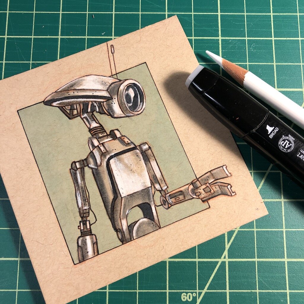
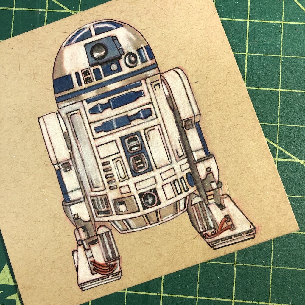
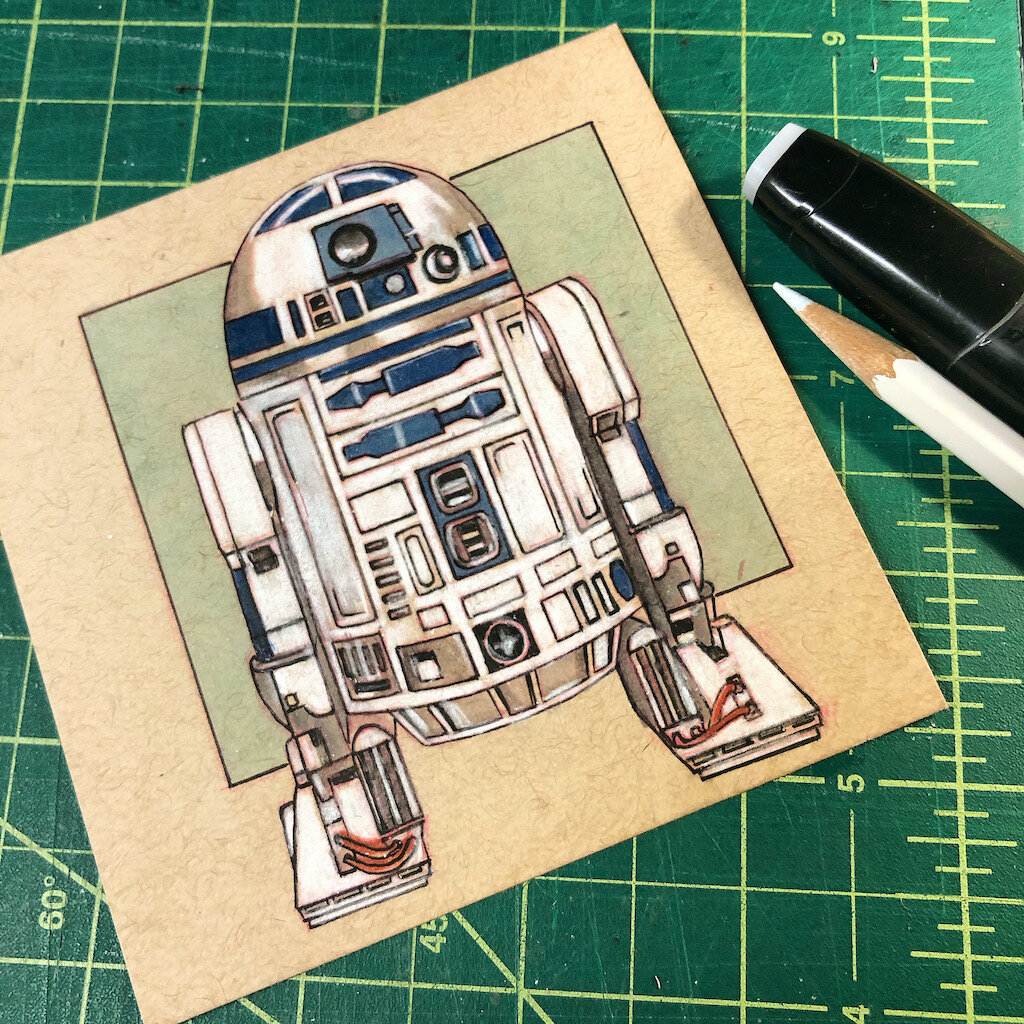
Let's get into the step by step process I used to create my March of Robots illustrations back in March and the process I will use this month. My March of Robots covered the Droids of Star Wars theme, and I'll be showing a few examples of my sketches and the processes used to create these fun droids.
Step one: Reference, Reference, and more Reference
I look at as much visual information as I can to figure out the look of what I’m sketching. Photos are ideal, but real-life examples are even better. Many artists may frown upon using too much reference, but I’m just not the type that remembers every detail from memory. I need as much reference to influence my sketches without having to take into account any guesswork.
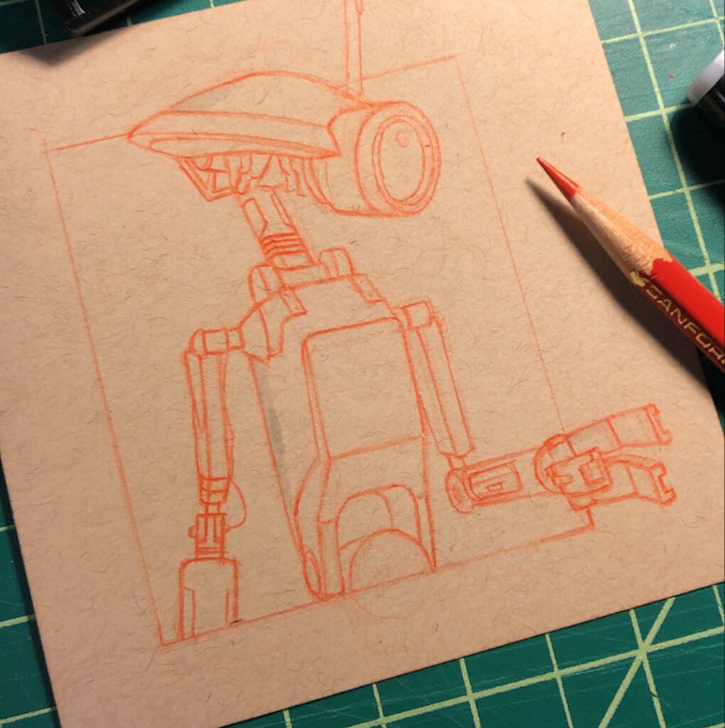
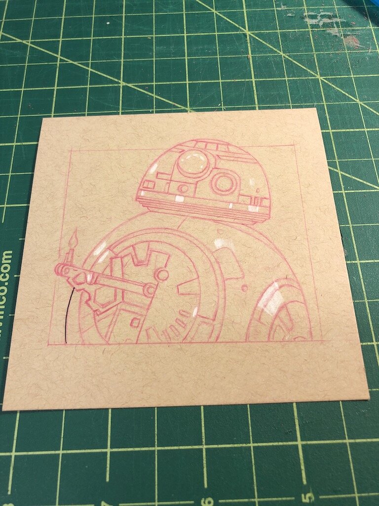
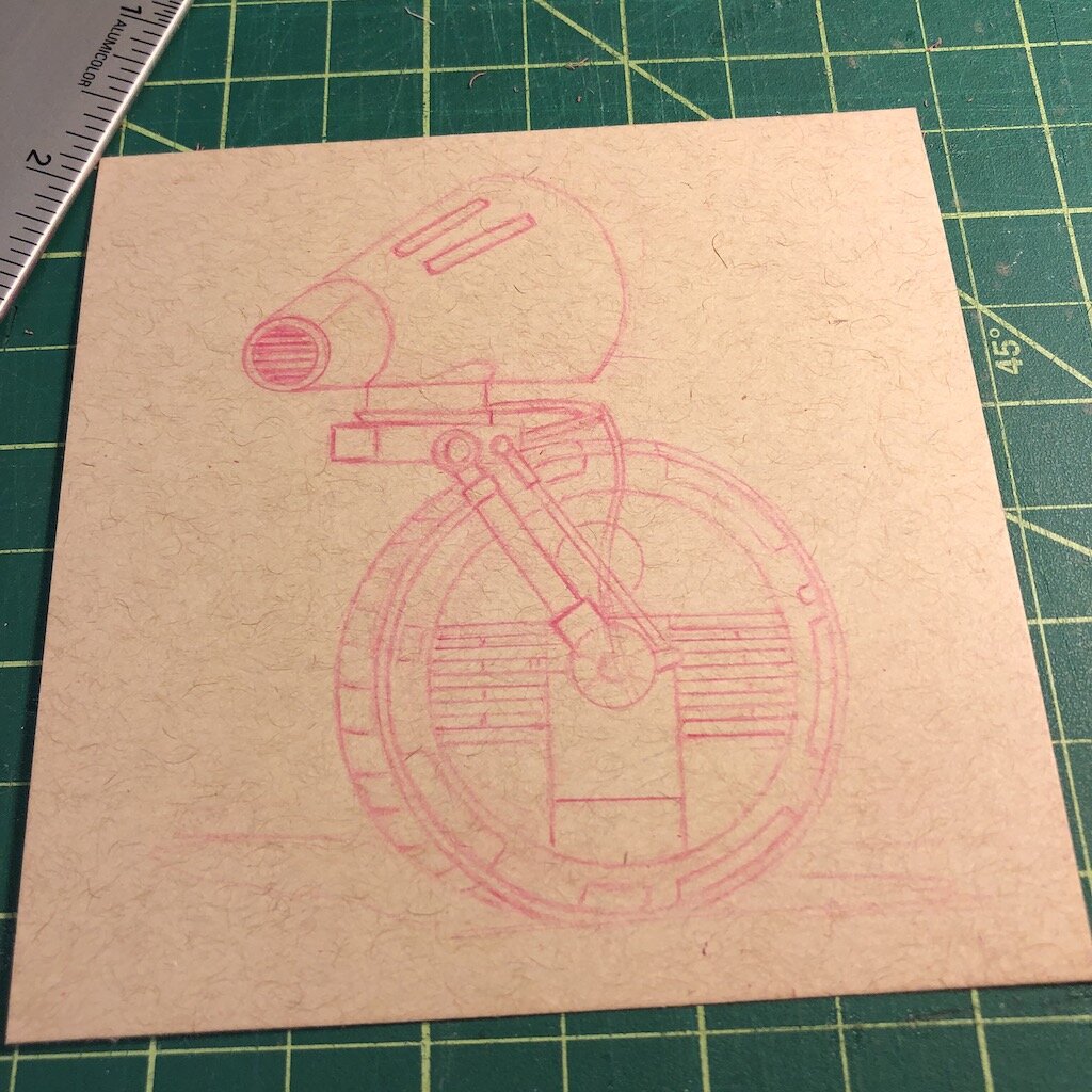
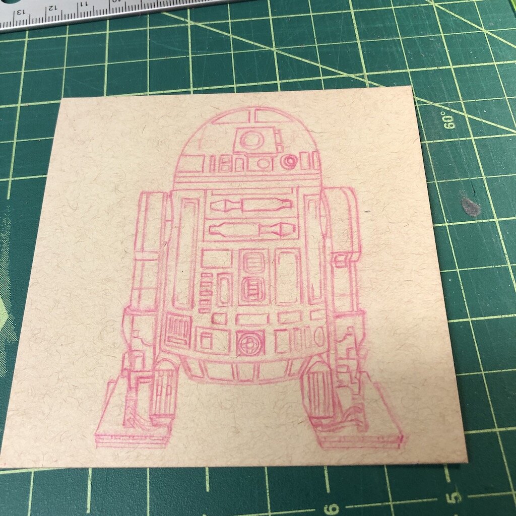
Step two: Rough sketch
I block out the basic shapes and composition of my droid, making sure that the design fits on the page, and the construction is good. I try to keep everything as light as possible, especially since I tend to have a heavy hand. I want to be able to erase everything if something doesn't work, which happens regularly. I'm guaranteed never to get something quite right the first time. I either need to adjust proportions or composition within my sketch. I'll often work out some basic thumbnails on a scratch piece of paper to get the construction down for the final image. I can always transfer things from one sketch to another instead of having to start over.

Step three: Solid lines
Once I get a composition that works out, I will make my pencil lines a bit darker before heading into inking. This process allows me to see where I need to ink my lines before color. This step also allows me to include those small details like some design elements and the armor's worn look. This is what I like to call authentic battle damage, now that I have all the lines finalized for inking.
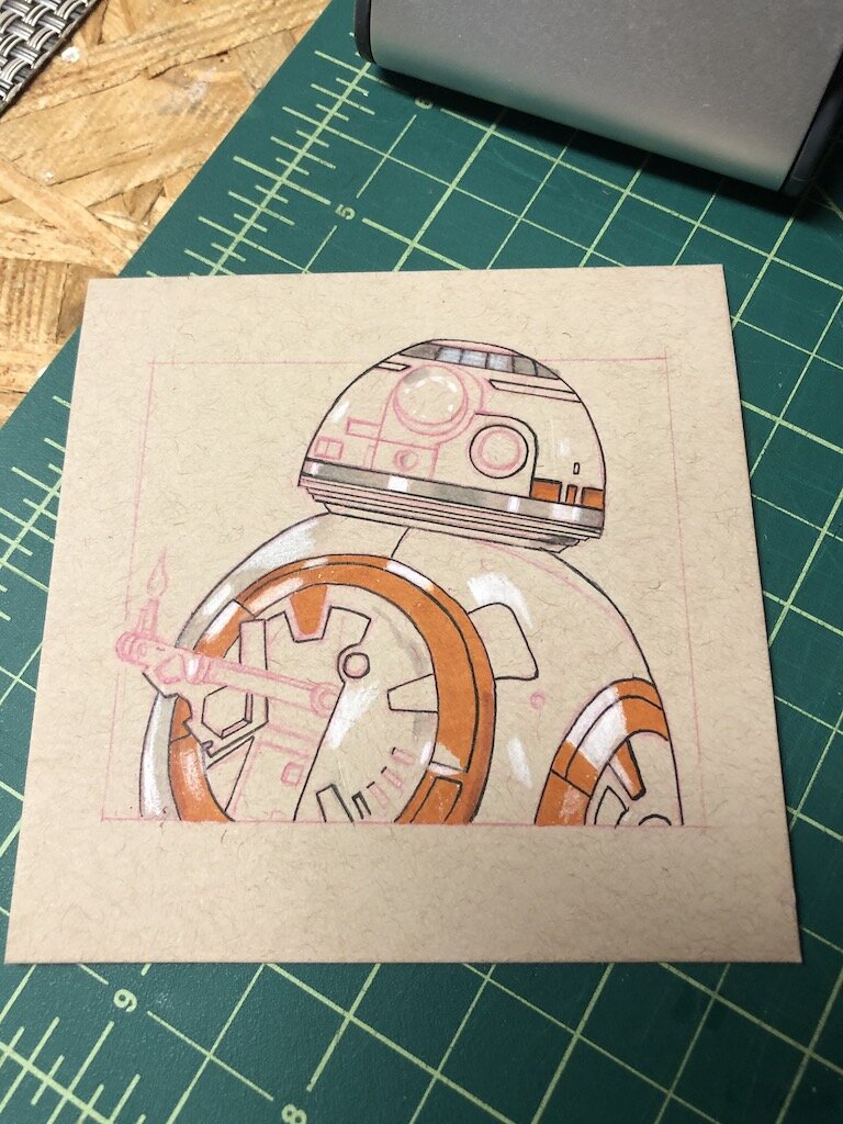
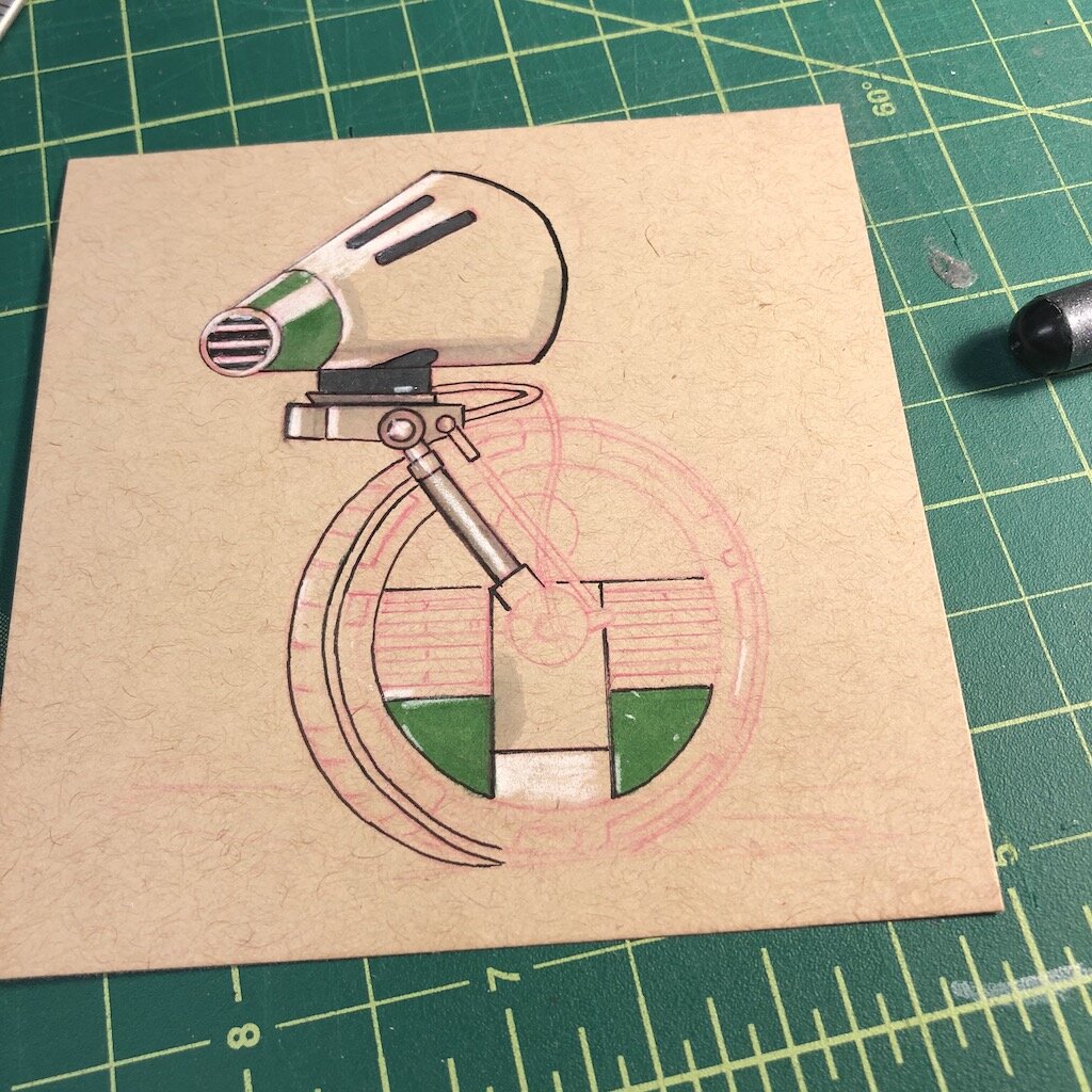
Step four: Inking time!
I usually tend to use the Copic Multiliner or the Faber-Castell Ecco Pigment since they do not bleed when you have use markers on top of the line. I use multiple different tip sizes for inking, depending on the details. Use a smaller point for tiny details and have a larger tip to show more contrast with the form closest to you. I usually use fineliners that do not bleed when you apply markers over them, so it does not mark the piece. Many artists tend to use the opposite approach and apply markers first and then inking after to give the markers a chance to dry. This approach avoids having to be more careful but does take more planning to make sure where you are placing your inking lines.

Step five: Highlights
I focus on the highlights first before I start the primary base color of my sketch. This gives me the ability to gauge where most of the main highlights are located. It's easier on the saturated sections to apply white pencil to blend in more directly to paper than using it over the marker after the fact. I sometimes tend to block the highlights first before I lay down the primary base color, so I don't overlook them when adding the overall base color.
Step six: Color
I keep a scratch piece of toned paper next to my sketch to test the markers for my chosen colors. I usually make small swatches of color thumbnails directly on the page to see if the color palette works. I pull out these markers first since they will be the primary markers I'm using during the sketch.
I test out the markers to see how they handle the paper I'm using to sketch for two reasons. First, check if the markers are still saturated and not dried out. The second is to test how the markers react to the paper material. Certain marker brands react differently to paper; some are more saturated, while others tend to bleed more.
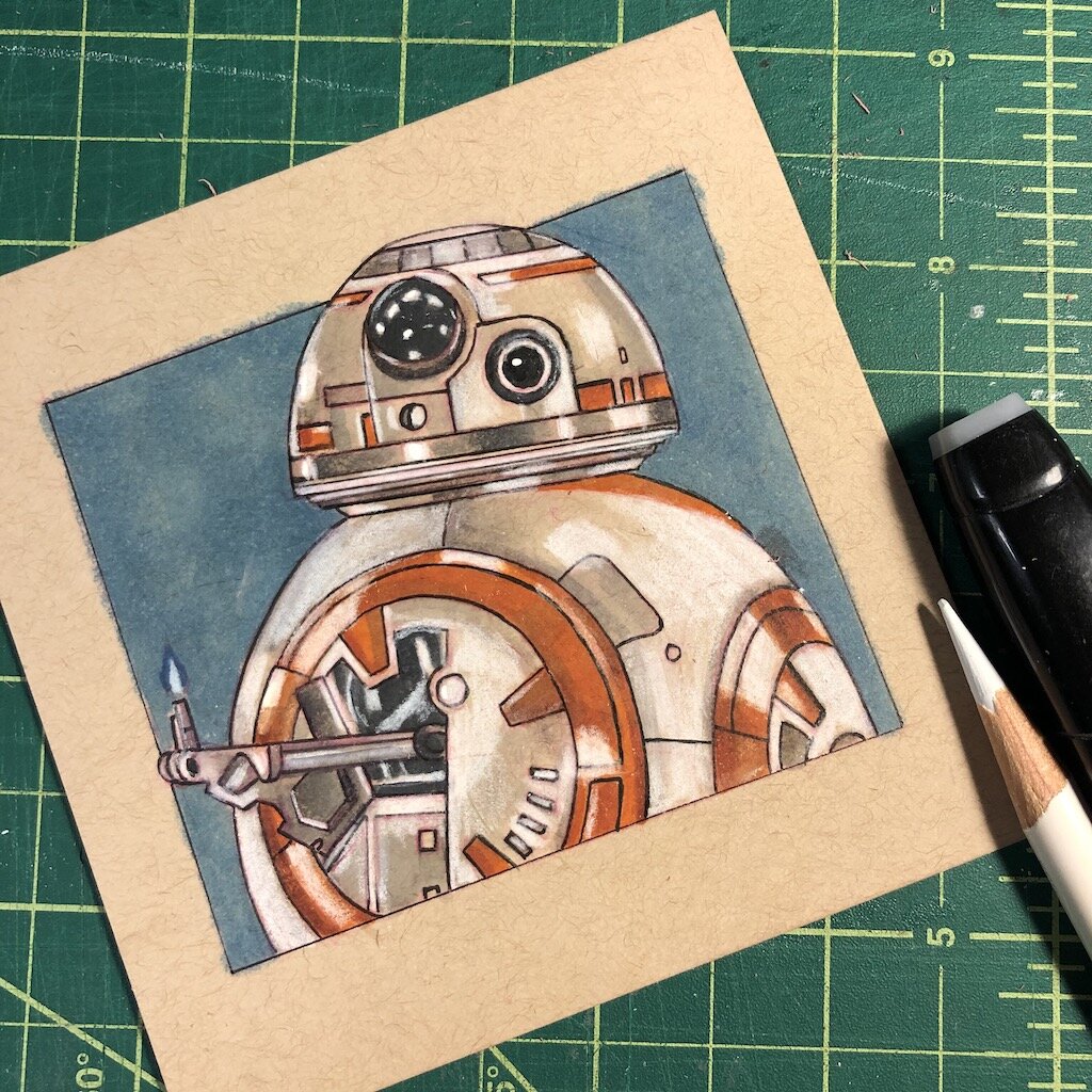
Step seven: Shadows
Once the primary colors are down for the sketch, I'll block in the shadows of the image. I usually use my cool greyscale markers for any dark shadows. I'll blend over each marker until it's the right gradual shade. I am always more comfortable working light to dark than the opposite way; you can still make it darker. Doing the opposite tends to be more challenging to correct and lighten and adjust after lying down darker lines.
Once the shadows are complete, I work on the extra details that give a sketch a little bit more character. I'll take my fineliner to work on some weathered look of a droid. I'll make some extra scratches and distressed wear to highlight some authentic battle damage that a droid may have encountered over the years. This gives it a more realistic look and adds character to my piece.
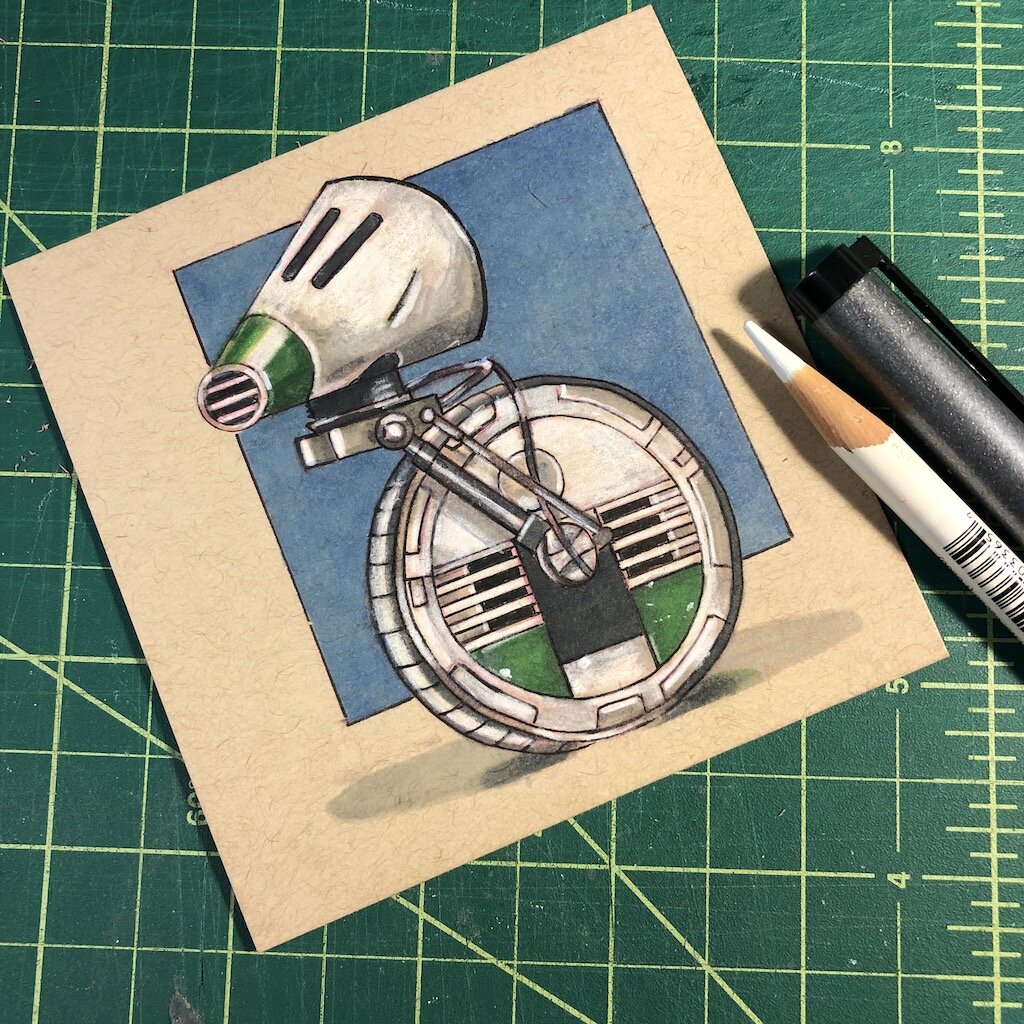
Final step: Final touches
Once I'm happy with the render and adding details, I'll go back over my sketch, add extra highlights, and add additional inking for the outline that I missed or make the edges a bit more crisper. Using markers and adding highlights tends to wash out some of the inking lines, so I'll attend to those lines with another coat. Once the extra details are finished, I'll typically add a color box behind the image that creates a bit of contrast and distinguishes the piece from the page. The lighter the image, the darker the background, and so forth.
Sometimes it's an actual image that I'll add to the background that you instantly recognize, and other times I may suggest an image by adding a shadow on the background. Adding a shadow may be a more lazy route, but it lets the viewer use their imagination to suggest what might be happening in the background. The point is to break up the image and give your sketch more contrast and make it more attractive to the viewer without having too much detail.
Last thoughts:
My process isn't too different from other artists using various supplies and techniques. I enjoy seeing the process of other artists that highlight certain materials. It's always great to discover new products I've never heard of before or something I never considered using to create my work. That’s probably why I'm addicted to Kickstarter, but that's another story. New materials never make you a better artist, but it is always fun to try new things or create a different process that works better for you.
My art background has fueled my interest in learning about different types of materials and lead me to get into the world of fountain pens. I would have never considered using fountain pens ten years ago, but it's great to expand myself and try more things. Get your pencils, pens, and ink ready!