Posts filed under Guest Post

Behold, Something New! The Harmonic Nib, from Opus Cineris

Opus Cineris Harmonic Nib

The Harmonic Nib. Image via Opus Cineris.

(This is a guest post by Andrew Coon. You can find more of Andrew’s fountain pen favorites on Instagram.)

Whenever a pen of note arrives, something interesting, I hand it to my wife. I play with pens, she knits. I appreciate the yarn she finds, and she appreciates the pens that show up. Over the years, many such pens have arrived and we have found a pattern.

She takes the pen, and writes the following:

Writing

A Harmonic BB nib, with Diamine Aurora Borealis on a Nock a5 Cahier.

And then she asks what makes it special. I have handed her a Pilot Emperor, a Pilot Custom Urushi, Jowo 6's, Bock 8's, King of Pens, stacked nibs of all different types, and many more.

This time, she said "this could be my favorite."

My wife has good taste.

What she wrote with is already one of my favorites - both for who made it as well as for what it is.

Anabelle Hiller, first being trained as a musician, then made the jump to metal working. A trained jeweler, she has focused on a particular piece of metal that anyone reading this holds dear - the nib of a fountain pen. After creating her own nib for her masterpiece she experimented with a batch of silver nibs. After a few truly lucky people tested them out at length, she moved on to make a batch of ten nibs in 14k gold.

I was lucky enough to obtain one of these, and I would like to tell you about it because there will be more of her creations. They will be worth finding and cherishing.

Opus Cineris Harmonic Silver

The Harmonic Nib, in Silver. Image via Opus Cineris.

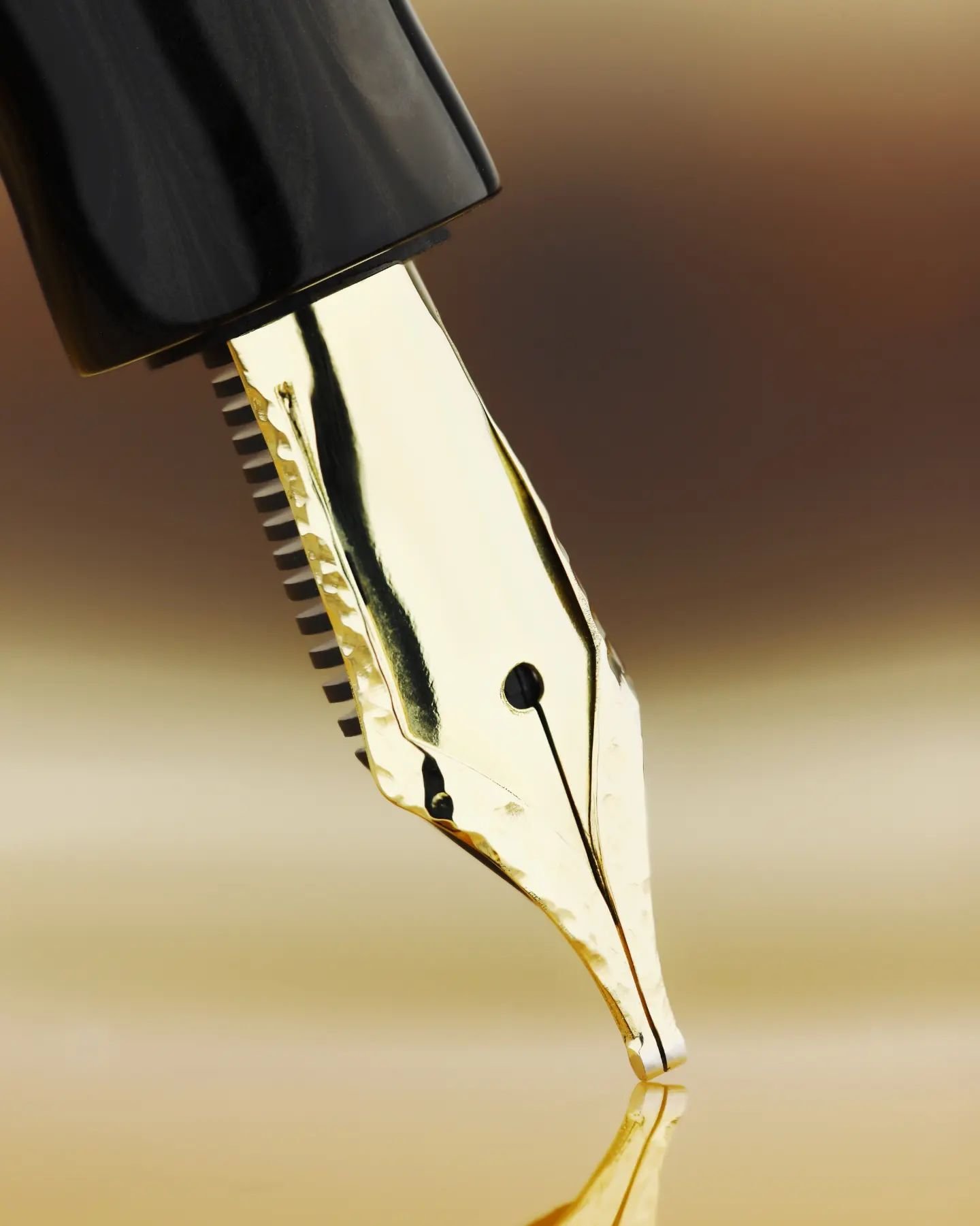
What is immediately striking about this nib is the double layer of metal that frames the entire nib. I don't know how this is done - but I can see what it makes possible. On these, this edge has a hammered finish that is very striking. On Anabelle's second set of nibs, a set of 8 made in silver, this edge was engraved in a leaf border, complementing the scrolls down the center of the nib.

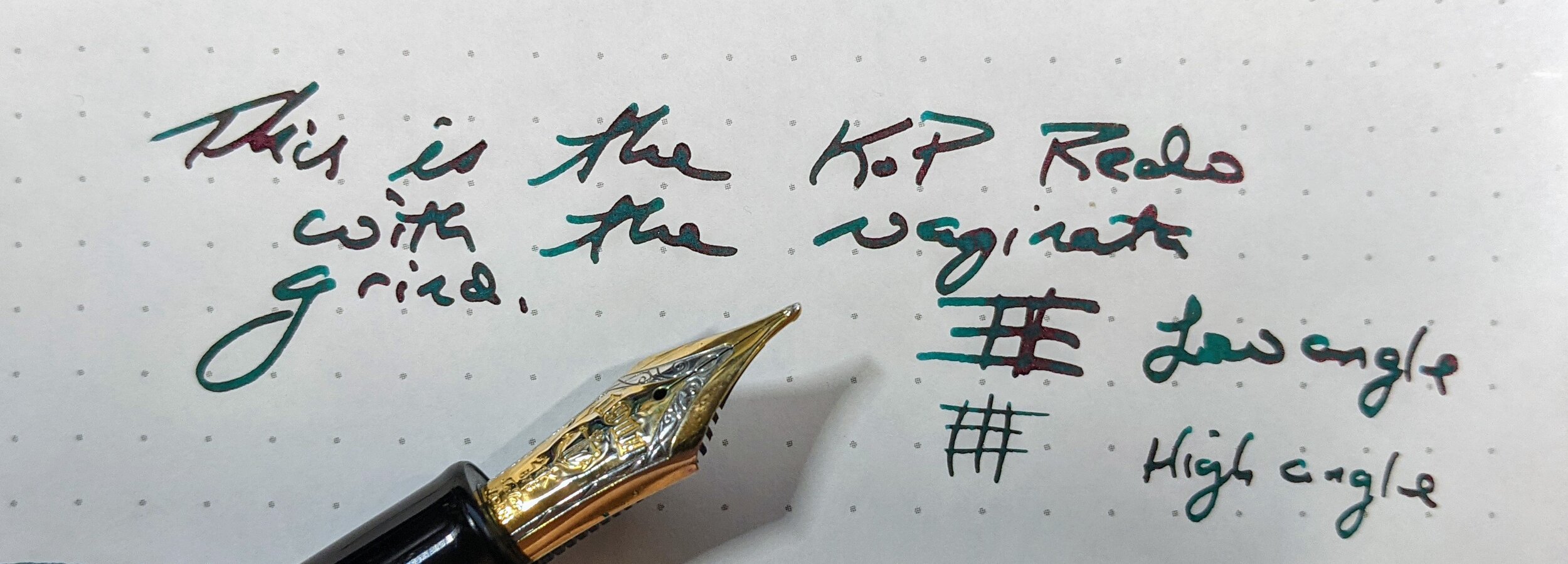
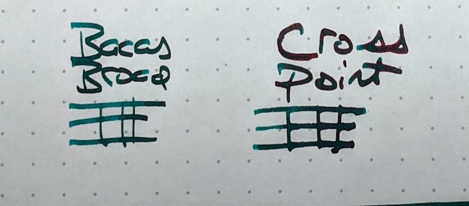
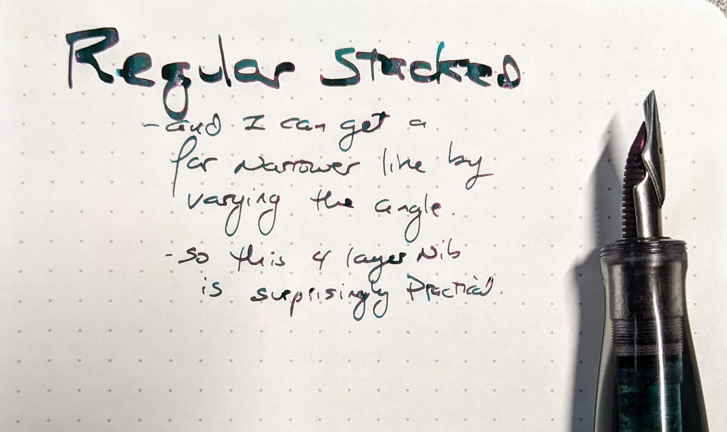
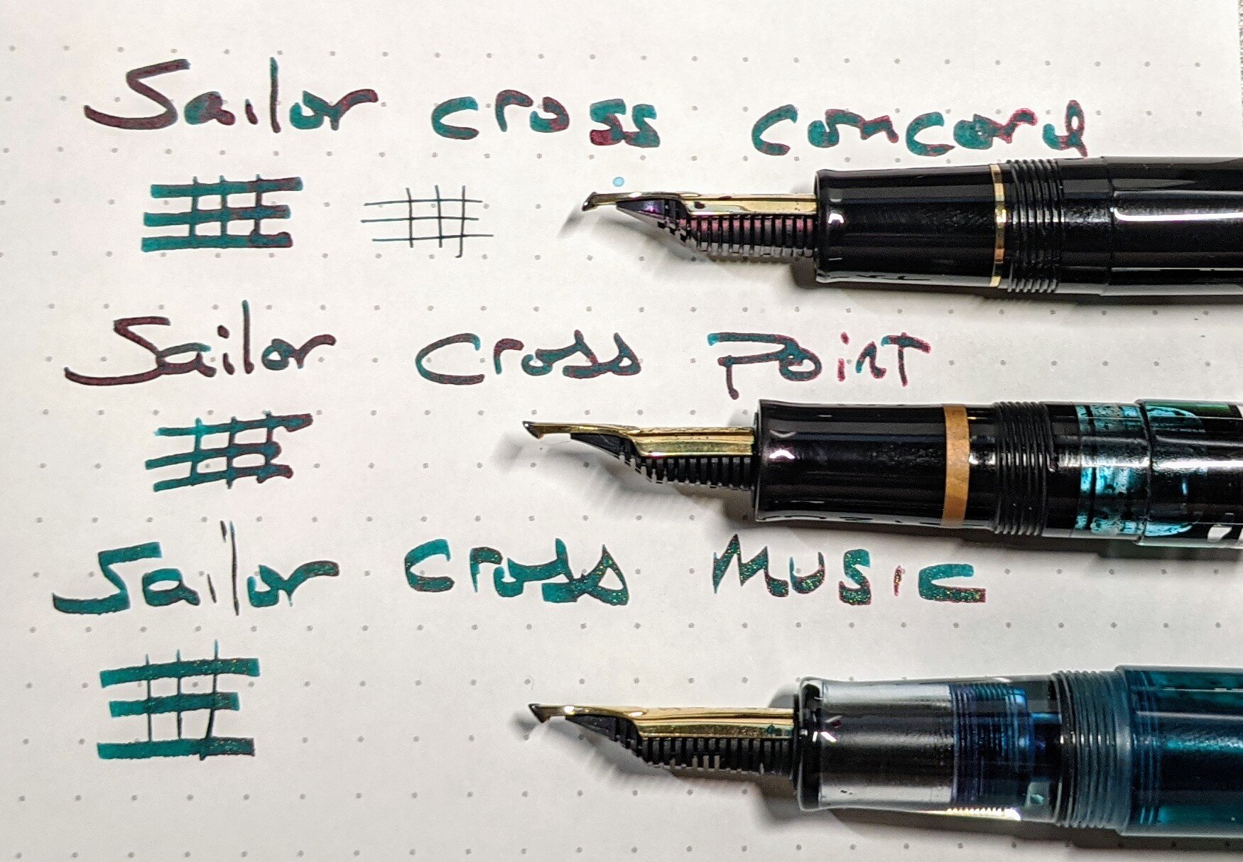
Matched with an ebonite feed from FPnibs.com, these nibs can be customized with any grind. What I have is a round BB, tuned for showing off the sheening and shading properties of any ink. And, it is perfect. Responsive and well behaved, I can only wish that all my nibs wrote like this one. I have used multiple brands of ink with it, multiple types of paper, and the performance has been consistent and superb.

Harmonic Nib Giants Pens

The Harmonic Nib, with Giants' Pens ebonite barrel. Image via Opus Cineris.

The pen this nib came in was made by Teun and Joep of Giants' Pens, and is elegant and clean. The material is a black and grey ebonite, that is almost impossible to photograph. The tolerances are tight - and the quickest way to tell is with the threading. This threading is smooth and exact. Matched with the immaculate polish, the pen is a stunner. Its shape is that of a Nakaya Naka-ai, and that is what it reminded me of. Light, nimble, a pen that I reach for multiple times a day.

It is not often that something truly new comes along in the pen community. This is one of those moments.

Anabelle makes nibs sing upon request, for any pens purchased from Appelboom. In addition to employing her, Appelboom also allowed Anabelle to use their website for the sale. This is very cool - It is always good to see those who are well established in the field support those who are starting.

I look forward to following along with what happens next. Engraving, gem setting, overlays? I don't know. But it will be great.

I invite you to join me in following Anabelle at Opus Cineris and on Instagram @opuscineris

(This nib was purchased by Andrew Coon at the 2022 Washington DC Pen Show, directly from Anabelle Hiller. Opus Cineris images provided for this post with permission.)

Posted on September 5, 2022 and filed under Opus Cineris, Fountain Pens, Nibs, Guest Post.

Tuduriya “Moonlit” Fountain Pen Review

Tuduriya “Moonlit” Fountain Pen Review

(The is a guest post by Andrew Coon. You can find more of Andrew’s fountain pen favorites on Instagram.)

I am always on the lookout for new makers. New shapes, new nibs, new materials, I get excited for all of these. Thus, when I saw a Kickstarter announced by Tuduriya (Instagram), I reached out to thank the maker for bringing this pen to market. The artist behind the brand is Takayuki Suzuki, and what caught my attention as I looked at the Kickstarter he had put together was the number of iterations that had gone into this final product. It is impressive to see how this model has developed. The subtle changes have added up to one very impressive pen.

The base model pen comes in 7 different materials (full details can be found on the Kickstarter page) for the section - all ebonite and all matched to a black ebonite cap and a black ebonite body. Further options include sections that are ishime, burl wood, layered urushi, and a pen that is entirely made of Calabrian briar wood. The two pens that I have for this review are the base model, with two different types of ebonite. The beige and black swirl is nice, but the red and black swirl really grabs my attention. The red and black are classic colors for ebonite, and polished to a mirror gleam.

Tuduriya “Moonlit” Fountain Pen

Comparison vs. Sailor 1911L (top) and Pilot Metropolitan.

This pen appears to be longer than it is, as it measures 14.9 mm uncapped, 15.2 mm capped. In comparison to other pens, it is about the same length as a Conid Kingsize, or a Pro Gear King of Pen. It is not much longer than a Pilot Metropolitan. There is a subtle narrowing of the barrel, as it goes from 12.6 mm to 12.2 mm at the end of the pen. This is hard to tell with the naked eye. The section is a very subtly pinched shape, which is 12.3 mm at the thinnest. A Parker 51 has a section that is 9 to 10 mm (depending on where you hold it). So in addition to not being as long as it looks, it isn’t as thin as it looks, either. Not being a fan of vintage pens due to their slender sections, I was worried whether this pen would work out for me. I was wrong to worry, and am very glad to have been wrong. Overall, the shape is very comfortable for me. I like big pens, and this isn’t too thin for my taste, nor is it too long to carry in a pen sleeve as an EDC.

Tuduriya “Moonlit”

The polish is immaculate, the threading is well done. Being able to hold two of them, I can tell that there is a consistency in production of these pens. The way the edges are crisp and smooth, this is a well-made writing instrument. The name of the brand, Tuduriya, is engraved into the ebonite along the top of the cap, and is both well done and very tasteful. This is the right amount of branding – enough to be clear without getting in the way of the overall design. I applaud the maker’s restraint in this.

Tuduriya “Moonlit” Pen

This is a Cartridge/Converter pen, and works well as such. I did use a touch of silicone and eyedroppered one of the pens, and set up like that it holds 5 ml of ink. I love a pen that uncaps quickly, and this uncaps in one turn. The nib that is underneath? A Bock steel 250 in a gold finish. It is just like any other Bock. But you can swap in something more interesting, which is what I did. I swapped in a stacked nib into the pen that was eyedroppered, and it has been a sweet combination.

If you would like, the maker can do a nib upgrade for you. A gold Bock is available, but the really interesting option is the ability to go with a nib from a well known Asian pen maker. Let me say that I am very excited to have a Pilot PO (aka Posting) nib in a pen that is both comfortable and more visually interesting than what that nib usually comes in.

What is there to critique? When filling from a bottle, the threads will be in the ink which could bother people. I make sure to wipe them off, so it doesn’t bother me. One of the two Bock nibs needed to be tuned out of the box. This is not a surprise for a Bock nib. If is sounds like I am reaching, I am. This is a great pen.

The base model runs approximately $225, depending on exchange rate, which makes this a great value. This is about as low as a hand made pen can cost. With the upgraded nib, this pen is a unique option. And as an ebonite pen without a clip, this is a prime candidate for urushi work.

I am excited for people to be able to enjoy these pens, and look forward to what this brand does next.

(The pens in this review were provided by Tuduriya at no charge for purposes of this review.)


Enjoy reading The Pen Addict? Then consider becoming a member to receive additional weekly content, giveaways, and discounts in The Pen Addict shop. Plus, you support me and the site directly, for which I am very grateful.

Membership starts at just $5/month, with a discounted annual option available. To find out more about membership click here and join us!

Tuduriya “Moonlit” Pen Box
Posted on February 22, 2022 and filed under Tuduriya, Fountain Pens, Pen Reviews, Guest Post.

When One Nib is not Enough

(The is a guest post by Andrew Coon. You can find more of Andrew’s fountain pen favorites on Instagram. This post contains affiliate links.)

The story of stacked nibs begins with Mr. Nagahara Sr., one of the nib specialists at Sailor, grinding a nib that mimics how a brush writes. With this grind, instead of different amounts of pressure being applied leading to a variety in line width, changing the angle of the pen to the paper leads to variation in the line created. This would eventually be called the Naginata-togi nib grind, and is still produced today by Sailor.

pic1.jpg

Mr. Nagahara then imagined, designed, and created ways to put two or more nibs on top of each other to create variations of this effect. With a larger canvas of metal to grind once two or three nibs were welded together, Mr. Nagahara created what we now know as the Sailor Specialty line of nibs. Nibs designed for Asian calligraphy, these nibs were far different from anything being created in other markets or by other fountain pen manufacturers.

What is immediately obvious upon using one of these nibs is how much ink they can put down on the paper, and how tall the lines created are. Below is a comparison between a Jowo Broad Architect, ground by Mark Bacas, and a Sailor Cross Point, the most vanilla of the stacked nibs. As you can see, the most extreme of architects overlaps with the most tame of the stacked nibs when it comes to width of line. But look at the ink itself, how it shows on the paper.

Image notes: All paper is Dot Grid TR from a Hippo Noto, all ink is Monteverde California Teal unless otherwise noted. All writing samples were at a normal writing angle, and if the nib is a Concord style, the thin lines are when writing with the normal orientation of nib.

Image notes: All paper is Dot Grid TR from a Hippo Noto, all ink is Monteverde California Teal unless otherwise noted. All writing samples were at a normal writing angle, and if the nib is a Concord style, the thin lines are when writing with the normal orientation of nib.

These nibs have become a bit of a fascination for me, but it is not because I am attempting to imitate a brush stroke when I am writing. I cannot tell if my writing with these does have a my brush like form or not. For me, and I suspect for many people outside of Asian contexts, it is the way that ink behaves when used in such a nib. As you can see from the picture about, you can get a wide line out of a single layer nib. If you buy a Sailor Fude, or have a nibmeister create a concord nib for you, you can get a line width that is equal to most two layer nibs. But ink flow, that will be the difference. Two layers of nib create a controlled ink flow that is far greater than is possible with a single layer nib. Yes, you can put that much ink on the paper using a single layer nib, but the modifications to the feed and nib that would make it possible would lead to a nib that throws ink into the cap whenever it is jostled. It would be a wet mess, and not in a good way.

With two or more layers of nibs, there is more three dimensional space that is filled with ink, as the entirety of the length of all of the nib slits are delivering ink down to the tipping. The result is a line that will show off every aspect of the ink used - sheen and shading will be amazing. An ink that is slightly undersaturated, and has some slight sheen, will be markedly different in a stacked nib. The color will pop, and the sheen will be obvious.

pic3.jpg

The other reason to use a stacked nib is the surprising practicality of it. With a regular orientation, holding the pen in the normal fashion leads to the broadest line, there is a surprising amount of line variation that can be produced by varying the angle at which the pen is held. In a nib welded in a concord orientation, a very serviceable fine or extra fine line is created when holding the pen normally, and a broad line is created when the nib is flipped over. Either type of stacked nib allows for enough line variation, that using a pen with a stacked nib helps immensely when taking notes.

pic4.jpg
pic5.jpg

I assume this would be useful in art as well, though as you can tell by now, I am no artist.

And now, on to the pens. All observations offered are based on the rather small data set of the pens that I have been able to obtain, and so if your experience is different, please let me know.

There used to be 5 types of stacked nibs created by Sailor - Cross, Cross Music, Cross Concord, King Eagle, and Cobra, along with their overfeed/emperor tab variants. See here for the details of what was once made. After the retirement of Mr. Nagahara Jr., the responsibility for creating specialty nibs has been passed down to a group of hand trained successors. When this occurred, the number of options decreased. And if you are wondering, no, Mr. Nagahara is not making any more stacked nibs, nor do I ever expect to see Sailor make the King Eagle or Cobra nibs again.

Below are the three representative options - the Sailor Cross (this nib was originally reviewed on the Pen Addict, but has been placed in a custom body after it came my way), Sailor Cross Music, and Sailor Cross Concord.

pic6.jpg

Yes, the Cross Music and Cross Concord are the newer generation of Sailor Speciality nib, and thus don’t have the scrollwork of the older versions. See the excellent work of CY, at Tokyo Station Pens, for the full history, and this website has close up pictures of the different approaches to hooking the tipping to each other though requires Google Translate.

pic7.jpg

The fountain pen community continues to owe a great debt of gratitude to Ralph Reyes as being the person who looked at the Sailor nibs and said "I can do that." And he did. There are more of his stacked nibs out in the world than anyone else who has made them, other than those nibs made by Sailor. Most of his nibs have been made in steel, though I know of at least one gold stacked nib he has made. When I use his later nibs, the best comparison I can make is to the Naginata nib which I have, ground by Mr. Nagahara Sr.

pic8.jpg

Ralph is not currently creating nibs. I hope that changes, and will suggest that the best way to find out if that ever changes is to follow him on Instagram.

Jim Crawford, Pen Sloth on IG is creating some of the most off the wall and interesting nib designs that have ever been imagined. He does this, in addition to his experiments with Urushi and re-tipping. If it is wild, and can be done with a nib, Jim has probably done it. His nib creations are all steel.

pic9.jpg

Jeremiah Hackett, who runs Monty Winnfield, brings to his nibs clean lines and welds that are impressive. His background in jewelry clearly shows. He has developed a wide variety of models that are worth looking into. All his nibs thus far have been steel.

pic10.jpg

Gena Salorino, Custom Nib Studio, has also begun playing in this field. Having been trained at Nibs.com, working with high end Asian nibs is something they excel at. Their grinds are flawless - they do this for a living and it shows. They can work with steel and gold nibs.

pic11.jpg

CY, of Tokyo Station Pens on Instagram has also jumped in to this field. His focus has been on creating grinds that are in line with the Naginata grinds that started all of this madness. He is working with gold Platinum 3776 nibs currently, which present some interesting differences from Jowo nibs that most other people are using. The 3776 C nib, as well as the Sailor Zoom nib - which I believe is what Sailor uses for its stacks - has more tipping material than the Jowo B, so greater line variation can be achieved. This also, obviously, greatly increases his material costs and thus the cost of the final product. In my opinion, it is worth the premium.

CY has begun grinding his Concord style nibs so that side of the nib that is on the paper when the pen is held conventionally can be an oblique, a stub, or another type of grind. I know that Gena can also do this as requested.

CY is also experimenting with other stacking options, as you can see with his five tined stacked nib which is in the middle. The bottom nib is a music nib, which he calls a Pyramid.

pic12.jpg

Every stacked nib thus far has been created by welding two pieces of metal together. There is someone who is taking another approach - Jose Munuera over in Ireland is using epoxy to hold the nibs together. I am not fully versed on the chemistry of the various glues that can be used, but am fairly certain that epoxy would be the glue to use if creating these nibs. He is offering nibs at a lower cost than anyone else, and as you can see below, is using a wide selection of types of nibs. The three layer made with 1.5mm Fulin nibs is the wettest, craziest nib that I own.

pic13.jpg

You will notice on some stacked nibs a strip of metal that runs on top of the nib. These are called overfeeds, and the theory is that by adding a place near the tipping where another piece of metal touches the nib slit creates an additional volume of ink that will be held suspended near the tip. This additional ink will serve as a buffer, making sure that the nib does not run out of ink. In theory, the physics of this make sense. In practice, I have never met anyone who thought they made a significant difference. I have one nib with an overfeed, a two layer by Ralph, and I cannot tell that it matters. If your experience is different, please let me know.

Purchasing one of these nibs is not simple, unfortunately.

Sailor stacked nibs are not listed online at the stores in America which stock them. So in person is the way to go, if you are close to Dromgooles, Anderson Pens, or Pen Boutique. Those are the three that I know of in the States. They do show up used on eBay or on the other various pen forums, but it is not common.

Otherwise, the best approach is to follow the individual makers on Instagram. When and if they have something for sale, that is where we will find out.

If you do have the opportunity to buy one, be warned that they will be costly. A lot of time goes in to creating one of these, and the people who are making these deserve the be reimbursed for this time.

Which stacked nib to buy, from which maker? I recommend getting any one you can. While there are subtle differences between all of the nibs I have shared here, and the approaches of each of the makers, they are all making good nibs. I am excited for what each of them is doing, and look forward to seeing what they, and others, create next.

Practical considerations

Most two layer nibs will fit in most caps. Three or more layers, and you will want to check with the person creating the nib. A custom pen may be needed to enjoy some of the more extreme creations.

The grind of these nibs is as important as it is on any other pen. Some makers are focusing on imitating the Naginata style grind, such as CY, and seeking to give maximal line variation based on angle of the pen. Others are grinding more of an architect style, so that the line is a consistent width no matter what angle is used. Some people are doing both, so be sure to specify which approach you want, if and when you are able to order a nib.

In addition to being the most compatible with stock pens, a two-layer nib gets you most of the performance of the multi-layered nibs. The failure rate of making three layer welded nibs is higher, and getting the flow dialed in is a challenge for the maker. Two layers, made with nibs that are initially rather broad, seems to be the sweet spot for stacked nibs.

These are durable and usable nibs. These are all steel welded to steel, or gold welded to gold - these are not going to fall apart. I carry a stacked nib in my pocket every day.

These nibs do not flex. At all. Layers of metal welded together do not flex, as a general rule. I can tell no difference between using a steel stacked nib vs a gold stacked nib. Gold is easier to weld, but with steel nibs being so much cheaper those tend to be what makers use.

Further, paper choice matters even more than with single layer fountain pens. Any paper used has to be able to handle a lot of ink, and dry times may be long. I use a Musubi with Tomoe River for writing in the morning, and use a piece of blotter paper.

Other than avoiding shimmer inks, which would be nigh on impossible to clean out of a stacked nib, I use any ink I want. Dry ink, wet inks, they all work. When using such a firehose of a nib, the difference between a dry and a wet ink is not significant.

What filling system works best to get ink to one of these nibs? An eyedropper, piston, or something where the entire back of the feed is in contact with the ink. Some of these nibs have the ability to be used with a cartridge or converter, however, it seems to be an inferior experience to do so. Nailing down the flow, so that all the layers of the nib receive ink yet the overall nib is not too wet, seems to be the greatest challenge of creating these. In my experience, a Japanese eyedropper, with its ability to control flow of ink to the back of the nib, is the ideal pen when using a stacked nib that doesn’t have the flow dialed in. Thus, my favorite vehicle for these are my Opus 88's - they are an affordable Japanese eyedropper that can be had in both Jowo and Bock compatible models. (A Conid can do the same thing, if you have a feed that will allow this.)

Flexible Nib Factory creates a two-channel and a three-channel Jowo feed. A stock Jowo feed seems to keep up with a two layer stacked nib, though switching over to a FNF two channel Jowo feed is fun. These nibs can be pulled, and treated like any other nib, but I confess that I prefer not to unless I have no other choice. The three channel seems to be best used with a three layered nib, or a full flex nib. To put a three channel feed on a single or double layer nib may be....messy.

Interested? Unless you are lucky enough to live near one of the brick and mortar stores that sells Sailor specialty nibs, I would suggest trying one of the Sailor Fude nibs. Once you have played around with it, ask yourself if you want to be able to write in that fashion, but with a better ink flow and the ability to write at a normal speed. If so, follow the makers listed above on Instagram, look around who might get to a brick and mortar store, set some saved searches on eBay, and I hope you find one. What you see above has taken me years to put together, but I have found the hunt to be worth it.

Which is my favorite? As of right now, it is this one … a three layer prototype that Ralph made, filled up with my favorite ink. But that is just for now, it might change soon.

pic14.jpg

(Yes, that is Emerald of Chivor, and yes, I just broke my own advice on using shimmer in a stacked nib. Cleaning it will be a nightmare, but it is worth it.)

If you ever see me at a pen show, and want to try a stacked nib, just ask. I always have one on me.

And if you want to try creating your own, then let me recommend starting with Jinhao nibs, and let me know how it goes. I am always interested in new makers in the pen community. I would love to do a follow-up to this, with an entirely different set of stacked nib makers.

Posted on June 21, 2021 and filed under Stacked Nib, Fountain Pens, Guest Post.