Posts filed under Ink Reviews

Noodler's Rome Burning Review

Noodler's Rome Burning

There are many reasons to chose a particular fountain pen ink to meet your writing needs. You may need an ink that dries quickly, or is waterproof, or it may be a simple as liking the color. With Noodler's Rome Burning you get all of those things plus so much more. My words can't do the explaination justice so let me borrow from Nathan Tardiff, the inks creator:

"Rome Burning” has a bulletproof patrician core color of Caesar’s purple with the colors of the inferno that wash away from it with excess liquidity. As it dries there are shades of brass that can actually shine on some paper grades and can halo the darker core when using the right nib/feed combination. On very absorbent cellulose paper the patrician core can be seen in the center as the fire surrounds it – as if an eclipse of the sun.

You got that? Good. You are officially smarter than me.

My thoughts on the ink are two-fold. One, the ink properties descibed above are legit and come through in the testing I did below. Two, I will most likely never use this ink again.

As to number two, there is nothing inherently wrong with the ink, I just don't like the color. In fact, I like the washed out purple much better. That said, it performed wonderfully and dried incredibly fast. If you are looking for a copper-brown ink then this would be a great choice.

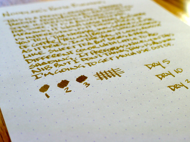
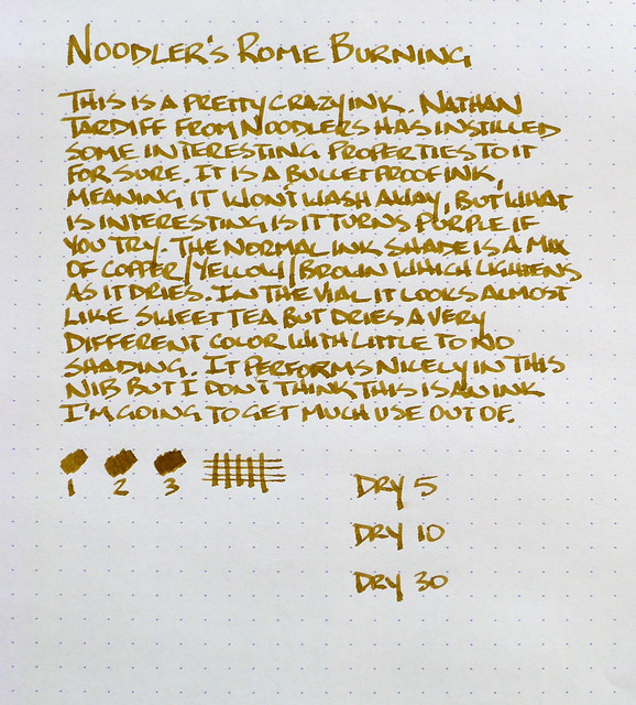
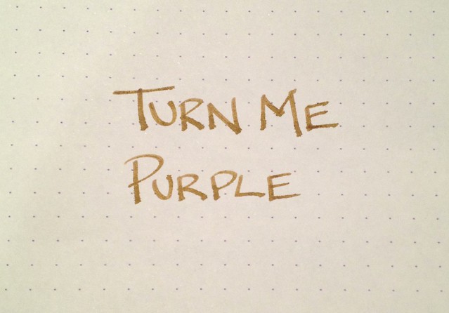
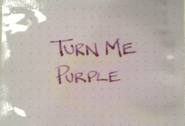
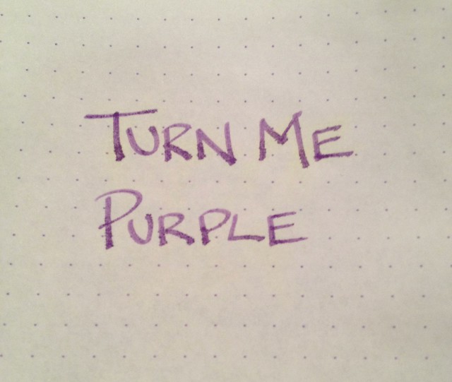
For thought number one, I had to test it to believe it myself. I cut out a little square of my Rhodia DotPad and submerged it in water for 2-3 minutes. What you see below are the before (dry), during (soaked, with a slight "inferno" showing), and after (dry and now purple). Pretty cool huh?

Noodler's Rome Burning

Noodler's Rome Burning

Noodler's Rome Burning

For more details on Noodler's Rome Burning check out these great reviews:

Flying Pony Studios

Ed Jelley

The Five Cat PENagerie

Noodler's Rome Burning

Posted on March 8, 2013 and filed under Ink Reviews, Noodler's Ink.

Pilot Iroshizuku Kon-Peki Ink Review

Pilot Iroshizuku Kon-Peki

If you listened to yesterday's podcast you caught me having a senior moment while discussing some of my ink reviews. I did a batch of three reviews in one sitting and when I was discussing the inks with Myke I was thinking I had published at least two of them on the blog. Well, now I can say that I actually have.

Pilot Iroshizuku Kon-Peki is one of the most popular inks on the market, and in one short review, I can see why. The rich, bright blue is stunning, and the shading is simultaneously subtle and exceptional. What really impressed me though was how well the ink behaved from the nib. Once again, I used my TWSBI Mini 1.5 mm stub nib for the review and found it the perfect choice. The ink flow was smooth and consistent - not too dry, and not too wet. If all Iroshizuku inks behave this well I am going to be in serious trouble.

The third ink review should be posted sometime next week, but I bet many of you can guess it from this image alone:

Ink Reviews

For more details on Pilot Iroshizuku Kon-Peki check out these great reviews:

Seize the Dave

Greasemonkeyhands

Ed Jelley

Vec Blog

Posted on February 21, 2013 and filed under Ink Reviews, Pilot, Iroshizuku.

Noodler's 54th Massachusetts Ink Review

Noodler's 54th Massachusetts

This is the point where I realized reviewing inks is going to be very difficult.

I am really happy with Noodler's 54th Massachusetts for many reasons. What I found challenging was showing the features of the ink that I enjoyed so much. The picture above is my second full pass at reviewing the ink, and there were several false starts in between. In fact, I nearly drained my 2ml sample from Goulet Pens before getting this done.

My first review was done with a Lamy Vista M nib. The ink worked great with the pen, but when it was time to photograph it I didn't think my picture showed off the ink well enough. I thought a wider nib might solve that problem, so I ordered a TWSBI Mini with a 1.5 mm Stub Nib. I had never used such a wide nib so I wasn't sure what to expect, but needless to say, I am very happy with my purchase.

What the 1.5 mm nib allowed for was more expressiveness in showing off the ink. Photography is hard for me to begin with, so on a dark ink like this it is nice to be able to show off the shading and color variations a bit. It still shows up dark though, so I do have some work to do on my lighting and editing.

On the ink itself, Noodler's 54th is classified as a blue black. It obviously leans more on the black side, and shows a lot of gray on the page. Sometimes I wonder where the blue actually is, but it shows up on the right paper and in the right light. This is an ink that I believe would grow on me the more I use it.

My ink reviews will be a work in progress. As my collection grows I will continue to add samples and work in more color comparisons. If there is anything specific you would like to see in the future please leave me a comment and I will do my best.

For more details on Noodler's 54th Massachusetts check out these great reviews:

Ink Nouveau - Noodler's 54th Massachusetts

Inkophile - Noodler's Has The Blues

Inkdependence! - Noodler's 54th Massachusetts

LostInBrittany Pens - Noodler's 54th Massachusetts Ink

Posted on February 7, 2013 and filed under Noodler's Ink, Ink Reviews.