Posts filed under Ink Reviews

Rohrer & Klingner Alt-Goldgrün Ink Review

Rohrer & Klingner Alt-Goldgrün

By all rights, there is no way I should like an ink like Rohrer & Klingner Alt-Goldgrün. Black inks and blue inks (and variations thereof) are my go-to colors, and it is rare that I find a non-standard color like Old Gold-Green making it into my daily carry. But wow, it is going to be hard to leave this one out.

I first heard of this ink when I was working at JetPens. When we were considering carrying the R&K ink line most of the comments we received said something along the lines of "Decide how many of each ink color you are ordering, then double that for Alt-Goldgrün." Looking at the color online, I couldn't believe what I was hearing. This color has almost a cult following, and after using it, I can see why.

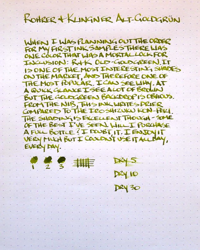
The main reason why so many people love this ink is the shading. You can probably see it better in the larger size of the photo, but the range of colors on the page is outstanding. The greens range from olive to lime, with shades of gold, yellow, and brown coming through as well. It is a truly unique color.

So now I have a dilemma. Do I go with a bottle of Alt-Goldgrün and commit to a regular load out? I'm not ready for that yet I don't think. I think the next step is to give it a good run in one of my F or EF nib pens and see how it performs.

How many of you use Alt-Goldgrün on a regular basis?

For more details on Rohrer & Klingner Alt-Goldgrün check out these great reviews:

Ink Nouveau

East...West...Everywhere

Nothing Spaces

Posted on March 21, 2013 and filed under Ink Reviews, Rohrer & Klingner.

Noodler's Rome Burning Review

Noodler's Rome Burning

There are many reasons to chose a particular fountain pen ink to meet your writing needs. You may need an ink that dries quickly, or is waterproof, or it may be a simple as liking the color. With Noodler's Rome Burning you get all of those things plus so much more. My words can't do the explaination justice so let me borrow from Nathan Tardiff, the inks creator:

"Rome Burning” has a bulletproof patrician core color of Caesar’s purple with the colors of the inferno that wash away from it with excess liquidity. As it dries there are shades of brass that can actually shine on some paper grades and can halo the darker core when using the right nib/feed combination. On very absorbent cellulose paper the patrician core can be seen in the center as the fire surrounds it – as if an eclipse of the sun.

You got that? Good. You are officially smarter than me.

My thoughts on the ink are two-fold. One, the ink properties descibed above are legit and come through in the testing I did below. Two, I will most likely never use this ink again.

As to number two, there is nothing inherently wrong with the ink, I just don't like the color. In fact, I like the washed out purple much better. That said, it performed wonderfully and dried incredibly fast. If you are looking for a copper-brown ink then this would be a great choice.

For thought number one, I had to test it to believe it myself. I cut out a little square of my Rhodia DotPad and submerged it in water for 2-3 minutes. What you see below are the before (dry), during (soaked, with a slight "inferno" showing), and after (dry and now purple). Pretty cool huh?

Noodler's Rome Burning

Noodler's Rome Burning

Noodler's Rome Burning

For more details on Noodler's Rome Burning check out these great reviews:

Flying Pony Studios

Ed Jelley

The Five Cat PENagerie

Noodler's Rome Burning

Posted on March 8, 2013 and filed under Ink Reviews, Noodler's Ink.

Pilot Iroshizuku Kon-Peki Ink Review

Pilot Iroshizuku Kon-Peki

If you listened to yesterday's podcast you caught me having a senior moment while discussing some of my ink reviews. I did a batch of three reviews in one sitting and when I was discussing the inks with Myke I was thinking I had published at least two of them on the blog. Well, now I can say that I actually have.

Pilot Iroshizuku Kon-Peki is one of the most popular inks on the market, and in one short review, I can see why. The rich, bright blue is stunning, and the shading is simultaneously subtle and exceptional. What really impressed me though was how well the ink behaved from the nib. Once again, I used my TWSBI Mini 1.5 mm stub nib for the review and found it the perfect choice. The ink flow was smooth and consistent - not too dry, and not too wet. If all Iroshizuku inks behave this well I am going to be in serious trouble.

The third ink review should be posted sometime next week, but I bet many of you can guess it from this image alone:

Ink Reviews

For more details on Pilot Iroshizuku Kon-Peki check out these great reviews:

Seize the Dave

Greasemonkeyhands

Ed Jelley

Vec Blog

Posted on February 21, 2013 and filed under Ink Reviews, Pilot, Iroshizuku.