Posts filed under Ink Reviews

Noodler’s Borealis Black Ink Review

Noodler's Borealis Black

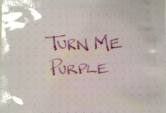
I am way too early in my ink exploration so I am hesitant to even say this ... but ... I think I have found my black ink.

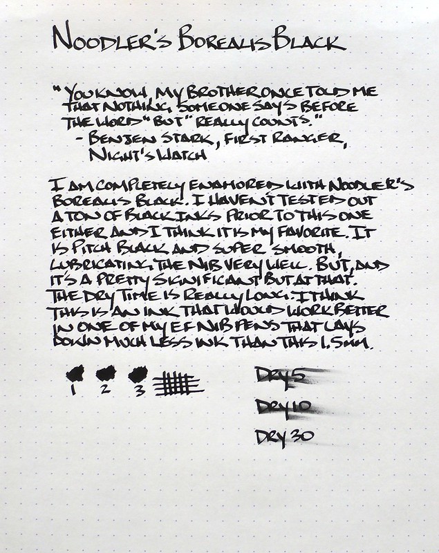
While Nathan Tardiff may never say explicitly, the name alone should tell you that Noodler's Borealis Black was created as a response to Aurora Black, which is one of the darkest basic blacks on the market. I haven't tested Aurora Black myself, but I think any black ink will have a hard time matching Borealis Black in pure darkness.

This ink is not without its flaws, which means it is not for everyone. First of all, this is not a bulletproof black ink. According to Noodler's, this ink is moderately waterproof, but can be washed out and is not light resistant. For me, bulletproof is not high on my list of ink priorities.

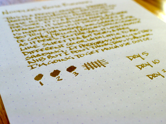
Secondly, and more importantly to some, Borealis Black takes a long time to dry. In my sample, you can still see some smearing at the 30 second mark. That is forever in dry time. I can't imagine a lefty ever using this ink. For me, it is not an issue. Using the same Rhodia paper in the photo I haven't had any ink transfer to my hand or to another page.

What I do love about this ink is that it writes smoother in my finest tip pens than any other ink I have tried. The review was done with my TWSBI Mini 1.5 mm Stub nib and I was so enamored with the performance and feel I loaded it out in my Pilot Prera F nib pen. The results were fantastic. The flow of the ink from the nib to the page had a different feel - it was highly lubricated and flowed freely.

I have several more black inks to test and as of right now this is the ink that they will all be measured against.

Noodler's Borealis Black

Posted on April 1, 2013 and filed under Ink Reviews, Noodler's Ink.

Rohrer & Klingner Alt-Goldgrün Ink Review

Rohrer & Klingner Alt-Goldgrün

By all rights, there is no way I should like an ink like Rohrer & Klingner Alt-Goldgrün. Black inks and blue inks (and variations thereof) are my go-to colors, and it is rare that I find a non-standard color like Old Gold-Green making it into my daily carry. But wow, it is going to be hard to leave this one out.

I first heard of this ink when I was working at JetPens. When we were considering carrying the R&K ink line most of the comments we received said something along the lines of "Decide how many of each ink color you are ordering, then double that for Alt-Goldgrün." Looking at the color online, I couldn't believe what I was hearing. This color has almost a cult following, and after using it, I can see why.

The main reason why so many people love this ink is the shading. You can probably see it better in the larger size of the photo, but the range of colors on the page is outstanding. The greens range from olive to lime, with shades of gold, yellow, and brown coming through as well. It is a truly unique color.

So now I have a dilemma. Do I go with a bottle of Alt-Goldgrün and commit to a regular load out? I'm not ready for that yet I don't think. I think the next step is to give it a good run in one of my F or EF nib pens and see how it performs.

How many of you use Alt-Goldgrün on a regular basis?

For more details on Rohrer & Klingner Alt-Goldgrün check out these great reviews:

Ink Nouveau

East...West...Everywhere

Nothing Spaces

Posted on March 21, 2013 and filed under Ink Reviews, Rohrer & Klingner.

Noodler's Rome Burning Review

Noodler's Rome Burning

There are many reasons to chose a particular fountain pen ink to meet your writing needs. You may need an ink that dries quickly, or is waterproof, or it may be a simple as liking the color. With Noodler's Rome Burning you get all of those things plus so much more. My words can't do the explaination justice so let me borrow from Nathan Tardiff, the inks creator:

"Rome Burning” has a bulletproof patrician core color of Caesar’s purple with the colors of the inferno that wash away from it with excess liquidity. As it dries there are shades of brass that can actually shine on some paper grades and can halo the darker core when using the right nib/feed combination. On very absorbent cellulose paper the patrician core can be seen in the center as the fire surrounds it – as if an eclipse of the sun.

You got that? Good. You are officially smarter than me.

My thoughts on the ink are two-fold. One, the ink properties descibed above are legit and come through in the testing I did below. Two, I will most likely never use this ink again.

As to number two, there is nothing inherently wrong with the ink, I just don't like the color. In fact, I like the washed out purple much better. That said, it performed wonderfully and dried incredibly fast. If you are looking for a copper-brown ink then this would be a great choice.

For thought number one, I had to test it to believe it myself. I cut out a little square of my Rhodia DotPad and submerged it in water for 2-3 minutes. What you see below are the before (dry), during (soaked, with a slight "inferno" showing), and after (dry and now purple). Pretty cool huh?

Noodler's Rome Burning

Noodler's Rome Burning

Noodler's Rome Burning

For more details on Noodler's Rome Burning check out these great reviews:

Flying Pony Studios

Ed Jelley

The Five Cat PENagerie

Noodler's Rome Burning

Posted on March 8, 2013 and filed under Ink Reviews, Noodler's Ink.