Posts filed under Ink Reviews

Scribal Workshop Cryptid Siren Blue Ink Review

Scribal Workshop

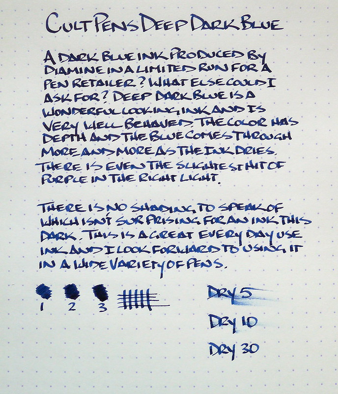
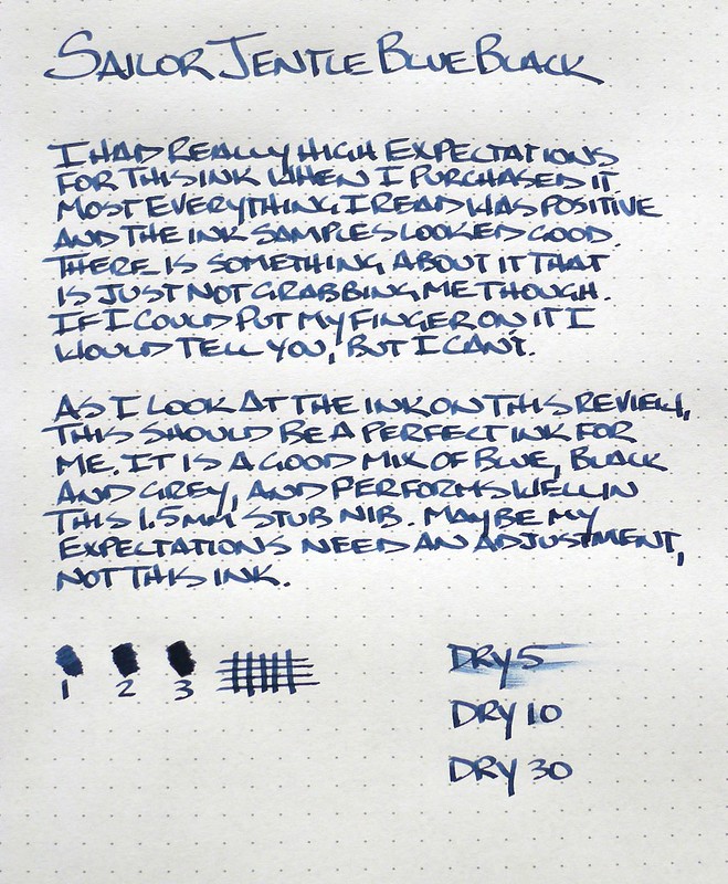
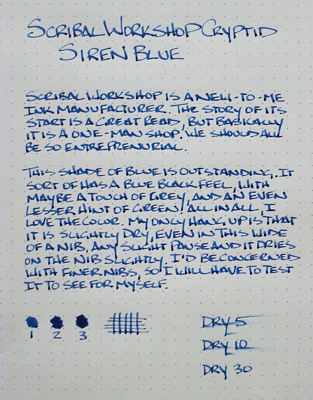
I had only heard about Scribal Workshop inks in passing before running into several bottles for sale by Anderson Pens at the Atlanta Pen Show. My blue ink radar went off, and I came home with a bottle of Cryptid Siren Blue.

Scribal is a family run business with ink being made by "Scribe and Chemist" Lucas Tucker. Along with the Cryptid line of inks, Scribal produces Bunny Washable Inks and Historic Inks, which is their iron gall line. Cryptid is essentially the standard fountain pen ink line, so that seemed like a good starting point.

The Siren Blue is a fantastic shade of blue - one of my favorites in fact. It leans on the darkish side of the spectrum with hints of black, grey, and even a touch of green. There is a moderate amount of shading and the dry time would fall into the "fast" category. And that may be an issue.

My nib would dry out almost as fast as the ink did on the paper. If I paused for a few seconds I would have a hard start, even with the 1.5 mm TWSBI stub used in the review. I loaded it up in my EF nib Vanishing Point and had the same issue. It frustrated me enough to where I had to clean it out. I could see this being a feature for artists and sketchers who like a dry, controllable line, but I need a little more smoothness for writing.

I'm going to keep trying it in different pens until I find a good match because the color is excellent. I can even get past the oregano-ish scent from the bottle if it were just a bit more lubricated.

Brian Goulet reviews the entire line of Cryptid Inks at Ink Nouveau. Has anyone else tested out ink from Scribal Workshop?

Posted on June 28, 2013 and filed under Ink Reviews, Scribal Workshop.

Cult Pens Deep Dark Blue Ink Review

Cult Pens Deep Dark Blue

A dark blue ink made in a limited quantity by a respected manufacturer for a pen retailer - why don't you go ahead and take my first born child while you are at it? All of my buttons were pushed with Cult Pens Deep Dark Blue, a limited run ink made by Diamine. For something this cool I was more than happy to get it shipped across the pond to my doorstep.

In my quest to try every blue ink on the planet (not really - it just seems that way looking at my ink shelf), I have discovered that I enjoy darker blues and blue blacks more than the lighter shades. I also don't like blues that are too black or show too much green. And you guys thought I was picky about my pens!

Deep Dark Blue nails everything I am looking for in a blue ink. Deep and dark truly describes the color but when looking at it on the page you can clearly tell it is blue, and that is key. When it dries you can even see hints of grey and purple. There is minimal shading with my TWSBI 1.5 mm stub but otherwise the ink performed well with no feathering or bleed on my Rhodia DotPad. The dry time was right in the middle of the range of inks I've tested, maybe even on the quicker side.

(Note: It was hard to accurately depict this color in the picture above. The top half of the page most accurately shows the color, while the bottom half is more blown out.)

Overall, I am very happy with this ink and can see having it in my daily rotation. It reminds me a lot of De Atrementis Benjamin Franklin, which I used in my Tomoe River Paper review. I'm glad I picked up two bottles up front, along with two bottles of another ink not available in the US which I will be reviewing soon. I'm such a tease.

Posted on June 17, 2013 and filed under Ink Reviews, Diamine.

Sailor Jentle Blue Black Ink Review

Sailor Jentle Blue Black

If it hasn't become clear by this point let me lay it out for you in no uncertain terms: I love blue black ink. I use it in every style of pen where it is available, especially fountain pens. Why? Anyone can use a basic blue or black ink. Using blue black shows that you put a little extra thought into your ink selection while still keeping it sane. I love wild, vivid colors as much as everyone else, but for daily use it is blue black all the way.

Sailor Jentle Blue Black is one of the recent additions to my ink collection and it has me perplexed. It is a well respected ink and is highly rated by many. For me, I think I am having a hard time coming to grips with where the color falls in respect to the other blue black inks I use regularly.

As I look at the pictures now I think the shade of blue black looks fantastic, but I distinctly recall more of a "meh" feeling when first inking the page. It is possible I didn't get the proper perspective by judging the ink immediately - there are often changes the longer ink sits. I want that initial satisfaction though, which I do get from other inks. Do you wait a certain amount of time before rating your inks?

I will be giving Sailor Jentle Blue Black a longer look in a wider variety of pens, especially finer nibs. That too makes a difference in how much I like a particular ink. I have been swayed by performance in an EF nib more than once and I look forward to seeing what else this ink can do.

Sailor Jentle Blue Black

(JetPens is an advertiser on The Pen Addict and I received this product at no charge.)

Posted on May 28, 2013 and filed under Ink Reviews, Sailor.