Posts filed under Ink Reviews

Sailor Jentle Limited Edition Autumn 2010 Oku Yama Maroon Ink Review

I have been on an ink kick to start 2014, adding 6 or 8 bottles to my collection already. Some are of the basic variety, like Pilot Black, while others I went to great lengths for. Sailor Jentle Limited Edition Autumn 2010 Oku Yama Maroon is one of those.

I don't know where I caught this limited edition bug from. It may be I realized a few weeks ago that I missed out on the Rohrer & Klingner Blau Schwarz in 2012 (and thanks to kind listeners I now have some), or maybe I'm just certifiable. Regardless, I went on the hunt to see what else I have missed and what else I could get my hands on.

I know Sailor produces special colors frequently so I set my sights there, which led me to Aesthetic Bay, a highly respected pen shop in Singapore. I picked up four (I know, certifiable) Sailor LE inks, the first of which is this Autumn 2010 Oku Yama Maroon.

I've never been a red ink guy but the few reviews I found of Oku Yama were positive. I wasn't sure what to expect when I inked it up in my recently acquired Franklin-Christoph Model 40 Pocket Fire and Ice with a broad Masuyama cursive italic nib but I have to say it exceed all expectations.

First off, the color is great. It is a solid maroon, not too bright and not to purple. I like purple on its own, but not in my red inks. The shading is better than expected too, with excellent color range in the lines. Secondly, it is a very lubricated ink, at least that's how it felt with this nib combo. I think it would work well in some of my EF nibs too.

Something interesting about Oku Yama caught me off guard, and that is the dry time. When I did the five-second smear test there was no smearing. Did I forget how to count to five all of a sudden? Nope, this is legit, and on Rhodia paper it is impressive. It was a pointless exercise to even bother with the 10 and 20 second tests.

How close is Oku Yama to the less expensive and widely available Sailor Jentle Grenade? I haven't reviewed Grenade yet but did have an ink sample to swab. It is lighter with more pink at first glance but I will need to do more testing. Compared to Diamine Oxblood, Oku Yama is less saturated and lighter in color. It falls right in between these two popular red inks. You can see more comparisons in the reviews below.

The real measure of an ink for me is will it make my regular rotation and I think I will be loading up Sailor Jentle Oku Yama often.

Further reading:

-- Sailor Jentle Oku Yama (via FPN)

-- Sailor Grenade vs Oku Yama vs 1670 vs Yama Budo Chromatography (via FPN)

Instagram close-up:

Posted on February 3, 2014 and filed under Ink Reviews, Sailor.

J. Herbin Eclat de Saphir Ink Review

If Iroshizuku Kon-peki is my favorite blue ink, then J. Herbin Éclat de Saphir is my close second.

Éclat de Saphir is a gorgeous, vibrant blue ink with lots of character and depth. I love how it pops off the page when I’m writing and even after it’s dried. I'm very pleased when inks retain the same level of saturation when they dry as when the ink is wet, and this ink is no exception.

Before I dive into the detailed notes, I do have some general comments about this ink. I love the color and shading qualities of this ink, but you really need to try it in a fine or larger nib (or medium and larger for Japanese nibs) to get the full effect. After playing with this ink for a while, I really want a stub nib. Secondly, many reviews I've seen on this ink praise its fast-drying property, as well as many other J. Herbin inks. This has not been the case for me with this ink. I don't know if I'm doing something wrong or if I'm just using wet nibs on heavy paper, but I would not say it's fast to dry. In my tests, it took about 20 seconds to dry to a point where it would not smudge when I brushed my finger across it. With that being said, it's still an excellent ink that I highly recommend.

J. Herbin Eclat de Saphir 3.jpg

This is one of the most well-behaved and easy to maintain inks I've tried. I currently only have cartridges, but will buy a bottle very soon so as to use it in even more pens. It's extremely easy to clean out of pens and washes off my fingers easily.

My favorite quality of this ink is the color. It's a medium to dark blue, very similar to what I think of as "royal" blue. It's nice and saturated, which is something I long for in inks. It has good lubrication and excellent flow in the handful of pens I've used so far.

On nice paper, this ink does not feather or show through the page. Sure, it does feather on cheap paper, but what ink doesn't?

The shading properties are fantastic. Again, I see a stub nib in my near future just so I can play with this beautiful ink some more.

Overall, this is one of my favorite inks and I can't wait to introduce it to more of my pens. Aside from my quibble with the drying time, it's close to a perfect ink for me. I'd like to hear from you if you have some information about the drying time or have advice on performing ink drying tests. Next time you're looking for a nice blue ink to try, grab some Éclat de Saphir.

J. Herbin Eclat de Saphir 1.jpg

(You can find more from Jeff online at Draft Evolution, Twitter, and App.net.)

Posted on January 31, 2014 and filed under Fountain Pens, J. Herbin, Ink Reviews.

Ink Samples With The Maruman Mnemosyne Word Book

Maruman Mnemosyne Word Book

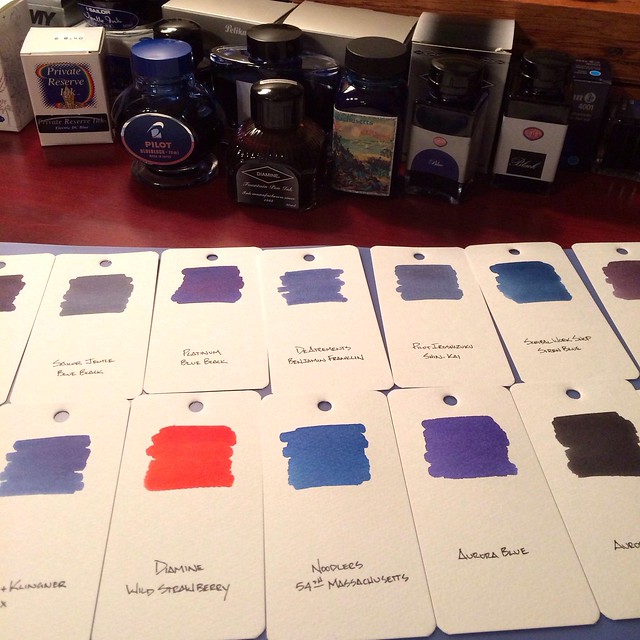
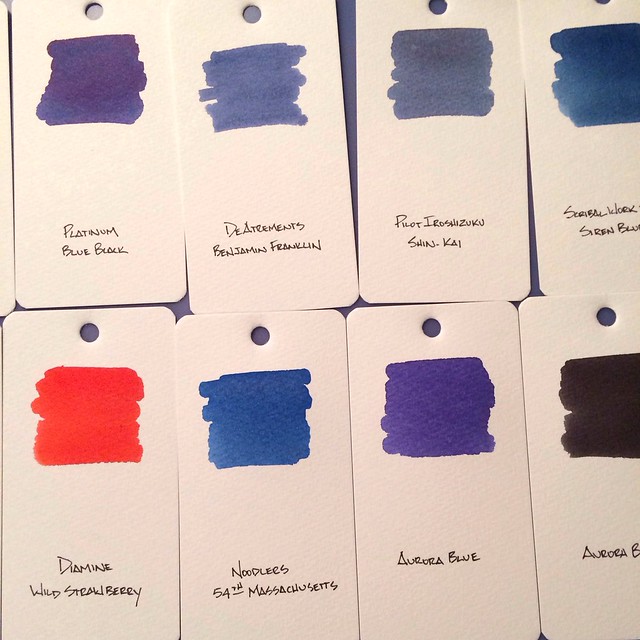
One thing I have always wanted is a visual sampling of my fountain pen inks. I have tried random sheets of paper and various notebooks but none have ever stuck. I wanted a good, thick paper and the ability to move the samples around and compare them side-by-side. Enter the Maruman Mnemosyne Word Book.

The Word Book is basically Maruman's take on flash cards. Used by students for memorization, these ringed study cards can serve many purposes. Personally, they remind me of a paint sample book and are the perfect setup for fountain pen ink samples.

Maruman Mnemosyne Word Book

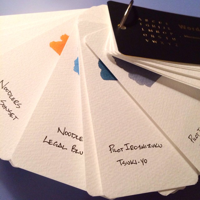
The cards are approximately 4"x2", giving me plenty of room for a large ink swab (using a basic Q-Tip dipped in the ink bottle) while leaving room for a written description at the bottom of the card. The cards are thick enough to where the large amount of ink doesn't buckle the card or bleed through. You could even use the back side for another ink sample, but I will probably use that side for ink notes.

The paper is off-white and does have some tooth to it, similar to watercolor paper. For deadly accurate color representation I will admit it is not perfect. Since the paper is so porous it soaks up much of the ink and dulls out some of the colors. It works for what I am trying to accomplish but a smoother, perfectly white paper would be a better choice.

Maruman Mnemosyne Word Book

Having the ring and pre-drilled holes is an awesome option. I can arrange the cards however I want, plus add and remove as needed. My only mistake was putting the ink sample near the top of the card. It would have worked much better if I put the ink at the bottom to where I could see them better when fanned out.

Overall, I am happy with this setup. It allows for a quick comparison of inks and is easily accessible. I have swabbed all of my ink bottles so far, and will be moving onto my sample vials in phase two. The Word Book is a great deal for under $4.00 at JetPens.

(JetPens is an advertiser on The Pen Addict and I received this product at no charge.)

Posted on January 2, 2014 and filed under Ink Reviews, Maruman.