Posts filed under Ink Reviews

J. Herbin Encre Rouge Ink Review

J Herbin Encre Rouge 2.jpg

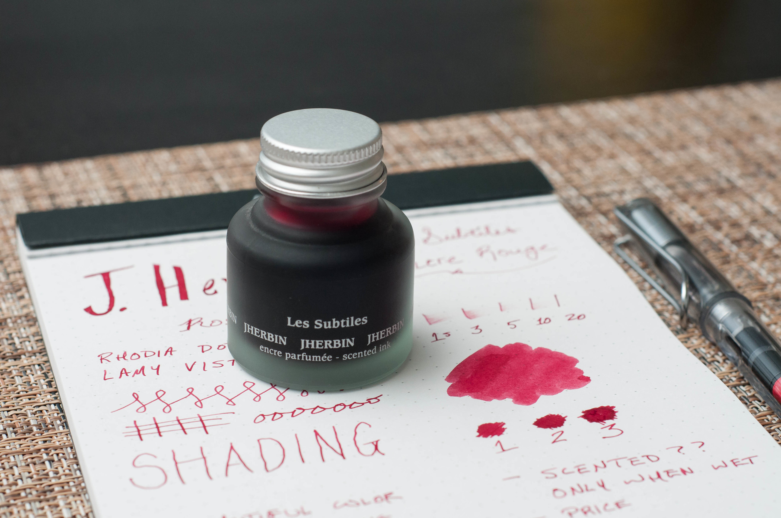
I've barely ventured into the realm of red inks, but the experience I've had with J. Herbin Encre Rouge makes me want to try more. I'm a little confused as to what to call this particular ink, so I'll just stick with Encre Rouge (translates to "red ink") for now. This ink is part of the Les Subtiles ("subtle") line of scented inks, available in 5 different flavors/colors. Each scent is matched to a color, so in this case: roses are red.

I don't remember the exact circumstance that landed this ink on my radar, but I bought a bottle last year to use for a Valentine's day note for my wife. What started as a fun idea for Valentine's Day has become one of the most interesting inks I own over the past year. I don't really care for the scented aspect of the ink, but I'm in love with the color.

Before we look at the writing qualities of this ink, let's talk about the special part: the scent. Remember scratch-and-sniff stickers from grade school? This is a more grown-up version of that in a way. The scent of this ink is roses, and from what I can smell, it's dead on. It's not overpowering when writing -- it smells like fresh roses are sitting on the desk next to you. That's about all you get though. Once the ink dries, the scent all but vanishes. That's my major complaint for this ink. The scent just doesn't last once the ink dries.

When writing a letter with this ink, I would expect the scent of roses to greet the reader upon opening the letter. This just isn't the case. Only the writer gets to enjoy the scent.

It's still an interesting concept. Here's how J. Herbin describe the process of infusing scents into ink:

J. Herbin scented inks are made from floral water (hydrosols) of rose, orange, lavender, apple and violets. The hydrosols used by J. Herbin come from Grasse, France, a Provencal town long associated with the perfume industry and famous for its floral scents.

Fancy!

Now, on to the writing qualities of this ink. This is where I'm really happy. I describe the color as a medium red. I can see faint shades of brown in some of the lines, but it looks more like oxblood to me. Mostly, the lines just look like the color of red rose petals. Based on Brad's description of red inks, I'm not sure if I'd call this a dark or bright ink. It seems to possess qualities of both. On one hand, I can detect some oxblood/brown shades, but it also seems to pop off the page. What do you think? Dark or bright?

J Herbin Encre Rouge 3.jpg

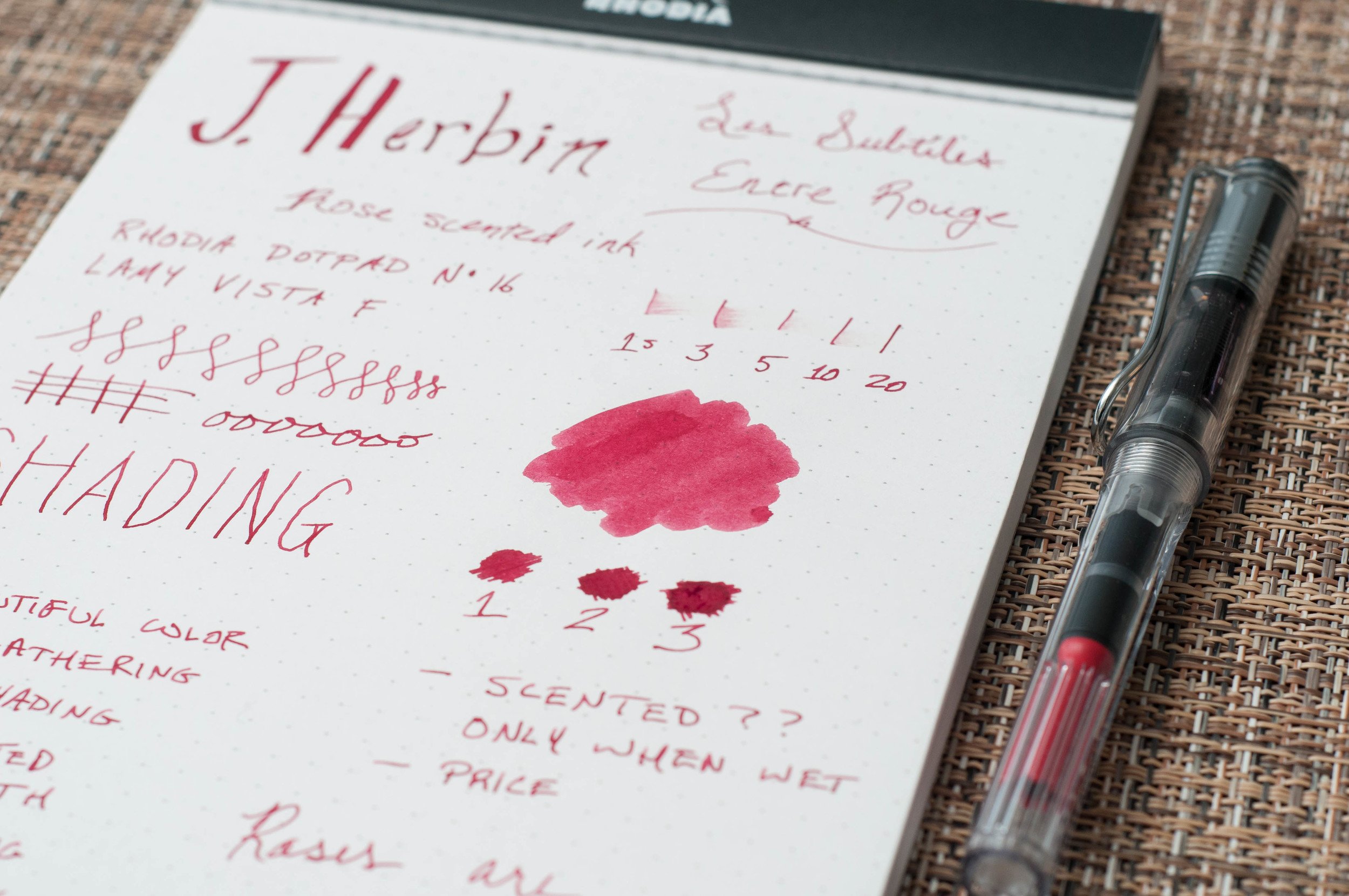
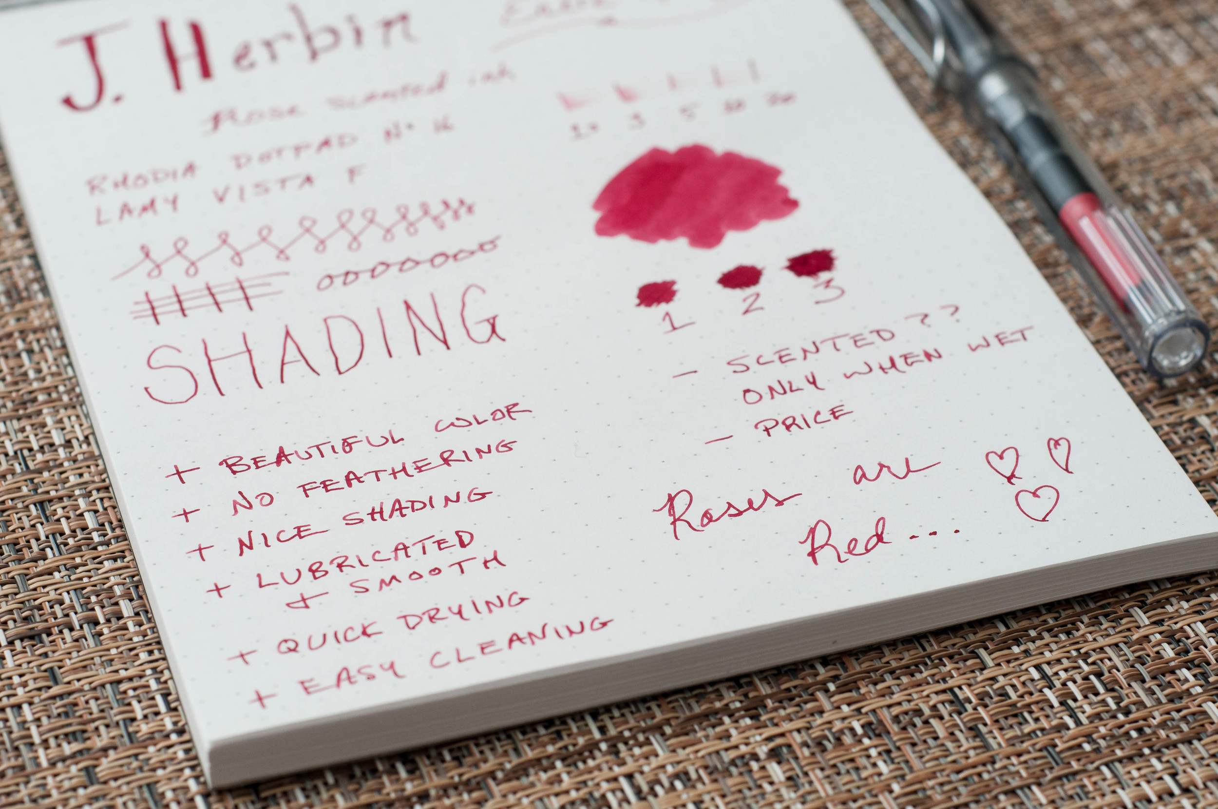
Opinions on color aside, this is a very well-behaved and enjoyable ink. In my use, it shows some excellent shading qualities, no feathering on nice paper, no bleed through, and it dries relatively quickly. I've tried this ink in a few pens, and I'd say it has average lubrication qualities.

Apart from my complaints about the quickly fading scent, this is a great ink. I'm afraid it's the reason that I might launch into a red ink journey in the near future. It's a few dollars more expensive than the regular J. Herbin inks, and I'm not sure it's worth the extra money. If there's a regular J. Herbin ink or an ink from another brand that has the same qualities as this ink, I'd be very eager to try it.

(You can find more from Jeff online at Draft Evolution, Twitter, and App.net.)

Put your nose close to the screen ...

Put your nose close to the screen ...

Posted on February 13, 2014 and filed under J. Herbin, Ink Reviews.

Sailor Jentle Limited Edition Autumn 2010 Oku Yama Maroon Ink Review

I have been on an ink kick to start 2014, adding 6 or 8 bottles to my collection already. Some are of the basic variety, like Pilot Black, while others I went to great lengths for. Sailor Jentle Limited Edition Autumn 2010 Oku Yama Maroon is one of those.

I don't know where I caught this limited edition bug from. It may be I realized a few weeks ago that I missed out on the Rohrer & Klingner Blau Schwarz in 2012 (and thanks to kind listeners I now have some), or maybe I'm just certifiable. Regardless, I went on the hunt to see what else I have missed and what else I could get my hands on.

I know Sailor produces special colors frequently so I set my sights there, which led me to Aesthetic Bay, a highly respected pen shop in Singapore. I picked up four (I know, certifiable) Sailor LE inks, the first of which is this Autumn 2010 Oku Yama Maroon.

I've never been a red ink guy but the few reviews I found of Oku Yama were positive. I wasn't sure what to expect when I inked it up in my recently acquired Franklin-Christoph Model 40 Pocket Fire and Ice with a broad Masuyama cursive italic nib but I have to say it exceed all expectations.

First off, the color is great. It is a solid maroon, not too bright and not to purple. I like purple on its own, but not in my red inks. The shading is better than expected too, with excellent color range in the lines. Secondly, it is a very lubricated ink, at least that's how it felt with this nib combo. I think it would work well in some of my EF nibs too.

Something interesting about Oku Yama caught me off guard, and that is the dry time. When I did the five-second smear test there was no smearing. Did I forget how to count to five all of a sudden? Nope, this is legit, and on Rhodia paper it is impressive. It was a pointless exercise to even bother with the 10 and 20 second tests.

How close is Oku Yama to the less expensive and widely available Sailor Jentle Grenade? I haven't reviewed Grenade yet but did have an ink sample to swab. It is lighter with more pink at first glance but I will need to do more testing. Compared to Diamine Oxblood, Oku Yama is less saturated and lighter in color. It falls right in between these two popular red inks. You can see more comparisons in the reviews below.

The real measure of an ink for me is will it make my regular rotation and I think I will be loading up Sailor Jentle Oku Yama often.

Further reading:

-- Sailor Jentle Oku Yama (via FPN)

-- Sailor Grenade vs Oku Yama vs 1670 vs Yama Budo Chromatography (via FPN)

Instagram close-up:

Posted on February 3, 2014 and filed under Ink Reviews, Sailor.

J. Herbin Eclat de Saphir Ink Review

If Iroshizuku Kon-peki is my favorite blue ink, then J. Herbin Éclat de Saphir is my close second.

Éclat de Saphir is a gorgeous, vibrant blue ink with lots of character and depth. I love how it pops off the page when I’m writing and even after it’s dried. I'm very pleased when inks retain the same level of saturation when they dry as when the ink is wet, and this ink is no exception.

Before I dive into the detailed notes, I do have some general comments about this ink. I love the color and shading qualities of this ink, but you really need to try it in a fine or larger nib (or medium and larger for Japanese nibs) to get the full effect. After playing with this ink for a while, I really want a stub nib. Secondly, many reviews I've seen on this ink praise its fast-drying property, as well as many other J. Herbin inks. This has not been the case for me with this ink. I don't know if I'm doing something wrong or if I'm just using wet nibs on heavy paper, but I would not say it's fast to dry. In my tests, it took about 20 seconds to dry to a point where it would not smudge when I brushed my finger across it. With that being said, it's still an excellent ink that I highly recommend.

J. Herbin Eclat de Saphir 3.jpg

This is one of the most well-behaved and easy to maintain inks I've tried. I currently only have cartridges, but will buy a bottle very soon so as to use it in even more pens. It's extremely easy to clean out of pens and washes off my fingers easily.

My favorite quality of this ink is the color. It's a medium to dark blue, very similar to what I think of as "royal" blue. It's nice and saturated, which is something I long for in inks. It has good lubrication and excellent flow in the handful of pens I've used so far.

On nice paper, this ink does not feather or show through the page. Sure, it does feather on cheap paper, but what ink doesn't?

The shading properties are fantastic. Again, I see a stub nib in my near future just so I can play with this beautiful ink some more.

Overall, this is one of my favorite inks and I can't wait to introduce it to more of my pens. Aside from my quibble with the drying time, it's close to a perfect ink for me. I'd like to hear from you if you have some information about the drying time or have advice on performing ink drying tests. Next time you're looking for a nice blue ink to try, grab some Éclat de Saphir.

J. Herbin Eclat de Saphir 1.jpg

(You can find more from Jeff online at Draft Evolution, Twitter, and App.net.)

Posted on January 31, 2014 and filed under Fountain Pens, J. Herbin, Ink Reviews.