Posts filed under Ink Reviews

Sailor Bung Box Blue Black Fountain Pen Ink Review

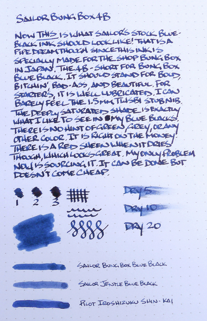
I received an epic batch of not-easy-to-come-by ink samples in January that knocked my socks off (thanks Richard!), and while I have had a chance to play with some of them I'm just now getting the chance to write them up. Sailor Bung Box Blue Black (aka Sailor 4B) is the first, and maybe the best.

My love of blue black inks is well known, and this package contained a wide variety of samples I had never heard of, much less tried. I went with the Sailor 4B first because I was also sent a cool empty box and bottle of this ink to see how Sailor packages these specialty inks for Japanese retailer Bungubox. Yes, it is only available directly through them unfortunately, unless you want to work some eBay magic.

The ink itself is fantastic. It is one of the most shaded blue black inks I have used and it has a nice red sheen that I had a hard time capturing. This ink could use more close-up photos to show off all of its properties. I'll work on that. It nails the color ratios too. There are no hints of stray colors - like green - that often ruin some blue black inks for me.

This is a standout ink, one I would give up a body part or two to acquire more of. Thanks Richard for sending me this sample!

(Note: Bungubox just launched an Amazon Shop. Several inks are available (not this one) but I'm not going to bother linking them because it would cost you almost $60 for one bottle of ink with shipping.)

Posted on March 17, 2014 and filed under Ink Reviews, Sailor.

Sailor Jentle Limited Edition Autumn 2010 Kin Mokusei Orange Ink Review

When I posted my review of the Sailor Limited Edition Oku Yama a few weeks back and explained my current ink fetish, I was actually reviewing the inks I purchased a bit out of order. Seeing writing samples of the Limited Edition Autumn 2010 Kin Mokusei online was the real impetus for my shopping spree.

It is a surprise to no one that I am a fan of orange, and Kin Mokusei is a brilliant orange ink. The shading is beautiful, ranging from yellow to deep orange without any appearance of brown or red. It is very rich looking and well behaved too, with excellent dry times. It flowed equally as well from both my TWSBI Mini 1.5mm stub nib and Pilot Falcon SEF.

My hangup with Kin Mokusei is I already own this ink in the form of Sailor Jentle Apricot. I had this concern when I ordered the ink and it turned out to be valid. Unlike Oku Yama, which I felt was able to stand on its own and seperate itself from other inks, I think Kin Mokusei is not worth the money. It is so similar that the 2-3 times premium price to Apricot is money better spent elsewhere.

How similar? Take a look at this chromatography test

So far, I'm 1-for2 with my Limited Edition Sailor ink purchases. Oku Yama is a keeper and Kin Moskuei is redundant. I have two more to test and review, and early indications show that this next one may be the big winner of the bunch.

Posted on March 3, 2014 and filed under Ink Reviews, Sailor.

J. Herbin Encre Rouge Ink Review

J Herbin Encre Rouge 2.jpg

I've barely ventured into the realm of red inks, but the experience I've had with J. Herbin Encre Rouge makes me want to try more. I'm a little confused as to what to call this particular ink, so I'll just stick with Encre Rouge (translates to "red ink") for now. This ink is part of the Les Subtiles ("subtle") line of scented inks, available in 5 different flavors/colors. Each scent is matched to a color, so in this case: roses are red.

I don't remember the exact circumstance that landed this ink on my radar, but I bought a bottle last year to use for a Valentine's day note for my wife. What started as a fun idea for Valentine's Day has become one of the most interesting inks I own over the past year. I don't really care for the scented aspect of the ink, but I'm in love with the color.

Before we look at the writing qualities of this ink, let's talk about the special part: the scent. Remember scratch-and-sniff stickers from grade school? This is a more grown-up version of that in a way. The scent of this ink is roses, and from what I can smell, it's dead on. It's not overpowering when writing -- it smells like fresh roses are sitting on the desk next to you. That's about all you get though. Once the ink dries, the scent all but vanishes. That's my major complaint for this ink. The scent just doesn't last once the ink dries.

When writing a letter with this ink, I would expect the scent of roses to greet the reader upon opening the letter. This just isn't the case. Only the writer gets to enjoy the scent.

It's still an interesting concept. Here's how J. Herbin describe the process of infusing scents into ink:

J. Herbin scented inks are made from floral water (hydrosols) of rose, orange, lavender, apple and violets. The hydrosols used by J. Herbin come from Grasse, France, a Provencal town long associated with the perfume industry and famous for its floral scents.

Fancy!

Now, on to the writing qualities of this ink. This is where I'm really happy. I describe the color as a medium red. I can see faint shades of brown in some of the lines, but it looks more like oxblood to me. Mostly, the lines just look like the color of red rose petals. Based on Brad's description of red inks, I'm not sure if I'd call this a dark or bright ink. It seems to possess qualities of both. On one hand, I can detect some oxblood/brown shades, but it also seems to pop off the page. What do you think? Dark or bright?

J Herbin Encre Rouge 3.jpg

Opinions on color aside, this is a very well-behaved and enjoyable ink. In my use, it shows some excellent shading qualities, no feathering on nice paper, no bleed through, and it dries relatively quickly. I've tried this ink in a few pens, and I'd say it has average lubrication qualities.

Apart from my complaints about the quickly fading scent, this is a great ink. I'm afraid it's the reason that I might launch into a red ink journey in the near future. It's a few dollars more expensive than the regular J. Herbin inks, and I'm not sure it's worth the extra money. If there's a regular J. Herbin ink or an ink from another brand that has the same qualities as this ink, I'd be very eager to try it.

(You can find more from Jeff online at Draft Evolution, Twitter, and App.net.)

Put your nose close to the screen ...

Put your nose close to the screen ...

Posted on February 13, 2014 and filed under J. Herbin, Ink Reviews.