Posts filed under Ink Reviews

Organics Studio Blue Merle Ink Review

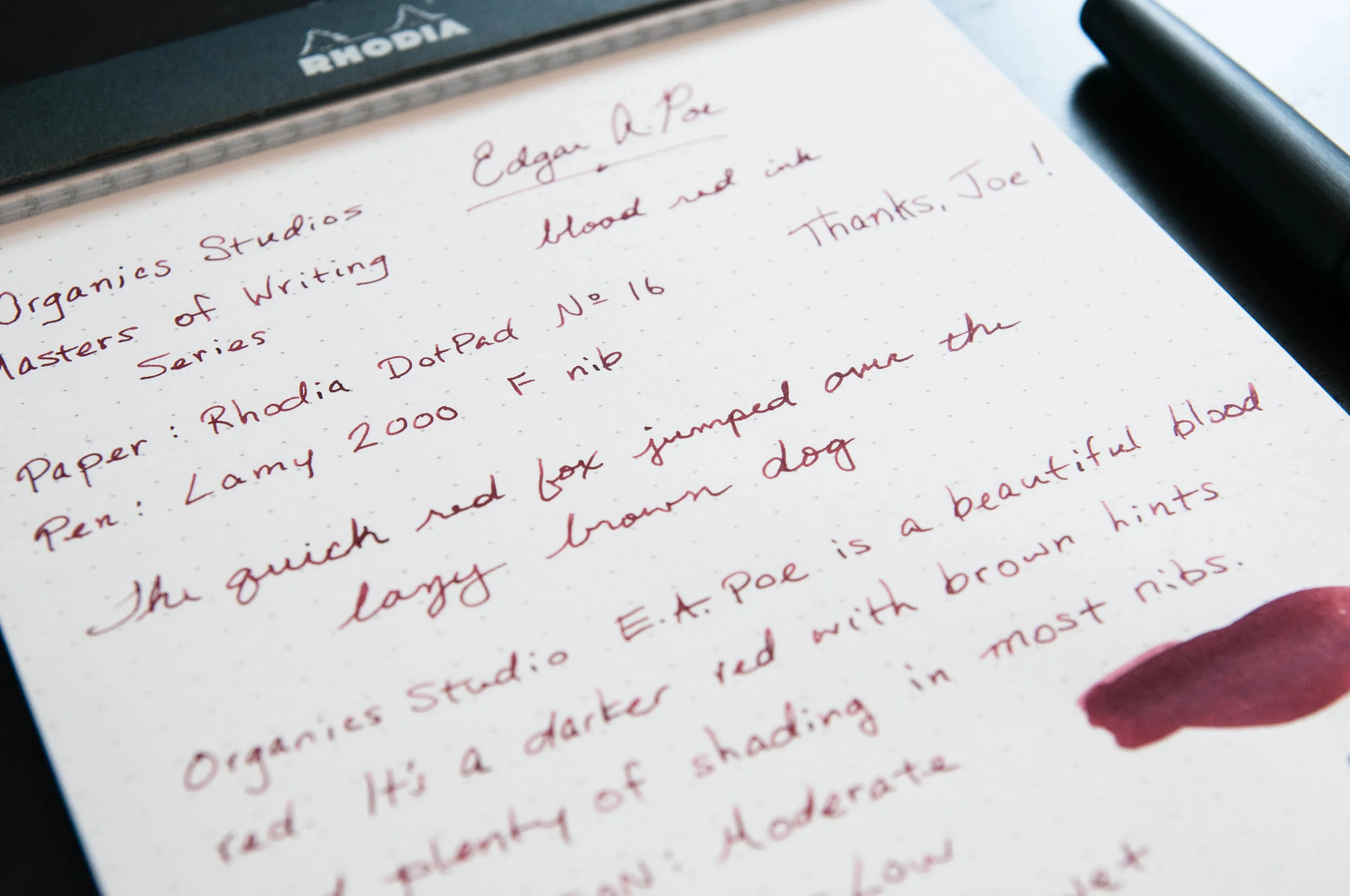
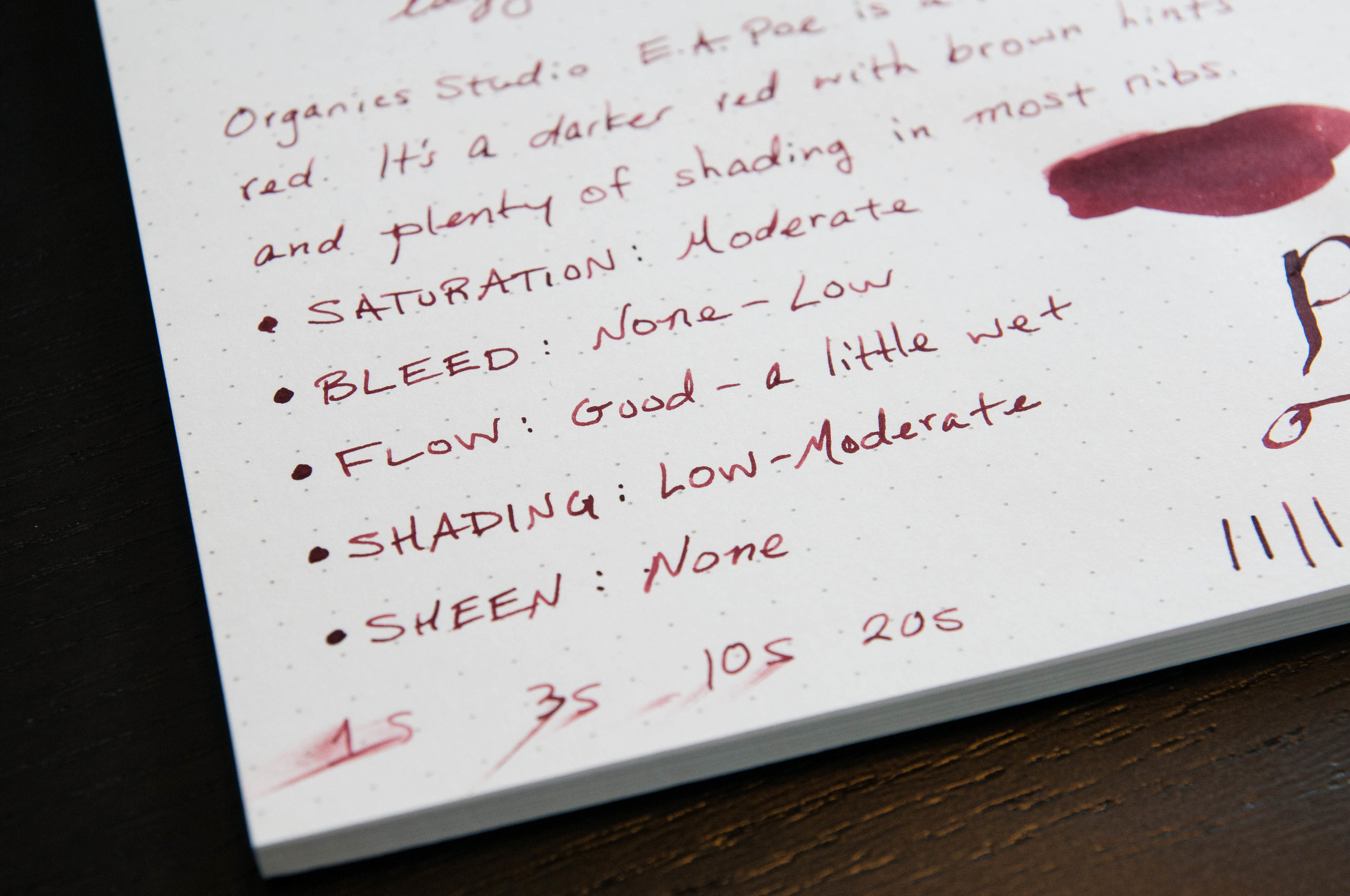
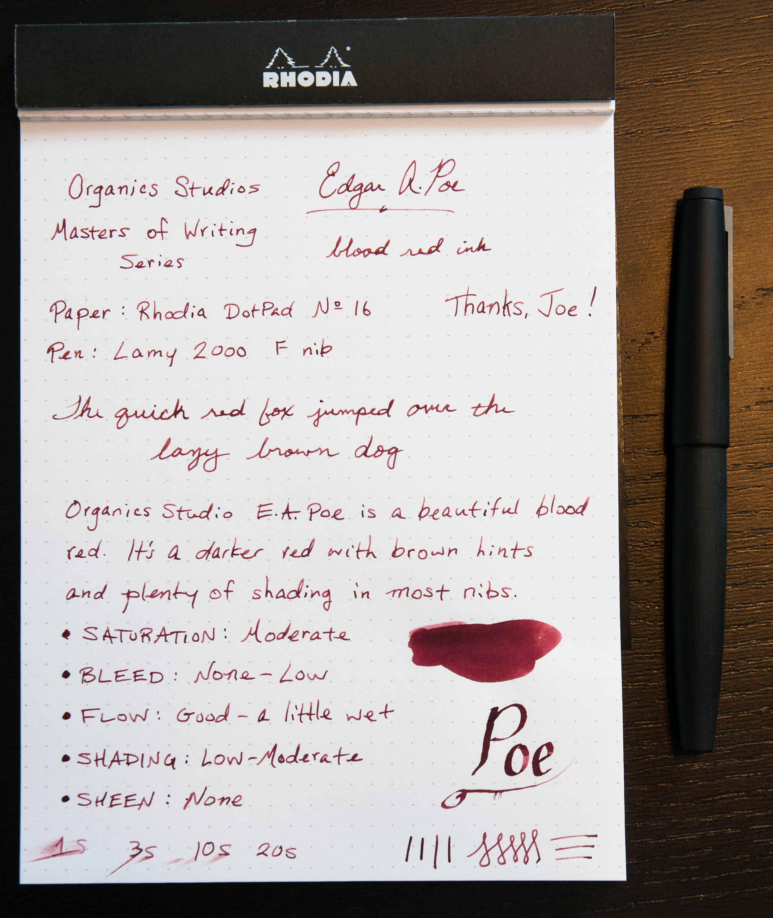
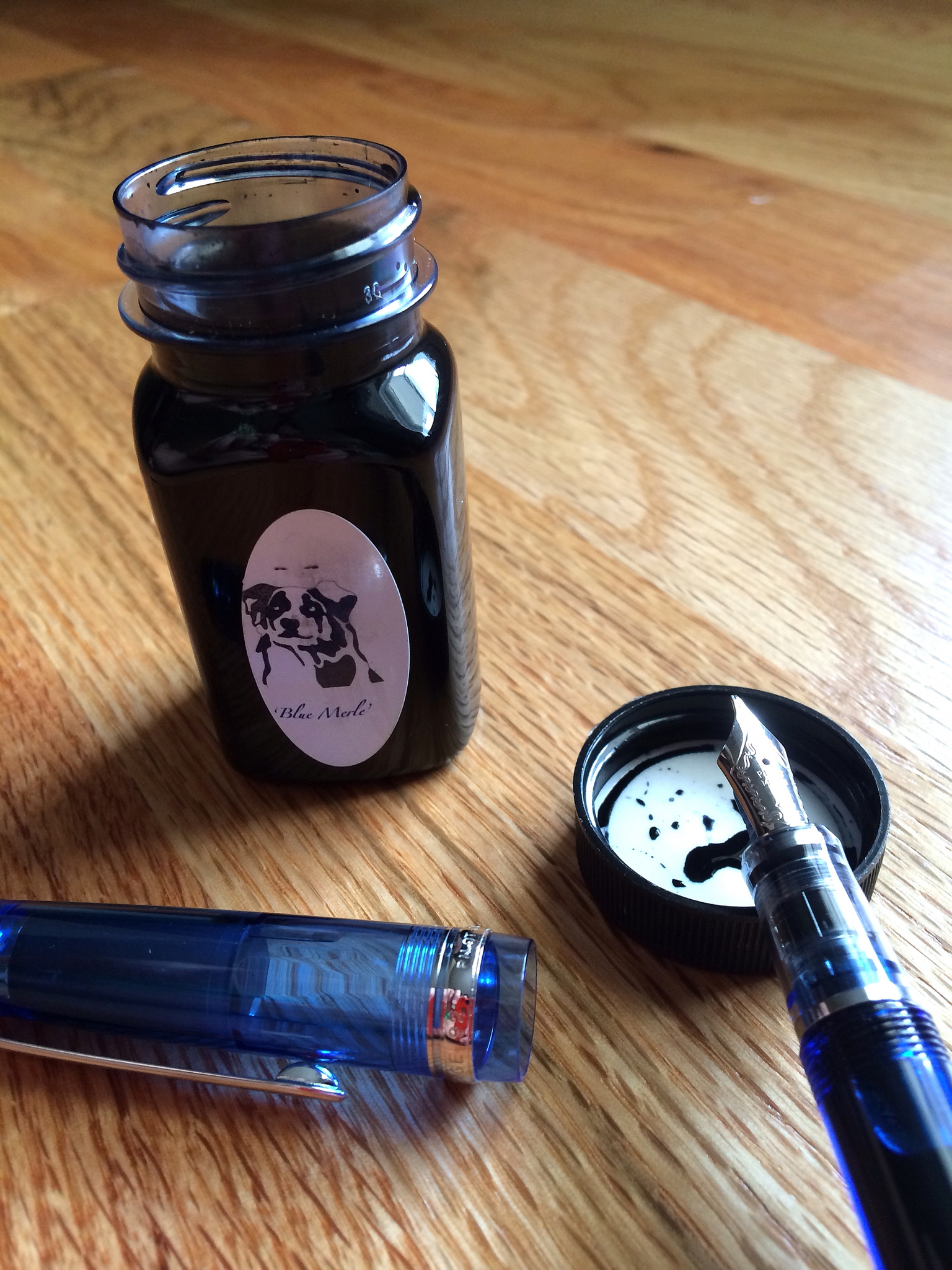
I didn't go to this years Atlanta Pen Show with much of a shopping list but one ink was definitely on the radar: Organics Studio Blue Merle. I assumed the Anderson's would have it at their table, and with an exchange of American currency a bottle was mine.

Organics Studio bills Blue Merle as a recreation of vintage Carter's ink. I'll admit I have no idea what Carter's ink is/was, but the goal was to create an ink with very few ingredients that behaves well and is easy to clean. In my testing so far, all of these things are true.

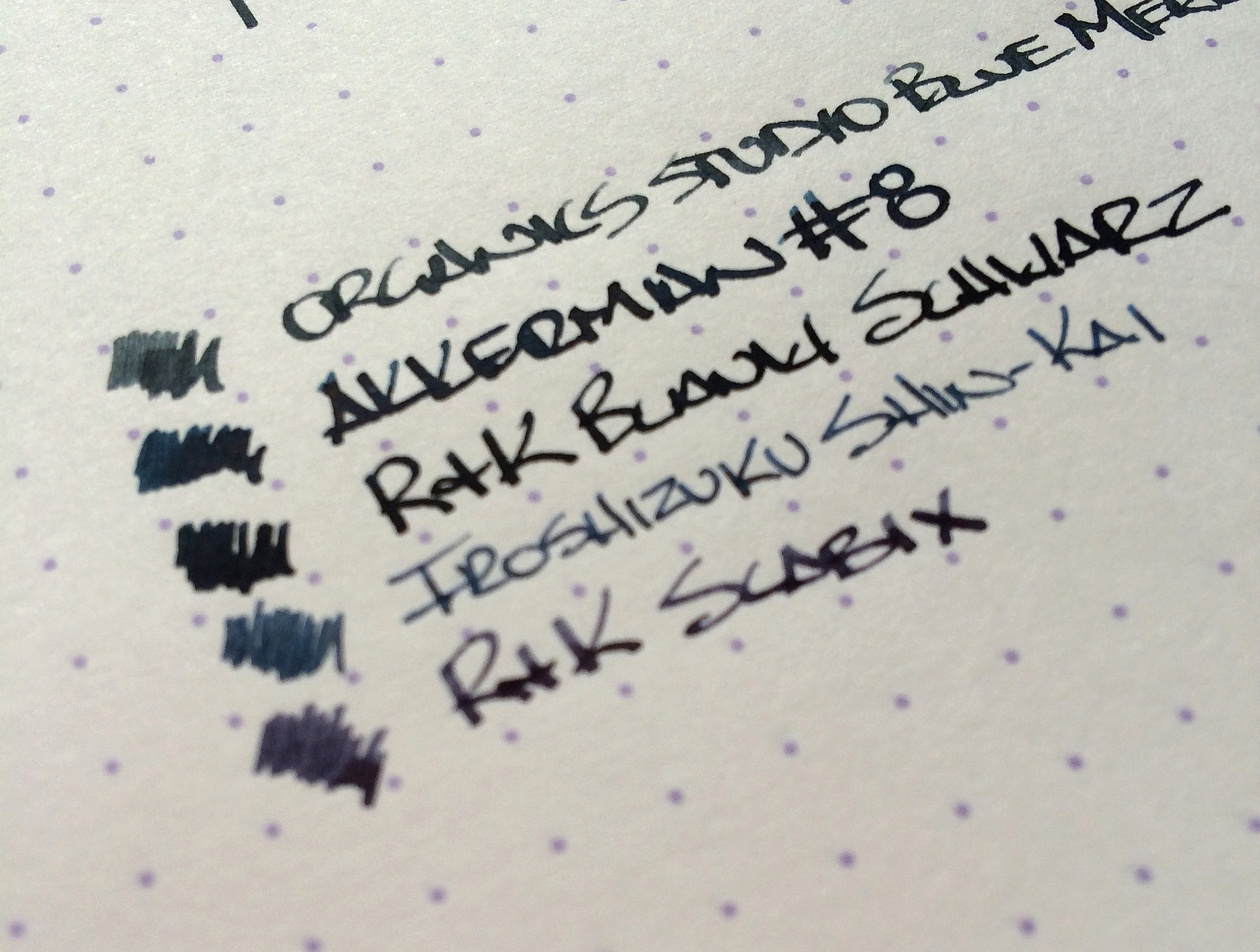
What drew me to Blue Merle, of course, is that is a blue black ink. Yet another one added to my collection! Blue Merle leans heavy on the grey side of the spectrum, making for a nice rain cloud type of color. Grey is one color I can handle in my blue black inks and this one is nice.

The behavior of this ink is a huge selling point. It flows great (I used my Pilot Custom Heritage 92 with a bold CI nib), shades wonderfully, dries reasonably fast, and cleans well. I've used it in a range of pens so far and have had zero issues wherever I have tried it.

In the grand scheme of things, Blue Merle probably will not crack my Top 5 blue black inks, but that's not a mark against it. It is a fun ink that is in the rotation often and always provides a great writing experience.

Posted on June 30, 2014 and filed under Ink Reviews, Organics Studio.

Organics Studio Edgar Allen Poe Ink Review

Say hello to one of my new favorite inks. Edgar Allen Poe is part of the Masters of Writing Series from Organics Studios. This is my first time trying any inks from Organics, and I'll definitely be trying more after this. In short, this is a dark red, bloody ink that can be used in most occasions, behaves well, and just looks awesome.

I was given a sample of this ink by Joe Lebo, a gentleman extraordinaire (Thanks, Joe!). He sent a couple of other samples as well, but the E.A. Poe sample was a surprise. Joe has great taste.

So, how does this ink perform? It's been fantastic in the few pens I've tried and I've had no complaints so far about how it behaves on paper. Let's get into the details.

The color is subtle, but deep. At first glance, you know it's a deep red with some brown hints, but then you start to notice the character. It's similar in color to a lot of the oxblood inks out there. If you like dark reds, you'll probably like this.

In the pens I tried, this ink had very good flow. It's a tad wet, but it doesn't create pools of ink when writing slowly. It's right in the middle of the scale for me. I haven't seen any bleeding with this ink, and show through is minimal. There's no sheen to the ink once it dries, which is a shame because it looks better when it's wet. This ink dries with a nice color though, unlike some inks that dry lighter or less saturated than when they are wet.

A favorite quality of the ink for me is the shading. There isn't a ton of shading -- it's subtle, but I love it. Dark red to lighter red and brown, and sometimes just a hint of pink in some situations. It's a lovely characteristic, and it does well in special nibs (stubs, italics).

Overall, this is a great ink. It's well-behaved and has great characteristics. It's a new favorite for sure!

If you're interested in trying this ink yourself, Goulet and Anderson both stock full bottles as well as samples. At somewhere around $14 for a 55 ml bottle, that's a pretty good value. It's not cheap, but it's also not expensive. Definitely worth it.

I'll be purchasing a bottle of E.A. Poe as well as a few more samples from Organics very soon.

Posted on June 4, 2014 and filed under Ink Reviews, Organics Studio.

P.W. Akkerman #8 Diep-Duinwaterblauw Ink Review

"What makes Akkerman inks so special?"

That is the question I get the most when talking about my P.W. Akkerman ink purchases. They are expensive, hard to come by, and some say, identical formulations to another very popular ink brand. Why spend the money and go through the trouble when you can get something similar for less and easier?

Located in The Hague, Netherlands, the P.W. Akkerman fountain pen shop has been in existence since 1910, carrying some of the finest brands on the market. To celebrate their 100th anniversary, they created their own fountain pen ink line which includes 31 vivid colors and possibly the coolest ink bottle on the planet.

Over the past several months I have been lucky enough to be sent several Akkerman ink samples, be part of a direct group buy, and grab a couple of bottles at the Atlanta Pen Show. So at the moment I have more Akkerman inks than any human being should ever own. Time to get reviewing.

Out of all the Akkerman inks in my possession, #8 Diep-Duinwaterblauw is my clear favorite. Knowing it is a blue black ink, that should come as no surprise. The funny thing is, as much as I loved it when I did the handwritten review below I don't think the color is an accurate representation of what I see looking at it in person. I actually think the color on my Pilot Letter Pad review is much more accurate. Looking at other reviews I'd say that is a fair statement.

Diep-Duinwaterblauw is a deep blue black with a hint of turquoise that I like more than I thought I would. The primary shade is dark, then pops of brightness come through, giving it a unique shading I have seen in very few other inks. It shows up in wide stub nibs as well as extra fine nibs and I find myself wanting to use it as much, if not more, than my favorite blue black inks.

One question that people have asked over the years about Akkerman is are these inks rebottled and rebranded? It is all speculation, but many people believe Diamine is the manufacturer of these inks. Not only that, there are Diamine equivalent inks that are exact matches to some Akkerman inks. I have no direct knowledge of this, and really have no comment on it either other than to inform you that there is a lot of conversation around this topic. Take from this what you will.

What I take away from my experience with #8 Diep-Duinwaterblauw is that this is a great color that perfoms wonderfully in any nib I pair it with. Is the price worth it? For me it is. I've spent as much on other inks that I haven't been nearly as happy with as my Akkerman inks. Look for more reviews of this brand in the very near future.

If you are interested in purchasing Akkerman inks and aren't visiting The Hague anytime soon, send an email to Vanness Pens and they may have what you are looking for.

Posted on May 30, 2014 and filed under Akkerman, Ink Reviews.