Posts filed under Ink Reviews

J. Herbin Stormy Grey Fountain Pen Ink Review

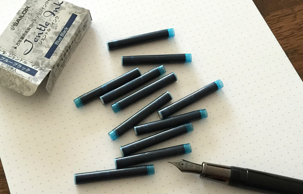
I've only been deep into fountain pens and inks for a few years and I don't recall a product - especially an ink - causing this much noise in our little world. J. Herbin Stormy Grey has taken the internet by storm, proving that we all like shiny and new. Especially shiny.

Gold flecks contained within the deep grey ink are the big selling point in J. Herbin's latest anniversary ink release. Rouge Hematite, the first release in the 1670 series, also had a gold feature, but in the form of a sheen, not actual flecks in the ink. That one slight change really sets Stormy Grey apart.

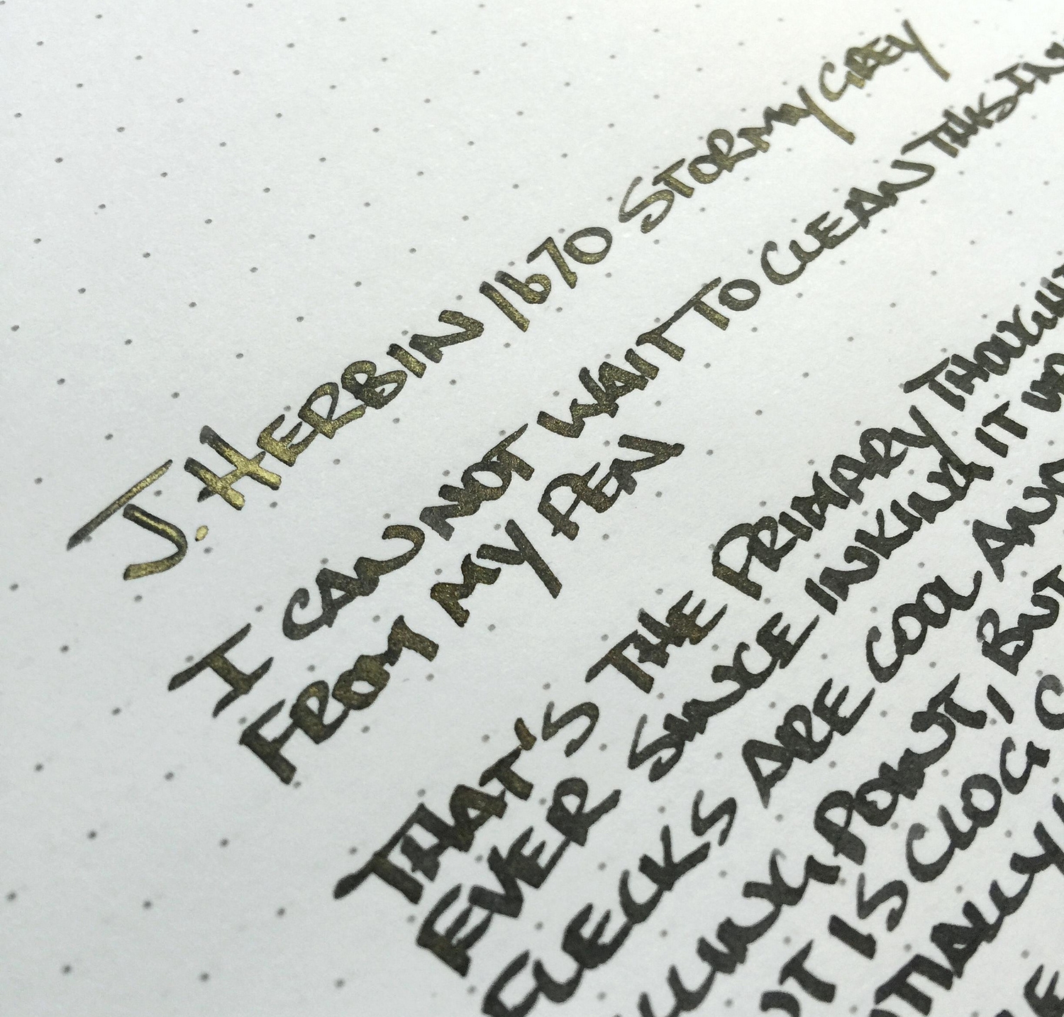
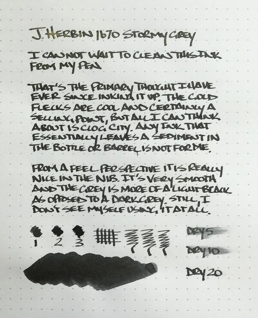
The grey is a beautiful, saturated coal grey, bordering on light black. I had zero flow issues in either my TWSBI 1.5 mm stub nib that this writing sample was done with, or a medium dip pen nib which I used for a few notes. I found the gold flecks to be inconsistent, with a heavy presence on some letters, and a light to no presence on others. This happens when there are actual physical materials that need to be dispersed within the ink.

My biggest issue with Stormy Grey is the additional maintenance required to keep the ink flowing consistently. J. Herbin even has a label warning:

Having these additional things to worry about doesn't fit my usage pattern. I would be very worried to leave this ink loaded for more than a week or two. Plus, the bottle and reservoir shaking that is needed to get even fleck dispersion before use is annoying. Using a dip nib is an option, but that limits portability.

I must be the only one with this issue though, as JetPens can't seem to keep it in stock. There was a short reload right before Christmas that vanished within hours, so if you want to get your hands on this ink be sure to sign up to be notified when inventory becomes available again.

(JetPens provided this product at no charge to The Pen Addict for review purposes.)

Posted on December 26, 2014 and filed under Ink Reviews, J. Herbin.

Sailor Jentle Blue Black Ink Cartridge Review

I am a big fan of bottled inks, as the sagging shelf in my closet will tell you, but there is absolutely a case to be made for fountain pen ink cartridges. What you sacrifice in variety and cost, you make up for in convenience, and sometimes that is a price worth paying.

Sailor inks are some of my favorites, including the bottled blue black and both the black and blue black Nano inks in bottled and cartridge form. It was a foregone conclusion that I was going to try out the new Jentle ink cartridges, in blue black of course, and they work wonderfully.

All Sailor inks I have tried are well lubricated and flow smoothly in all nibs and in all nib sizes, and the blue black cartridge is no exception. I popped in into my medium nib Sailor Black Luster and it worked just as expected. The lines were solid and there were no flow issues at all. The only thing I noticed is that the color is slightly darker than the blue black ink from the bottle. This happens from time to time when comparing bottled inks versus the same ink in cartridge form. It's often not a dead-on match.

My only hope is that Sailor expands on this line to include even more colors. Pelikan has done this, adding matching cartridges to their Edelstein ink line, so hopefully this becomes a thing with brands. Yes, it is not as cost effective or environmentally friendly, but if the barrier to entry can be lowered even a tick I think it is worth it.

(JetPens is an advertiser on The Pen Addict and I received this product at no charge.)

"This end up" and a born on date. My kind of 12-pack.

"This end up" and a born on date. My kind of 12-pack.

Posted on December 8, 2014 and filed under Sailor, Ink Reviews.

Sailor Jentle Four Seasons Souten Ink Review

(Jeff Abbott is a regular contributor at The Pen Addict. You can find more from Jeff online at Draft Evolution and Twitter.)

The only experience I've had with Sailor inks so far are the Nano Black cartridges that I ordered with a High Ace Neo. It was an excellent introduction, as the Nano Black is one of the most well-behaved inks I've ever had the pleasure of using. How does the Souten fare against the likes of Pilot Iroshizuku? Pretty well, but it hasn't dethroned Kon-peki for me.

Sailor Jentle Four Seasons Souten is a bit darker and more saturated than Kon-peki, but it's still a beautiful color in its own right. It's the shade of blue that I've been looking for a long time. It seems like every time I find a nice royal blue, it dries to a much less interesting shade. Inks that dry lighter just don't make it into my rotation very often. I'm not very good at describing shades, but I'd describe this as a royal medium blue. JetPens says it's azure, and I guess that's a pretty good description as well.

You could say that Souten is the closest relative to Sailor Sky High, but I don't think it's close enough to qualify. Even so, it's a fantastic ink, and I don't think it's fair to compare the two, or to compare Souten to Kon-peki.

As I'd expect from Sailor, the ink is incredibly well-behaved. If there was one thing that annoyed me about the Nano Black, it's the fact that it dries up in the nib incredibly fast. Souten hasn't dried on the nib even when I've had the pen uncapped and unused for over 2 minutes.

On the page, Souten is smooth and wet. It still manages to dry quickly depending on what kind of paper you're using, and the finished color is still quite pleasing. Looking back through my notes, I'm always drawn to Souten before I know what it is. It has a gravitational pull of some sort.

There is slight shading in this ink, but it's not spectacular. In a wet nib, you likely won't see any shading, but it does look nice in a specialty nib. If blue inks that shade are your thing, there are others that have better shading qualities.

It's behaved very well in the pens I've tried it out in, and it has definitely found a spot in my rotation of favorite inks. Good thing, too. I've had a stretch of bad choices with blue inks, so I'm really happy to have a new go-to blue ink that doesn't look dull or ordinary.

Bleeding, feathering, and show-through aren't issues with this ink. It plays nice with all types of paper, but really shines on premium sheets like Rhodia.

Cleaning out is similar to many other inks. No hitches or problems.

When you talk about inks, you don't always feel the need to mention the bottle. The Sailor Jentle ink bottles are an exception. I love the design of this bottle. It's low and wide and appears to be squatting down to offer the ink. I love the wide cap and heft. Also, it uses a fairly standard filling reservoir that sits in the mouth of the bottle. Just turn the bottle upside down and back up, and you're ready to fill your pen from the full reservoir.

Overall, Sailor Jentle Souten is a great blue ink that I have no problem using daily. When I'm using this ink, I don't feel that it's lacking anything, which means I don't constantly want to re-ink my pen for no good reason. It's a solid, bold blue that works great and draws the writer and reader to the page.

After using this ink, I'm sure I'll be trying more from the Jentle line of inks.

Posted on October 1, 2014 and filed under Ink Reviews, Sailor.