Posts filed under Ink Reviews

Caran d'Ache Chromatics Magnetic Blue Ink Review

Being a fan of blue black inks, there is a lot to like about Caran d'Ache Chromatics Magnetic Blue. But regardless of if I like the color or not, there is one big, BIG hangup with this ink.

The Chromatics line was created to mimic the color spectrum found in a prism, and the 12 colors represent a very nice range. The Magnetic Blue I chose is a nice cloudy blue with hints of grey and a hint of purple. The shading is average, with a narrow range of color found in my lines. You can see it, but the shading is not necessarily a standout. The smoothness and lubrication of the ink is a highlight, flowing true and easily form the nib. It is a long-drying ink though, one of the longest I recall testing. When using it in my Midori Travelers notebook I actually had it transfer to the previous page when shutting the book.

Ranking it against only the other blue black inks I use frequently, it's not top 5 material on color alone. It's just not special enough to stand out from the crowd, and therein lies the major problem. It will cost you $38 dollars to try out an average ink.

This is easily the most expensive bottle of ink on my shelf and it will be rarely used. Looking at the swatches on JetPens I think I would have been happier with one of the brighter colors like Electric Orange or Hypnotic Turquoise. I use so many blue black inks I am very sure of where this ranks, so picking a different color may have left me more impressed. Still, for a premium ink it doesn't do enough for me to justify the price. Pilot Iroshizuku has nothing to worry about.

Have you used any of the Caran d'Ache Chromatics inks? I've love to get some feedback and comments if you have. Let me know what I am missing!

(JetPens provided this product at no charge to The Pen Addict for review purposes.)

Posted on January 9, 2015 and filed under Caran d'Ache, Ink Reviews.

J. Herbin Stormy Grey Fountain Pen Ink Review

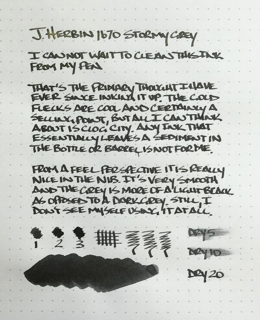
I've only been deep into fountain pens and inks for a few years and I don't recall a product - especially an ink - causing this much noise in our little world. J. Herbin Stormy Grey has taken the internet by storm, proving that we all like shiny and new. Especially shiny.

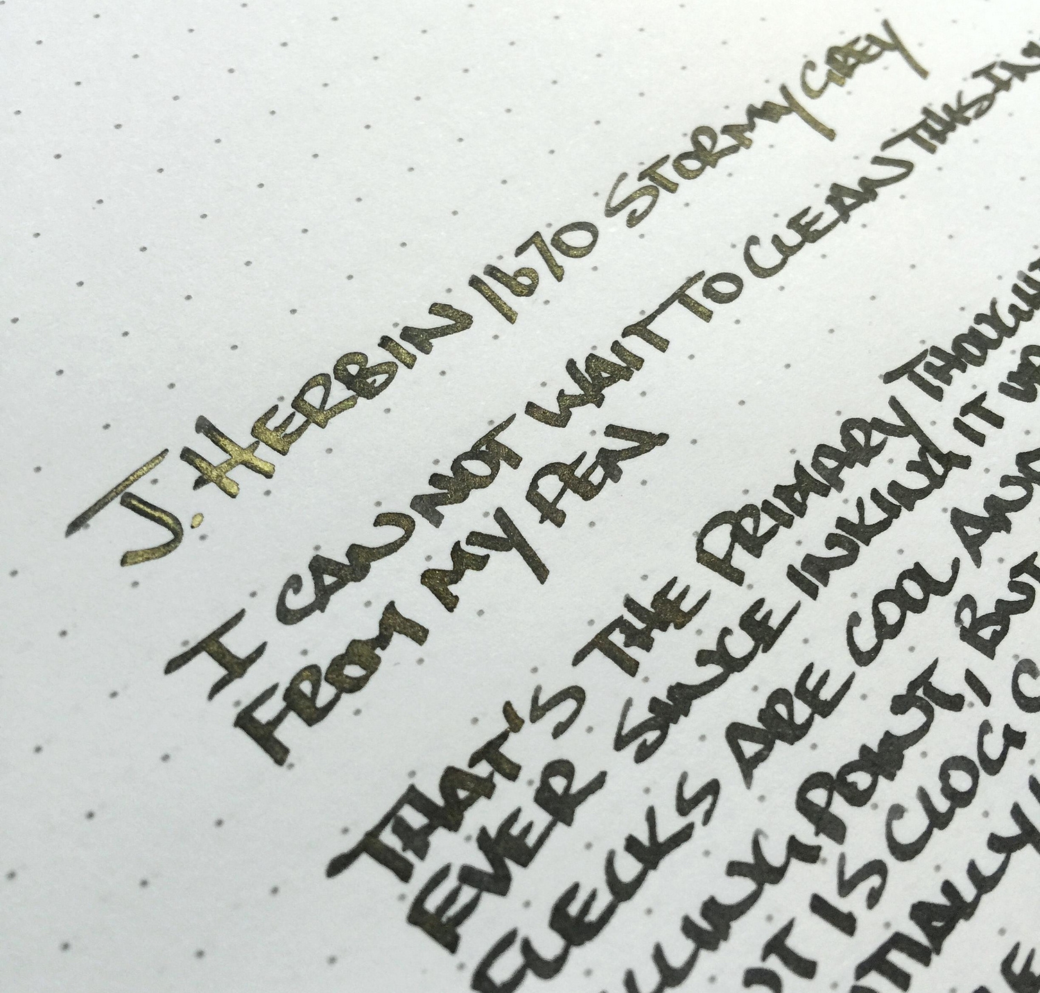
Gold flecks contained within the deep grey ink are the big selling point in J. Herbin's latest anniversary ink release. Rouge Hematite, the first release in the 1670 series, also had a gold feature, but in the form of a sheen, not actual flecks in the ink. That one slight change really sets Stormy Grey apart.

The grey is a beautiful, saturated coal grey, bordering on light black. I had zero flow issues in either my TWSBI 1.5 mm stub nib that this writing sample was done with, or a medium dip pen nib which I used for a few notes. I found the gold flecks to be inconsistent, with a heavy presence on some letters, and a light to no presence on others. This happens when there are actual physical materials that need to be dispersed within the ink.

My biggest issue with Stormy Grey is the additional maintenance required to keep the ink flowing consistently. J. Herbin even has a label warning:

Having these additional things to worry about doesn't fit my usage pattern. I would be very worried to leave this ink loaded for more than a week or two. Plus, the bottle and reservoir shaking that is needed to get even fleck dispersion before use is annoying. Using a dip nib is an option, but that limits portability.

I must be the only one with this issue though, as JetPens can't seem to keep it in stock. There was a short reload right before Christmas that vanished within hours, so if you want to get your hands on this ink be sure to sign up to be notified when inventory becomes available again.

(JetPens provided this product at no charge to The Pen Addict for review purposes.)

Posted on December 26, 2014 and filed under Ink Reviews, J. Herbin.

Sailor Jentle Blue Black Ink Cartridge Review

I am a big fan of bottled inks, as the sagging shelf in my closet will tell you, but there is absolutely a case to be made for fountain pen ink cartridges. What you sacrifice in variety and cost, you make up for in convenience, and sometimes that is a price worth paying.

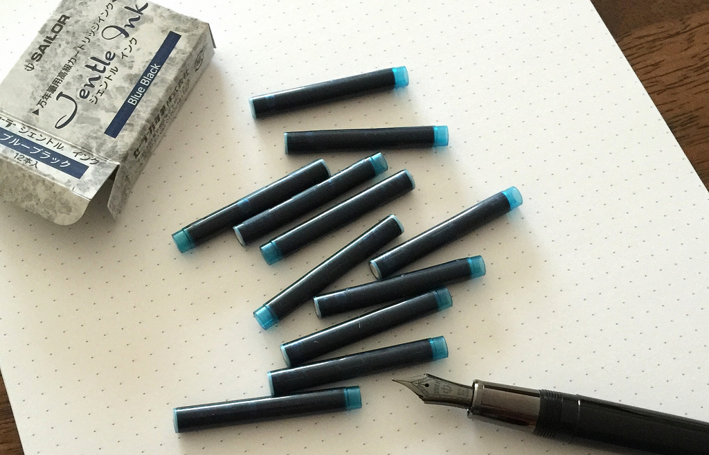
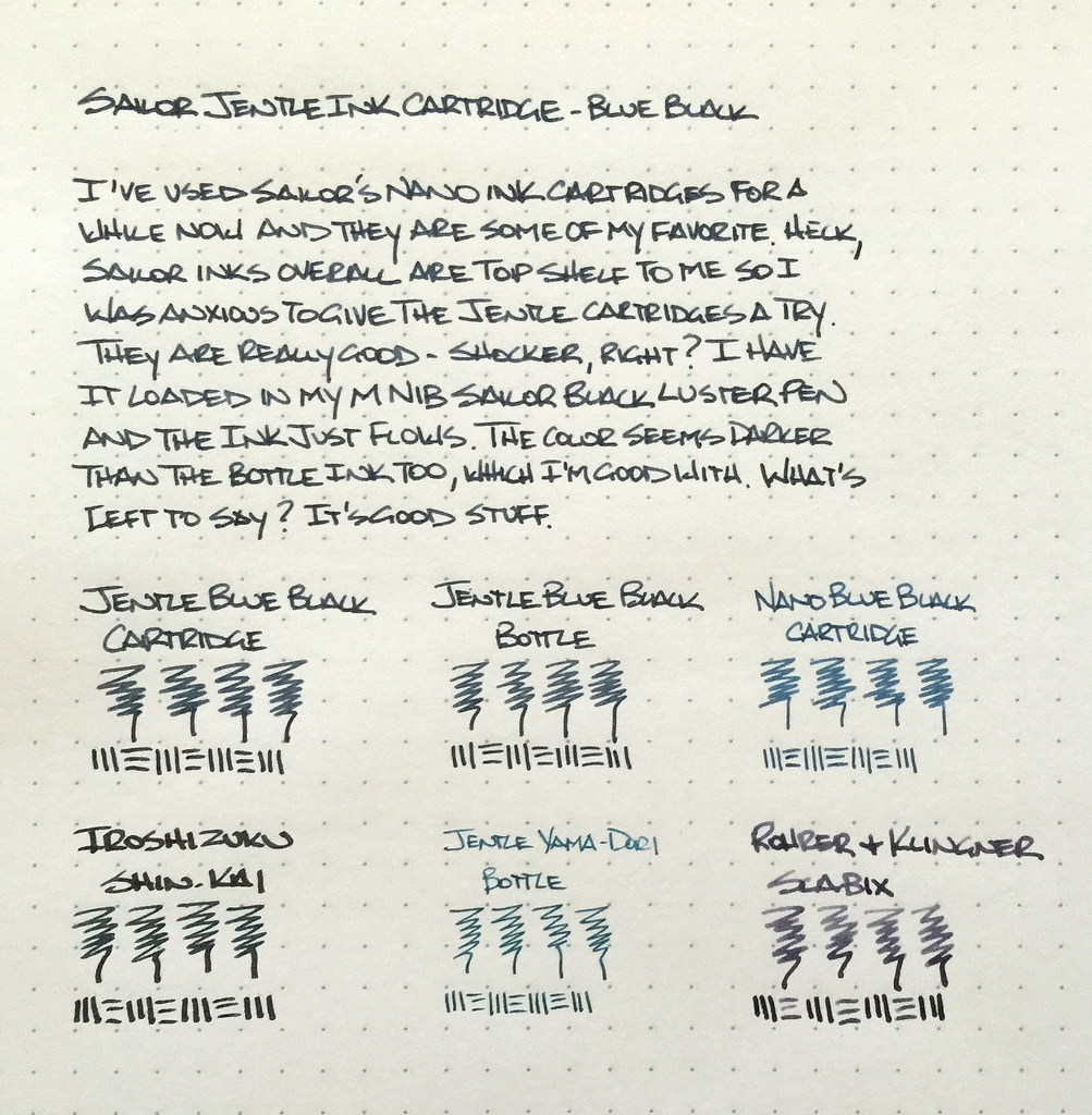
Sailor inks are some of my favorites, including the bottled blue black and both the black and blue black Nano inks in bottled and cartridge form. It was a foregone conclusion that I was going to try out the new Jentle ink cartridges, in blue black of course, and they work wonderfully.

All Sailor inks I have tried are well lubricated and flow smoothly in all nibs and in all nib sizes, and the blue black cartridge is no exception. I popped in into my medium nib Sailor Black Luster and it worked just as expected. The lines were solid and there were no flow issues at all. The only thing I noticed is that the color is slightly darker than the blue black ink from the bottle. This happens from time to time when comparing bottled inks versus the same ink in cartridge form. It's often not a dead-on match.

My only hope is that Sailor expands on this line to include even more colors. Pelikan has done this, adding matching cartridges to their Edelstein ink line, so hopefully this becomes a thing with brands. Yes, it is not as cost effective or environmentally friendly, but if the barrier to entry can be lowered even a tick I think it is worth it.

(JetPens is an advertiser on The Pen Addict and I received this product at no charge.)

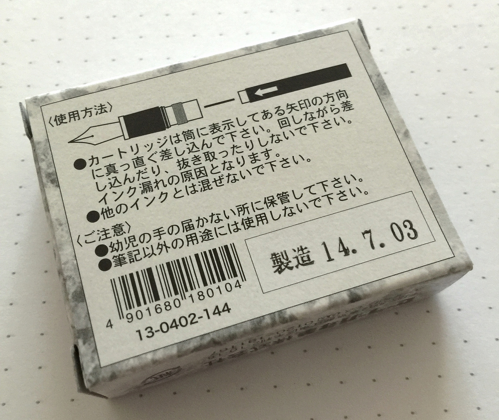
"This end up" and a born on date. My kind of 12-pack.

"This end up" and a born on date. My kind of 12-pack.

Posted on December 8, 2014 and filed under Sailor, Ink Reviews.