Posts filed under Ink Reviews

Kaweco Royal Blue Fountain Pen Ink: A Review

(Susan M. Pigott is a fountain pen collector, pen and paperholic, photographer, and professor. You can find more from Susan on her blog Scribalishess.)

Kaweco Royal Blue is a blue ink that is similar to Waterman's Serenity Blue but exhibits more of a purple hue. It flows nicely from my Pelikan's italic nib and is neither too wet nor too dry. It has no odor to it (some inks do). The blue pops nicely on white paper but is more subdued on cream or other colors of paper.

This ink should be perfectly suitable for correspondence. I would feel comfortable using it in a business setting, but it might have too much purple in it for some tastes.

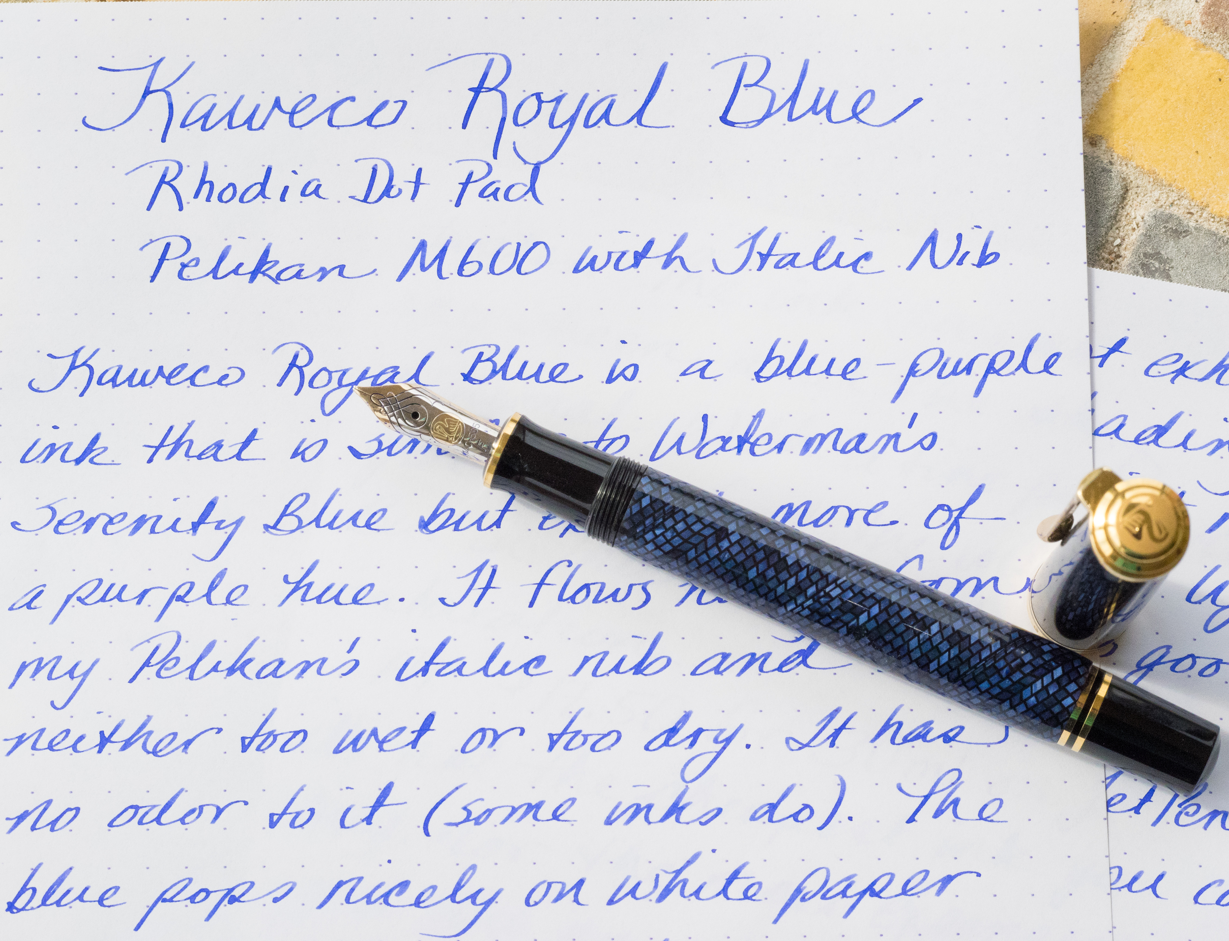
The ink does not exhibit any sheen, and the shading is minimal. With a fine point nib, the ink may be too light, but with wider nibs it has good saturation.

At $17.50 for 30ml on JetPens, this isn't the cheapest ink you can buy or the most expensive. If you like a blue ink with a purple cast to it, then this is a great choice. If, however, you prefer a truer blue or blue-black ink, then I would not recommend Royal Blue.

I prefer inks with a little more character--lots of saturation, shading, sheen, unique colors, etc. So, I doubt Kaweco Royal Blue will be in my regular rotation. But I'm impressed by its good flow and it behaves well.

Pros

  • Good blue-purple color
  • Good flow, not too heavy or dry
  • No distinctive, annoying odor
  • A good choice for a basic blue ink

Cons

  • Does not exhibit sheen or much shading
  • The purplish cast might make this less suitable for business use
  • A little expensive
Fun with lighting!

Fun with lighting!

Posted on March 27, 2015 and filed under Ink Reviews, Kaweco.

Noodler's Nikita Ink Review

(Jeff Abbott is a regular contributor at The Pen Addict. You can find more from Jeff online at Draft Evolution and Twitter.)

There is an endless array of colors out there that you can fill into a fountain pen to bleed out onto the page, but sometimes what you're after is a true, basic color. In the case of a basic, bright red, Noodler's Nikita fits the bill.

I've been using Nikita for quite a while now whenever I want to use a basic red — something you might expect out of a red gel ink pen. It's not fancy, there's hardly any shading, but it's a saturated red that grabs your attention. Sometimes that's just what you want from an ink — the opposite of subdued.

If you're familiar with Noodler's inks, then this one is what I consider an average ink in their line — and that's not a bad thing. Basically, you can expect a nicely saturated, well-behaved ink that just works and cleans out nicely. My main complaint with the ink is the dry time. It takes quite a while to dry in my experience. Other reviews I've found online seem to disagree, so take that with a grain of salt. I'm sure humidity, paper quality, and more factors come into play when drying time is measured. I happen to live in a very humid area (it was 91% earlier today), and that must be part of the cause for slow dry time.

Apart from that, Nikita is a lubricated ink that flows nicely from different pens and nib sizes. I never experienced any skips or hard starts — it's a really low-maintenance ink in all respects.

As far as shading goes, you won't find much of that here. If you use the right nib, you can detect some slight shading in lighter areas of the stroke, but it's subtle. There's a tad bit of feathering on some papers, but I didn't experience this with any of the accepted fountain pen friendly papers.

I'm fairly sure that this ink only comes in a 4.5 oz eye-droppper bottle, so keep that in mind if you want to go for the whole bottle. Those eye dropper bottles are nearly impossible to use for pens that need to be dipped into the ink in order to draw it up into the converter or reservoir. And you also score a free pen with the ink, though I'm pretty sure it's just an unbranded Platinum Preppy that you can use as an eyedropper pen.

20150316-_JLA9589.jpg

I don't know my Russian history well enough (read: at all), but that's where the name for the ink comes from — Nikita Krushchev. I won't embarrass myself by trying to give a history lesson, but his story is pretty interesting.

All in all, this is my go-to ink if I'm looking for a bright red that gets the job done. If I were a grammar teacher, this would be the perfect ink for bleeding all over my students' papers as it performs OK on cheap paper as well.

Thanks to Joe Lebo for sending me a sample of this ink to try out!

You can find the bottles (or samples) of this ink from Goulet Pens.

На здоровье! (Cheers!)

Posted on March 18, 2015 and filed under Ink Reviews, Noodler's.

Parker Penman Sapphire Ink Review

You have heard me talking about grail pens before, but is there such a thing as a grail ink? Lovers of Parker Penman Sapphire would undoubtedly say yes.

What makes this ink so special? For starters, it was only produced from 1993 to 2000. That brings on a rarity other readily available inks do not have. But there is a valid reason why Parker no longer makes it: It damages pens. Sounds wonderful, doesn't it?

Fans of Parker Penman Sapphire don't seem to care that it may stain and clog pens. To them, the vibrant blue color, deep saturation, and amazing sheen are worth the tradeoff. I see all of those things in my sample, which was sent to me by my wonderful ink benefactor in a vial simply marked "PPS". It is a very nice shade of blue, and the sheen is amazing - nearly 100% sheen on some of my letters - but overall I don't see what all the fuss is about. There are so many amazing blue inks currently on the market.

That is part of the chase right now for fans of PPS. When they aren't shelling out $75 or more for a bottle on the secondary market, the hunt is on for the closest match currently being produced. Private Reserve American Blue comes up in my searches as a close comp, as does Diamine Majestic Blue, Noodler's Baystate Blue (with staining and clogging built right in!), and Sailor Bung Box Sapphire. (Comparison shot of the last two and PPS found here.)

For me, I don't get it. It's a fine ink, and the sheen is undeniably cool, but it probably wouldn't crack my top 20 inks if I were to even effort a list like that. And that is only if it was currently available. I certainly don't see paying a premium for it. You won't find a stash of Parker Penman Sapphire hidden under my bed anytime soon.

Posted on March 13, 2015 and filed under Ink Reviews, Parker.