Posts filed under Ink Reviews

Diamine Sargasso Sea Ink Review

(Susan M. Pigott is a fountain pen collector, pen and paperholic, photographer, and professor. You can find more from Susan on her blog Scribalishess.)

Diamine Sargasso Sea is a rich, blue ink named after a region in the Atlantic Ocean. Known as the Northern Atlantic Subtropical Gyre, the region is defined by the ocean currents that surround it rather than by land boundaries. The sea is covered with patches of seaweed called Sargassum. The seaweed is bright orange, but the sea itself is a deep, tropical blue. (Source: National Oceanic and Atmospheric Administration)

This ink is well named. It is a highly saturated blue, evocative of the deep sea at dusk. It flows well, and, as with most Diamine inks, exhibits no negative characteristics. It works well in both wide and fine nibs, though, as always, you will get more shading with wider nibs. I didn't get any bleed through in spite of the ink's rich color.

I've been using this ink in a Pelikan M600 with an italic nib, a Platinum 3776 with a fine nib, and a Conway Stewart with a medium flex nib. I like it in all three pens. It is such a striking color that it's enjoyable to use for journaling, grading, and correspondence.

Because the ink is so saturated, it is difficult to see much shading unless you look closely. My macro lens also revealed some sheen to the ink.

The ink takes some time to dry fully on the Rhodia paper I used for my handwritten review. I've not had any problems with it smudging or being too wet in my Tomoe River journal.

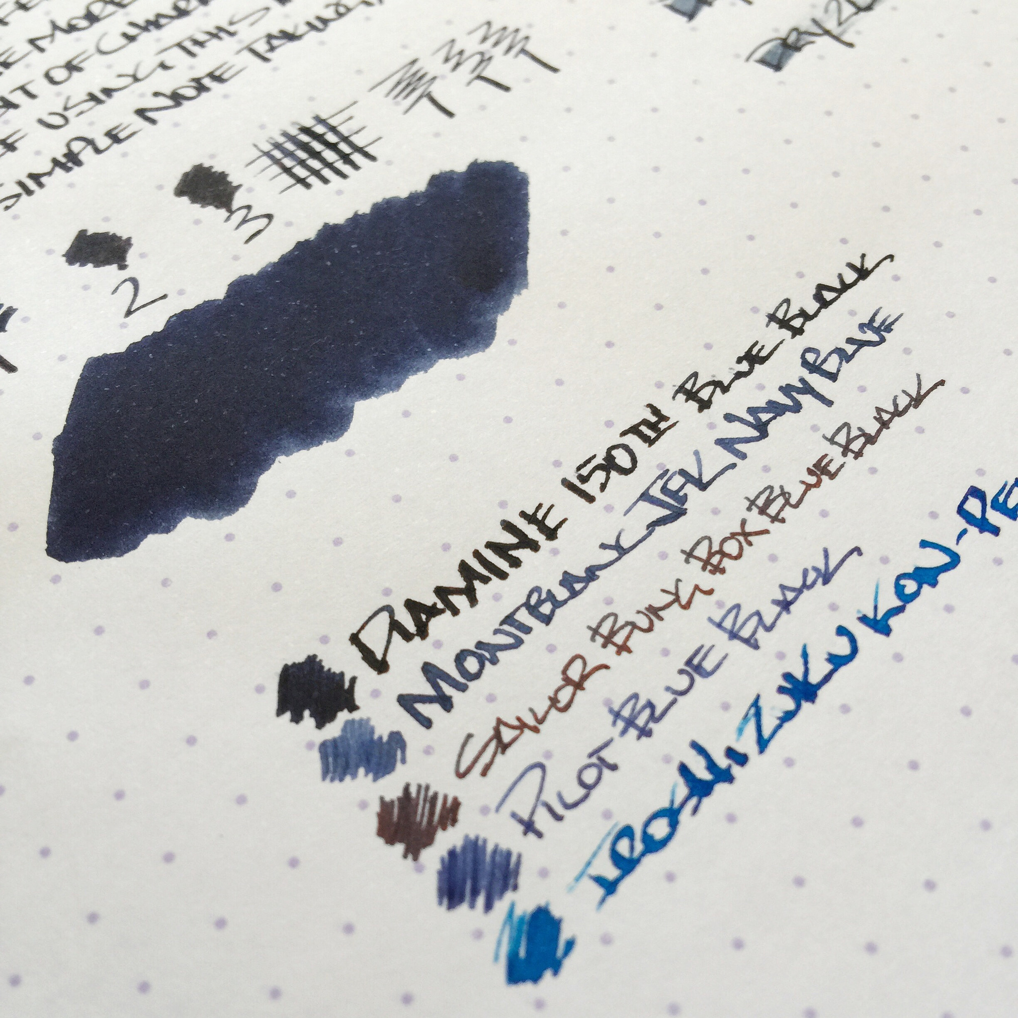
I really love this ink's rich, blue color. I'm usually a fan of blue-black inks, but there's something about Sargasso Sea that delights me. A comparison with other blue inks is below.

You can purchase Diamine Sargasso Sea in two sizes at JetPens: 30ml ($7.00) or 80ml ($14.50).

Posted on April 10, 2015 and filed under Diamine, Ink Reviews.

Diamine 150th Anniversary 1864 Blue Black Ink Review

Image via JetPens.com

Image via JetPens.com

I was excited when Diamine announced their 150th Anniversary inks, especially because I would be able to add a new blue black ink to my ever growing ink inventory. Blue black inks are my favorite of course, and I couldn't wait to see how it stacks up with the rest of my stash.

Diamine inks are some of the most user friendly inks on the market. They flow well in a wide range of nibs and maintenance is a breeze. They offer up a massive range of colors, and are very well respected in a sometimes crowded market. The 150th Anniversary lineup fits in well with their other offerings, albeit a touch more expensive due to the "Limited" tag.

When I first inked it up I was concerned with how dark the ink was, and that feeling did not pass the more I used it. It is very pretty, but very dark with minimal shading. I prefer lighter, or at least more shaded blue blacks. If you like darker blue black you should give this a shot because, as expected, it performs wonderfully.

Like Montblanc Midnight Blue, I inked it up expecting to love it, but it is just average for my tastes. My current Top 5 Blue Black inks would look something like this:

  1. Montblanc JFK
  2. Akkerman #10 Diep-Duinwaterblauw
  3. Pilot Iroshizuku Shin-kai
  4. Sailor Blue Black
  5. Sailor Bung Box Blue Black

I could run another five to seven honorable mentions too, as there are a bunch of great blue black inks on the market. What are your favorites?

(JetPens provided this product at no charge to The Pen Addict for review purposes.)

Posted on March 30, 2015 and filed under Diamine, Ink Reviews.

Kaweco Royal Blue Fountain Pen Ink: A Review

(Susan M. Pigott is a fountain pen collector, pen and paperholic, photographer, and professor. You can find more from Susan on her blog Scribalishess.)

Kaweco Royal Blue is a blue ink that is similar to Waterman's Serenity Blue but exhibits more of a purple hue. It flows nicely from my Pelikan's italic nib and is neither too wet nor too dry. It has no odor to it (some inks do). The blue pops nicely on white paper but is more subdued on cream or other colors of paper.

This ink should be perfectly suitable for correspondence. I would feel comfortable using it in a business setting, but it might have too much purple in it for some tastes.

The ink does not exhibit any sheen, and the shading is minimal. With a fine point nib, the ink may be too light, but with wider nibs it has good saturation.

At $17.50 for 30ml on JetPens, this isn't the cheapest ink you can buy or the most expensive. If you like a blue ink with a purple cast to it, then this is a great choice. If, however, you prefer a truer blue or blue-black ink, then I would not recommend Royal Blue.

I prefer inks with a little more character--lots of saturation, shading, sheen, unique colors, etc. So, I doubt Kaweco Royal Blue will be in my regular rotation. But I'm impressed by its good flow and it behaves well.

Pros

  • Good blue-purple color
  • Good flow, not too heavy or dry
  • No distinctive, annoying odor
  • A good choice for a basic blue ink

Cons

  • Does not exhibit sheen or much shading
  • The purplish cast might make this less suitable for business use
  • A little expensive
Fun with lighting!

Fun with lighting!

Posted on March 27, 2015 and filed under Ink Reviews, Kaweco.