Posts filed under Ink Reviews

Montblanc Toffee Brown Ink Review

(Susan M. Pigott is a fountain pen collector, pen and paperholic, photographer, and professor. You can find more from Susan on her blog Scribalishess.)

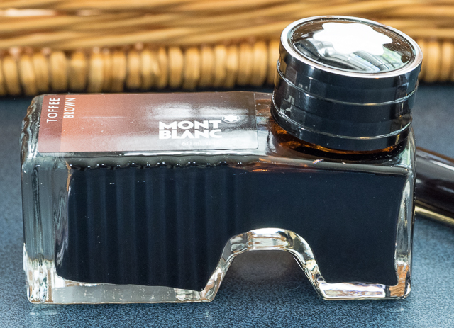
Montblanc Toffee Brown is a gorgeous brown ink with lots of character. It comes in a hefty Montblanc bottle with the MB star on the cap.

Some describe the bottle as a shoe shape. I honestly don't see a shoe–if it is a shoe, it's a clunky one. I just assumed that the shape was practical: you have a smaller reservoir when the ink runs low. But that will take a while. This bottle holds 60ml of ink.

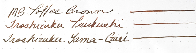
The ink flows well, has no detectable odor, and no negative qualities that I could find. When compared with my two other brown inks (Iroshizuku Yama-guri and Tsukushi), Toffee had shades of green and pink in it. Yama-guri is more of a black-brown, and Tsukushi is a reddish-brown. Toffee is what I would call a golden-brown, though it does have pink/red tones.

Montblanc Toffee is now the standard ink for my M800 Tortoise with its triple broad oblique nib. Oh. My. Gosh. Just look at that shading! It has gradations from dark brown to toffee (thus the name).

The ink is not waterproof. Its dry times depend on the width of your nib, but the ink seems to be pretty wet. With this kind of shading, though, I don't mind waiting for the ink to dry.

I never thought I'd be a "brown ink person" (I gravitate towards blues). But I also tend to be a little OCD about inks matching my pens and vice versa. So, for my brown pens, I use brown inks. Toffee Brown has replaced the Iroshizukus at least for my broad nib. The color and shading are simply outstanding. But for my finer nibs, I still like Yama-guri and Tsukushi. I guess I just need to buy more brown pens!

Posted on June 5, 2015 and filed under Ink Reviews, Montblanc.

Callifolio Baikal Ink Review

One of the benefits of attending a pen show is seeing new products in person for the first time. I had never heard of Callifolio ink prior to seeing Lisa Vanness from Vanness Pens at the Atlanta show. She came up to me with two sheets of ink swabs and said "pick one!" I must have stared at those sheets for about 10 minutes - talk about an impossible task!

Callifolio ink comes from L'Artisan Pastellier and chemist Didier Boinnard, who specializes in using natural pigments in creating their lineup of products. And what a lineup it is.

When Lisa laid out the swab samples in front of me two things stood out: One, there were no eye-searing bright colors, and two, there were an enormous number of blues. Since blues are kind of my thing I went that route with the sample bottle that Lisa gave me. After much hemming and hawing, Baikal came home with me, and I must say it was an excellent choice.

Named, assumedly, for Lake Baikal in Russia, the blue in this ink is hard to pin a description on. I wanted to call it a dusty blue at first, but it's a little darker than what I consider dusty. Denim is likely a better term, but hints of purple peek through from time to time. What stuck with me the most is the mix ink I call Scabix (seen in this review), which is a 1:1 mix of Rohrer & Klingner Scabiosa and Salix. Scabix is more purple, but the feel of the color is right, and very complimentary.

Mixing inks is worth mentioning here because Callifolio inks are able to be mixed at will. These non-toxic and non-corrosive inks are made to be tame and work with all types of pens. They aren't waterproof or permanent because of this, but that makes them easy to use and clean.

Callifolio is available to be purchase in either 40 ml triangular bottle (same as Diamine 150th) for $11 or in 50 ml pouches for $8 that you can use to refill your own ink bottle. And by your own ink bottle, I mean like the fancy Nock Co. logo bottle that Lisa made for me and Jeff, seen below. These prices make testing out Callifolio a no-brainer, and a worthwhile addition to your ink stash.

My thanks to Lisa and Vanness Pens for providing these goods at no charge for review purposes.

Posted on May 26, 2015 and filed under Ink Reviews, Callifolio.

Diamine Tyrian Purple Ink Review

(Susan M. Pigott is a fountain pen collector, pen and paperholic, photographer, and professor. You can find more from Susan on her blog Scribalishess.)

Tyrian Purple is named after a reddish-purple dye made in Tyre, Phoenicia, from sea snails. Huge numbers of snails were collected and boiled in lead vats. The smell, apparently, was quite memorable. The dye was meant to mimic clotted blood, and it was restricted to the rich, because of its limited availability. (Source: The New York Times; see also Wikipedia).

Diamine's version certainly evokes the ancient color with both red and purple tones. It reminds me a little of Noodler's Black Swan in Australian Roses (original formulation), though that ink has more shading. Nevertheless, Diamine's color exhibits good shading with a flex or broad nib. With a finer nib, you won't notice the shading at all.

The ink flows well, has no distinctive odor, and dries relatively quickly depending on the paper. On the Rhodia dot pad, it takes a bit more time to dry than on more absorbent paper.

This is not a highly saturated, deep purple. It leans more toward magenta. But it is beautiful, and if you want a purple that looks more like wine than grape juice, Tyrian Purple is a good choice. If you prefer a purer purple color, Diamine Imperial Purple might suit you better.

A comparison of several purple inks is below. Unfortunately, I sold my bottle of Black Swan in Australian Roses, so I couldn't include it in the comparison.

Tyrian Purple will work well for journaling and personal correspondence. I wouldn't use it in a business setting, though for grading papers it would be a happy medium between red and purple.

You can purchase Diamine Tyrian Purple at JetPens for $14.50 (80ml).

Posted on May 15, 2015 and filed under Diamine, Ink Reviews.