Posts filed under Ink Reviews

KWZ Gummiberry Iron Gall Ink Review

I’m a fan of Iron gall inks, especially the more modern varieties like this KWZ Gummiberry from Vanness Pens. Iron gall inks can be intimidating if you are unfamiliar with them, but the way companies manufacture ink these days helps keep your pens safer as long as good fountain pen hygeine is used.

KWZ is a brand I have heard of in passing over the last few years. Made in Poland by Konrad Żurawski, the inks are made in small batches. This allows for experimentation with a wide range of colors that I personally haven’t seen before, especially in the iron gall realm.

Lisa Vanness asked me which color of the lineup I wanted to sample, and Gummiberry jumped off the page at me. I have enough blue and blue black inks to last a lifetime, and I’m a fan of Rohrer & Klingner Scabiosa, so I figured I’d see how another purple iron gall ink would compare.

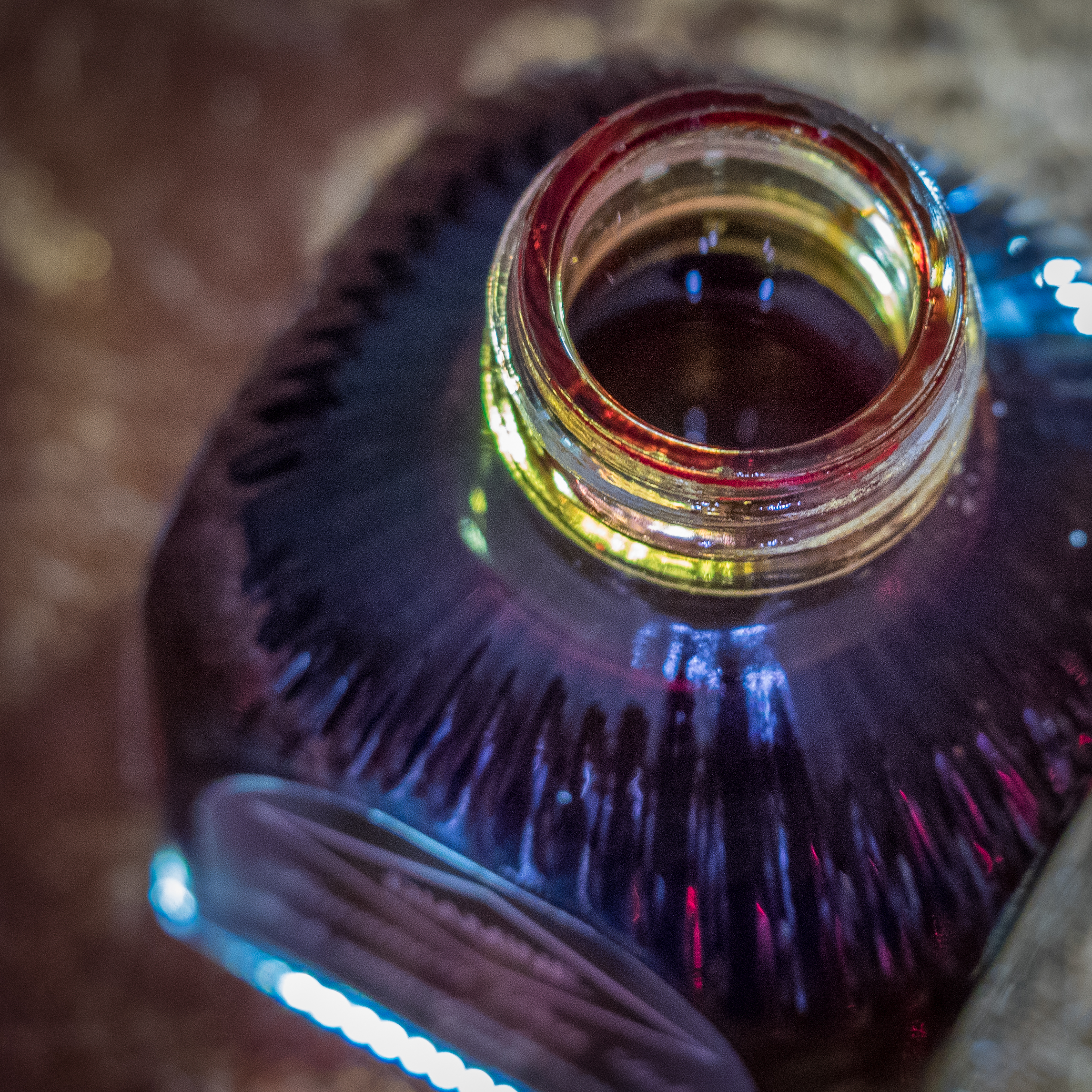
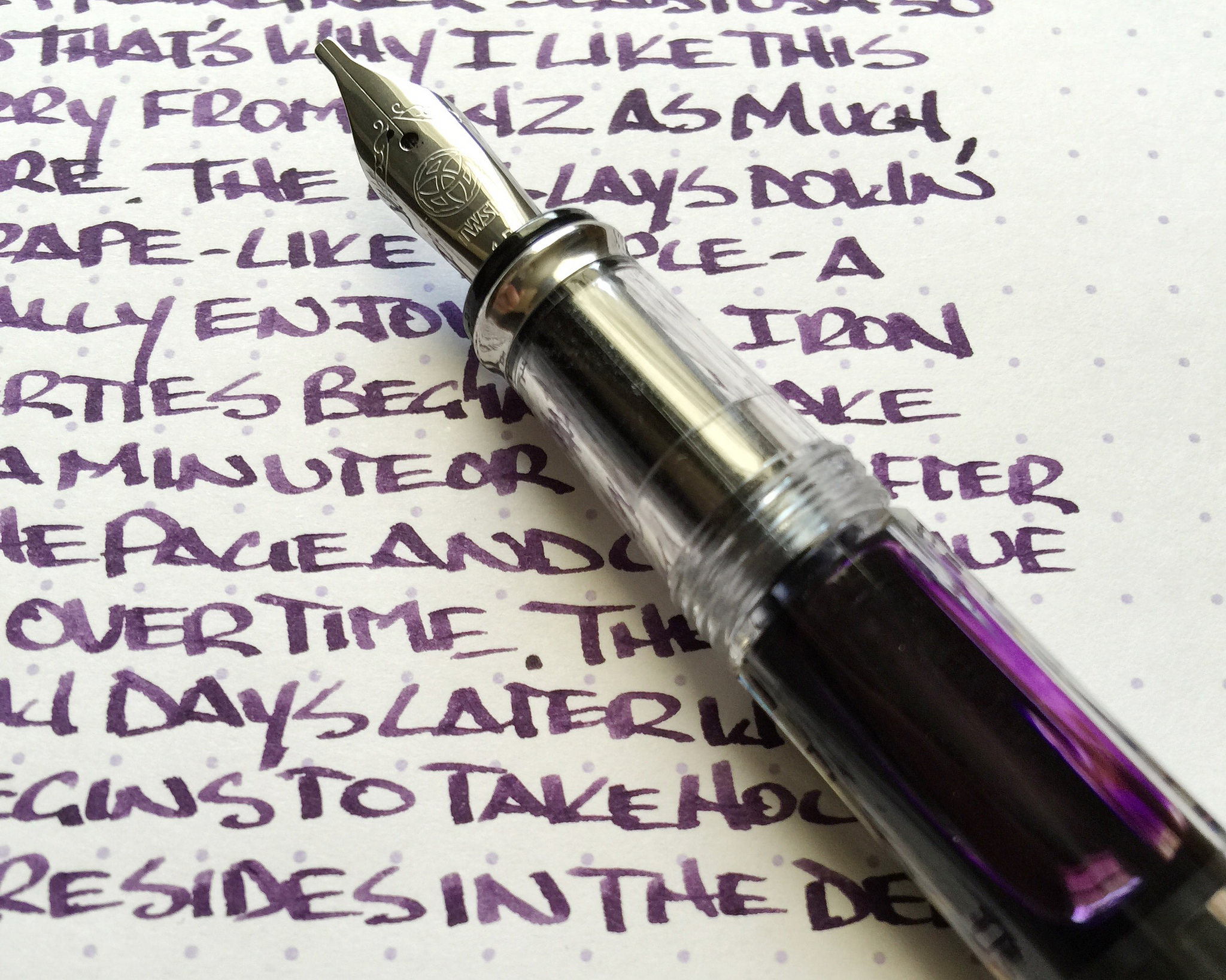
Gummiberry is a grape-colored purple. It hits the page similar in color to the juice found in a grape jelly jar and dries into a color as deep as the deepest recesses of the jelly itself. From a distance, the aged color is nearly black, but a closer look shows that the deep purple color is retained. It has a wonderful look on the page.

Iron gall inks are generally quick drying, and this one is no exception. Even on slick Rhodia paper there was little smudging after 10 seconds, which puts it ahead of most standard inks. The ink is also waterproof, forming a bond with the paper after drying that is not able to be washed out. This is why iron gall inks were the historical standard for important documents and signatures.

As much of a fan of iron gall inks as I am, I am concious that without proper pen maintenance and cleaning I could be opening up myself to problems in my pens down the line. As I mentioned earlier, most iron gall inks these days are tamer than their predacessors and I have no problem keeping them inked in my modern pens for weeks, if not months, at a time. KWZ has an excellent page set up for fountain pens and iron gall ink maintenance that you should read prior to getting into these great inks.

I’m anxious to try more of what KWZ is offering, if nothing else for the colors offered (turquoise iron gall anyone?) My thanks to Vanness Pens for sending me this ink at no charge for review purposes. I’m hooked, and will definitely be purchasing more at the DC Pen Show next month.

Posted on July 13, 2015 and filed under Ink Reviews, Iron Gall, KWZ.

Sailor Bung Box Hatsukoi "First Love" Sapphire Ink Review

(Susan M. Pigott is a fountain pen collector, pen and paperholic, photographer, and professor. You can find more from Susan on her blog Scribalishess.)

I can't remember where I first saw a photograph of Bung Box Sapphire–Twitter or Instagram or a Web site–but I immediately fell in love with it, apparently a common experience with this ink. The minute I got the email from Vanness Pens that a box had arrived I ordered some. It's a good thing, too, since their entire stock of Sapphire sold out the same day.

A little history about Bung Box Sapphire: apparently, the owner of the Bung Box store fell in love with Parker Penman Sapphire, so she tried to recreate the color. She called it Hatsukoi, which means "first love" (Bung Box Facebook Page), since that is the emotion the color evoked in her. I think most fountain pen lovers can relate to this experience, whether we fall in love with a particular ink color or a specific pen (or several).

An insert included with the ink tells the story of its name

An insert included with the ink tells the story of its name

The Bung Box Sapphire ink bottle is a work of art. Compared to the usual Sailor Jentle ink bottles, these glass bottles are like miniature vases or containers for fancy perfume. I know I won't throw mine away when I've used up all the ink.

One of the best characteristics of Bung Box Sapphire is its excellent shading. As always with inks like this, the shading is most visible with wider nibs. I used my widest nibs (Pilot Parallel 2.4 and 1.5), my Nakaya music nib, an italic, a couple of flex nibs, and one fine nib to write samples.

The shading is fabulous, ranging from deep blue to a lighter, almost turquoise blue. If you look closely, you can even see shading with the fine nib.

Although the ink sparkles, I only detected sheen in my splash samples not in my writing samples. You can see a bit of magenta along the edges.

I compared Bung Box Sapphire with some of my other blue inks. All of them have distinctive characteristics. I would say Sapphire and Asa-Gao are the closest in terms of chromatography. Both have a little bit of magenta in them. But I think Bung Box Sapphire stands out (along with Akkerman Shocking Blue) as the most vivid color.

Bung Box Sapphire is an exquisite ink. It flows well and its dry times are in the normal range, at least with a fine nib on a Rhodia dot pad. With wider nibs, the dry time is longer. The ink is not waterproof.

One thing I've noticed about all my Sailor inks is that they have a distinctive odor. Apparently, they contain the chemical phenol to prevent mold or other contaminants from growing. In his glossary, Richard Binder says, "Phenol is an effective fungicide, acting as a protoplasmic poison, and was used for this purpose in ink until prohibited by law. (It is also toxic to forms of life other than fungi and is regulated as a Class B poison.) Phenol has a sweet, tar-like odor that is readily detected in inks containing it." I need to do more research on this ingredient as it can be rather caustic. I wonder if it can damage vintage pens, especially celluloid ones? Just in case, I'm not planning on using Sailor inks in any of my celluloid pens until I know more.

Sailor Bung Box Hatsukoi Sapphire is a unique, vibrant blue with excellent shading and some sheen. You can purchase this ink at Vanness Pens for $35.65 plus shipping, but only if you're really fast and lucky.

Posted on June 26, 2015 and filed under Bung Box, Ink Reviews, Sailor.

Diamine Autumn Oak Ink Review

(Susan M. Pigott is a fountain pen collector, pen and paperholic, photographer, and professor. You can find more from Susan on her blog Scribalishess.)

It's June in Texas, so I feel rather strange writing about an autumn-colored ink. But, today it's also overcast and rainy thanks to a tropical storm, so it seems fallish out there, despite the temperatures. Let's all pretend it's October!

Diamine Autumn Oak is aptly named. The color looks like the leaves at Lost Maples State Park, a place we visit every November.

The ink is a beautiful orange with stunning shading properties, ranging from a dark orange with hints of brown to a light orange, just like leaves.

I compared Autumn Oak with my other two orange inks, Pelikan Edelstein Amber and Iroshizuku Yu-Yake.

Amber also exhibits good shading, but it is more yellow in tone than Autumn Oak and doesn't have the range of colors. Yu-Yake is a flat orange and exhibits hardly any shading (I always crave an orange lollipop when I use Yu-Yake).

Chromatography indicates that Yu-Yake contains yellow, orange, and a slight amount of pink. Amber contains primarily yellow. Autumn Oak contains orange, yellow, and a good amount of pink (which is probably what gives it the gorgeous brown tones).

Autumn Oak, like other Diamine inks, has no odor. It flows well in all the pens I used. It shows little water resistance, and dry times depend on the size and wetness of your nib.

One concern I have about Autumn Oak is that it seems to darken after a day or two in a pen. Perhaps this is due to cross contamination between inks (i.e. my pen had some old ink in the feed and it mixed with the Autumn Oak) or maybe the ink darkens when it sits in a pen for a while.

In this photo, Autumn Oak looks much more brown than orange after a day or two in my pen

In this photo, Autumn Oak looks much more brown than orange after a day or two in my pen

After I experienced the color shift the first time, I thoroughly cleaned out my pens (water, pen flush, more water) and refilled with Autumn Oak. Even after the cleaning, I noted a slight amount of darkening. I wonder if anyone else has experienced this with Diamine Autumn Oak?

But in this photo the darkening is less noticeable

But in this photo the darkening is less noticeable

Regardless, this ink is a keeper. The shading alone makes it one of my favorite inks. Now I must have a Pilot Vanishing Point in orange just for this ink. I love it when an ink color requires a pen purchase, don't you?

I'm not the only one impressed by this ink (many reviews are available). I shipped a pen to Canada and used Autumn Oak to address the package. The recipient was happy to receive her new pen, but she wrote to me just to ask, "What was that ink you used?" If ink on an address label impresses someone, you know you have a winner!

Posted on June 19, 2015 and filed under Diamine, Ink Reviews.