Posts filed under Ink Reviews

Montblanc Blue Hour Ink Review

Twilight at Caprock Canyons, Texas

Twilight at Caprock Canyons, Texas

(Susan M. Pigott is a fountain pen collector, pen and paperholic, photographer, and professor. You can find more from Susan on her blog Scribalishess.)

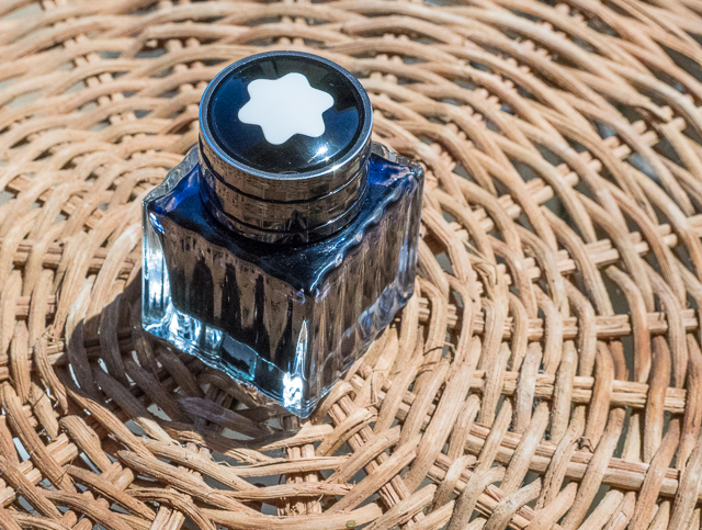
Montblanc "Blue Hour" or "Twilight" is "linked to the 'blue hour,' the time when the day turns to night," according to Montblanc's website. The ink comes in a 30ml square glass bottle adorned with the Montblanc emblem on the cap. It is a limited edition ink.

When I first saw a sample of this ink, I couldn't wait to purchase a bottle. It looked lovely with deep blue-green tones, sheen, and shading. I love blue inks, and I expected great things from Montblanc Blue Hour.

But when I inked my first pen with Blue Hour, I was disappointed. The ink didn't have the depth I was expecting. Where was the sheen? Where was the shading? And, worst of all, after I wrote a few pages and the ink dried, it faded to a sort of dusty bluish-green. You can see in the picture below how the ink is deep blue when it's fresh and dusty blue-green when it has dried.

I tried it in several different pens with various nib sizes and grew more disappointed. Broad nibs bring out the shading, but the ink was dry and unsaturated in my finer nibs.

The only way I was able to get sheen from the ink was in droplets. None of my writing samples, even with my super broad, flexible music nib, exhibited any sheen.

Chromatography demonstrates that the ink has blue, green, and yellow tones. I expected it to be more of a blue-black, but it leans more towards teal.

Blue Hour is not a wet, highly-saturated ink. When you do a smear test, it dries quickly. Obviously, the dry times will be longer with broader nibs, but not by much. The ink is not waterproof.

When I first used Blue Hour, I thought it resembled Iroshizuku Tsuki-Yo. The two inks look similar, but Tsuki-Yo has more green and the color definitely doesn't fade. Tsuki-Yo also flows better, especially in fine nibs.

I'm glad Blue Hour came in the smaller 30ml bottle, because this is not an ink I will use much. After falling in love with Montblanc Toffee, I genuinely thought this would be a terrific ink. But it is dry; it fades, and it simply fails to impress.

Posted on August 7, 2015 and filed under Ink Reviews, Montblanc.

KWZ Gummiberry Iron Gall Ink Review

I’m a fan of Iron gall inks, especially the more modern varieties like this KWZ Gummiberry from Vanness Pens. Iron gall inks can be intimidating if you are unfamiliar with them, but the way companies manufacture ink these days helps keep your pens safer as long as good fountain pen hygeine is used.

KWZ is a brand I have heard of in passing over the last few years. Made in Poland by Konrad Żurawski, the inks are made in small batches. This allows for experimentation with a wide range of colors that I personally haven’t seen before, especially in the iron gall realm.

Lisa Vanness asked me which color of the lineup I wanted to sample, and Gummiberry jumped off the page at me. I have enough blue and blue black inks to last a lifetime, and I’m a fan of Rohrer & Klingner Scabiosa, so I figured I’d see how another purple iron gall ink would compare.

Gummiberry is a grape-colored purple. It hits the page similar in color to the juice found in a grape jelly jar and dries into a color as deep as the deepest recesses of the jelly itself. From a distance, the aged color is nearly black, but a closer look shows that the deep purple color is retained. It has a wonderful look on the page.

Iron gall inks are generally quick drying, and this one is no exception. Even on slick Rhodia paper there was little smudging after 10 seconds, which puts it ahead of most standard inks. The ink is also waterproof, forming a bond with the paper after drying that is not able to be washed out. This is why iron gall inks were the historical standard for important documents and signatures.

As much of a fan of iron gall inks as I am, I am concious that without proper pen maintenance and cleaning I could be opening up myself to problems in my pens down the line. As I mentioned earlier, most iron gall inks these days are tamer than their predacessors and I have no problem keeping them inked in my modern pens for weeks, if not months, at a time. KWZ has an excellent page set up for fountain pens and iron gall ink maintenance that you should read prior to getting into these great inks.

I’m anxious to try more of what KWZ is offering, if nothing else for the colors offered (turquoise iron gall anyone?) My thanks to Vanness Pens for sending me this ink at no charge for review purposes. I’m hooked, and will definitely be purchasing more at the DC Pen Show next month.

Posted on July 13, 2015 and filed under Ink Reviews, Iron Gall, KWZ.

Sailor Bung Box Hatsukoi "First Love" Sapphire Ink Review

(Susan M. Pigott is a fountain pen collector, pen and paperholic, photographer, and professor. You can find more from Susan on her blog Scribalishess.)

I can't remember where I first saw a photograph of Bung Box Sapphire–Twitter or Instagram or a Web site–but I immediately fell in love with it, apparently a common experience with this ink. The minute I got the email from Vanness Pens that a box had arrived I ordered some. It's a good thing, too, since their entire stock of Sapphire sold out the same day.

A little history about Bung Box Sapphire: apparently, the owner of the Bung Box store fell in love with Parker Penman Sapphire, so she tried to recreate the color. She called it Hatsukoi, which means "first love" (Bung Box Facebook Page), since that is the emotion the color evoked in her. I think most fountain pen lovers can relate to this experience, whether we fall in love with a particular ink color or a specific pen (or several).

An insert included with the ink tells the story of its name

An insert included with the ink tells the story of its name

The Bung Box Sapphire ink bottle is a work of art. Compared to the usual Sailor Jentle ink bottles, these glass bottles are like miniature vases or containers for fancy perfume. I know I won't throw mine away when I've used up all the ink.

One of the best characteristics of Bung Box Sapphire is its excellent shading. As always with inks like this, the shading is most visible with wider nibs. I used my widest nibs (Pilot Parallel 2.4 and 1.5), my Nakaya music nib, an italic, a couple of flex nibs, and one fine nib to write samples.

The shading is fabulous, ranging from deep blue to a lighter, almost turquoise blue. If you look closely, you can even see shading with the fine nib.

Although the ink sparkles, I only detected sheen in my splash samples not in my writing samples. You can see a bit of magenta along the edges.

I compared Bung Box Sapphire with some of my other blue inks. All of them have distinctive characteristics. I would say Sapphire and Asa-Gao are the closest in terms of chromatography. Both have a little bit of magenta in them. But I think Bung Box Sapphire stands out (along with Akkerman Shocking Blue) as the most vivid color.

Bung Box Sapphire is an exquisite ink. It flows well and its dry times are in the normal range, at least with a fine nib on a Rhodia dot pad. With wider nibs, the dry time is longer. The ink is not waterproof.

One thing I've noticed about all my Sailor inks is that they have a distinctive odor. Apparently, they contain the chemical phenol to prevent mold or other contaminants from growing. In his glossary, Richard Binder says, "Phenol is an effective fungicide, acting as a protoplasmic poison, and was used for this purpose in ink until prohibited by law. (It is also toxic to forms of life other than fungi and is regulated as a Class B poison.) Phenol has a sweet, tar-like odor that is readily detected in inks containing it." I need to do more research on this ingredient as it can be rather caustic. I wonder if it can damage vintage pens, especially celluloid ones? Just in case, I'm not planning on using Sailor inks in any of my celluloid pens until I know more.

Sailor Bung Box Hatsukoi Sapphire is a unique, vibrant blue with excellent shading and some sheen. You can purchase this ink at Vanness Pens for $35.65 plus shipping, but only if you're really fast and lucky.

Posted on June 26, 2015 and filed under Bung Box, Ink Reviews, Sailor.