Posts filed under Ink Reviews

Sailor Pen and Message Cigar Ink Review

(This is a guest post by Felix Jen. Felix is a fountain pen and ink enthusiast. You can find him at his blog, Inks and Pens, or at his Instagram.)

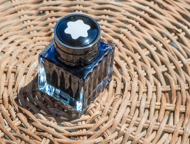
Sailor, the Japanese pen and ink manufacturer, has gotten themselves quite a reputation with their hard-to-find store-exclusive inks such as Bungbox Sapphire and Pen-and-Message inks. Sailor's Pen and Message Cigar is a brown ink with a great depth of color and a very subtle color change.

When I was first sent a sample of this ink, I didn't really know what to think about it. It seemed like a murky green in the vial that looked a bit unappealing, but once I filled a pen up with it, my opinion totally changed. The ink lays does lay down as a shade of dark green and quickly changes to a brown color as it dries. I was completely shocked as there aren't many inks that change colors so quickly.

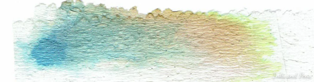
The ink is a deep brown with some definite green undertones as well as a light blue tint. This is actually one of the nicer browns with a great deal of depth to it, unlike some inks in the color range.

A paper chromatography test of this ink confirms the presence of green and blue. The chromatography is actually all over the place, with yellow, orange, blue, green, and brown!

This review was written in a Pilot Parallel 1.5mm on HP 32lb Premium Choice Laser.

On paper, the ink behaves wonderfully. There is not a bit of feathering or bleed-through, even on the extremely wet parts of the page. There is a little bit of show-through but nothing too major. With thinner papers like Tomoe River, you can clearly see what is written on the reverse side. The ink cleans out easily from converters and does not stain, unlike some Noodler's inks.

Shading is not this ink's strong point. The ink barely has any shading, from a light brown to a darker blackish color. The dry time is a bit long, averaging at around 20 seconds on this paper and 19 seconds on Rhodia. When using finer nibs, the dry time is significantly reduced, to around 13 seconds with an Medium.

This ink's water test is also an enigma. The test was done with drops of water placed on the page for about 20 seconds then wiped away with a tissue. Strangely, much of the brown in the ink washes away but leaves a water-resistant blue-gray portion. The lines can still clearly be seen and there is barely any smearing of the brown.

Sailor Pen and Message Cigar is truly a one-of-a-kind ink with a beautiful color and outstanding behavior. You can find this ink directly from Pen and Message for 2160¥ in a 50mL bottle. They are out of stock at the time of this writing, but will be accepting "preorders" in August 2015.

Posted on August 27, 2015 and filed under Guest Post, Ink Reviews, Sailor.

Callifolio Bosphore Ink Review

(Jeff Abbott is a regular contributor at The Pen Addict. You can find more from Jeff online at Draft Evolution and Twitter.)

The more inks I try, the more I like the ones that don't necessarily commit to a single color. Blue inks with shades of green, purple, or gray. Purple inks with hints of gold, teal inks with red sheen, etc. These are the truly interesting inks because they exhibit depth. Sure, I do love some Kon-peki because the blue just pops off the page, but other times I want something that keeps me guessing.

Callifolio Bosphore is a perfect example of that description. I'm still not sure what color this ink really is, but it's a very interesting ink regardless. When I first look at the ink, I think it's purple. But as I keep looking, I change my mind to blue with some purple undertones. And then, wait — was that a patch of green I saw? I don't know anymore. Oh, now it's blue again! I don't mean this in a bad way at all — it's absolutely positive characteristic of the ink.

Let's back up a bit. L'Artisan Pastellier's Callifolio inks are all made by a single individual in Southern France. Brad wrote about one of them recently, and made the same remark: you won't find a lot of bright, poppy colors in the line-up.

These inks are apparently very easy to mix together, so keep that in mind if that's something you're interested in. The ink is also extremely well-behaved, but I'll get into that in a bit.

BYOG (bring your own glass)

Let's start with the container. This is unlike any ink container you've ever seen. It's a flexible pouch with a screw top. Really, it feels and acts like a sturdy Capri-Sun. This is very interesting because the opening on top isn't big enough to fit a pen into, and I'm pretty sure that's intentional. This ink container is meant to be emptied into a more proper container, like a spare glass bottle you may have. In my case, I didn't have a spare container, so I just used a syringe to get out a bit of ink for testing. I'm still amazed by how small the container looks next to a 50 ml glass bottle of ink.

The 50 ml pouch of ink runs around $8, while a 40 ml glass bottle is $11. You get a nice savings from opting out of the glass bottle, but that just keep in mind that you'll want something to transfer this ink to if you get the larger pouch option.

Ink characteristics

This is an extremely well-behaved ink. Even though it feels dry in the Monteverde, which usually feels a bit more wet with most inks, it never skips a beat or has flow issues. I wish the ink was a tad more lubricated, but it's not a major complaint. Once I'm writing, I don't notice it, but it is fair to note since this pen is typically a wet writer. Strangely enough, writing with a Japanese F nib didn't yield bad results either. Really, the ink is lubricated just enough to provide a nice level of feedback between the page and the nib tip.

Again, the color of this ink is interesting. I'm going to stick with calling it a dusty purple, but it's so much more. Purple, blue, gray, and even a hint of green sometimes are some of the colors you can expect to see regularly. It's these types of color mixes that keep me very interested in an ink.

The ink dries fairly quickly on thick paper — just under 10 seconds before most smudging isn't a problem. Probably not quick enough for some lefties, but not bad either.

This ink shades pretty easily, but it maintains the main color profile throughout. This isn't an ink that is blue through the main strikes and green through the light strokes. You just get darker and lighter shades of the mysterious dusty purple. Don't get me wrong, this is nice — just trying to accurately describe the behavior with words.

Wrap up

For the price, you should definitely check it out if this type of color is in your area of interest. This is a solid ink that will work well in any pen, and it's unlike anything you can buy from any of the large manufacturers.

((Vanness Pens provided this product at no charge to The Pen Addict for review purposes.)

Posted on August 12, 2015 and filed under Callifolio, Ink Reviews.

Montblanc Blue Hour Ink Review

Twilight at Caprock Canyons, Texas

Twilight at Caprock Canyons, Texas

(Susan M. Pigott is a fountain pen collector, pen and paperholic, photographer, and professor. You can find more from Susan on her blog Scribalishess.)

Montblanc "Blue Hour" or "Twilight" is "linked to the 'blue hour,' the time when the day turns to night," according to Montblanc's website. The ink comes in a 30ml square glass bottle adorned with the Montblanc emblem on the cap. It is a limited edition ink.

When I first saw a sample of this ink, I couldn't wait to purchase a bottle. It looked lovely with deep blue-green tones, sheen, and shading. I love blue inks, and I expected great things from Montblanc Blue Hour.

But when I inked my first pen with Blue Hour, I was disappointed. The ink didn't have the depth I was expecting. Where was the sheen? Where was the shading? And, worst of all, after I wrote a few pages and the ink dried, it faded to a sort of dusty bluish-green. You can see in the picture below how the ink is deep blue when it's fresh and dusty blue-green when it has dried.

I tried it in several different pens with various nib sizes and grew more disappointed. Broad nibs bring out the shading, but the ink was dry and unsaturated in my finer nibs.

The only way I was able to get sheen from the ink was in droplets. None of my writing samples, even with my super broad, flexible music nib, exhibited any sheen.

Chromatography demonstrates that the ink has blue, green, and yellow tones. I expected it to be more of a blue-black, but it leans more towards teal.

Blue Hour is not a wet, highly-saturated ink. When you do a smear test, it dries quickly. Obviously, the dry times will be longer with broader nibs, but not by much. The ink is not waterproof.

When I first used Blue Hour, I thought it resembled Iroshizuku Tsuki-Yo. The two inks look similar, but Tsuki-Yo has more green and the color definitely doesn't fade. Tsuki-Yo also flows better, especially in fine nibs.

I'm glad Blue Hour came in the smaller 30ml bottle, because this is not an ink I will use much. After falling in love with Montblanc Toffee, I genuinely thought this would be a terrific ink. But it is dry; it fades, and it simply fails to impress.

Posted on August 7, 2015 and filed under Ink Reviews, Montblanc.