Posts filed under Ink Reviews

Pelikan Edelstein Amethyst Ink Review

(Jeff Abbott is a regular contributor at The Pen Addict. You can find more from Jeff online at Draft Evolution and Twitter.)

Pelikan Edelstein inks are usually highly regarded for their excellent qualities and colors, so I was pretty psyched to get a chance at their new 2015 ink — Amethyst.

To be honest, I had to look up the color because it didn't immediately pop out in my mind. I'd call it a medium purple, which is pretty close to the gem that probably inspired it.

After inking it up in a German EF nib, I was off to the races. The first impressions of the ink were great, and they didn't let up either.

Behavior

The ink is extremely smooth and lubricated, even in a slightly scratchy EF nib. I was actually surprised by the smoothness because the pen isn't usually that smooth with other inks. I'm still impressed by the smoothness of the ink, and that gets even better with a wider nib. I used the ink in a M nib as well, and it wrote like oil on glass, but didn't cause any bleed or pooling issues despite the generous flow.

The ink also doesn't have any issues starting after not being used for several days. Non-ordinary colors (like purple, red, green, etc.) normally have mixed results when it comes to reliability after a few days of storage, but Amethyst has no trouble at all. Again, pretty impressive.

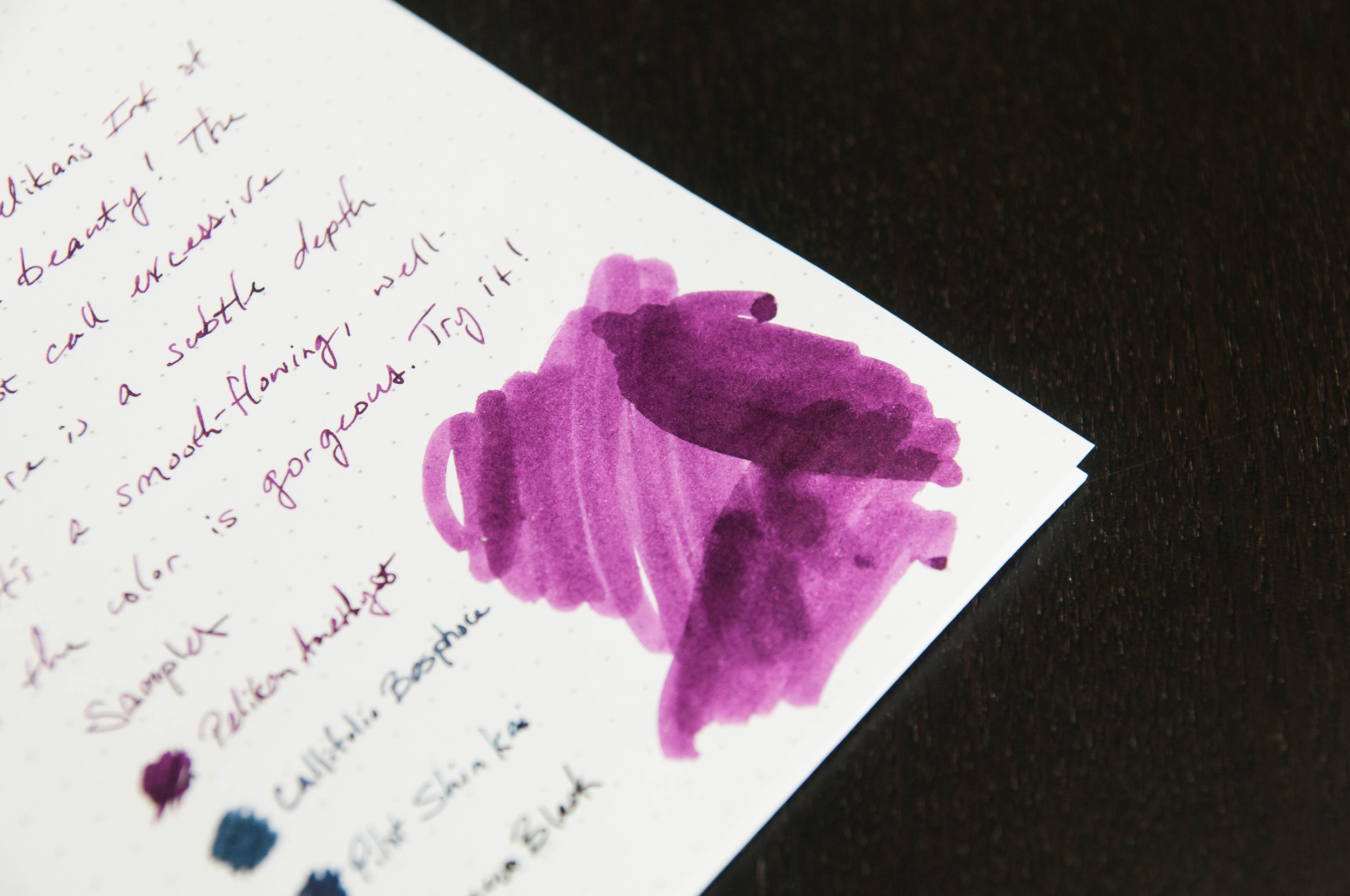
Now, one of my favorite qualities of this ink is the shading. If you look at an amethyst gem, you don't see a single shade of the color. You see several different shades since there are different angles, thicknesses, and gem qualities. The Amethyst ink captures these qualities beautifully. The shading properties aren't incredibly dramatic, but they're beautiful and striking without being flamboyant. This is an ink that does extremely well in a broad or flat nibbed pen (like a stub or italic).

This is an elegant ink with some great surprises in store. People definitely notice the character.

Color

The color of the ink is very similar to the gem. Pelikan did a fantastic job matching the color. In use, it's a medium purple. If you're using it in a smaller nib, it looks entirely professional for most things. In a wider nib, it exhibits a nice range of light to medium dark purples. In any nib, it looks great and shows its character well.

Overall

In all, this is a solid ink and represents the Edelstein brand very well. It's the newest ink to the lineup, and it compliments the rest nicely. If you're interested in purple inks, Pelikan Edelstein Amethyst should be on the top of your list.

(Goldspot Pens provided this product at no charge to The Pen Addict for review purposes.)

Posted on October 14, 2015 and filed under Ink Reviews, Pelikan.

Diamine Asa Blue Ink Review

(Jeff Abbott is a regular contributor at The Pen Addict. You can find more from Jeff online at Draft Evolution and Twitter.)

Blue inks are a weakness of mine. I'm always searching for something that's a little different and interesting compared to the ones I've already tried.

JetPens recently started carrying small trial size bottles of many Diamine inks, and I've been trying those out pretty frequently.

Asa Blue is one of those inks, and it's probably one you've heard of before. This is one of those standard blues that gets recommended quite a bit. Even though I've known about it since I first started using fountain pens, I'm only now just getting around to trying it.

In this case, better late than never.

Color

Asa Blue is a deep, rich blue. I'd call it a royal blue, and it lives up to the name much better than Kaweco's version of the color. Calling it navy might be too much, since navy is closer to blue-black in most cases. Either way, this is a standard blue that looks fantastic and fits in professional environments with no problem. This ink won't turn heads because of its stand-out color, but it might for the small amount of shading it exhibits.

I think the best way to describe this color is to compare it to most blue gel ink pens that you can buy. It's a standard blue, and it looks fantastic. And, like I said earlier, this is a deep, dark blue, but I wouldn't classify it as a blue-black.

Properties

Like other Diamine inks I've tried recently, it behaves admirably in my pens. Feathering is non-existant, show-through is minimal, and there's a pleasant level of shading evident in some strokes. It's a smooth, well-lubicrated ink that works well in dry, small-nibbed pens, but also doesn't over-saturate the page in a broader nib. It behaves just as you'd expect a Diamine ink to behave, and that's a compliment.

The shading in this ink is subtle. It's not flamboyant like Kon-peki, Ancient Copper, or Rouge Hematite, but you notice it in the strokes after the ink has settled on the page. There's just enough variation in the color that you can tell a fountain pen created the line. For an office setting, you can't go wrong with properties like that. It looks professional, but it's also gorgeous instead of bland.

Conclusion

I've been really happy so far with the Diamine inks I've tried. They behave well, clean out of the pen easily, never have issues starting or skipping, and have great color and saturation. With a deep blue, I'm not expecting a lot of shading, but the small hints evident in Asa are a real pleasure to notice when writing.

There are a couple of different options for buying this ink. You can get a full-sized 80ml bottle, or a smaller 30ml bottle for about $17.50 or $7.50, respectively.

If you're interested in dark blues that behave well, this is a swell place to start.

(JetPens provided this product at no charge to The Pen Addict for review purposes.)

Posted on September 30, 2015 and filed under Diamine, Ink Reviews.

J. Herbin Emerald of Chivor Ink Review

(Susan M. Pigott is a fountain pen collector, pen and paperholic, photographer, and professor. You can find more from Susan on her blog Scribalishess.)

When J. Herbin first announced their newest 1670 collector's ink, the Internet went crazy–well, the fountain pen Internet went crazy. The photographs of the ink revealed a spectacular teal green with gold flakes and stunning red/pink sheen. I certainly had never seen anything like it before. Of course J. Herbin had already produced other 1670 inks with silver or gold flecks (Stormy Grey and Rouge Hematite), but Emerald of Chivor stands out because of its special sheening qualities.

As soon it was available, I bought a bottle from Anderson Pens for $26.00 plus shipping. I honestly didn't have high expectations for this ink. I bought the original formula Rouge Hematite and sold it. My bottle of Stormy Grey sits unused. The speckles just didn't show up consistently enough. Plus the red and grey colors weren't my favorites. But I'm a nut for blue and teal inks, so I knew I would like Emerald of Chivor even if the gold specks disappointed me. Plus, that fantastic sheen was so unique.

I've been writing with the ink for several weeks. It flows smoothly from my Pilot 912 with an FA nib. If I shake the pen gently before writing, the speckles appear pretty consistently. I'm impressed with how well the ink's sheen and flecks appear even with my fine FA nib.

I've also used calligraphy nibs to test the ink. Obviously broader nibs show off the ink even better than fine ones.

The ink is heavily saturated and it takes time to dry. So you have to be careful not to smudge it while you write. It isn't water fast, but it's so saturated, water doesn't completely erase it.

I haven't experienced any nib clogging. I've left the ink in my 912 for several weeks, and the nib writes perfectly each time. I wouldn't leave it in vintage pens for any length of time, however, just to be safe.

The thing that surprised me most about Emerald of Chivor is that the paper you use makes all the difference. On Clairefontaine Triomphe and Rhodia Dot Pad paper, the gold specks show up just fine, but there's no pink sheen.

But on Tomoe paper the ink shines like neon light. This is what made everyone go "Wow!" when they first saw this ink. I'm not sure why the pink sheen shows up on Tomoe but not on the other paper. You'll need to experiment the paper you use with Emerald of Chivor to find what brings out both the sheen and the sparkles.

Of course, to see these marvelous properties, you have to view the ink and paper in bright light, particularly bright sunlight. In ordinary light, the ink is a beautiful teal, and you can see some shimmer. But if you want an explosion of color, you need bright light.

The gold specks fall to the bottom of the bottle. You need to shake the ink well before filling your pen.

The gold specks fall to the bottom of the bottle. You need to shake the ink well before filling your pen.

Perhaps this ink is best used for special things like invitations and envelopes where calligraphy nibs best express its beauty. It's certainly terrific for every day use in finer nibs, but to fully appreciate this glamorous ink, you'll have to take your writing into the sunshine to see it sparkle. And that's not a bad thing. Everyone can use a little sunshine.

Posted on September 18, 2015 and filed under J. Herbin, Ink Reviews.