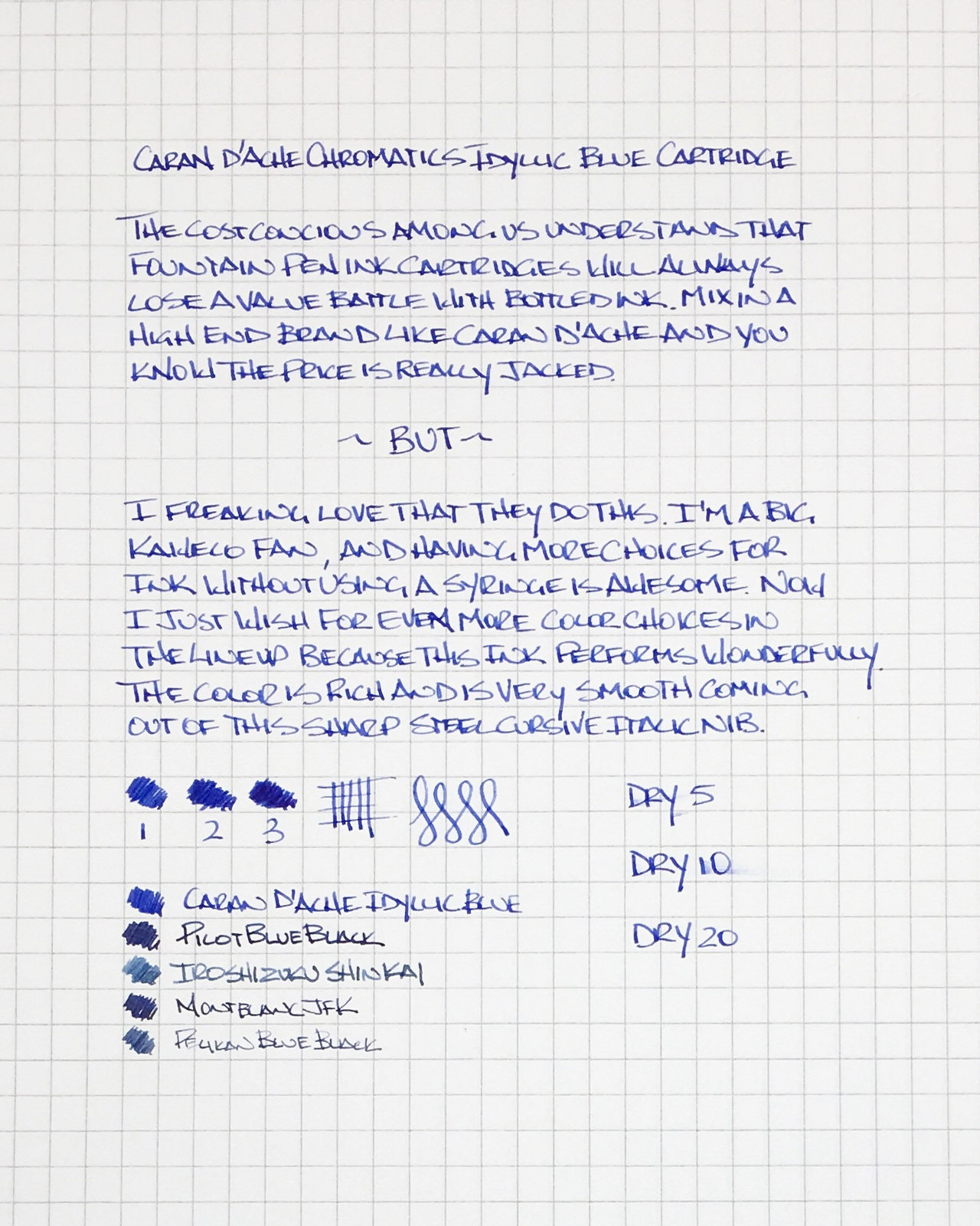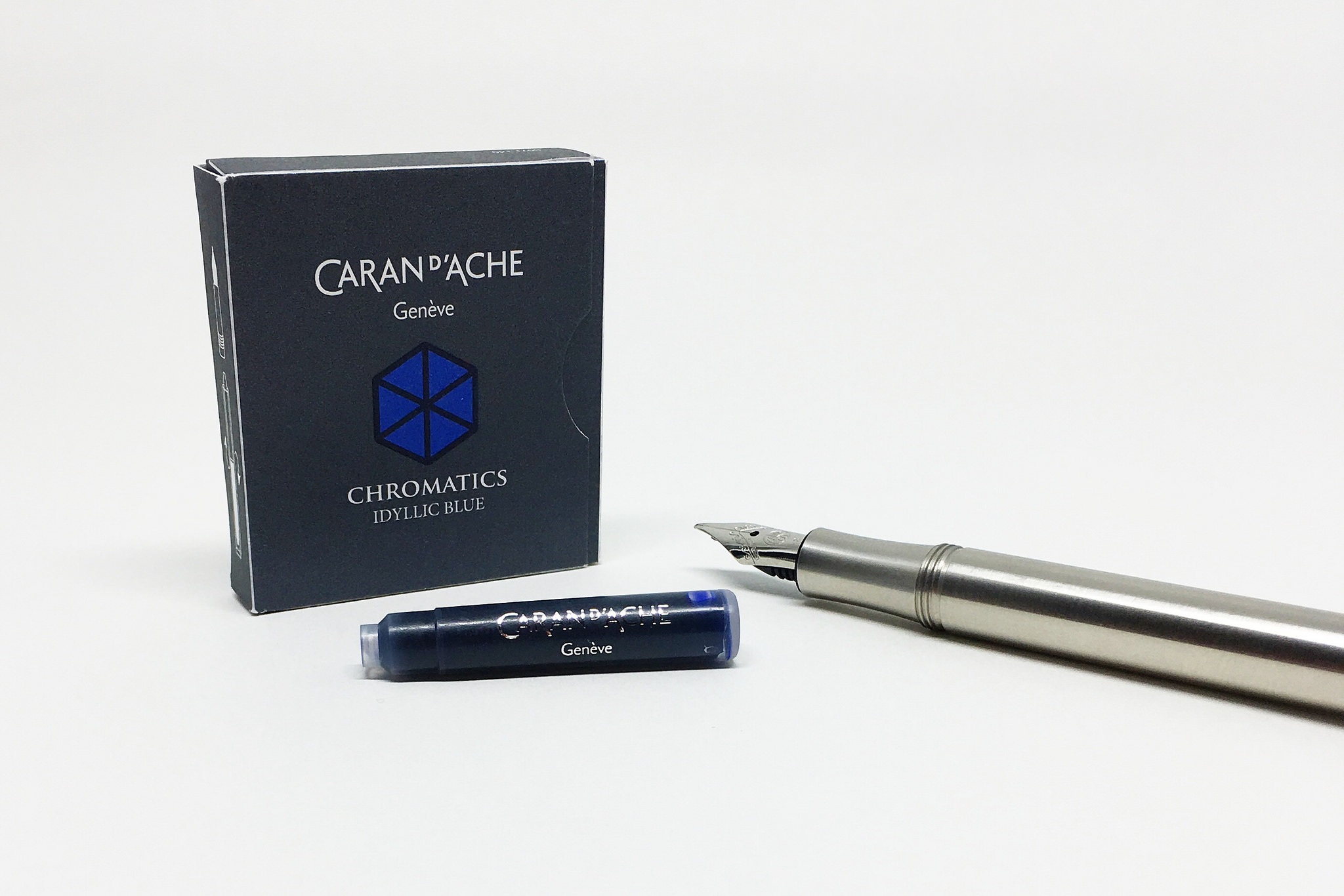
Fountain pen ink cartridges are an economic and environmentally bad choice. Compared to bottled ink, the price per milliliter is far greater, and you are tossing empty plastic tubes into the trash can on a regular basis. Now that I have gotten that out of the way, let me tell you why I love these Caran d'Ache Chromatics ink cartridges.

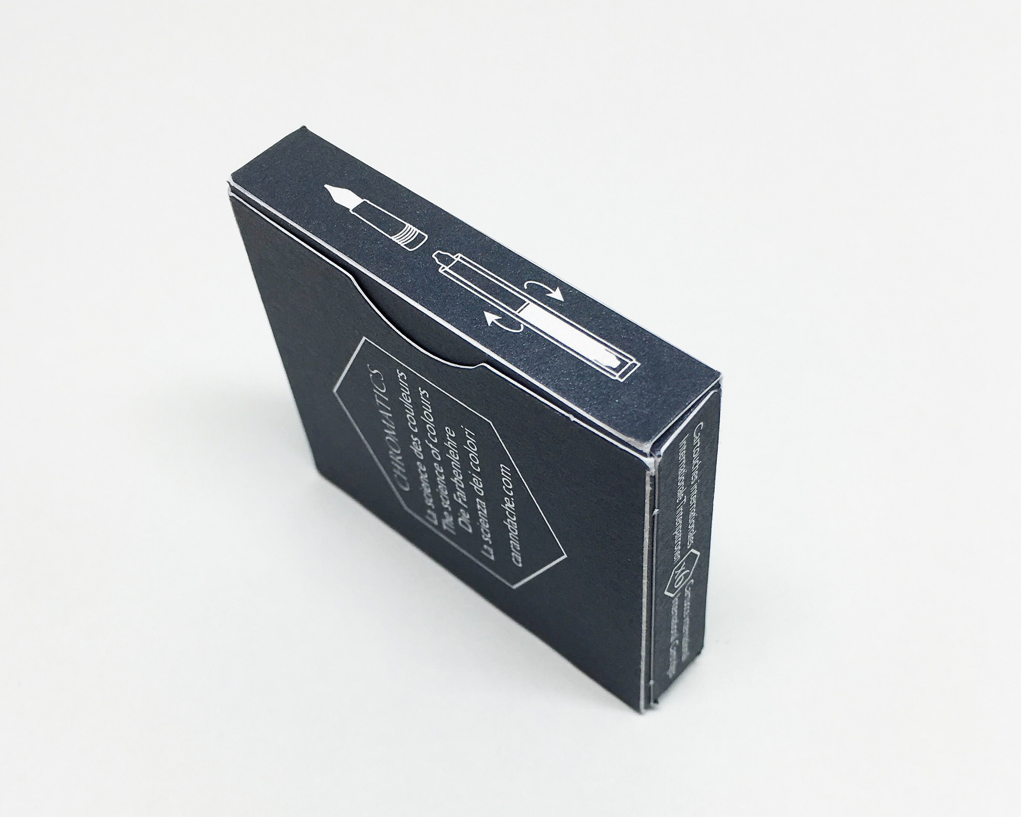
Color name imprinted on the cartridge. Thank you!
I’m a huge fan of Kaweco pens, especially the pocket varieties like the AL Sport and Liliput. There have been attempts at making converters for these pens (I’ll be testing the newest one soon) but so far nothing beats a standard short international ink cartridge. The issue for addicts like me is that color choices are limited, unless you want to syringe fill empty cartridges. I’ve done that plenty, but let’s face it: Cartridges are far easier to use, and more portable.
Kaweco offers 8 colors to satiate people like me, but getting a high end ink like Caran d’Ache in this format is great news. Granted, only Cosmic Black and Idyllic Blue are available right now, but I would be over the moon if they continued down the Chromatics color lineup. (Edit: I'm happy to note I am wrong. All colors ARE available.)

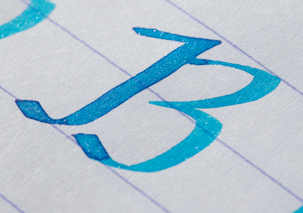
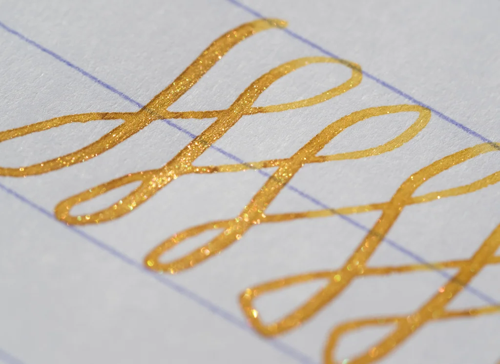
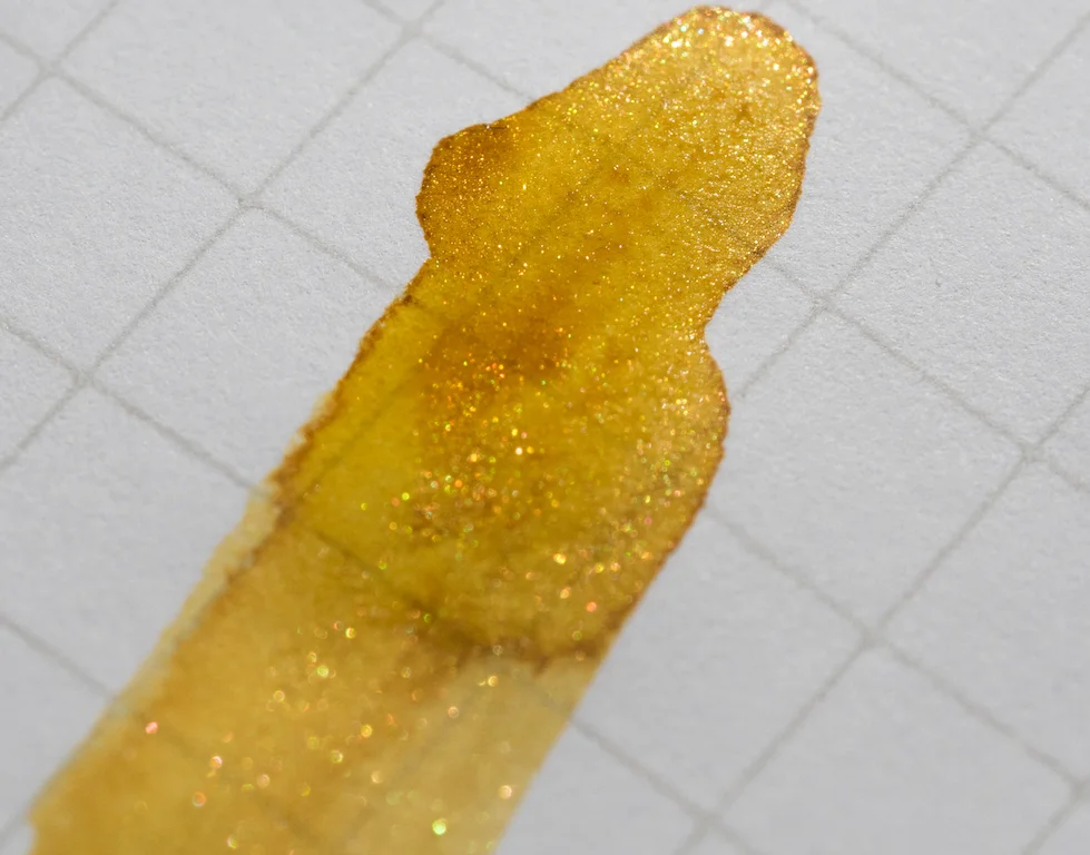
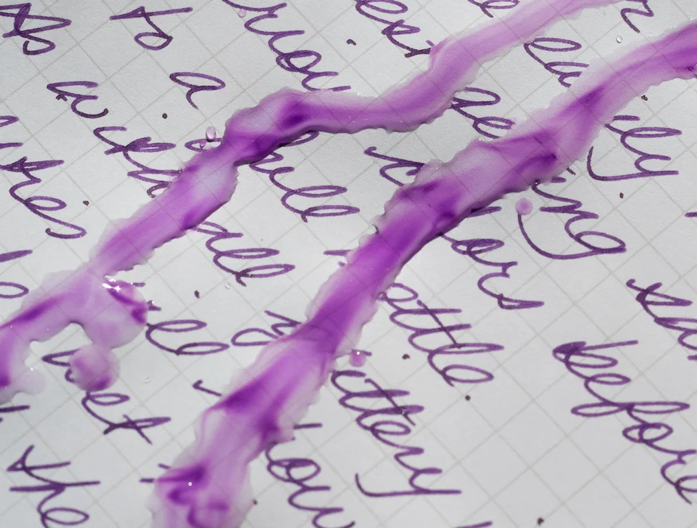
Idyllic Blue is one of the best standard blues I recall using. I’m not usually a blue user, I go for blue black or turquoise shades before reaching for stock blues, but this one is fantastic.
The color has a depth and richness than normal blues can’t achieve. Many are light and watery looking, but not Idyllic Blue. There is minimal shading, with slight variation from light to dark in the lines, but the lubrication is off the charts. I used a crisp fine cursive italic for this review, and the nib was noticeably smoother than with other, less lubricated inks. The dry time was impressive as well, even at the five second mark.
In barrel double stack approved.
This is a premium ink, and it comes at a premium price. $5.50 for for six ink cartridges doesn’t sound expensive in a vacuum, but that is nearly a 100% increase over the aforementioned Kaweco cartridges. There are also only two color choices for now, unlike the 25 Diamine currently has available in the short international size.
Still, I’ll be enjoying these Idyllic Blue ink cartridges for a while and crossing my fingers for more colors to join the lineup soon.
(JetPens provided this product at no charge to The Pen Addict for review purposes.)