Posts filed under Ink Reviews

Pilot Iroshizuku Ama-iro Ink Review

(Jeff Abbott is a regular contributor at The Pen Addict. You can find more from Jeff online at Draft Evolution and Twitter.)

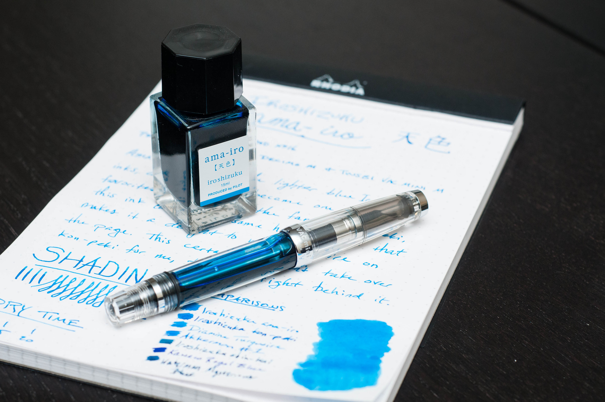
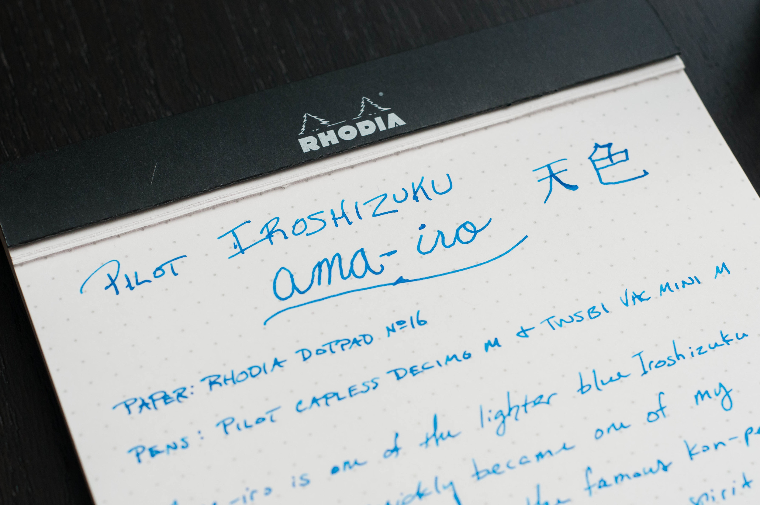
For the longest time, I thought Pilot Iroshizuku Kon-peki was my favorite blue ink from the Iroshizuku line. It's bright, has great shading properties, dries relatively fast, and looks great everywhere. I always shied away from Ama-iro because it looked too light — almost transparent. Well, I eventually cracked and decided to give Ama-iro a shot, and I'm really glad I did.

I've never used an Iroshizuku ink that I disliked, so I was sure that Ama-iro would be a nice ink that lacked the "wow" factor of others. The name translates to "Sky," which is very fitting given the light, bright blue hue. In my book, they could also call it "Bora Bora" because it looks like the clear blue waters of Indonesian island paradise.

Like I said, I didn't go into this ink thinking I would care for it. To my surprise, I was completely wrong. This is just another example that shows you should never assume anything. Immediately after inking it up, I was enamored with the light blue shade that had a beautiful shading behavior. In a matter of minutes, I went from "meh" to "love it."

What makes the Ama-iro so great? Well, the color. If you've used an Iroshizuku ink before, you know what to expect. It's an incredibly well-behaved ink with beautiful color characteristics, great flow, and pretty bottles. The Iroshizuku inks are my favorite of any other brand. That said, I was 100% sure that I would never find an ink that compares to my beloved Kon-peki, and I'm sure there are plenty of folks that hold that same opinion. Let it be known, this opinion has not changed, but Ama-iro is nipping at the heels of this special title. It's closing the gap with every stroke from my pen.

The sky can be different colors depending on weather conditions and what locale you're currently in. For me, this color reminds me of a clear, sunny day in Colorado — somewhere around 6,000 ft. elevation. They're clean, crisp, and rich with color. That's exactly what this blue is like. It's not just a flat light blue — it's rich and has amazing depth.

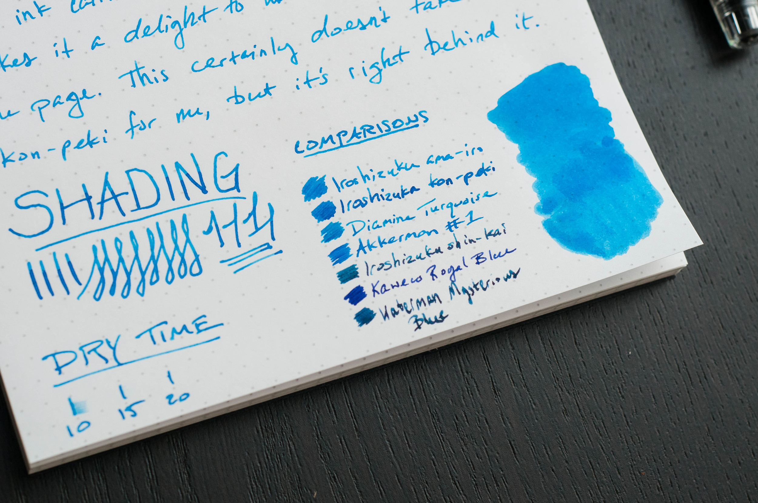
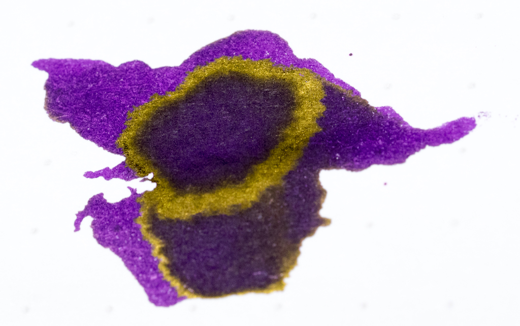
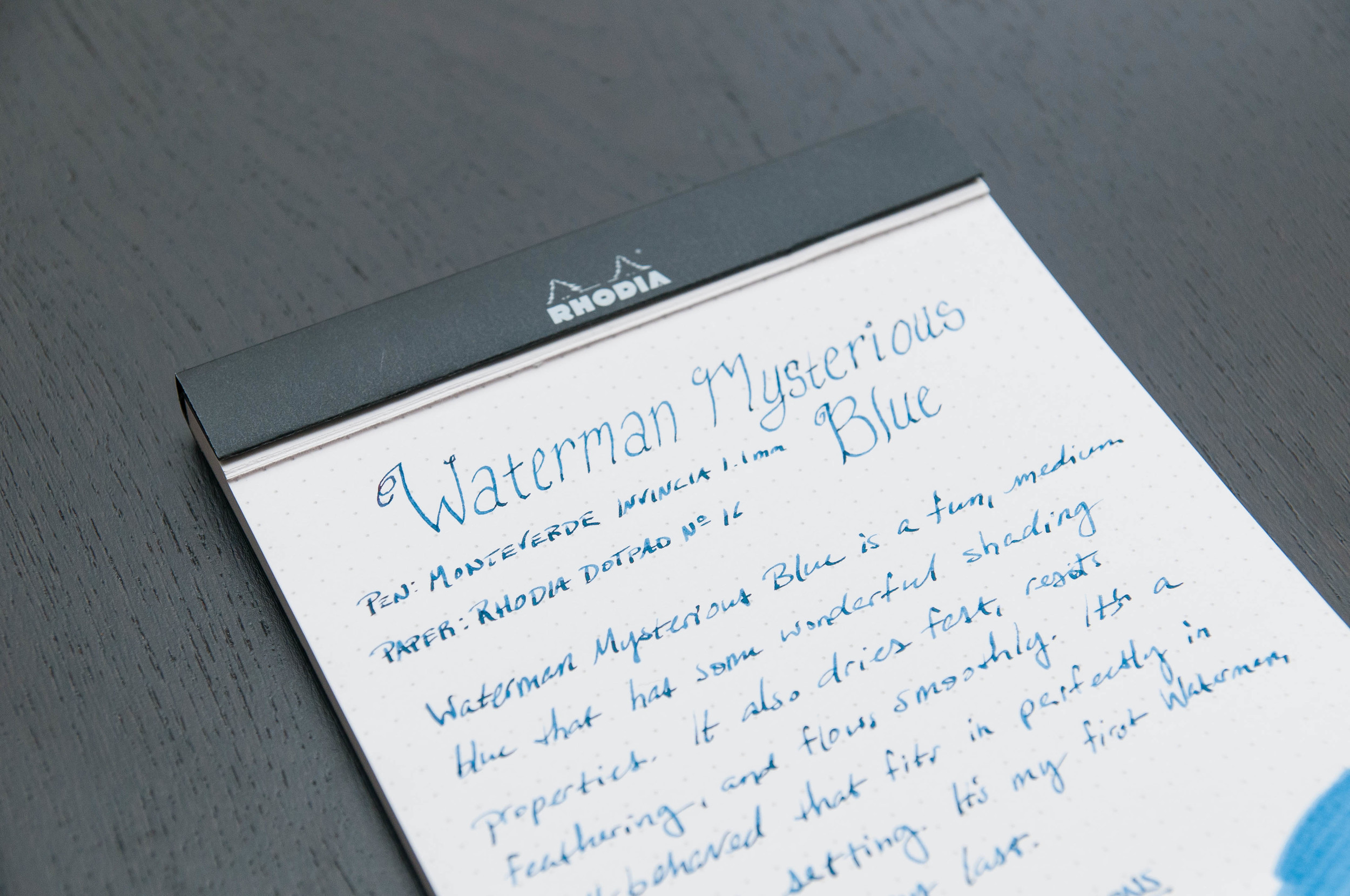
My favorite characteristic of this ink is its ability to shade to a medium blue. I've used the ink in several pens, and I love using it in wetter, broader nibs that can really show off the shading. It really is something to behold.

Another favorite feature of this ink is the dry time. I clocked it somewhere between 10 and 15 seconds when using a Japanese medium nib and a European medium nib. Not the fastest dry time, but definitely impressive.

Apart from that, all the other characteristics of this ink are in line with all the other Iroshizuku line. Great flow, easy to clean up, no bleeding or feathering, and minimal show-through.

If your favorite blue ink is Iroshizuku Kon-peki, you should give this ink a try. It's a great cousin to add to your collection for those days when you need some bright sky cheer.

JetPens sell this particular ink in two sizes: 50ml bottles and 15ml bottles. Pick up the smaller size if you aren't sure it's the right color for you! I hope you are as pleasantly surprised as I was.

(JetPens provided this product at no charge to The Pen Addict for review purposes.)

Posted on June 1, 2016 and filed under Pilot, Iroshizuku, Ink Reviews.

Lamy Dark Lilac Fountain Pen Ink: A Review

(Susan M. Pigott is a fountain pen collector, pen and paperholic, photographer, and professor. You can find more from Susan on her blog Scribalishess.)

Lamy Dark Lilac ink is a special edition formulation designed to complement the new Lamy Dark Lilac Safari fountain pen (which I do not own). It looks spectacular in my TWSBI 580 AL purple, however.

Lamy Dark Lilac in TWSBI 580

The ink is a true purple, meaning that it is neither too red nor too blue in tone. Some purples, such as Pelikan Edelstein Amethyst and Diamine Imperial Purple, have a red tone whereas others, such as Diamine Damson shift more towards the blue/grey spectrum.

Dark Lilac is a deep, rich purple but not so dark that it appears black. It is a wet ink and flows well from my TWSBI 580 with a medium nib. It writes without feathering on both Rhodia and Tomoe paper and dries fairly quickly, though it is definitely not waterproof.

Lamy Dark Lilac on Rhodia Paper

Lamy Dark Lilac on Tomoe River Paper

In large nibs, the ink offers nice shading.

There is also a hint of gold sheen, but it is difficult to see unless you view it in direct sunlight or bright light.

The Lamy bottle is unique in that it has a plastic bottom that holds blotting paper you can use after filling your pen. Word to the wise: put the cap back on the ink bottle before attempting to tear off some blotting paper lest you spill dark purple ink all over your counter and hands. A friend told me so.

The bottom of the bottle also sports a deep well so you can dip your pen into the deepest part of the bottle to collect as much ink as possible.

The bottle is quite large and holds 50ml of ink. It isn't the prettiest ink bottle design, but it suits the utilitarian aesthetic of Lamy.

The ink is quite popular and is currently sold out at Goulet Pens, JetPens, and other retailers. Goulet indicates they will restock Dark Lilac by late May for $10.50.

UPDATE: Goldspot has about 30 bottles in stock right now. Be quick!

Posted on May 27, 2016 and filed under Lamy, Ink Reviews.

Waterman Mysterious Blue Ink Review

(Jeff Abbott is a regular contributor at The Pen Addict. You can find more from Jeff online at Draft Evolution and Twitter.)

I'm always on the hunt for exciting blue inks, and the most recent to come across my desk is Waterman's Mysterious Blue. I've had some trouble coming up with a description for the color of this ink, but I've settled on a rusty blue jeans color. It does have a bit of mystery to it, but that's bound to happen when using the same inks between different pens and papers. But, for being a dark blue ink, it's got some great character.

First off, the shade of this ink is much darker than I expected from looking at images online. It certainly photographs lighter than it appears on the paper. When writing, it shades beautifully and shows off navy, indigo, and green tones. It really is a beautiful color with loads of hidden characteristics. It's dark enough for office use, but has plenty of personality.

It's a well-lubricated ink that is very easy to clean. I haven't experienced any issues with it clogging, skipping, or failing to start immediately. It's a well-behaved ink, and acted exactly as I expected.

My favorite quality of this ink is the shading. It exposes different layers of the complex color hues and saturation, and I'm constantly enamored with what comes out on the page with this ink. It's dark, but it's moody.

Feathering is pretty much non-existent, and show-through is minimal on most papers even when using a wet 1.1 mm stub nib.

It's on the dark side of the blue spectrum, but not dark enough to call it a blue-black ink. And that's exactly how I like my dark blue inks — still blue.

JetPens offers this ink in several different formats. You can get a 50ml bottle, a package of 6 international short cartridges, or a package of 8 international long cartridges.

Overall, I'm really enjoying this ink and look forward to adding to the semi-regular rotation. I'm a huge sucker for lighter, brighter blues, but this is a nice contender for more subdued purposes.

(JetPens provided this product at no charge to The Pen Addict for review purposes.)

Posted on May 25, 2016 and filed under Waterman, Ink Reviews.