Posts filed under Ink Reviews

Sailor Jentle Uca Arcuata Fiddler Crab Green Ink: A Review

(Susan M. Pigott is a fountain pen collector, pen and paperholic, photographer, and professor. You can find more from Susan on her blog Scribalishess.)

I must admit, this has to be one of the most unusual ink colors I've reviewed. When I opened the bottle, my first thought was that the color looked like something from a festering pond.

I had no idea what it was supposed to be, and the name on the ink bottle, Uca Arcuata, didn't exactly reveal anything. So, I did some Googling and discovered that this ink is part of a bespoke collection made for the Kingdom Note Store based on various crustaceans. These inks include Zarigani blue, coconut crab brown, giant spider crab red, tiger prawn brown and Uca Arcuata (Fiddler Crab Green) which is currently sold out.

I've never seen an actual Fiddler Crab, but the ink color certainly looks like the color from the Fiddler Crab illustration on the box.

Still, I wouldn't call this color "green" at all. Maybe the color varies a bit from bottle to bottle since it's a specially formulated ink, but to me the color is yellow-brown, not green. Of course, Sailor can name their inks whatever they want, so if they want this to be green, who am I to argue?

Like all Sailor inks, this one has a distinctive odor to it due to the preservative phenol. It's not an unpleasant odor, just noticeable. And it keeps the ink from getting moldy, although I'm not sure mold would affect this color much.

The bottle comes with a built-in ink miser. Just turn the bottle upside down (cap on, of course) so the ink collects in the inner ink well, then turn it over and fill your pen. I usually remove the ink miser because I feel like it gets in the way of filling bigger pens. But, when ink runs low, it can be helpful.

The ink flows well and is even a bit wet. It exhibits nice shading qualities, but as far as I can tell, it has no sheen. It is also not waterproof.

The central question is, why would anyone use this color for writing? I can see it as a color for sketching, but for writing? I'm not sure. It's not a color that appeals to me, at least not yet. Maybe, in the fall when I want a color that matches the fallen leaves in Abilene (a drab yellow). . . .

Still, Uca Arcuata is quite similar to an ink I do love: Iroshizuku Ina-Ho. When placed next to one another, Ina-Ho actually seems to have more green than Uca Arcuata. But on its own, Ina-Ho comes across like a gold ink, whereas Uca Arcuata seems more brown.

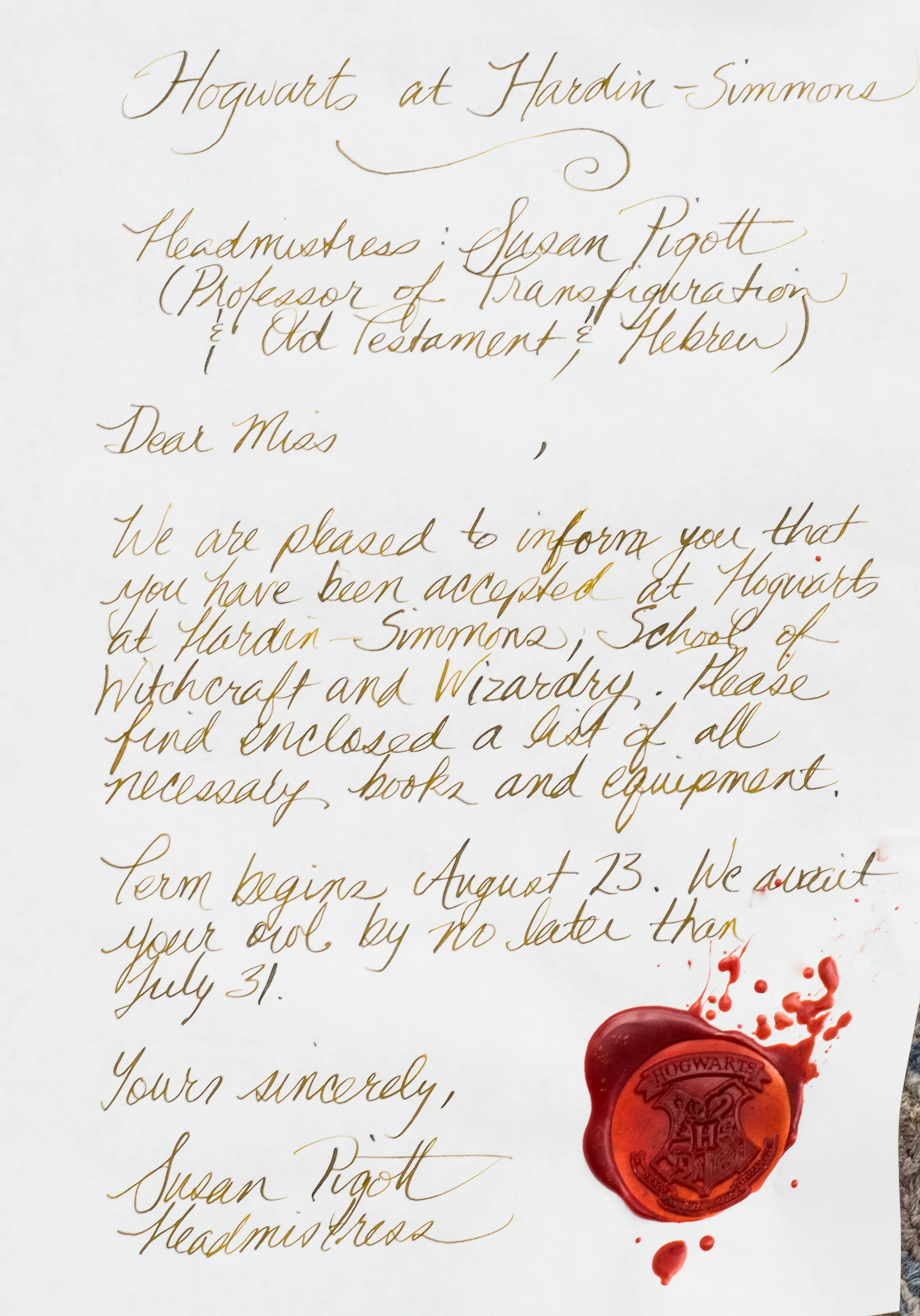
I suspect both these colors are acquired tastes, sort of like Brussels Sprouts. I do enjoy breaking out of my blue ink rut, so I suspect that I will use Uca Arcuata from time to time. It might look especially nice on Tomoe River paper. I'm teaching a Harry Potter class this fall at my university, so Uca Arcuata might be just the thing to write acceptance letters to my aspiring wizards. Though, clearly, I need to work on my wax seals.


Enjoy reading The Pen Addict? Then consider becoming a member to receive additional weekly content, giveaways, and discounts in The Pen Addict shop. Plus, you support me and the site directly, which I am very grateful for.

Membership starts at just $5/month, with a discounted annual option available. To find out more about membership click here and join us!

Posted on July 8, 2016 and filed under Sailor, Kingdom Note, Ink Reviews.

Pelikan 4001 Dunkelgrün (Dark Green) Ink: A Review

(Susan M. Pigott is a fountain pen collector, pen and paperholic, photographer, and professor. You can find more from Susan on her blog Scribalishess.)

Pelikan released a new version of green ink to match its M120 Special Edition pen. The ink matches the pen perfectly, so if you've seen a photograph of the M120, its barrel color is the color of this ink.

Although Pelikan named this ink "Dunkelgrün" (Dark Green), I would say it's really more a medium green than a dark green. When I did a chromatograph analysis, the ink tends toward the blue spectrum more than the yellow.

And in some of my photographs it came out looking teal (it really is more green than teal).

But I think of a dark green as more black or olive in color, like one of my all-time favorite inks, Sailor Jentle Epinard which is, unfortunately, no longer available.

Nevertheless, Pelikan's Dark Green is certainly a practical color, perhaps a bit too blue-green for business use, but perfect for letter writing, journaling, and grading.

The ink seems a bit dry to me–much dryer, for example, than Iroshizuku Sho-Ryoku, but not as dry as many J. Herbin inks. Because of this, it dries quickly (at least in the extra-fine and medium italic pens I tested it with). It is not waterproof, nor does it make any claim to be.

The ink exhibits some shading in wider nibs, but in narrower nibs it is pretty flat.

In this picture the ink looks teal, but in real life it is more green

I was able to detect a slight purple sheen in the ink splats, but I didn't see it in any of my written samples. This ink does not demonstrate the impressive sheening qualities of inks like Sailor Yama-Dori, for example.

If you want a medium green ink that flows well and is consistent, then Pelikan 4001 Dark Green is a good choice. For all you teachers/professors out there, it really is a terrific grading ink. If, however, you want a green ink with more character, I'd suggest you consider Iroshizuku Shin-Ryoku or Sailor's Tokiwa-Matsu (their replacement for Jentle Epinard).

You can buy a 2 ounce bottle of Pelikan Dark Green from Goldspot Pens for $13.00.

(Goldspot provided this product at no charge to The Pen Addict for review purposes.)


Enjoy reading The Pen Addict? Then consider becoming a member to receive additional weekly content, giveaways, and discounts in The Pen Addict shop. Plus, you support me and the site directly, which I am very grateful for.

Membership starts at just $5/month, with a discounted annual option available. To find out more about membership click here and join us!

Posted on June 24, 2016 and filed under Pelikan, Ink Reviews.

Pilot Iroshizuku Ama-iro Ink Review

(Jeff Abbott is a regular contributor at The Pen Addict. You can find more from Jeff online at Draft Evolution and Twitter.)

For the longest time, I thought Pilot Iroshizuku Kon-peki was my favorite blue ink from the Iroshizuku line. It's bright, has great shading properties, dries relatively fast, and looks great everywhere. I always shied away from Ama-iro because it looked too light — almost transparent. Well, I eventually cracked and decided to give Ama-iro a shot, and I'm really glad I did.

I've never used an Iroshizuku ink that I disliked, so I was sure that Ama-iro would be a nice ink that lacked the "wow" factor of others. The name translates to "Sky," which is very fitting given the light, bright blue hue. In my book, they could also call it "Bora Bora" because it looks like the clear blue waters of Indonesian island paradise.

Like I said, I didn't go into this ink thinking I would care for it. To my surprise, I was completely wrong. This is just another example that shows you should never assume anything. Immediately after inking it up, I was enamored with the light blue shade that had a beautiful shading behavior. In a matter of minutes, I went from "meh" to "love it."

What makes the Ama-iro so great? Well, the color. If you've used an Iroshizuku ink before, you know what to expect. It's an incredibly well-behaved ink with beautiful color characteristics, great flow, and pretty bottles. The Iroshizuku inks are my favorite of any other brand. That said, I was 100% sure that I would never find an ink that compares to my beloved Kon-peki, and I'm sure there are plenty of folks that hold that same opinion. Let it be known, this opinion has not changed, but Ama-iro is nipping at the heels of this special title. It's closing the gap with every stroke from my pen.

The sky can be different colors depending on weather conditions and what locale you're currently in. For me, this color reminds me of a clear, sunny day in Colorado — somewhere around 6,000 ft. elevation. They're clean, crisp, and rich with color. That's exactly what this blue is like. It's not just a flat light blue — it's rich and has amazing depth.

My favorite characteristic of this ink is its ability to shade to a medium blue. I've used the ink in several pens, and I love using it in wetter, broader nibs that can really show off the shading. It really is something to behold.

Another favorite feature of this ink is the dry time. I clocked it somewhere between 10 and 15 seconds when using a Japanese medium nib and a European medium nib. Not the fastest dry time, but definitely impressive.

Apart from that, all the other characteristics of this ink are in line with all the other Iroshizuku line. Great flow, easy to clean up, no bleeding or feathering, and minimal show-through.

If your favorite blue ink is Iroshizuku Kon-peki, you should give this ink a try. It's a great cousin to add to your collection for those days when you need some bright sky cheer.

JetPens sell this particular ink in two sizes: 50ml bottles and 15ml bottles. Pick up the smaller size if you aren't sure it's the right color for you! I hope you are as pleasantly surprised as I was.

(JetPens provided this product at no charge to The Pen Addict for review purposes.)

Posted on June 1, 2016 and filed under Pilot, Iroshizuku, Ink Reviews.