Posts filed under Ink Reviews

KWZ Iron Gall Green #4 Fountain Pen Ink Review

(Jeff Abbott is a regular contributor at The Pen Addict. You can find more from Jeff online at Draft Evolution and Twitter.)

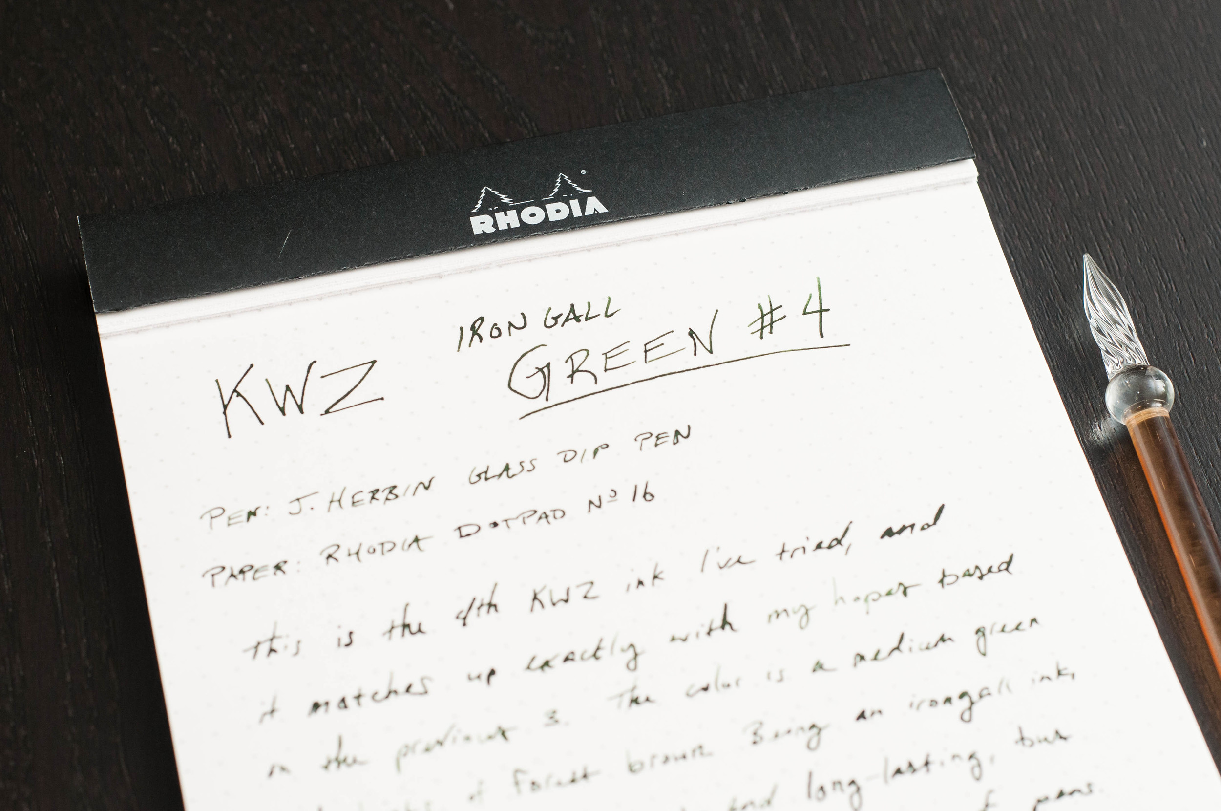
KWZ Iron Gall inks are no strangers around here, and that's for good reason. These inks are pretty, well-behaved, and stand the test of time. Previously, we've written about KWZ's Iron Gall Blue #1, Blue #4, Gold, and Gummiberry colors, but the Green #4 is a new one for me. I've had this sample for quite a while, but this one went unnoticed behind other samples until I did some cleaning in the ink supply drawer. Once I realized I'd never tried it, I put it in a couple of pens immediately to give it a shot. Just like the other KWZ inks, I was happy with the results.

To provide a little background, this ink is categorized as "Iron Gall," which really means it's nearly permanent once it meets paper. A chemical reaction happens between the ink and the page that makes it highly resistant to water damage, fading over time, and losing its color over the years. Iron Galls are great for archival quality projects, and this Green #4 is just as good at the job as the others. Vanness has a great overview of what makes the KWZ Iron Gall inks special if you're interested in learning more.

Once you get past the Iron Gall archival aspect of this ink, there are only a couple of other things to consider when using it. For one, you might be surprised when the ink dries either the same shade as when it's wet, and (in some cases) it actually dries darker. Most inks become lighter as they dry, which can diminish some of the original pop of the ink color. Not so with the Green #4. It stays the nice medium-green color and dries a bit darker in the wetter spots.

The other thing to remember when using an Iron Gall ink is that it should not stay in your pen for long periods without being used. To me, I don't view this any differently than other inks, in so much that I like to clean out pens if they've been unused after about a month. If you're mindful about how long the ink has been in your pen, you should be fine. However, if the pen you're using has special sentimental value, or is difficult to replace, you might be a bit more careful about keeping it clean. Either way, these KWZ inks are fairly gentle, and I've never had an issue with pens getting clogged or becoming difficult to clean.

Now, after those differences, the Green #4 acts just like any other ink. The color is a wonderful woodland green with brown hints and a very subtle gold shimmer in certain lights. I wasn't really sure about the color when I first started using it, but I grew to love it because it has an abundance of character.

The shading is a large part of that character, along with the subtle shimmering effect. The shading isn't dramatic, but it's definitely noticeable in nibs from the F size and higher (German standard). It's a perfect amount of flare for the color.

The other fantastic quality of this ink is the dry time. In most cases, it's dry between 8 and 12 seconds. In fountain pen terms, this is very quick. Really, it's astonishing how quickly it dries, and the other KWZ IG inks are pretty close to this as well. Definitely something to consider if quick-drying inks are your preference.

At the end of the day, the KWZ Iron Gall Green #4 is a lovely medium or dark green ink that behaves wonderfully in all pens and on all papers. Just like the other KWZ IG inks I've used, I highly recommend this color. It's a very strong contender in the "work safe" green ink category, and it gets bonus points for being permanent.

You can find KWZ Iron Gall inks at Vanness Pens in 60ml bottles or 4ml sample vials.


Enjoy reading The Pen Addict? Then consider becoming a member to receive additional weekly content, giveaways, and discounts in The Pen Addict shop. Plus, you support me and the site directly, which I am very grateful for.

Membership starts at just $5/month, with a discounted annual option available. To find out more about membership click here and join us!

Posted on August 17, 2016 and filed under KWZ, Iron Gall, Ink Reviews.

Franklin Christoph Terra Firma Ink Review

(Jeff Abbott is a regular contributor at The Pen Addict. You can find more from Jeff online at Draft Evolution and Twitter.)

One of my favorite things to do at pen shows is to check out the Franklin Christoph booth to see what kind of new model pens they have on display. It's hard to get a good look since most of the unique stock sells out pretty quickly. Either way, if you end up purchasing a pen from the fine folks at Franklin Christoph, they offer to fill it with an ink from their own line. There's roughly a dozen colors to choose from, and I've enjoyed every one that I've tried. My most recent experiment was Terra Firma, a delightfully shade-happy red-brown ink.

Normally, I don't pay much attention to brown inks — they've never been something to catch my eye when ink shopping. This particular ink caught my eye because of the pronounced shading it exhibits. I love an ink that shades well, regardless of the color.

A few weeks later, I've determined that I like a bit more red in my inks of this color, but Terra Firma is a solid, respectable ink even if it's not my favorite color.

First off, this is an extremely well-behaved ink with surprisingly good dry times. The ink consistently dries in 12 - 15 seconds in the 1.1mm stub I've been using. Not bad at all. When it's time to clean out a pen, this ink only requires one flush to clear out all the color from the pen. That's about as easy as it gets.

The color of this ink screams "earth" or "dirt" as soon as you start writing. The Latin for Terra Firma is "solid earth," which probably wasn't a coincidence when the ink was named. Due to the red shades in this ink, it reminds me a lot of the soil in the area I grew up. Everyone calls it "Alabama clay," and it is almost identical to the color of this ink. Based on comparisons, it's somewhere in between a standard medium brown and a brown-red like Oxblood or Ancient Copper (both from Diamine). It looks good on paper, and it's deep enough to pass as a "business-friendly" shade.

Now, my favorite characteristic of this ink is the shading. This ink loves to shade. I highly recommend putting this ink in a broader nib (preferably a stub or italic) so that you can see the full range of color hidden inside the medium brown top layer.

The ink comes in a 2 oz. bottle in either a traditional screw cap or a eyedropper cap. The eyedropper cap has a nozzle that makes it a piece of cake to fill eyedropper pens without any mess or an actual eyedropper or syringe.

Franklin Christoph inks are $12.50 a bottle from their online store.

Posted on August 10, 2016 and filed under Franklin-Christoph, Ink Reviews.

Graf Von Faber-Castell Deep Sea Green Ink Review

When I think of Graf Von Faber-Castell I think of high end writing instruments like the Perfect Pencil or the somewhat extreme Pen of the Year release. What I haven’t thought about, until now, are their fountain pen inks. I had no idea what I had been missing.

Deep Sea Green is my first foray into GVFC inks and I am completely enamored with it. It was an easy choice actually, because the colors in the rest of the lineup aren’t all that inspiring. They offer ink colors that all fountain pen companies have to offer: Black, blue, red, green, brown, grey. Sure, they have fancier names - “Garnet Red”, “Cobalt Blue” - but they aren’t all that exciting. Deep Sea Green is a clear outlier.

Despite the basic colors, these are not basic inks. All GVFC inks are indelible, meaning they are smudge-resistant, light-fast, waterproof, and solvent resistant. For all intents and purposes, they are permanent. That is something I can get behind despite the blandness of the shades available.

Deep Sea Green has more character than I expected when I received this bottle from Goulet Pens. I’ve been using it in my Sailor King of Pens with a stock medium nib, and it shades well despite the fineness of the nib. There are showings of light and dark greens and blues, plus appearances of grey. It flows wonderfully and dries quickly too. I’ve had nothing but positive experiences so far, and yes, it makes me even want to try some of the more boring colors.

$30 may seem steep for a bottle of ink, and it is, but keep in mind the bottle holds 75ml, which is a 50% increase over the similarly priced Pilot Iroshizuku. And the ink contained within has far more features. The bottle itself is strong, sturdy, and wonderful to look at on a desk or shelf.

Now, if the higher-ups at Graf Von Faber-Castell would mix in a purple or turquoise we would be off to the races.

(GouletPens provided this product at no charge to The Pen Addict for review purposes.)


Enjoy reading The Pen Addict? Then consider becoming a member to receive additional weekly content, giveaways, and discounts in The Pen Addict shop. Plus, you support me and the site directly, which I am very grateful for.

Membership starts at just $5/month, with a discounted annual option available. To find out more about membership click here and join us!

Posted on July 25, 2016 and filed under Faber-Castell, Ink Reviews.