Posts filed under Ink Reviews

Robert Oster Signature Ink Astorquiza Rot: A Review

(Susan M. Pigott is a fountain pen collector, pen and paperholic, photographer, and professor. You can find more from Susan on her blog Scribalishess.)

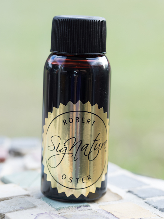
Astorquiza Rot is named after Claudia Astorquiza who introduced Robert Oster inks internationally. “Rot” is German for red (I feel really dumb that I didn’t know that). The ink is a deep red that looks almost exactly like blood droplets.

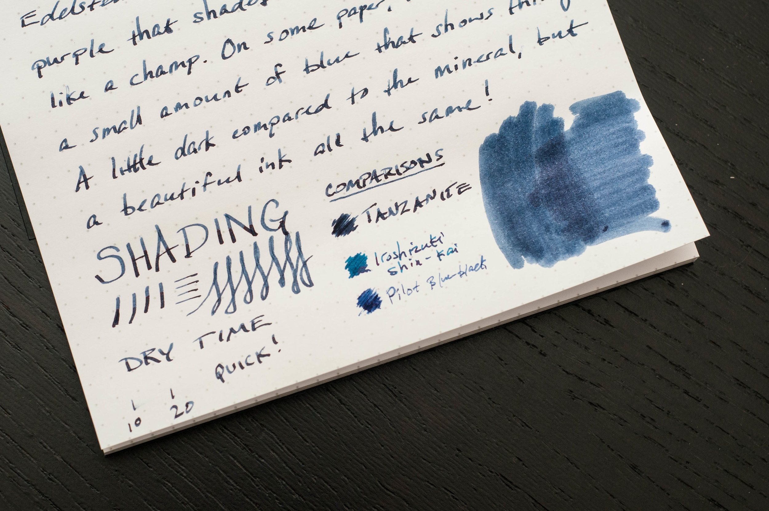
In my Conid Minimalistica fountain pen with a flexible titanium nib, the ink comes out dark and nicely shaded.

Ink testing shows that the ink has a good amount of pink in it, especially when lightly swabbed once with a Q-Tip. But when you put down more ink with a swab, the color becomes a deep, glossy red. It’s a very wet ink and it is not waterproof.

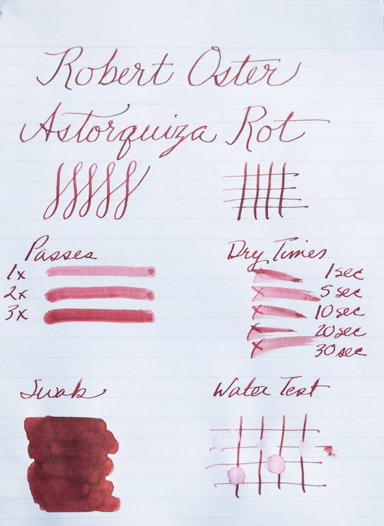
The chromatography test shows that the ink is mostly reddish-pink with a hint of blue.

The ink writes beautifully and exhibits excellent shading. I did not detect any sheen on the Maruman paper I used for my ink tests, nor did I see any with my Tomoe paper. But in my ink splats, I found that the ink has a black, glossy sheen. It’s really pretty cool!

Now that the holidays are drawing near, you might want a rich red ink for letters and cards. Astorquiza Rot is a terrific choice. You can find this and other Robert Oster inks at Vanness Pens, $16.00 for 50ml.

(This ink was purchased with my own funds from Vanness Pens.)


Enjoy reading The Pen Addict? Then consider becoming a member to receive additional weekly content, giveaways, and discounts in The Pen Addict shop. Plus, you support me and the site directly, which I am very grateful for.

Membership starts at just $5/month, with a discounted annual option available. To find out more about membership click here and join us!

Posted on November 18, 2016 and filed under Robert Oster, Ink Reviews.

Pelikan Edelstein Tanzanite Fountain Pen Ink Review

Image via JetPens

(Jeff Abbott is a regular contributor at The Pen Addict. You can find more from Jeff online at Draft Evolution and Twitter.)

Pelikan Edelstein inks have always gotten positive thumbs up from me when I've used them in the past, and that makes me want to keep trying the colors that I haven't yet tried. The next ink on that list was Pelikan Edelstein Tanzanite.

The Edelstein line is made up of ink colors that are meant to match a corresponding jewel or gem for which they're named. In the case of Tanzanite, you end up with a beautiful rusty purple that dries with a touch of blue. The tanzanite gemstone, like most gems and jewels, come in a variety of similar colors, and the Tanzanite ink color looks like the color of a raw tanzanite mineral to my eyes. So, since the gem is in the blue/violet category, so is this ink!

Like every other Edelstein ink I've used, this one flows well and works great in every pen I throw it in. The Tanzanite is no different. I haven't dealt with any slow starts, skipping, or globbing with this ink in the 3 pens I've used it in so far. And, like the other Edelsteins, it cleans out easily when it's time to switch out inks.

The two main features that strike me with this particular ink are the color and the amount of shading. First, the color is beautiful. It's a gray purple with hints of blue, and you can also detect some red-purple sheen in the right light. This variance of character is what I love about this particular ink. It adds interest to the page, and it delights the writer and reader. It actually reminds me a lot of KWZ Gummiberry Iron Gall. It's a great color, and even if you aren't the biggest purple/violet ink fan, I'm sure it could put a smile on your face.

Then, there's the shading. Oh my, can this ink shade. The ink stays fairly dark, but I love the amount of dark depth that you see at the end of a downstroke with this ink. And, the lighter strokes bring out the more playful notes of the tanzanite color. It's my belief (and maybe Pelikan did this on purpose) that the Edelstein inks must have good shading properties in order to properly represent the gemstones and jewels they're named after. Jewels aren't precisely one color — they have several different shades due to the cut and the way light bounces through it. To me, this is the signature attribute of the Edelstein line, and Tanzanite does a great job of reinforcing that belief.

In summary, the Pelikan Edelstein Tanzanite is another great option in the Edelstein line-up that exhibits wonderful shading characteristics. It's a rich gray-purple that can pass for office use while still providing a lot of delight. I highly recommend checking this out if you have a chance. If you're already a fan of purple inks, you'll love it, but I imagine that this is an ink that anyone can appreciate if given the chance.

You can pick up a 50 ml bottle from JetPens for about $30, or you can grab a sample from Anderson Pens if you're not sure you want the big bottle up front. If cartridges are your thing, you can also find a 6-pack from any of the retailers mentioned above for less than $10.

(JetPens provided this product at no charge to The Pen Addict for review purposes.)


Enjoy reading The Pen Addict? Then consider becoming a member to receive additional weekly content, giveaways, and discounts in The Pen Addict shop. Plus, you support me and the site directly, which I am very grateful for.

Membership starts at just $5/month, with a discounted annual option available. To find out more about membership click here and join us!

Posted on November 16, 2016 and filed under Pelikan, Edelstein, Ink Reviews.

Sailor Jentle Ink Kin-Mokusei: A Review

(Susan M. Pigott is a fountain pen collector, pen and paperholic, photographer, and professor. You can find more from Susan on her blog Scribalishess.)

Kinmokusei is a small shrub known as Orange Osmanthus (Tea Olive) in the United States. The plant boasts beautiful, fragrant, orange flowers that bloom in the fall. Sailor’s ink captures the flowers’ color perfectly.

Kin-Mokusei ink is supposed to be a re-release of the beloved Sailor Jentle Apricot that has been out of production for some time. Since I don’t have any Sailor Apricot, I can’t compare the two to see if they are exactly the same. Regardless, Kin-Mokusei is a beautiful ink in its own right.

The ink is a vibrant orange with significant pink tones and a bit of yellow, as demonstrated in the chromatography.

It offers excellent shading properties, especially in wide nibs.

Like other Sailor Jentle inks, you will notice a slight odor, but it is not pronounced (nothing as strong as the KWZ inks). It is wet, and on smooth paper takes a good amount of time to dry. It is not waterproof.

The ink exhibits a tiny bit of pink sheen, as you can see in these ink spots.

Kin-Mokusei is a true orange, with a vibrant hue that is unlike any of my other orange inks. I expected Iroshizuku Yu-Yake and Kin Mokusei to be an exact match, but they aren’t. Yu-Yake is much less vibrant. Diamine Autumn Oak and Pelikan Amber aren’t close matches either.

Kin-Mokusei is a perfect ink for autumn. You can order this limited-edition ink from Vanness Pens for $18.00. It’s currently sold out, but they’ve got more on the way. You can sign up for email notification when it’s in stock. Obviously, this is already a very popular color. If you like this ink, order several bottles!

(This ink was purchased at full price with my own funds from Vanness Pens.)

Posted on October 21, 2016 and filed under Sailor, Ink Reviews.