Posts filed under Ink Reviews

Pilot Iroshizuku Chiku-rin Ink Review

(Jeff Abbott is a regular contributor at The Pen Addict. You can find more from Jeff online at Draft Evolution and Twitter.)

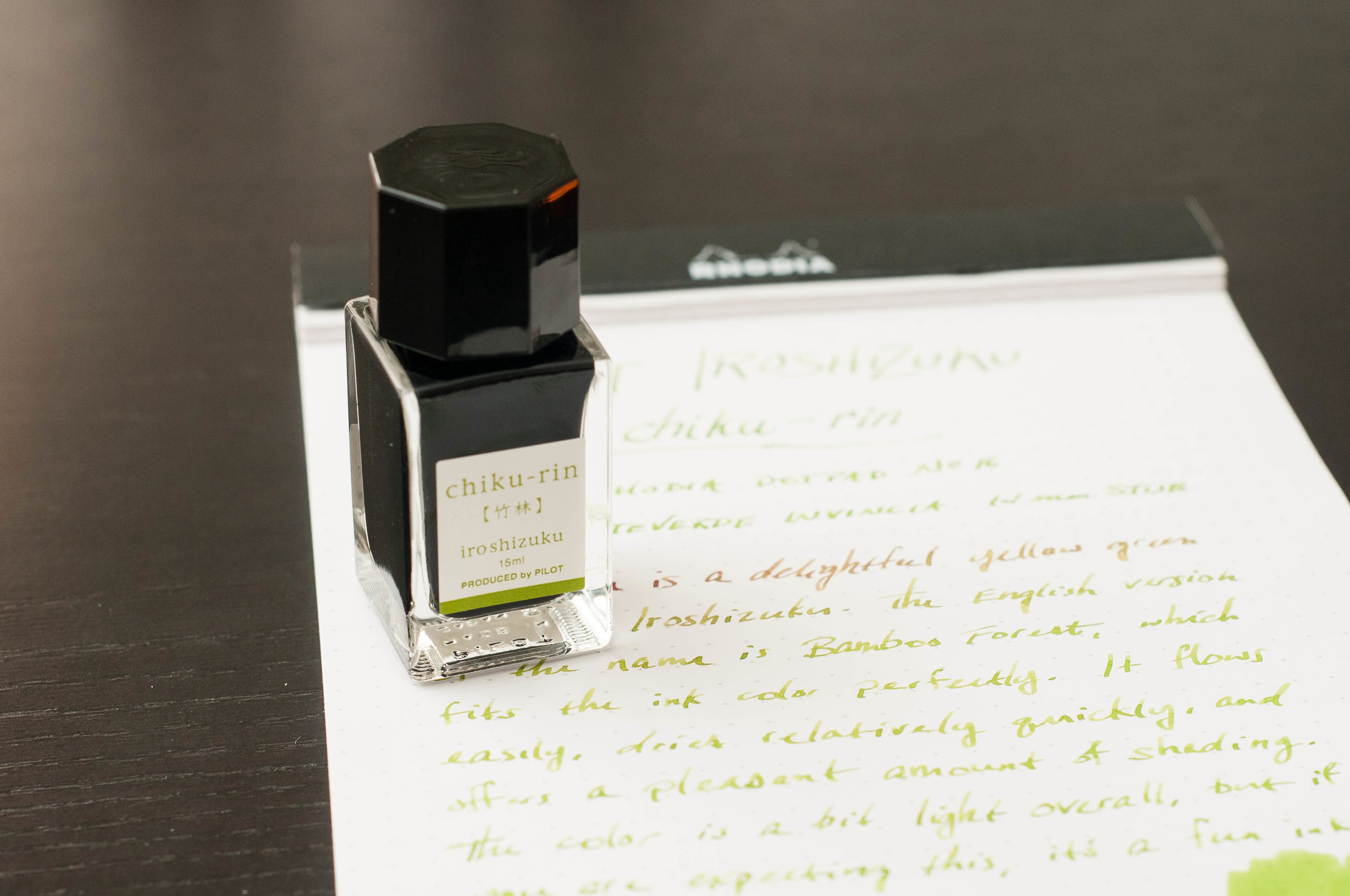
Spring is still a couple months away (at least), but that doesn't mean your ink has to be cold and gloomy. Iroshizuku chiku-rin is a cheery yellow-green ink that comes alive on paper. It's not an orthodox ink color to be sure, but it's delightful to say the least. No matter what's going on, this ink cheers me up.

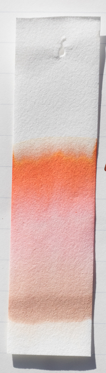
The English version of chiku-rin is "bamboo forest," which fits this color perfectly. With a wetter nib, you get more saturation of the green, but in most of my pens, this lays down as a light green with yellow accents. If the nib is dry, however, it might be difficult to read your writing later on as the light yellow color doesn't contrast well to white paper. It's also probably safe to say that this ink isn't office friendly. Overall, it's a beautiful color that I love using.

The shading of chiku-rin is great. It's not as dramatic as some inks, but it provides a good range of color depth in most pens. Obviously, the larger the nib, the more variation, but this ink also shades well in smaller nibs due to the light color. I've also used this ink in a Pilot medium nib, and the shading behavior is just as great as with this 1.1mm stub in the review pictures.

I was shocked when I measured the dry time of this ink and found that it is consistently dry after about 8-10 seconds. This is something to consider if fast dry time is important to you. In the world of fountain pen inks, that's a rare dry time. Obviously, this will depend on the nib you're using and the size of the strokes, but for most non-specialty nibs that are medium or smaller, you can count on a quick dry time.

Like every Iroshizuku ink I've used, this ink flows well, has no issues starting, and is generally really well-behaved. It's easy to clean, lubricates the nib nicely, and performs consistently in a variety of nibs. Bleeding hasn't been an issue, but it would be difficult for me to see if there were small amounts due to the light color.

The ink shade is so light that show-through also isn't an issue. In standard Field Notes paper, there will be a fair amount of show-through, but in other fountain pen friendly papers, this won't be an issue. The only time I can see the ink on the opposite side of the page is if the paper is lit from behind.

I'm consistently pleased with every Iroshizuku ink I try, and chiku-rin is no different. With this ink line, you can expect great behavior and ink characteristics. The only real concern you have as a buyer is picking the colors you like. I'm not well-versed in the light green and yellow-green spectrum, but I really do enjoy using this ink fairly often. It goes great with cold, wet, wintery days, but it also looks great on a warm summer day. It's a happy color, and that's probably my favorite thing about it.

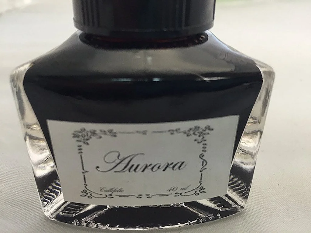
Chiku-rin is available in a standard 50ml bottle as well as a smaller 15ml bottle.

(JetPens provided this product at no charge to The Pen Addict for review purposes.)


Enjoy reading The Pen Addict? Then consider becoming a member to receive additional weekly content, giveaways, and discounts in The Pen Addict shop. Plus, you support me and the site directly, which I am very grateful for.

Membership starts at just $5/month, with a discounted annual option available. To find out more about membership click here and join us!

Posted on February 15, 2017 and filed under Pilot, Iroshizuku, Ink Reviews.

Callifolio Aurora Ink: A Review

(Susan M. Pigott is a fountain pen collector, pen and paperholic, photographer, and professor. You can find more from Susan on her blog Scribalishess.)

Callifolio is an ink brand I had never tried until now. L'Artisan Pastellier, the maker of these inks, is based in France and produces a variety of ink colors which you can buy in 40ml bottles or 50ml pouches. The ink meets the high standards for environmental safety and the colors represent natural pigments found in nature.

Image via Vanness Pens

I received a sample of Callifolio Aurora along with an order of ink from Vanness Pens. Aurora is an unusual terracotta color. It is highly saturated, moderately wet, and exhibits good shading qualities. The ink is not waterproof.

Chromatography reveals colors ranging from sandy-brown, to pink, to red-orange, to dark brown. This is a complex color.

Ink splats show dark brown sheen that can also be seen with wide nibs.

With my oblique medium nib, I couldn’t detect sheen, but there is some shading.

I’ve decided that Callifolio Aurora is the perfect color for my Montblanc Rouge et Noir fountain pen. I love how unique this color is and how beautifully it writes. You can order it from Vanness Pens, $12.00 for a 40ml bottle, $8.00 for a 50ml pouch, or $2.00 for a 4ml sample.


Enjoy reading The Pen Addict? Then consider becoming a member to receive additional weekly content, giveaways, and discounts in The Pen Addict shop. Plus, you support me and the site directly, which I am very grateful for.

Membership starts at just $5/month, with a discounted annual option available. To find out more about membership click here and join us!

Posted on February 10, 2017 and filed under Callifolio, Ink Reviews.

De Atrementis Red Roses Ink Review

(Jeff Abbott is a regular contributor at The Pen Addict. You can find more from Jeff online at Draft Evolution and Twitter.)

The De Atramentis ink brand is made solely by the one and only Dr. Franz-Josef Jansen in Germany. I've tried a few inks from De Atramentis over the years, and I've always been impressed by how they behave and act on the page. I was recently rummaging around the ink shelf when I found an old test vial from Goulet Pens that I had never inked up: Red Roses. Being that Valentines Day is right around the corner, I decided to give it a shot.

Red Roses is a reddish pink ink that flows beautifully in all three pens I've used it with. On some papers, it shows up more pink than the Rhodia I used in this example, but it's a beautiful color either way. One thing is for sure: this ink is not meant to be subtle. It pops off the page like tiny flowery explosions. Oh, and it has a strong scent of roses, which I both enjoy and dislike. More on that in a bit.

Hands down, my favorite part of this ink is the shading. It swings back and forth between a medium dark pink and lighter, more neon pink in some places. It's a delightful color that brings a smile to your face. Someone opening a letter that was composed with this ink will be greeted by a lovely scent and the exciting color that grabs your eyes and gently refuses to let go. In this 1.1mm stub nib, it really shows off the shading qualities, but it shades pretty nicely in smaller nibs as well. But, like most inks that shade well, I really recommend using this ink in a larger nib size.

Something that really surprised me about this ink is how fast it dries. I'm not well-versed in the world of pink and purple inks, but I had an assumption that this ink would take around 20 seconds to completely dry. I was completely wrong. In most cases, the ink is dry in about 10-15 seconds in this 1.1mm stub nib. In a medium nib, it dries consistently in under 10 seconds. This is phenomenal for any ink. 10 seconds is a hard number to break, but it does it somehow.

The flow and lubrication of the ink is right where I like it: the middle. It's lubricated and wet enough to make scratchy nibs feel a bit smoother, but not too wet to cause issues with the paper. Again, for how quickly this ink dries, I'm shocked by how well it flows.

Being a fairly saturated ink, there is some show-through on most papers. On the sheet of Rhodia I used here, it's almost unusable on the back side of the sheet. For other thinner papers, this will only be worse. Still, it doesn't present any real problems apart from making it a bit difficult to read if you write on both sides of the page. Bleeding is non-existent.

Like I just mentioned, it's a very saturated ink, so cleaning can take some time to properly remove all the little particles. Still, it's not difficult to clean in any sense.

Now, the scent of this ink catches me on two different opinions depending on what I happen to smell. I don't know why this happens, but sometimes I smell lovely roses, and other times I smell baby wipes. I have no explanation. There's nothing in our house that smells anything like baby wipes, so I'm sure it's not a non-ink scent. Still, it hits me one out of three times when I smell the ink, and I'm not sure I like it. Overall, the roses smell really nice when that's what I smell. I prefer the smell of roses that the J. Herbin rose ink exhibits, but the color of this Red Roses ink is much better.

Finally, the price of this ink is a bit high, but that's not unusual for a scented ink. At fifteen bucks for a 35ml bottle, I'd recommend trying a sample before committing to the entire bottle. While you're at it, try several other De Atramentis inks! They're fantastic inks, and ink samples are more fun if you buy more at a time.

Red Roses is a fantastic pink ink that looks stunning on the page and adds a delightful scent (mostly) to go along with the passionate color. It behaves well, dries extremely quickly, and is bound to put a smile on the face of the reader. Just in time for Valentines Day!


Enjoy reading The Pen Addict? Then consider becoming a member to receive additional weekly content, giveaways, and discounts in The Pen Addict shop. Plus, you support me and the site directly, which I am very grateful for.

Membership starts at just $5/month, with a discounted annual option available. To find out more about membership click here and join us!

Posted on February 8, 2017 and filed under De Atrementis, Ink Reviews.