Posts filed under Ink Reviews

Nagasawa Kobe 21 Taison-Ji (Temple Yellow) Ink: A Review

(Susan M. Pigott is a fountain pen collector, pen and paperholic, photographer, and professor. You can find more from Susan on her blog Scribalishess.)

The Nagasawa Stationery Shop is located in Kobe, Japan. It carries a line of more than fifty Sailor inks, many of which are now available through Vanness Pens.

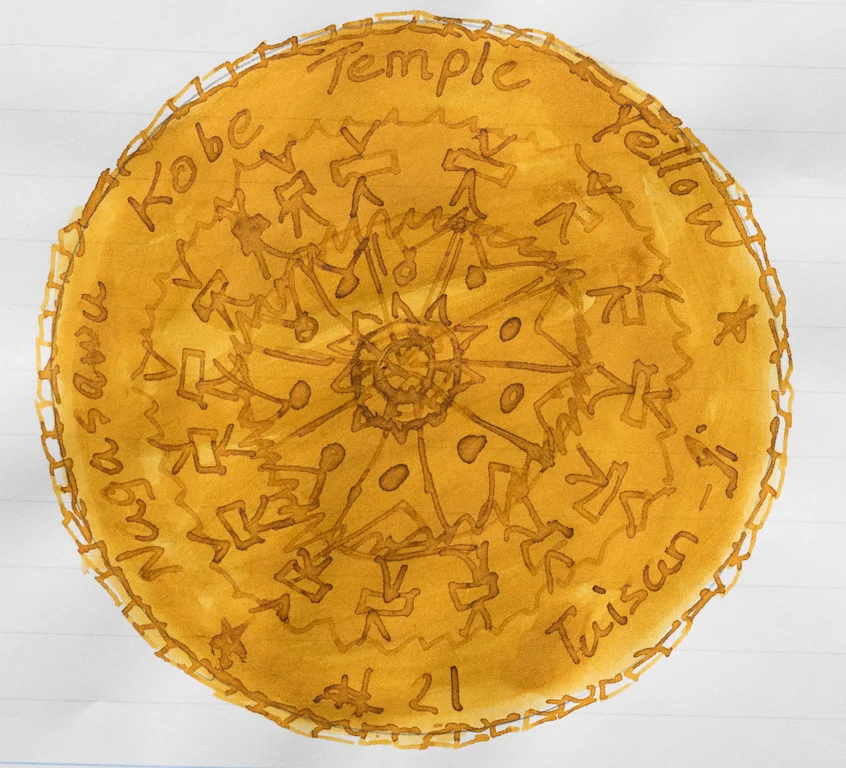
I ordered a sample of Nagasawa Kobe 21, Taisan-Ji (Temple Yellow) specifically for my prototype Omas Burkina because I like matchy inks.

Temple Yellow is a beautiful amber ink with amazing shading properties. In my ink testing, I found it to be a rich color, very wet, but definitely not waterproof.

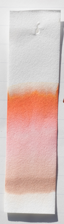
Chromatography reveals vivid lime green and deep orange colors mixed to create this brownish-yellow.

The ink splats demonstrate a dark brown sheen.

Because the ink is very wet, it can smear easily, especially if you’re a leftie. But, once it dries it is such a gorgeous color and the shading is wonderful, especially where the ink pools.

I thought KWZ Honey (review here) might be a much cheaper alternative, but it’s much more brown than Temple Yellow. Pelikan Amber is a close match, but it is a limited edition color (out of stock everywhere I checked) and also expensive.

Kobe Temple Yellow is $30.00 for a 50ml bottle at Vanness Pens. You can get a 4ml sample for $3.00.


Enjoy reading The Pen Addict? Then consider becoming a member to receive additional weekly content, giveaways, and discounts in The Pen Addict shop. Plus, you support me and the site directly, which I am very grateful for.

Membership starts at just $5/month, with a discounted annual option available. To find out more about membership click here and join us!

Posted on February 17, 2017 and filed under Kobe, Ink Reviews.

Pilot Iroshizuku Chiku-rin Ink Review

(Jeff Abbott is a regular contributor at The Pen Addict. You can find more from Jeff online at Draft Evolution and Twitter.)

Spring is still a couple months away (at least), but that doesn't mean your ink has to be cold and gloomy. Iroshizuku chiku-rin is a cheery yellow-green ink that comes alive on paper. It's not an orthodox ink color to be sure, but it's delightful to say the least. No matter what's going on, this ink cheers me up.

The English version of chiku-rin is "bamboo forest," which fits this color perfectly. With a wetter nib, you get more saturation of the green, but in most of my pens, this lays down as a light green with yellow accents. If the nib is dry, however, it might be difficult to read your writing later on as the light yellow color doesn't contrast well to white paper. It's also probably safe to say that this ink isn't office friendly. Overall, it's a beautiful color that I love using.

The shading of chiku-rin is great. It's not as dramatic as some inks, but it provides a good range of color depth in most pens. Obviously, the larger the nib, the more variation, but this ink also shades well in smaller nibs due to the light color. I've also used this ink in a Pilot medium nib, and the shading behavior is just as great as with this 1.1mm stub in the review pictures.

I was shocked when I measured the dry time of this ink and found that it is consistently dry after about 8-10 seconds. This is something to consider if fast dry time is important to you. In the world of fountain pen inks, that's a rare dry time. Obviously, this will depend on the nib you're using and the size of the strokes, but for most non-specialty nibs that are medium or smaller, you can count on a quick dry time.

Like every Iroshizuku ink I've used, this ink flows well, has no issues starting, and is generally really well-behaved. It's easy to clean, lubricates the nib nicely, and performs consistently in a variety of nibs. Bleeding hasn't been an issue, but it would be difficult for me to see if there were small amounts due to the light color.

The ink shade is so light that show-through also isn't an issue. In standard Field Notes paper, there will be a fair amount of show-through, but in other fountain pen friendly papers, this won't be an issue. The only time I can see the ink on the opposite side of the page is if the paper is lit from behind.

I'm consistently pleased with every Iroshizuku ink I try, and chiku-rin is no different. With this ink line, you can expect great behavior and ink characteristics. The only real concern you have as a buyer is picking the colors you like. I'm not well-versed in the light green and yellow-green spectrum, but I really do enjoy using this ink fairly often. It goes great with cold, wet, wintery days, but it also looks great on a warm summer day. It's a happy color, and that's probably my favorite thing about it.

Chiku-rin is available in a standard 50ml bottle as well as a smaller 15ml bottle.

(JetPens provided this product at no charge to The Pen Addict for review purposes.)


Enjoy reading The Pen Addict? Then consider becoming a member to receive additional weekly content, giveaways, and discounts in The Pen Addict shop. Plus, you support me and the site directly, which I am very grateful for.

Membership starts at just $5/month, with a discounted annual option available. To find out more about membership click here and join us!

Posted on February 15, 2017 and filed under Pilot, Iroshizuku, Ink Reviews.

Callifolio Aurora Ink: A Review

(Susan M. Pigott is a fountain pen collector, pen and paperholic, photographer, and professor. You can find more from Susan on her blog Scribalishess.)

Callifolio is an ink brand I had never tried until now. L'Artisan Pastellier, the maker of these inks, is based in France and produces a variety of ink colors which you can buy in 40ml bottles or 50ml pouches. The ink meets the high standards for environmental safety and the colors represent natural pigments found in nature.

Image via Vanness Pens

I received a sample of Callifolio Aurora along with an order of ink from Vanness Pens. Aurora is an unusual terracotta color. It is highly saturated, moderately wet, and exhibits good shading qualities. The ink is not waterproof.

Chromatography reveals colors ranging from sandy-brown, to pink, to red-orange, to dark brown. This is a complex color.

Ink splats show dark brown sheen that can also be seen with wide nibs.

With my oblique medium nib, I couldn’t detect sheen, but there is some shading.

I’ve decided that Callifolio Aurora is the perfect color for my Montblanc Rouge et Noir fountain pen. I love how unique this color is and how beautifully it writes. You can order it from Vanness Pens, $12.00 for a 40ml bottle, $8.00 for a 50ml pouch, or $2.00 for a 4ml sample.


Enjoy reading The Pen Addict? Then consider becoming a member to receive additional weekly content, giveaways, and discounts in The Pen Addict shop. Plus, you support me and the site directly, which I am very grateful for.

Membership starts at just $5/month, with a discounted annual option available. To find out more about membership click here and join us!

Posted on February 10, 2017 and filed under Callifolio, Ink Reviews.