Posts filed under Ink Reviews

Callifolio Olivastre Ink Review

(Sarah Read is an author, editor, yarn artist, and pen/paper/ink addict. You can find more about her at her website and on Twitter.)

The Callifolio inks from L'artisan Pastellier are a line of non-toxic, non-corrosive, gentle inks made with natural pigments. Olivastre is one of the most saturated colors of the bunch, and the second most fun to say (after Andrinople, of course).

The inks come in 40ml bottles, or 50ml refill pouches. The bottles are interesting. They're the triangular wedge ones that can form a circle if you collect enough of them (or so I hear--it's a theory I'd like to test, as soon as possible). The pouches will only work if you have another container you can pour the ink into, as a pen can't be filled from the pouch itself. But I love the idea of refill pouches--I wish more ink companies would adopt that practice.

The formula is gentle enough that it can be used safely in vintage pens, and the colors can be mixed. I'm anxious to collect a few more colors so I can play mad scientist and concoct my own custom hues of this nice ink. I think that property gives this ink more potential as an art medium, beyond its standard pen-fill purpose.

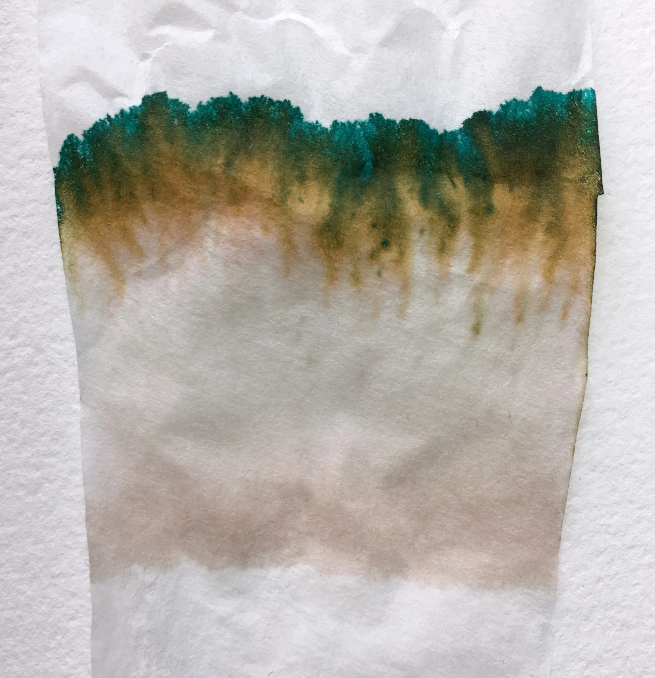
Olivastre just means "olive green"--and chromatography shows this is a lovely blend of gold, emerald-teal, and some shadow of a warm brown. It's a complex color that shows lovely shading, even with a fairly fine line. It saturates as a deep emerald/olive, and fades to a bright grass green. It's a dark enough color to pass as professional(ish), but bright enough to be fun.

It feels like a dry ink, but it flows very well, especially in a nice broad nib. Though it flows well, it dries quickly. Even on Tomoe River paper, it's dry in around 15 seconds, and seems to dry almost instantly on more absorbent paper. I suspect it would be a workable choice for lefties, though I'd need confirmation on that. But in contrast to some other fast-dry inks, I didn't experience much feathering, even on cheap paper.

It's not water resistant at all. Allowing drops of water to sit for any length of time lifted nearly every trace of the ink from the page. A slight shadow of it can still be seen--but not enough to salvage your notes in a rainstorm. But that's what makes it so easy to clean, and so kind to delicate pens. The more I see people posting about an ink that stained or damaged their pen, the more I want to hug inks that I can trust to be kind to my pens.

Personally, I find this color beautiful. I'm really enjoying using it, and I've got it loaded in several pens, so I can see how it plays with different nibs and papers. I'm decidedly intrigued by the Callifolio line, now, and anxious to try more. They have TONS of colors, including all the shades of blue--and millions of possible permutations when you consider mixing. It's the playground of ink, and it's recess time.


Enjoy reading The Pen Addict? Then consider becoming a member to receive additional weekly content, giveaways, and discounts in The Pen Addict shop. Plus, you support me and the site directly, which I am very grateful for.

Membership starts at just $5/month, with a discounted annual option available. To find out more about membership click here and join us!

Posted on April 20, 2017 and filed under Callifolio, Ink Reviews.

Monteverde Emerald Green Ink Review

(Jeff Abbott is a regular contributor at The Pen Addict. You can find more from Jeff online at Draft Evolution and Twitter.)

A few weeks back, I tried out my first Monteverde fountain pen ink and was pleasantly surprised. Since then, I've acquired another Monteverde ink, and while it doesn't perform as good as the previous, it's still a beautiful color and well-performing ink. Monteverde Emerald Green is a beautiful color, and I've really been enjoying using it as spring comes around.

There are several blues that easily make my top 5 lists, and I don't even need much time to decide. Greens, however, are a bit more elusive for me. I haven't settled on a list of favorites because I'm still working on finding what I like, and it doesn't help that there are an endless amount of green inks out there. It's slow work, but it's enjoyable.

Emerald Green takes its name from the emerald jewel, and it lives up to that name quite well. It's not what I would call a true emerald green, but it gets close and manages to be beautiful in the process. At the end of the day, I'm less interested in the name of the ink compared to how I like the color and ink properties.

Emerald Green is a light to medium green hue depending on how much ink is on the page. At times, you can detect more yellow and a touch of blue, giving it a pleasant teal or lime hint. Even with these other tones, it's impossible to mistake this for another color. It's absolutely green, and it's a beautiful shade.

Just like the Scotch Brown ink I reviewed, this ink has Monteverde's ITF (Ink Treatment Formula) that supposedly makes it perform at a higher level. Thinks like easy and consistent flow, resistance to drying when the cap is off, nib lubrication, and dry times. Like I said in my earlier review, I don't know (or really care) about their treatment system; whatever they're doing seems to work just fine. This is a very well-behaved ink. It flows well in the pens I've used, it doesn't have any trouble with starting or skipping, even after being uncapped and unused for a minute. It also does really well after being capped and unused for over a week — the ink usually started flowing just fine after the first stroke of a letter. Impressive.

The dry time is also a positive aspect of this ink. I found that the ink was dry on the page within 10-15 seconds in most cases. Obviously, this time increases as the nib size increases, but it manages to dry quickly in general.

Shading is great with this ink, though I wish it had just a little bit more variation. When you look at the ink after it dries, it's easy to see the shading between the fast and slow strokes of the letters and where the ink pools. But, the shading doesn't occur as effortlessly as other favorite inks. Still, it's nothing to criticize — it does a great job shading.

One thing I did notice was that the ink had significant show-through on some papers. Specifically, the untreated Baron Fig paper suffered the most, and also exhibited a good amount of feathering. But, on coated papers (Rhodia, Clairefontaine, Apica), it showed through very little and had no feathering problems. Sure, some inks perform well on every paper you throw at it, but this Monteverde still does a very good job considering. Part of using fountain pens is understanding that each pen, ink, and paper combination are unique and require a bit of learning to find what suits it best.

Overall, I've really been enjoying the Monteverde Emerald Green. It's a pretty good deal on JetPens at about $8 for a 30ml bottle. If you really love this ink, you can also purchase it in a massive 90ml bottle for just $16. If you're looking for a new green to try, consider this one!

(JetPens provided this product at no charge to The Pen Addict for review purposes.)


Enjoy reading The Pen Addict? Then consider becoming a member to receive additional weekly content, giveaways, and discounts in The Pen Addict shop. Plus, you support me and the site directly, which I am very grateful for.

Membership starts at just $5/month, with a discounted annual option available. To find out more about membership click here and join us!

Posted on April 19, 2017 and filed under Monteverde, Ink Reviews.

De Atramentis Black Edition Green Ink Review

(Jeff Abbott is a regular contributor at The Pen Addict. You can find more from Jeff online at Draft Evolution and Twitter.)

De Atramentis, the German ink company comprised of Dr. Franz-Josef Jansen, is an ink brand that I'm getting more accustomed with. As I try more of their inks, I've found a lot that I like, as well as things I don't care for. In the case of Black Edition Green, I came away a bit disappointed with the color and behavior of the ink. But, as they say, you can't win them all.

From looking at the name of the ink, I was expecting a rich, deep ink that had hints of green hidden away under a black shroud. Instead, the ink looks like a medium gray-green. It's not a bad color, I just don't think the name matches up with the actual ink color. The green is definitely there, but the black is pretty light. It's an interesting color, for sure, but not what I was expecting.

The next thing I noticed about the ink was how quickly it soaks into the paper when writing. In the 1.1 mm Monteverde stub nib, it felt a bit dry, but some papers soaked up the ink like a sponge, while others behaved normally. This probably has something to do with the coatings on different papers. For example, the ink did great on Rhodia and Clairefontaine, but looked terrible on Baron Fig paper. On the latter, the ink had zero shading and a bland gray-green hue that didn't look very attractive. Overall, the saturation of this ink is on the low side.

On the plus side, there's a fair amount of shading if you're using the right paper. It shades between a dark green and a lighter gray-green, but it's not dramatic. It's business friendly, especially in finer nibs.

Dry time is somewhere in the 15-second range, depending on the nib and paper. This is fairly standard and positive as far as drying times go for most inks.

I didn't detect any amount of feathering in my testing, with only minimal cases on cheap copy paper. It does an excellent job in that department. Show-through was also minimal, which is pretty impressive for a darker and somewhat wet ink like this one.

Like I mentioned before, I'm not sure what to make of the lubrication qualities in this ink. The pens I've tested with this ink do fine, but they feel slightly less smooth. And, there's the tendency for the ink to soak in on uncoated papers, which is something you need to keep in mind if that's primarily what you use. If I used Baron Fig exclusively with this ink, I would be disappointed. This isn't a knock on Baron Fig — most of my inks perform great on their paper. This has something to do with the formula of this particular ink.

When it comes down to it, it's difficult to recommend De Atramentis Black Edition Green. Dark greens are plentiful, and I can think of 5 inks from memory I'd rather use than this one, let alone if I went ink shopping. Given the price of the De Atramentis inks (about $15 per 35ml bottle), I'd suggest looking at some of the options that Diamine offers as a start. After that, most ink brands have a dark green or gray-green that looks great and performs well.

(JetPens provided this product at no charge to The Pen Addict for review purposes.)


Enjoy reading The Pen Addict? Then consider becoming a member to receive additional weekly content, giveaways, and discounts in The Pen Addict shop. Plus, you support me and the site directly, which I am very grateful for.

Membership starts at just $5/month, with a discounted annual option available. To find out more about membership click here and join us!

Posted on April 5, 2017 and filed under De Atrementis, Ink Reviews.