Posts filed under Ink Reviews

Kyoto Kyo-Iro Higashiyama Moonlight Ink: A Review

(Susan M. Pigott is a fountain pen collector, pen and paperholic, photographer, and professor. You can find more from Susan on her blog Scribalishess.)

Kyoto Kyo-Iro inks are plant-based inks inspired by places in Kyoto, Japan, sold by the TAG Stationery Store. Higashiyama is a ward within Kyoto, and Moonlight is a color based on moonlight reflected off the Kyoto style houses. All the colors in this series are muted, earthy tones.

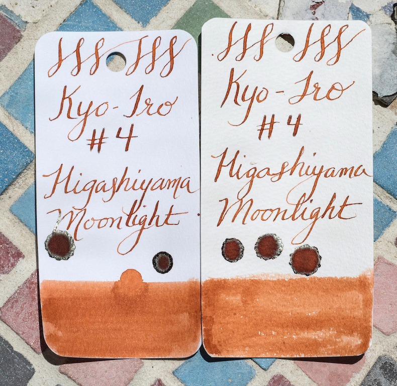
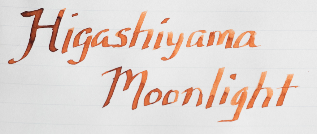
Higashiyama Moonlight is a terracotta color with peach and deep orange tones.

The ink is an unusal color with excellent shading properties. It is a fairly dry ink, even in my Pelikan medium italic. Nevertheless, it flows well and retains its rich color even after drying. It is not waterproof.

In wide nibs, like the Pilot Parallel 2.4mm, the ink exhibits gorgeous shading.

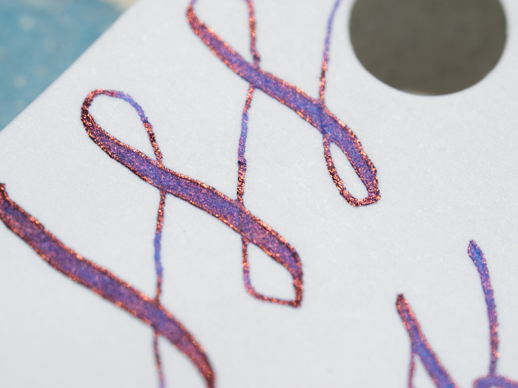
It also has a beautiful dark brown sheen in ink splats and wherever the ink pools with wide nibs.

I much prefer terracotta-colored inks over bright oranges, and Higashiyama Moonlight is an absolutely gorgeous shade. If you like earthy, muted inks, you’ll like the Kyo-iro line. My next bottle will be Soft Snow of Ohara. You can buy these specialty inks from Vanness Pens, $28.00 for a 40ml bottle or $3.50 for a 4ml sample.

My wonderful husband purchased this ink for me for Mother’s Day from Vanness Pens.


Enjoy reading The Pen Addict? Then consider becoming a member to receive additional weekly content, giveaways, and discounts in The Pen Addict shop. Plus, you support me and the site directly, which I am very grateful for.

Membership starts at just $5/month, with a discounted annual option available. To find out more about membership click here and join us!

Posted on May 26, 2017 and filed under Kyoto, Ink Reviews.

Col-o-ring Ink Testing Book: A Review

(Susan M. Pigott is a fountain pen collector, pen and paperholic, photographer, and professor. You can find more from Susan on her blog Scribalishess.)

Once upon a time there was the Maruman Mnemosyne Word Book with lovely textured, cream-colored cards that many pen afficionados used for ink sampling. And then, suddenly, they were gone. No longer produced. No longer stocked. And, lo, pen addicts across the world knew not what to do—go back to gasp index cards?

Captured from JetPens.com

No! For along came a fountain pen Queen with pink hair to save the ink-testing world. Ana Reinert of The Well-Appointed Desk kindly created the Col-o-ring Ink Testing Book. And all was well again.

The Col-o-ring Ink Testing Book is a single-ring-bound book of 100 cards made of 100lb/160gsm acid-free white paper. Each book has a thick brown cardboard cover and back.

When you put a Mnemosyne card next to a card from the Col-o-ring notebook, you’ll notice several differences. First, the Col-o-ring cards are slightly smaller (2 inches by 4 inches vs. Mnemosyne’s 2.1 x 4.1). Second, the Col-o-ring paper is white whereas Mnemosyne is a yellowish-cream color. Third, the Col-o-ring cards are smooth whereas the Mnemosyne cards have significant texture.

Col-o-ring on left; Mnemosyne on right

I much prefer the Col-o-ring cards to the Mnemosyne. Although I love Mnemosyne’s texture for swabbing, it isn’t so great for nibs, especially flexible nibs which sometimes catch on textured paper. The Col-o-ring paper won’t catch your nibs. I also prefer Col-o-ring’s white paper to Mnemosyne’s cream. Inks look different on cream paper than true white paper, and when I’m testing ink, I want to see the actual color, not a slightly yellowed version.

I received a new batch of ink samples from Vanness Pens, mostly Kobe and Kyoto inks, so I used my Col-o-ring book to do initial swabs, splats, and swirls. I am so impressed with this paper. It is thick, smooth, and offers plenty of space for ink testing.

I like to do my swabs at the bottom so I can see the colors quickly when I fan out the cards.

The paper takes swabs well, though it does curl up slightly when it dries. Like Tomoe River Paper, it displays sheen beautifully:

Col-o-ring books are a steal at $10.00 a piece. The only problem is getting them! Queen Ana is hurriedly trying to meet demand, so be patient. She has pen shows to attend, pink hair to maintain, and other queenly duties. You can sign up here to be notified when the books are back in stock.

All hail Queen Ana!

(The Well-Appointed Desk provided this product at no charge to The Pen Addict for review purposes.)

Posted on May 12, 2017 and filed under Col-o-ring, Notebook Reviews, Ink Reviews.

Callifolio Bleu Pacifique Ink Review

(Jeff Abbott is a regular contributor at The Pen Addict. You can find more from Jeff online at Draft Evolution and Twitter.)

There might be something wrong with me, because I can't stop trying turquoise inks to save my life. There's just something about the bright blue shade with hints of green and happiness that I can't get enough of. The latest in this obsession? Callifolio Bleu Pacifique.

Callifolio is made by l'Artisan Pastellier in France, and feature a wide array of colors and properties. With over 30 inks on offer, it's hard to narrow down the list.

Bleu Pacifique is inspired by the calm blue of the Pacific ocean on its best days. It's a light shade of the turquoise family, but still stunning. While not waterproof, this ink still has many positive attributes that make it a solid contender in the wide world of turquoise blue inks.

Depending on the nib you use with this ink, dry time can be pretty fast. In my testing with this EF TWSBI nib, it typically dries completely in about 8 - 12 seconds. That's fast, but it's a small nib. In other nibs, it takes around 15 - 20 seconds to fully dry. Still, not bad at all.

Perhaps my favorite thing about this ink (besides the color) is the shading properties. Like the body of water it's named after, it shifts between a light blue green and a darker blue with only a hint of green under the surface. The entire range of shades is beautiful, and I never get tired of looking at it and watching it morph between the strokes.

The ink flows really well, although it is a bit dry. In the short list of pens I've used with this ink, it wasn't a problem, but those pens are known to have fairly good flow to begin with. Only keep this in mind if you intend to use this in a pen that has known flow problems or tends to write on the dry side.

One area where this ink does not excel is when it comes to less than premium papers. If you use this in a standard Field Notes paper or anything similar (or worse), you can expect some significant bleeding, feathering, and show-through. Even in the EF nib on the TWSBI, this ink feathered like a river in my Field Notes book. But, anything with a coating on the paper or with better GSM will hold up spectacularly well with this ink. As such, I would only recommend this if you intend to use it with papers like Rhodia, Clairefontaine, Leuchtturm, Tomoe River, etc.

Cleaning out this ink is as simple as it should be. No complaints, hitches, or issues.

At the end of the day, I don't need any more turquoise inks in my collection, but I'm really glad I added this one. It's similar to everything else in the turquoise spectrum, but it still shades differently, has a lighter tone, drier flow, and fairly quick dry time compared to the others I have. It's a fantastic ink, and I highly recommend it if you're in the market for a great turquoise ink.

JetPens now stocks all 36 Callifolio inks, including Callifolio Bleu Pacifique, of course.

(JetPens provided this product at no charge to The Pen Addict for review purposes.)


Enjoy reading The Pen Addict? Then consider becoming a member to receive additional weekly content, giveaways, and discounts in The Pen Addict shop. Plus, you support me and the site directly, which I am very grateful for.

Membership starts at just $5/month, with a discounted annual option available. To find out more about membership click here and join us!

Posted on May 3, 2017 and filed under Callifolio, Ink Reviews.