Posts filed under Ink Reviews

De Atramentis Pearlescent Brillant Violet Silver Ink Review

(Sarah Read is an author, editor, yarn artist, and pen/paper/ink addict. You can find more about her at her website and on Twitter.)

So, more sparkle inks, yes? I have to say that I feel like my sparkle ink needs are already met, but that feeling is in direct opposition to my "more ink, please" philosophy. So, sure--more sparkle ink. This time it's De Atramentis bringing the glimmer to your pages, with their Pearlescent line, which includes a wide variety of colors with either silver or gold sparkle. One thing that this line offers that the others don't is your choice of either gold or silver in each color. So if you fall in love with a base color, you can go with either the cool or warm shine to it.

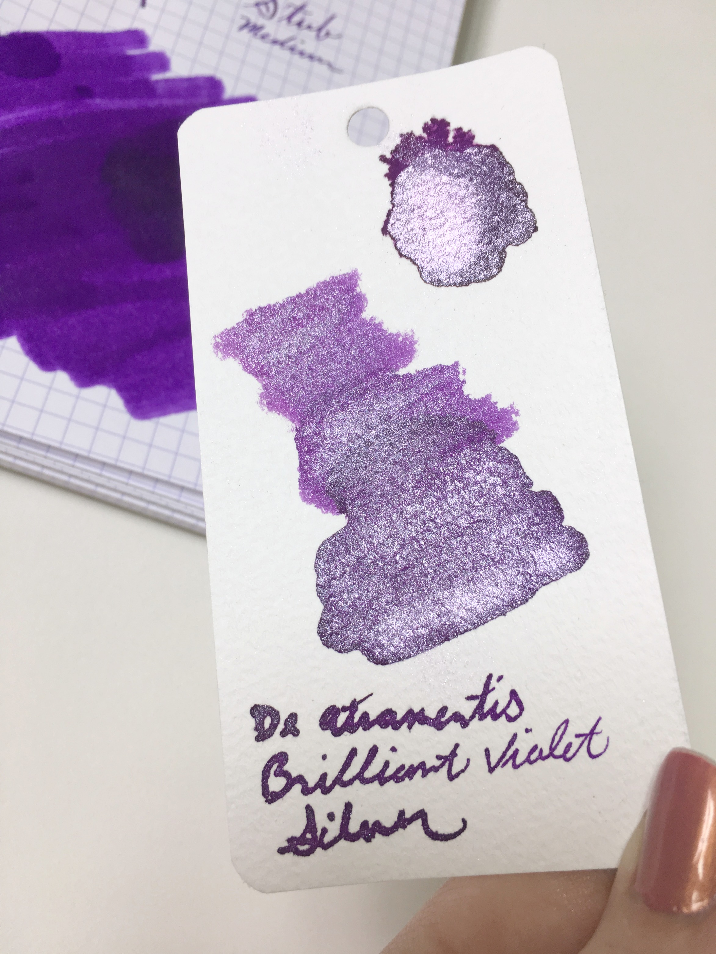
This ink is very shiny. At the right angle, it is almost mirror-bright in sunlight. And the shimmer shows nicely even in a Pilot Metro fine point nib. With a stub, it's a total party ink. It might even be a bit too much for everyday use, at least for me. I'd reserve something this blingy for holiday cards and special occasions. Or for sending really alarming news.

The color of this Brilliant Violet lives up to its name. It's a very saturated color with lots of zip. The dry time is fairly slow on Rhodia paper. It was noticeably faster on cheaper paper, where it still showed a good sparkle and very little feathering. There's almost no shading to be seen on any paper. It survived a light sprinkle of water with the lines still visible, but when really soaked it all disappeared. It does, however, stain skin and remain firmly in place for days. I also noticed that, when dry, the sparkle rubs off the paper a bit. So if you're passing your hand over dry writing, you may end up looking like Tinkerbell. There is no extra charge for this service.

The chromatography showed some lovely blue undertones, but overall it's not a terribly complex color. It is brighter than the other purples in my collection, but that's likely because I prefer my purples more muted. The silver sparkle does cool the color down a bit--the gold sparkle version of the same color looks quite different. It's really interesting to see how the different sparkles change the colors throughout the collection.

The ink flowed well in my TWSBI with a stub nib, even after sitting for several days. And I had no trouble with it in the fine point Pilot Metro, either. I did have some flow issues with the TWSBI when I swapped in the medium nib, even after forcing some ink into the feed--but the difference was drastic enough that I'd attribute the issue to the nib rather than the ink.

If you're looking to add some serious zing to your writing or artwork, these inks should do the trick. And with ten different colors, each with the two sparkle options, there's almost certainly one that inspires you. The Heliogen Green with gold sparkle is calling to me. My pen pals can anticipate Tinkerbell letters in the near future (happy thoughts included).

(JetPens provided this product at no charge to The Pen Addict for review purposes.)


Enjoy reading The Pen Addict? Then consider becoming a member to receive additional weekly content, giveaways, and discounts in The Pen Addict shop. Plus, you support me and the site directly, which I am very grateful for.

Membership starts at just $5/month, with a discounted annual option available. To find out more about membership click here and join us!

Posted on July 27, 2017 and filed under De Atrementis, Ink Reviews.

Robert Oster Signature Ink Review: Peppermint

(Susan M. Pigott is a fountain pen collector, pen and paperholic, photographer, and professor. You can find more from Susan on her blog Scribalishess.)

I’ve often said that my favorite color of ink is blue—any shade of blue. But Robert Oster is making a green-ink lover out of me. I reviewed Verde de Rio here, and I’m still planning on getting a bottle of Jade. When I first saw Peppermint on Robert’s Instagram feed, I knew I had to have it. For those folks who like to do the Christmas in July thing, Peppermint is the perfect ink. It makes you feel all cool and pepperminty inside as you write with it.

Chromatography shows how nicely complex this ink is, with pink, some turquoise, and lots of deep blue and green shades.

The ink looks sort of flat on my ink testing sheet, but I think that’s because I used a fine nib, and the Maruman paper doesn’t show off the ink’s sheen (more on that below). This is a really nice blue/green ink. It has no odor. The dry times are faster than some of the other Robert Oster inks I’ve tested, but it’s definitely not a dry ink. It is not waterproof.

But boy, oh boy, is this some sheeny ink. When you use a wide nib or do ink splats and expose it to some sunshine, you get a bright pink sheen that shouts “Peppermint!” And then you start craving candy canes.

Written with the Handwritmic Pen

Peppermint is a terrific green for any occasion, but just wait until it’s time to write those Christmas cards. I might just get started now! (Ha, ha, yeah right). You can get a 50ml bottle of Robert Oster Peppermint from JetPens for $17.00.

(JetPens provided this product at no charge to The Pen Addict for review purposes.)


Enjoy reading The Pen Addict? Then consider becoming a member to receive additional weekly content, giveaways, and discounts in The Pen Addict shop. Plus, you support me and the site directly, which I am very grateful for.

Membership starts at just $5/month, with a discounted annual option available. To find out more about membership click here and join us!

Posted on July 21, 2017 and filed under Robert Oster, Ink Reviews.

Robert Oster River Of Fire Ink Review

(Jeff Abbott is a regular contributor at The Pen Addict. You can find more from Jeff online at Draft Evolution and Twitter.)

In Australia, Robert Oster has been producing some unique, beautiful inks that I'm sure we've all heard of. One of the more famous ones is Fire and Ice, which has a lovely blue shade and gobs of red sheen. Be careful looking at the collection of Robert Oster inks — you'll want to pick up a surprising number of delicious inks to try.

One of the new inks for 2017 is River of Fire — a gorgeous dark green with hints of blue and subtle red sheen. It's a beautiful ink that performs admirably at a decent price.

From JetPens, here's a short description of Robert Oster and his inks:

Inspired by the rich scenery and culture of Australia, Robert Oster inks are available in a stunning selection of vibrant and contemplative colors. Made with a commitment to environmental friendliness, all Robert Oster inks are non-toxic, 100% made in Australia, and bottled in PET plastic bottles from the country's first carbon-neutral plastics plant.

The environmental-friendly aspect is pleasing enough, but throw in the lovely colors and you've got a real winner.

River of Fire is a lovely green with hints of deep blue. It reminds me of a glimmering river, shifting from dark green, light green, and blue as it flows. It's a beautiful shade, and there's plenty of it. The saturation is phenomenal, and you never feel like it's not dialed up enough to let those gorgeous colors shine through. This is an ink that deserves a fat, wet nib to showcase its beauty and hidden attributes.

While the main color for River of Fire is medium to dark green, it has a lovely amount of shading between the greens. It shades easily and often, regardless of nib. There are blue undertones, and those come out more when using a wetter nib, so keep that in mind.

Like its cousin, Fire and Ice, there's a bit of red sheen at times. It isn't as prominent as the sheen in Fire and Ice, but it's there if you have the right light. To my eye, it's mostly red sheen, but I pick up blue/green sheen as well. It's a real delight when you see these characteristics pop up when you aren't expecting them. What looks like a normal, nicely shaded green ink has some sheeny tricks. To get the best results for sheen, use a really wet nib and Tomoe River paper.

The bleed and feathering factor of this ink is incredible. Even when using wide, wet nibs, this ink keeps its cool. I've tried it on all the paper types I own, and I haven't seen any bleeding, feathering, or show-through. It's really incredible. That green goodness stays where it's supposed to.

Another surprising attribute of River of Fire is the dry time. The dry time ranges from 5-20 seconds depending on the nib and paper, but I was shocked to get consistent 8-10 second dry times using a 1.1mm stub (broad side) on Clairefontaine. That's incredible. On other papers, the dry time is more consistent with other inks, coming in around 15-20 seconds in the darker, pooled areas. For most writing conditions, 10-12 seconds seems to be the average.

The flow and lubrication of this ink is also top-notch. It starts consistently, has no issues with skipping or stuttering, keeps well when uncapped for a couple of minutes, and lubricates the nib well. This really helps out when using a wide nib, because the ink flow has no problem keeping up with the amount of ink required in such a large nib.

I'm still only dipping my toe in the Robert Oster well, but I know I'll certainly be trying out others. If there was a "one of each" sampler pack of Oster inks, I'd be all over it. It's a slippery slope, but one worth sliding down if you enjoy unique, well-behaved, nuanced inks that pack a punch.

JetPens has a huge range of Robert Oster inks available, and at $17 for a 50ml bottle they are an excellent value.

(JetPens provided this product at no charge to The Pen Addict for review purposes.)


Enjoy reading The Pen Addict? Then consider becoming a member to receive additional weekly content, giveaways, and discounts in The Pen Addict shop. Plus, you support me and the site directly, which I am very grateful for.

Membership starts at just $5/month, with a discounted annual option available. To find out more about membership click here and join us!

Posted on July 12, 2017 and filed under Robert Oster, Ink Reviews.