Posts filed under Ink Reviews

De Atramentis Alexander Hamilton Ink Review

(Sarah Read is an author, editor, yarn artist, and pen/paper/ink addict. You can find more about her at her website and on Twitter.)

De Atramentis has taken their standard Aubergine color and put a dashing Alexander Hamilton on the label--giving an already popular ink a new wave of energy. I'm not usually into the relabeling of old products, but the De Atramentis themes are always a fun take.

This rich purple ink is nicely lubricated. I had no flow issues with it at all--and though it behaves like a very wet ink, the dry time isn't too unreasonable. It took about 22 seconds to dry completely on Rhodia paper, but it's relatively dry a bit quicker than that.

It's a very saturated color that doesn't show much shading. There is a little bit, but it's not a key feature with this ink. Chromatography shows that it's a bright pink and grey mix, and the dark tones of it do result in a higher rate of show-through on thin paper. I did not experience any bleeding on the papers I tried. When it pools, it has a subtle brassy sheen to it that is extremely lovely. I didn't see much of this sheen in regular writing, though--only in places where I deliberately tested for it.

One of my favorite features of this ink is its water resistance. It isn't advertised as having any resistance, but both my drop test and my wash test showed that this ink will survive a leaky water bottle or spilled cup of tea. While the pink tone washed away, the darker grey tone stayed put and the text was still easily readable.

While the color is the same as the Aubergine ink from De Atramentis, the shade itself is different from the other purples in my swatch collection. It has a magenta undertone that makes it a little more zippy than the more common dusty purples.

The popularity of Hamilton as an historical--and more recently, musical--figure has led to some scarcity of this ink. If you love the color, Aubergine is still more easily available. But the fun themed labels are worth the wait--and they make great gifts for fans and enthusiasts.

(Vanness Pens provided this product at no charge to The Pen Addict for review purposes.)


Enjoy reading The Pen Addict? Then consider becoming a member to receive additional weekly content, giveaways, and discounts in The Pen Addict shop. Plus, you support me and the site directly, for which I am very grateful.

Membership starts at just $5/month, with a discounted annual option available. To find out more about membership click here and join us!

Posted on January 11, 2018 and filed under De Atrementis, Ink Reviews.

Two Kyoto Ink Reviews: Ohara’s Morning Snow and Hisoku

(Susan M. Pigott is a fountain pen collector, pen and paperholic, photographer, and professor. You can find more from Susan on her blog Scribalishess.)

For Christmas Santa bought me some fabulous ink! (Well . . . actually, I ordered the ink and Santa wrapped it, but whatever). I asked for several Japanese inks. One was Kobe’s Mikage Grey (which I included in a review of grey inks here). The others were Kyoto TAG inks: Kyo-no-oto Hisoku, which is a limited edition ink, and Kyo-iro Ohara’s Morning Snow. These are inks produced by the TAG stationery store in Kyoto, Japan.

Kyo-iro Ohara’s Morning Snow

I fell in love with Kyo-iro Ohara’s Morning Snow when I first saw it on the Vanness website. The name comes from the soft purple shadows that appear in snow drifts on cold mornings (not that we have such days in Abilene, Texas, sigh). The color is a muted purple that can be quite dark in wide or flexible nibs and nicely subtle in finer ones.

I tested the ink using my Aurora Nebulosa with a medium italic nib (no flex). The ink shades well and writes beautifully, though it is a bit on the dry side. As you can see from the swipes, the ink can appear as a dark purple or (as in the swab) a dusky purple. It is not waterproof.

Chromatography reveals several colors in Ohara’s Morning Snow: dark blue, purple, lavender, pink, and light blue.

The ink exhibits wonderful shading and sheen in wide nibs, as demonstrated using my Handwritmic Ruling Pen.

But for normal writing, the ink is much more subtle, as you can see in these writing samples with my medium italic nib. The poem is by Christian Wiman who teaches at Yale.

##Kyo-no-oto Hisoku

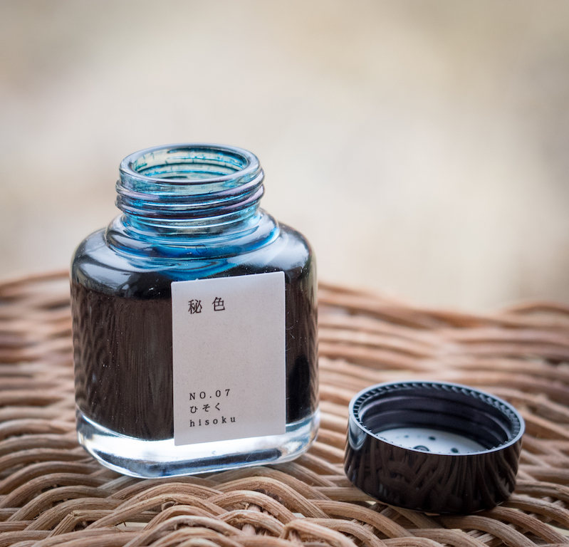
I saw a swatch of Kyo-no-oto Hisoku on the Fountain Pen Network and went nuts over it. Poor Lisa at Vanness Pens got about a dozen emails from me about this ink. Fortunately, she was able to procure a bottle and got it to me in time for Christmas. Hisoku means “secret,” and this ink looks like something whispered in the wind. Unfortunately, it is a limited edition.

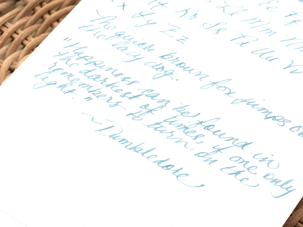
Hisoku is an unusal color. It’s not bright like a teal ink and it’s not dark like a blue ink. Vanness calls it a “steel blue.” I think it looks like the muted blues you sometimes see in Renaissance paintings. I tested it using an Omas fine extra flessibile nib. It exhibits gorgeous shading and the color is quite unique. It reminds me a little of Noodler’s Dostoevsky, but I like Hisoku better. The ink is wet and is not waterproof.

Chromatography reveals some of Hisoku’s secrets. It is a muted blue ink with some yellow tones.

Hisoku looks fantastic in a wide nib with excellent shading and sheen where the ink pools.

I wrote out a poem by one of my favorite poets (Mary Szybist) using my Omas pen, but something is wrong with the feed and the nib kept railroading.

So, I switched to my TWSBI mini with a 1.1mm stub. The ink performed well. It’s wet, but not deeply saturated, yet it shades beautifully.

I love Kyoto inks because they are soft, distinctive colors that evoke emotions in me that other inks simply do not. I can’t explain this. Perhaps the names of the inks create images in my mind that stimulate emotions. Perhaps the colors themselves remind me of fond memories. Either way, the inks are special to me.

You can purchase both Kyo-iro Ohara’s Morning Snow and Kyo-no-oto Hisoku at Vanness Pens. 40ml bottles are $28.00 and 4ml samples are $3.50[

(These inks were purchased from Vanness Pens at a discount with my own funds.)


Enjoy reading The Pen Addict? Then consider becoming a member to receive additional weekly content, giveaways, and discounts in The Pen Addict shop. Plus, you support me and the site directly, for which I am very grateful.

Membership starts at just $5/month, with a discounted annual option available. To find out more about membership click here and join us!

Posted on December 29, 2017 and filed under Kyoto, Ink Reviews, Tag.

Robert Oster Signature Ink Review: Soda Pop Blue

(Susan M. Pigott is a fountain pen collector, pen and paperholic, photographer, and professor. You can find more from Susan on her blog Scribalishess.)

I love Robert Oster inks, and I know I’m not alone. I am especially fond of blue inks, so it’s no surprise that when Soda Pop Blue came out, I wanted some. Soda Pop Blue is a cross between a blue and a turquoise ink. And, like many Robert Oster inks, it has lovely shading and sheen.

I tested Soda Pop Blue on Maruman Septcouleur 75gsm paper, which is a smooth, true white paper. I used a Parker Premier fountain pen with a medium nib. This nib doesn’t exhibit much shading, but in broader nibs (see below) the shading is excellent. Soda Pop Blue isn’t as wet as other Robert Oster Inks I’ve tested, drying quite quickly. But that doesn’t mean that it’s too dry—in fact it flows nicely. The ink is definitely not waterproof.

My chromatography test demonstrates that the ink contains quite a bit of pink, turquoise, and blue.

Robert Oster produces so many beautiful blues. I did a comparison of the colors I have on hand so you can see the subtle variations. The closest match to Soda Pop Blue is Bondi Blue. But do you see that Blue Denim? Yum!

Soda Pop Blue is a gorgeous, saturated blue with stunning pink sheen. I used my Handwritmic Brody Neuenschwander Ruling Pen pen on Midori MD Cotton paper with excellent results as you can see in the photo below:

You can purchase a 50 ml bottle of Robert Oster Soda Pop Blue from Vanness Pens for $17.00 or you can get a 4 ml sample for $2.50.

(Vanness Pens provided this product at no charge to The Pen Addict for review purposes.)


Enjoy reading The Pen Addict? Then consider becoming a member to receive additional weekly content, giveaways, and discounts in The Pen Addict shop. Plus, you support me and the site directly, for which I am very grateful.

Membership starts at just $5/month, with a discounted annual option available. To find out more about membership click here and join us!

Posted on December 15, 2017 and filed under Robert Oster, Ink Reviews.